-
Posts
4,717 -
Joined
-
Last visited
-
Days Won
5
Posts posted by monkeypower
-
-
Did Nike switch to screen printing names and numbers for retail jerseys with the new template?
I seem to recall there being three levels of Nike jerseys when I last bought an NFL jersey in 2019, most expensive, middle, cheapest, where the middle one was stitched because that's what I got. Now looking at these new Jets jerseys, the middle price point one is screen printed and same with all the other different throwback jerseys.
There are still stitched jerseys in the middle price point of the old templates available.
-
-
On 7/21/2023 at 4:46 PM, monkeypower said:
Well, all they did was flip the colours of the endzone text.
For a team that has a colour in the name, there's not much of that colour on the field anymore.
Update: The beat guy asked about the field and the response from the Tech official was essentially that it's the primary logo and it's used by all the sports facilities in keeping with brand guidelines. The article is paywalled now, but it kind of sound like the Tech official was saying "what else did you expect us to use?" and nothing to the contrary was ever considered.
-
1 hour ago, SFGiants58 said:
The font was "almost" to a good point.
It's ITC Busorama-adjacent with some flare serifs. However, what the Angels really should be using is ITC Busorama straight-up.
It captures that "Hollywood" vibe of the '97-'01 set, but doesn't have the more gimmicky elements of that look. If only ITC made a digital version that had all the alternate characters.
It's a great font, but I'm already a sucker for art deco.
I haven't been there in seven years years now so maybe it's changed (but I doubt it), a lot of signage inside Angel Stadium still uses the Disney-era fonts.
-
1 hour ago, TenaciousG said:
With respect to the Oilers throwbacks, who the hell is it actually for? The cynic in me would say the ownership, but Bud Adams passed away and so unless Amy Strunk Adams has some weird personal grieving process that involves the Oilers (in which case the team should have just stayed the Tennessee Oilers), this is applying nostalgia for literally one year of transitional football.
IMO The Oilers’ history should transfer back to Houston, where the vast majority of it was actually played. This should be a Texans’ throwback. If you don’t take the branding with you a la the Colts, you shouldn’t be allowed to take the history. I’m open to being proven wrong on this but I don’t get it.
1 hour ago, ruttep said:Yeah I don't get why the Titans are doing this either. This seems like throwback for throwback's sake. At least with the other teams they're bringing back looks from their past that fans and their city have connected with. The Tennessee Oilers were a complete joke that couldn't get anyone in the state to care about them until they moved into a new stadium and rebranded as the Titans.
The Titans are doing it because Oilers look is a beloved look and it'll make money and get people in the nostalgia feelings and the Titans have the IP. It's no different than the Hurricanes playing Whalers dress-up. $omebody's got to do it.
We'll have to wait for the unveiling spiels to see if they reference the Houston Oilers and the Tennessee Oilers or just the Tennessee Oilers or just some vague general "Oilers" history.
-
 7
7
-
-
16 hours ago, Jer15 said:
That's right. I believe his wife/partner (I forget if they are married) has a really good job and.....yeah....that's why he moved on
His wife is a writer who was hired on by Marvel to be the head writer for the upcoming* Iron Heart series. It says the series already filmed by the end of last season before he left, but it was believed online to be so he could be closer to family. Maybe she's based out of Atlanta now?
*We'll see if that series still comes out though, but that's not for this thread.
-
 1
1
-
-
5 hours ago, VampyrRabbit said:
Of course, the all navy cap, headspoon, lack of front number and the Tuscan Font on that throwback uniform totally make them look like Boston.
Not current Red Sox, but the Red Sox of the time. A lot of Angels history was a slightly different West Coast Red Sox.


They also had a tuscan wordmark in the LA and early California days.

That's my problem with discussion of the Angels going back full time or switching to blue, especially with the concepts that just switch the current look to a blue hat and jersey. They'll just look like the Red Sox (or Guardians or Nationals or so on). The Angels red on red with blue as an accent separates them from the many other red and blue teams.
-
 1
1
-
-
On 7/18/2023 at 7:28 AM, spartacat_12 said:
Going back to the previous 3 letter abbreviation conversation, I remember sometimes seeing MDA used for Anaheim.
There were also a couple applications where they were ANH, namely the NHL video games of the 90s, which was a choice made no sense to me.
-
6 hours ago, CaliforniaGlowin said:
This is better than looking like the Rangers

Those throwbacks make them look like the Red Sox.
-
 2
2
-
-
Per my dad, the Seahawks had a pretty big reach here in Calgary (and I guess probably a swath of Western Canada) back in the day pre-cable because every weekend Calgary would get the Seahawks game coming out of Spokane and then the national broadcasts.
There are a decent amount of middle aged to older people who are Seahawks fans here because of that. However, my dad is not one of them because they were always on TV and they were bad most of the time.
-
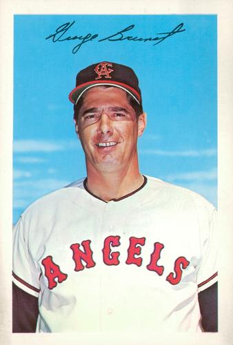
(I personally find these jerseys to be overrated) Hey, the Angels are wearing throwbacks this weekend series against Pittsburgh, including tonight's game.

A cursory search of Dressed to the Nines shows these were never button up with the state logo sleeve patch, but hey, what are you gonna do?
-
 1
1
-
-
6 minutes ago, j'villejags said:
The non-bevel was the theory that spread in response to the initial tweet.
The basketball team, from the little I notice on Twitter and around March, seems to use the non-beveled logo pretty much as an alternate but football doesn't besides on the throwbacks.
Personally, I prefer the beveled logo because of the weight and depth the bevels give the logo as opposed to the old logo. Plus the beveling is actually done correctly unlike A&M.
-
 2
2
-
-
On 7/13/2023 at 6:37 PM, monkeypower said:
This from Texas Tech football's local beat writer as Tech is doing a huge reno to their football stadium, including putting in new turf.
Well, all they did was flip the colours of the endzone text.
For a team that has a colour in the name, there's not much of that colour on the field anymore.
-
 1
1
-
 4
4
-
-
Per the mothership, the Jets throwbacks will be unveiled on July 24th (this upcoming Monday at time of posting).
-
 5
5
-
-
Catching up,
Bucs: Great, but that's not to be unexpected with that set
Browns: Meh, whatever
Vikings: Meh. They are throwbacks that really feel like throwbacks. I do like their current set, minus the numbers, so I'm not getting all hot and bothered over Northwestern stripes.
Seahawks: Great. I do prefer the new logo but I would not be against Seattle going back to those colours full time
Colts: Going to be all black right? That Twitter video is not one you put out if you are going with throwbacks.
-
 1
1
-
-
10 hours ago, fouhy12 said:
Probably doesn't mean anything in regard to what the Jets wear this year, but this tweet gives me some hope that they're stick to traditional combos with Rodgers there now.
If the Jets just wore G/G/W/G, G/W/G/W, and G/W/W/G, I think it's a pretty nice-looking set.
I don't know if that truly does mean anything because G/G/W/G is still technically the primary set so it make sense to be for media day-esque photos. They only wore the green jerseys once(!) last season and the jersey combo they wore the most, G/W/B/B, was something that came up on a whim the season prior to last, so I don't know if there's much to be read into with the Rodgers photo for the Jets of recent years.
7 hours ago, fouhy12 said:Very interesting. I do maybe wish they went with the greens though.
-
20 hours ago, throwuascenario said:
Unpopular opinion: the kachinas were a downgrade from what they had. The color scheme is the most important part of the brand for a team IMO, and they simply don't have one anymore. Red and sand is much stronger than black, green, red, blue, and purple. Also, the logo is too detailed for a jersey.
I like the overall concept of the kachinas better, but those two flaws are too much to look past.
The Coyotes colours are black, green, red (brick?) and sand. The purple, there's no blue, is limited to the logos which is typically excused away as not being part of a colour scheme when it's not used anywhere else, see Mighty Ducks, Anaheim and Blackhawks, Chicago.
I really don't think the kachina is a downgrade from that boring old set. My issue with the kachina set is that it is way too dark. They should have taken the time to lighten at least one of the red or green but teams seem to be hesitant to change any flaws when bringing back retros full time.
-
 5
5
-
-
31 minutes ago, TBGKon said:
Metlife did get new turf this offseason. I believe the previous turf had the NFL logo sewn in (which is why Super Bowl XLVIII had the smaller NFL logo at midfield). The new turf is likely blank and allow for customization.
There was a video put out by the WSJ 10 years ago showing how the stadium switches over between the teams and the MetLife person called the logo "inlayed" and it's not trays like the endzones are. I would assume that means that it was sewn in.
The initial plan was for there to be Jets and Giants logo switched out at midfield and for them to be switched out like the endzones but then a Giants player blew out his knee during the first training camp at the stadium and it was shelved.
-
7 hours ago, fouhy12 said:
I hope for goodness' sake the Jets put a logo out there too and not just the shield.
-
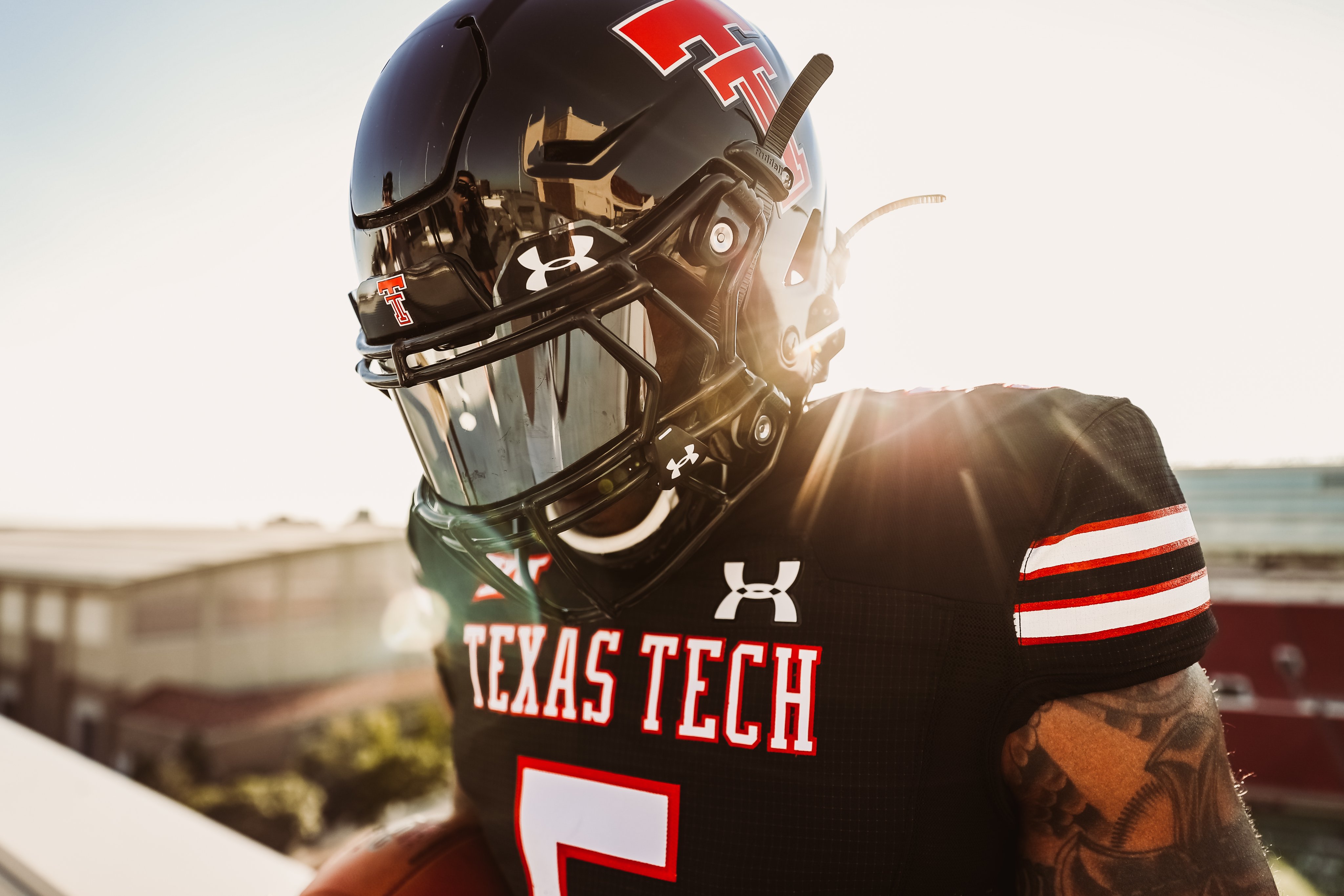
This from Texas Tech football's local beat writer as Tech is doing a huge reno to their football stadium, including putting in new turf.
-
 1
1
-
-
11 hours ago, zubazpirate said:
I caught Wenatchee Wild GM Bliss Littler on the Pipeline Podcast, he said that the Wild don't have enough time to design and order sets of uniforms for this year so they will be using the Winnipeg ICE template with Wild logos on them.
(Not sure if that means they will be sewing Wild logos directly over the ICE logos on the existing uniform sets? Or if they will be making new Wild jerseys with the Wild logo right on them, he didn't get into that level of detail.)
7 hours ago, Ridleylash said:Most likely it just means using the ICE template and just swapping the ICE logos out for Wild ones.
4 hours ago, spartacat_12 said:I was going to question if this was easier than just wearing the existing Wenatchee jerseys and stitching on a WHL logo but then I remembered they'd have to be in CCM jerseys, so I guess this is the easiest process.
At least the colours are similar enough to the existing Wenatchee logo?
I also do hope Wenatchee updates their logo now that they are in a higher league with more money and brand importance being around.
-
 1
1
-
-
The NYT is disbanding its sports department and it will now just be the Athletic.
-
Look, I didn't say I believed any of it. I just had that memory unlocked with all this Ducks talk.
-
 1
1
-
-
Notice no response to my Reebok Jets post(s). Just back to the pants.
-
 1
1
-


/cdn.vox-cdn.com/uploads/chorus_image/image/67010720/1006048688.jpg.0.jpg)


NFL 2023 Changes
in Sports Logo News
Posted
My mistake for using screen printed for all.
There isn't a high end version of the Jets new throwbacks (yet?), but the cheaper (Nike Game) of the two options says screen print while the next step up one (Nike Limited) says heat sealed.
There are Nike Limiteds of the old template that are stitched and are cheaper than the new heat sealed Limited.