


TalktoChuck
-
Posts
5,198 -
Joined
-
Last visited
Posts posted by TalktoChuck
-
-
I doubt Deion jumps to the NFL. He'd be giving up too much control with an NFL job. If he's successful at Colorado, he'll make the jump to an SEC school as soon as possible. One of the second tier SEC schools will give him $9 Million a year and treat him like a god.
-
On 9/12/2022 at 9:29 AM, Discrim said:
Hockey teams either being the Ice or having Ice in their name is weird...you don't see basketball teams calling themselves the Hardwood.
The New York Football Giants.
-
 3
3
-
 1
1
-
-
9 minutes ago, Kevin W. said:
Their coverage so far has been incredibly loathsome. I'm sure that the advertising dollars they're receiving from Qatar have nothing to do with the slant.
I was fully expecting a pro-Qatar spin to all the coverage from every outlet during the tournament, so that wasn’t too jarring of a thing.My bigger issue was the over the top whining anytime a call went against the US. I guess I should have expected that too.
-
I’m sure it’s just because I’m in a weird headspace from being sick all weekend, but as an American and casual soccer observer, I came away from this Wales/US game not wanting to root for team USA at all.
Pulisic is incredibly unlikable. The commentators that Fox used were terrible and very biased. And most importantly, the uniforms are downright ugly.
Also, the coaches’ sweater that just said “STATES” is the dumbest piece of clothing I’ve ever seen.
-
47 minutes ago, UncleJunior said:
Love this Flyers jeresy and can't understand how these are not on sale yet.
*EDIT - I GUESS Nov. 15? "Reverse Retro."
Yeah, all the RR jerseys go on sale Nov. 15. Some teams are doing pre-orders through their online team stores, but not everyone.-
1
-
-
If it makes it better/worse for anyone, the Avalanche and NHL are not referencing the Rockies at all in any of their marketing speak about this uniform. Now obviously, the Rockies inspiration is clear, but according to them it's simply a Colorado flag version of their original sweaters.
Quote from NHL.com " . . . pays tribute to its home state by incorporating colors of the Colorado flag while reintroducing the original jersey design donned by Avalanche greats in the 1995 inaugural season."I think this is why they went with just the C instead of the Mountain-C. So, they could distance themselves from the old Rockies as much as possible.
-
4
-
-
As someone who has lost some of the most important people in my life, I know it’s not my place to tell other people how to grieve.
That being said, this Utah helmet is one of the most ridiculous and selfish things I have ever seen. I hope to god they got the ok from the deceased’s families before doing this.
-
That's a terrible logo, but I love the idea of using unused stuff for the reverse retro program. Would love for the Avalanche to do either an Xtreme or Wolf/Nordiques look as a reverse retro.
-
3
-
-
On 10/11/2022 at 7:42 PM, BBTV said:
Who would have thought that people who wear headdresses and warpaint and do the tomahawk would have the n word in their vocabulary. Surprised we don't here more of this coming out of Atlanta.
I remember a couple years ago (like 2019 or so) the Braves tried to curtail the chop as best they could. They quit playing the music that initiated it over the PA and they even went as far as playing competing music/sounds over the PA when the fans would start doing it by themselves.
Sadly, once everyone came back from the pandemic they went back to initiating the chop over the PA again. -
So now these TV stations are super imposing their own ads on top of the boards that are already covered in ads?
The NHL really decided to make watching this league as unenjoyable as possible over the offseason.-
6
-
1
-
 1
1
-
-
8 minutes ago, AFirestormToPurify said:
Much better! Is this a pre-season thing, along with the weird font for the names or have they finally decided to come to their senses and put the captain letters back where they belong, on the left side of the chest?
Either way, it's probably just to make room for a disgraceful sponsor patch on the other side. For shame
That's exactly what it is. (For now) They are only allowed to have an ad in the upper right chest. They may not have an ad sponsor right now, but this move is for sure so they can add one in the future.
-
1
-
1
-
-
2 hours ago, DTConcepts said:
Slightly tangential, but I think I'd like jersey ads better if they were local(ish) businesses instead of multinational banks and tech startups that will be belly up in three years. Like, if the Avs (god forbid) decide to have jersey ads, I'd much rather see a King Soopers ad than a KeyBank or Pepsi ad.
King Soopers (Aka Kroger) is the largest supermarket chain in the US. Kroger keeps the old local names of the companies they buy out because people get real emotional about where they buy food.
-
1
-
-
49 minutes ago, Ridleylash said:
OITGDNHL does a single trade have a novel of conditions attached to it lmfao
-
8 hours ago, Pharos04 said:
I always went with a personal observation of "if anyone can do it casually (or while drinking a beer), it's not a sport, it's a hobby"
I'll be crossing your name off the invite list for my summer BBQs because you're not coordinated enough to play football, baseball, or basketball with a beer in your hand. -
8 hours ago, spartacat_12 said:
Even if the NHL hadn't officially retired 99 I can't imagine anyone would've had the stones to actually ask for it. And even if they had, my guess is most teams wouldn't have issued it. Just look at the debate that went on 5 years ago when Josh Ho-Sang wore 66 in honour of Lemieux.
https://www.sportsnet.ca/hockey/nhl/josh-ho-sang-wearing-no-66-anything-ultimate-respect/
-
1
-
 1
1
-
-
I wasn't a huge fan of the Melo look, and I could take or leave the current set. I have a soft spot for the Navy/Maroon/Gold of the 90s, but the Nuggets should be rainbow or bust. Use the last round of Nike alts as the basis but switch Black to Navy, and you're good to go.
Also, as a Denver native, I would love it if I never had to see the Colorado flag on a piece of clothing again.-
5
-
-
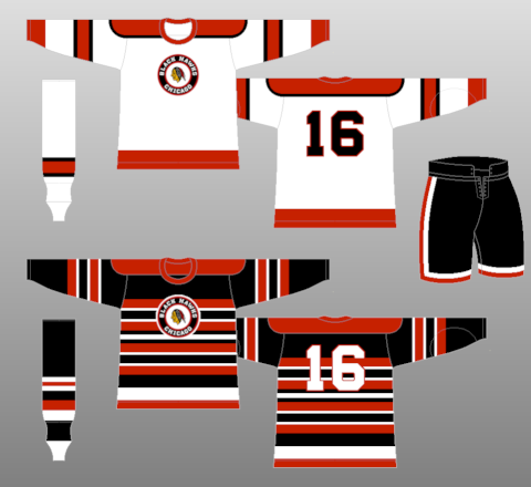
4 hours ago, Ridleylash said:
My biggest question, then, is that if they were so stumped for ideas in their own history, why not just do a Cougars-inspired fauxback? Vegas already set the precedent for using designs from past clubs the first go around, surely they could've just done that jersey in Hawks colors and called it a day.
This feels like a bootleg version of their 75th anniversary jersey.
06 teams shouldn't be using the jerseys of the WHA, save that for the newer teams.
6 hours ago, pepis21 said:Looks good but it reverse to what? They never had sweater like that. It would be fantastic for Winter Classic since this is fauxback.
I believe it's a "streamlined" version of their '51-'55 look. Of course with the script instead of the roundel logo.
http://www.nhluniforms.com/Blackhawks/Images/Blackhawks18.png3 hours ago, M4One said:Blackhawks still have a number of options in their history they could have pulled from. A red version of the jerseys they wore from 26-34 or a red version of the jersey they wore in 34-35.
Shouldn't have to come up with a faux RR jersey only the second time around for a team that have different jerseys in their history.
The problem is, they've already done a version of every one of their jersey designs within the last 2 decades. Sure, you could do a red version of their '26-'34 look, but they just used that design for the '19 Winter Classic. And the '34-'35 design was more or less used for the '09 Winter Classic. Even this RR, like Ridley pointed out, is a retread of their 75th anniversary jersey.
The well for Blackhawks throwbacks has run dry. -
50 minutes ago, DEAD! said:
It would be a waste if they don't use "blasty" on the jerseys
They have blasty, as well as all those western inspired alternate logos from their old alternate jersey. If they just go with that lame W it’ll be a huge missed opportunity.-
3
-
-
1 hour ago, FiddySicks said:
I only ask because it sounds like the most OITGDNHL thing possible, but was Fruit of the Loom actually at one point a uni supplier for the NHL?
Considering how small the garment industry is, I would be shocked if Fruit of the Loom wasn’t at one point in their history a part of the pro sports jersey business in at least an indirect way.
I know for sure they had a deal to make Wilson apparel during the 90s, but I think that was strictly for casual athletic wear.
-
1 hour ago, ltjets21 said:
I really dont see the practicality of spending hundreds of millions of taxpayer money to shrink soldier field for an MLS team. Does not draw really any money and from MLS standards the current stadium is fine.
The main draw of doing this wouldn't be soccer, it would be concerts. Set up some summer 3-day concerts with Dave Matthews, Phish, Dead & Co., Luke Bryan. etc. and you make an easy million+ each weekend.
-
4
-
-
23 minutes ago, Sport said:
Good grief. I guess handsome men hadn’t yet reached Canada by 1962.
Real Men™ playing Real Hockey™. None of that pretty boy millennial bull crap they got today!-
2
-
3
-
-
1 hour ago, VampyrRabbitDesign said:
I own a 2010-13 Oilers replica home jersey and I was wearing it when I wrote that. The blue on the shirt looked lighter than the value that is on that site. It's also a different shade to the blue on the crest. The colour matching on that shirt isn't the best - as well as the different shades of blue, the orange for the cuffs + yoke, crest + and reebok logo, collar and the centre and hem stripe are all different shades.
It would be surprising to me if Tampa Bay, Toronto, Edmonton and Vancouver (well, not the first two) all used the same shade of blue during the aformentioned time period, but that might just be me. If someone could post a pic of all four of those jerseys in the same picture to show the colour similarity, that would be great.I do use the site a lot to choose colours, just that moment threw doubt into my mind.
Doesn't Trucolor only show the official colors in respect to Pantone and graphic reproductions? The actual fabric colors will be slightly off from those shades in almost every situation.
-
1
-
-
4 hours ago, GDAWG said:
it will be interesting to know what happens to March Madness and other sports once these super conferences break off from the NCAA.
The SEC & B1G present April Anarchy™
-
1
-
1
-
-
23 hours ago, Sport said:
They overcame having 35 year old Jack Johnson playing serious defensive minutes in 2022. He was a healthy scratch in the playoffs for the Blue Jackets four whole ass years ago. I feel good for him, though, what with all the crap he's been through with his parents stealing and losing most of his career earnings. I'm glad his cup didn't come as part of the Penguins.
I forget if it was Game 6 or Game 5 of the finals, but I saw someone in the front row wearing a Jack Johnson jersey. I'm a fan of 4th line jerseys, but even I thought that one was a little much. In a perfect world where Girard doesn't get hurt, Jack Johnson never sees the ice.
23 hours ago, Sport said:It's honestly weird how bad they were that year because clearly they had some dudes on that team. Matt Duchene was there too. And we all thought at the time what terrible luck it was to go through that season and wind up with only the 4th pick. The guy they got just won the Norris and Conn Smythe, the three guys taken in front of him are good (Nico and Heiskanen) to full-on bust (Nolan Patrick), but in a redraft Cale Makar goes #1 every time. Hockey is funny.
2016-2017 was a perfect storm. You had the Sakic/Roy fall out where Roy quits 6 weeks before the season starts. That was such a gut punch to the fanbase, I can't even imagine how much it affected the players. Then you add on Duchene moping around all year asking to leave while putting up a -30, the starting goalie Varlamov only playing like 30 games, and both Erik Johnson and Landeskog being injured throughout the year.
I know there were talks of blowing the whole thing up after that year; Firing Bednar, trading Landeskog, etc. Thank goodness they didn't do that.21 hours ago, TBGKon said:Really? Was it that bad?
The Tampa reign of terror wasn't/isn't that terrible. I mainly have issues Maroon and Kucherov because they are some of the poorest sports I've ever seen. I love Hedman, and everyone else is fine if not a little boring.
-
4
-


College Football 2022
in Sports In General
Posted
Glorious name, and a sweet logo to boot.