


TalktoChuck
-
Posts
5,198 -
Joined
-
Last visited
Posts posted by TalktoChuck
-
-
I guess I'll throw a few of my pieces up here. I started painting two years ago as a way to relax and haven't stopped since. I use oil paint on canvas. I have no training/classes to my name and struggle doing any kind of detail so my style is very abstract and erratic. Basically just shapes and colors.
"Underpaid" 48x36

"Julius Swerving Pt. III" 24x30
"I Wanna Get Killed By The Government" 40x30
-
 6
6
-
-
What font do the Colorado Rapids use in their logo?
-
Can anyone tell me the font that this comes from? Or something that is pretty close, I really just need the 5.

-
That's fantastic news. Wonder if the Avs slum it in Springfield for a year before setting up as the 6th Pacific team.
From some of the rumors earlier this year, I think Colorado will affiliate with San Antonio and then Florida will affiliate with Springfield.
-
What font is used for the "Extreme" word mark on the right hand side?
-
Right team, wrong uniform:

Damn, I forget how beautiful that Chargers uniform was. The only thing I would change is the double outline on the numbers.
-
Can anyone tell me what font is used for "New York" on the New York Red Bulls logo?

-
I agree with you McCarthy. I love the look of long socks on a baseball uniform, but stirrups are awful.
-
Never mind. 'Playoffs' is the font Journal and 'our' is DIN Bold Condensced.
-
Can anyone help me with the fonts from this image?

-
Does anyone know what font the Arena Football League uses for the AFL atop their logo?
-
It amazes me that a company as well financed as ESPN, always has horrible photo shopped images. They can't at least find a good graphic design intern from the local community college?
-
- i like the Bengals current uniforms and hate their old ones
- i think the Chiefs & Redskins look dated/old/tired/boring, not classic
I agree with everything except the Chiefs. I love their look. I think the could benefit from adding a little more contrast between the shades of red and yellow. But other than that, they look great.
-
The Rockies should have kept this look:

I actually really liked the black undershirt look, but the purple undershirt didn't look right to me.
A light color under a dark color just looks unbalanced.
-
I really like the Lightning's new set, and i don't care for their old victory stripes. They are as pointless as the slogans on the inside collar of football jerseys.
-
1
-
-
Lions vs. Chargers 2007
First year in current Charger unis, second to last year in Lions old unis

The only difference between that Lions uniform and what they wear now is the number font...
And stripe width, if you want to get real technical.

-
Media is an experience. You watch the movie, play the video game, read the book, listen to the music. The only reason to have the disc (or purchase the iTunes license) is as a vehicle for acquiring the media. Copies of that media are functionally the same no matter how that copy is acquired. An iTunes mp3 is exactly the same as a ripped mp3 from a CD. There's no loss of authenticity when you copy it (because all versions of a CD/DVD are simply copies anyway).
That is simple not true. There can be massive differences between one mp3 and another. Every time you copy or convert an audio file you loose quality. There are even differences from the audio file that is recorded (the master files) and the one that is put on the cd, simply because of the transfer from one medium to the other. And then when you upload the file to hosting sites and download them, the quality gets diminished even more.
No mp3 is exactly the same as another.
-
I must admit, I miss the "Graphite Jays" color scheme. Now, I'm not saying I miss the uniforms, logos, or emphasis on black and gray from that era - I just wish they still used the specific colors from that era. The shade of blue they used especially looked spectacular in person.
It was a great color scheme, not really for the Jays. But for a team like the Lightning, it would be beautiful.
-
Can anyone point me in the direction of a free font that looks similar to the old Padres interlocking SD logo?
-
I have never understood why some people consider this to be Oregon's best set.
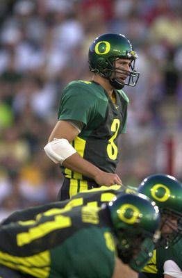
The set after these (Kellen Clemens era) was solid.
These uniforms? They were ok. Not bad, but not good.
Oregon's uniforms are always so close to being good, for me. All of their uniforms for the last decade or so have been a few tweaks away from being good. It's always close, but no cigar.
-
EDIT- Nevermind, I figured it out.
-
I don't think your opinion is in the minority at all. The Broncos' navy set is a MUCH better uniform than the orange alt (soon to be primary). Not exactly a fan of the helmet/jersey/pants comprising of three different colors, as is the case when Denver wears their orange jersey.
I like the orange a lot more. Not really for aesthetic reasons, more so for team history reasons. The Broncos have always worn an orange top with white pants (except for those awful yellow/brown uniforms their first year) before their 1996 update. And during most of that time they wore blue helmets. I think switching to the orange jersey is great because it gives a nod to the team's past while staying with the modern look.
-
I'm not sure if this is unpopular or not, but I can't stand it when football uniforms don't have tv numbers on the sleeve or shoulder. It just looks really cheap/high school looking to me.
-
This just in: the Mountain West is desperate and pathetic.
I don't think that classifies as desperate or pathetic. They are just trying to make sure they don't lose anymore schools the way they lost BYU/TCU/Utah. I could see your point if this rule was put into place very recently (like once Air Force and Boise thought about jumping to the Big East) but since this has been in effect since June the desperate and pathetic terms don't really apply. They are just doing what every organization should do, protecting their investments.


NHL Anti-Thread: Bad Business Decision Aggregator
in Sports In General
Posted
I’d really love to see the NHL commit to a 4 division, no conferences alignment. Put Seattle in the Pacific, move Arizona to the Central. And then have the top four teams in each division make the playoffs and face off against their division for the first two rounds. Then when you get to the final four division winners, re-seed based on regular season record.