


TalktoChuck
-
Posts
5,198 -
Joined
-
Last visited
Posts posted by TalktoChuck
-
-
What an amazing series that was. The fact that Tampa made it to (and almost won) three straight cups is a feat that doesn't get the credit it deserves.
-
 3
3
-
-
1 hour ago, GriffinM6 said:
Just needs the extra blue stripe bordering the silver and it's perfect.

Still needs silver outlines on the numbers. Whether it's a double outline or single outline, silver needs to be on the numbers.
-
5
-
-
2 hours ago, BBTV said:
The irony of Durant making his way back to Seattle via OKC, GS, and BKLN (did I miss anyone?) would be something to see. It would almost soften the blow, because in a way, it'd be like the Sonics returning since the best player that left would be back.
Oh also, Rick Ross, who I just learned exists, is potentially buying the 10% of the Sixers that Michael Rubin is being forced to sell. The rumor is that Rubin, who has relations with lots of players and agents and can now offer them endorsement deals, will leverage this to steer players to the Sixers and work some otherwise rule-breaking tactics while still receiving a check from the Sixers ownership group for some BS made-up position.
You've never heard of The Boss™??
-
 1
1
-
-
It really drives home the whole top 1% wealth inequality in this country when you see that everyone who owns a sports team is related to each other.
-
4
-
-
8 hours ago, mcj882000 said:
I always thought the blue equipment looked fine, it's the burgundy equipment they use on the road that always looked bad to me. (I still don't think either looked better than the black pants & helmets they used to wear, though - for rushed-in placeholders they sure made the whole set click.)
Huh?
Are you referring to the burgundy shoulder/hem stripes? The equipment they use on the road is the same blue as at home. -
Which Canucks look would be the right one?
-
47 minutes ago, Brave-Bird 08 said:
It's kind of like if the Braves started calling themselves the Unincorporated Cobb County Braves or the Atlanta Braves of Unincorporated Cobb County
I'd be down for Cobb County Braves, but only if they play the Big Boss Man theme at the beginning of every home game.
-
6
-
 1
1
-
-
On 6/6/2022 at 1:43 PM, Red Wolf said:
As a Broncos fan from Arkansas, I feel as though I also own the Broncos now. We're all in this together.
Weird that a single family from Arkansas owns just about* every single pro sports team in Colorado.
-
11 hours ago, AFirestormToPurify said:
It just looks so corporate and soulless. Same as every logo designed in the last decade. Broad, thick lines, heavily computerized, full of meaningless Nike Speak. No distinct personality, it looks like every new logo is designed by the same few people in the same design firm
Who cares about how logos look on twitter. I don't see anyone calling for a redesign of the Blackhawks and Red Wings logos because they look bad in tiny thumbnail versions. I know you and I have had this same exact argument before but a hockey jersey logo is 12"x12", it looks GOOD when there's lots and lots of details
Worst case Ontario, why can't they just come up with simplified logos specifically and exclusively for ant-sized applications? Why do they have to touch the main logo on the jersey?
Worst Case Ontario. New band name, I call it! -
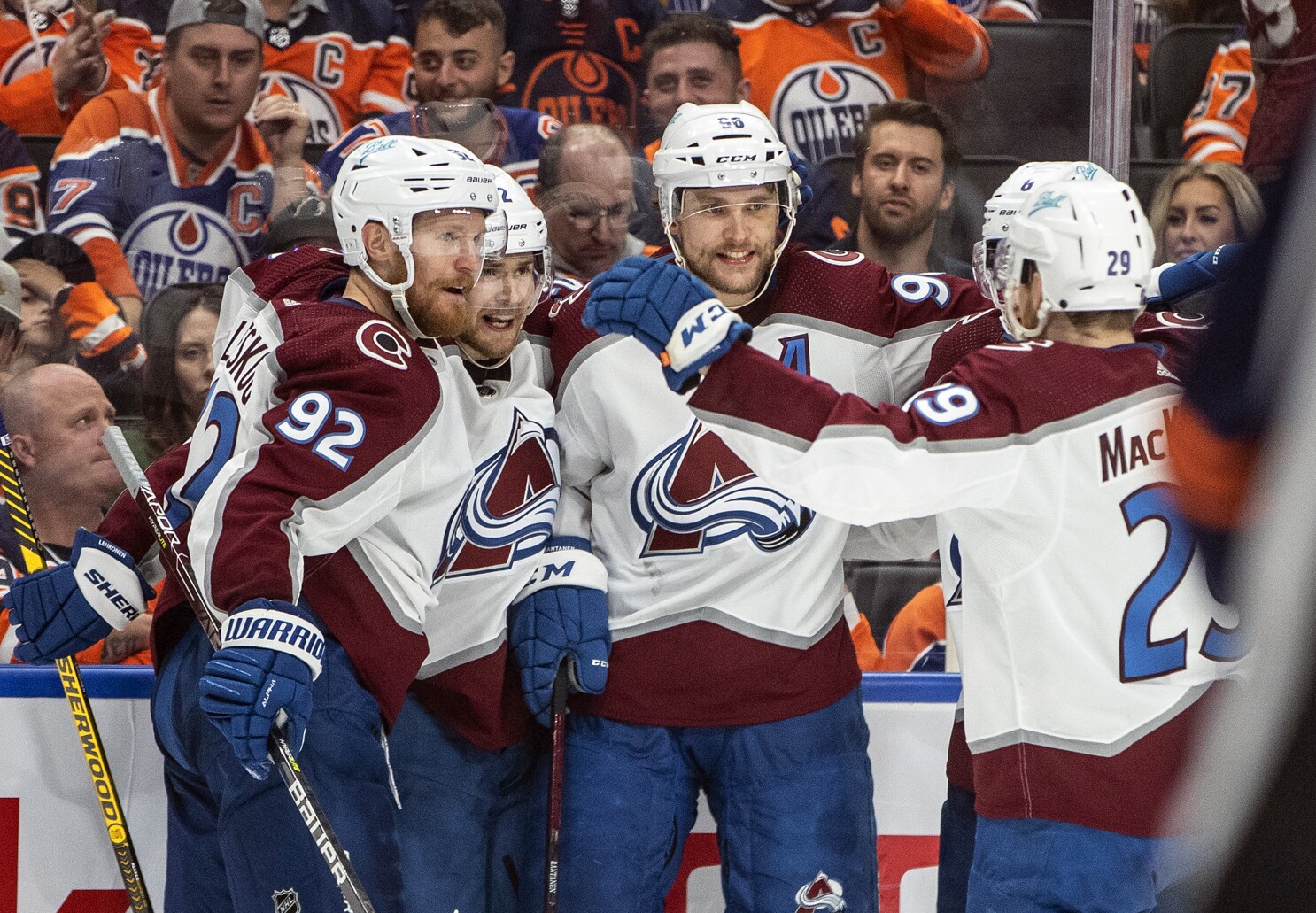
Thank goodness the Avs ended this in 4. My stress levels couldn't handle more of that series plus a cup series.
Major props to Draisaitl. The dude almost single handedly won that game while his body was falling apart. -
24 minutes ago, DoctorWhom said:
I don't understand what could be fun about knowing the Finals matchup before the season even starts.
2016 was the only somewhat interesting one because of the Cavs upset. Outside of that, the league was boring as hell for those years. No reason to watch the playoffs or even regulars season games.
This may be far from the best Finals matchup, but at least the winner is a legit tossup, unlike those years.
In theory, this is a great finals matchup. And, in theory the playoffs this year should have been a blast. But instead, star players are legit quitting on their teams in a game 7 and every game is a 30 point blowout by half time.
-
4 minutes ago, DoctorWhom said:
Still better than 2015-2018 when everyone was just waiting for the inevitable Warriors - Cavs Finals on the first day of the season.
I disagree. The playoffs before the finals were probably just as bad as this year, but those finals were 10x more entertaining than this one.
The NBA should be embarrassed by the last 3 minutes of this game. That was brutal to watch.-
2
-
-
This may be just me having rose colored nostalgia glasses, but this is the worst NBA playoffs I can remember. It's been nothing but players giving 50% effort and 30 point blowouts every game.
-
1
-
-
17 hours ago, mafiaman said:
Class D USSSA softball - Nike is ruining MLB uniforms one team at a time.
When a child (Nike) gets behind the wheel of a car and runs into a tree, you don't blame the child... You blame the 30-year-old woman (MLB) who got in the passenger seat and said, "Drive kid i trust you."-
3
-
-
18 hours ago, dont care said:
So these agreements become null and void after an ownership switch (because they didn’t agree to it) I see this continue to be a toilet bowl of a franchise, ownership sells in about 5 years and new ownership finally ends this madness. Either that or the madness is allowed to continue and then the team ultimately folds because Bettman refuses to see the inevitable. It’s you move Gary which one do you think will be the larger embarrassment.
I image they would make the sell of the franchise dependent on the new owner agreeing to remainder of this deal (if it actually happens). It's too big of an investment from the city to not guarantee the 30 years regardless of a new team owner.
-
5 hours ago, Alex Houston said:
This Rangers run has been impressive, but I got a feeling that Colorado is going to be rude awakening for those guys. If the Avalanche can buckle down more defensively so they don't get into shootouts with Edmonton, you got to like their chances against whoever comes out of the East.
Tampa still scares me. Their defense and goalie matchup the best against the Avs.
-
11 hours ago, Ridleylash said:
I though Smith was going to rebound after last game?
He actually did play pretty well. The rest of his team either hung him out to dry or didn’t bother to show up though.
The first/third goal were because of terrible defense, and the fourth goal he was missing half his equipment. -
1 minute ago, habsfan1 said:
Mike Smith is finished. Assuming they want to win this series, who will the new starter be for Edmonton?
I checked Wikipedia. I'm not familiar with any of these names, but the team somehow has 3 backups listed on their current roster: Mikko Koskinen, Stuart Skinner, Olivier Rodrigue.
Koskinen is a good goalie and started the majority of their games during the season. But don't count Mike Smith out yet. This is what happened in Game 1 against Calgary and it's just what he does. He'll come back next game and have a stellar game. One of the TNT guys (I think it was Biz) described him perfectly as a roller coaster and you never know what you're gonna get.
-
The Rockies City Connect is ok. Adding green and the license plate inspired font are great and I hope they use those things in the future. The cap logo is bad. Everything else is meh.
But, at least it doesn’t have the flag on it. As a native, I’ve grown to dislike that flag because it’s on everything.
-
My only complaint with TNT's coverage this season/playoffs is Don Koharski. Get him off my screen. He lacks any sort of public speaking skills and he is consistently wrong about every call they ask him about.
-
2 hours ago, AFirestormToPurify said:
Worst case scenario for the Cup finals
Oilers vs Hurricanes '06 rematch. For obvious reasons. Both teams look very underwhelming at home
Oh no. This would have to be the worst looking Stanley Cup Final ever, right? It's ten times worse than the last time they faced off.
-
1
-
-
Using this logo on a solid green hat would have looked better.
-
18
-
-
On 5/25/2022 at 11:23 PM, Ridleylash said:
Blues stave off elimination with a huge comeback in the third to clinch out Game 5 in OT and now get to head home with a massive momentum boost.
If they win this series, that Thomas goal is going to be the iconic moment of it and the Avs are going to have to deal with the branding of being the new Capitals with how damn often they choke in the second round.
The second round choking is a little over blown.
Last year against Vegas is a choke only because they lost 4 straight after being up 2-0. People forget Vegas tied the Avs for the president's trophy. 2020 against Dallas they were down to their 3rd string goalie. And 2019 against San Jose they were the 8 seed and barely made the playoffs.-
1
-
-
4 hours ago, Sport said:
The blue numbers help, but I think outlining them in burgundy was a mistake because they flash and vibrate and it makes the blue appear brighter on the numbers than it does anywhere else in the uniforms. I would've outlined them in silver.
100% agree. The sleeve numbers on both jerseys need to be outlined in silver as well.
-
3
-


:no_upscale()/cdn.vox-cdn.com/uploads/chorus_image/image/18109941/1982-canucks-williams-bossy-campbell-080092566.0.jpg)

:format(jpeg)/cdn.vox-cdn.com/photo_images/2940531/GYI0065010392.jpg)


The Rite of Spring: 2022 Stanley Cup Playoffs Thread
in Sports In General
Posted
Following the Avs throughout the 2010s was a real f***king chore. Lots and lots of terrible hockey, including the worst season in modern NHL history. Seeing these guys below who were apart of that worst season, raise a Stanley Cup is honestly amazing.
