


TenaciousG
-
Posts
883 -
Joined
-
Last visited
-
Days Won
1
Posts posted by TenaciousG
-
-
With respect to the Oilers throwbacks, who the hell is it actually for? The cynic in me would say the ownership, but Bud Adams passed away and so unless Amy Strunk Adams has some weird personal grieving process that involves the Oilers (in which case the team should have just stayed the Tennessee Oilers), this is applying nostalgia for literally one year of transitional football.
IMO The Oilers’ history should transfer back to Houston, where the vast majority of it was actually played. This should be a Texans’ throwback. If you don’t take the branding with you a la the Colts, you shouldn’t be allowed to take the history. I’m open to being proven wrong on this but I don’t get it.
-
 8
8
-
 1
1
-
-
Nike can’t stop getting in its own way on these US kits. What was the last good one? It’d have to be the Waldos for me. Solid white isn’t going to sell or stand out and the splatter paint only marginally improves it. Also putting red directly on blue has always looked terrible. They need to figure this out. Ideally before the next World Cup.
-
1
-
-
We can officially add the “tiny Denver” to the list of all time meh series-clinching uniforms. Of course nothing will ever top the horror of the Cavs long-sleeves
-
4
-
-
Can we all just agree that ads are out of control and need to be scaled back?
The teams have enough money, and Covid is mostly over so it’s no longer a valid excuse.
-
6
-
 1
1
-
-
The fact that the VEGAS Golden Knights’ sweaters look like old gold, combined with the New Orleans Saints using Vegas gold for everything, makes me want to slink into a grave
-
3
-
-
The city-specific logos are a good idea. But the drab black-and-white primary is so sad. There was a really good opportunity to blend the common features of each country’s identities: all have the color red in the flag, all the flags are striped. You have the eagle in Mexico to the bald eagle in the US to the Maple leaf in Canada; there are a lot of good features you could draw from. But nah, just do a big fat 26 with a picture of the World Cup that looks like it was cut out of a newspaper.
-
6
-
-
On 5/12/2023 at 5:11 AM, AFirestormToPurify said:
Agreed except for the last part. It's Seattle that needs to ditch the red. Salmon would be perfect for them
I have bad news for you: ownership in Seattle has some weird obsession with red. Most of the placeholder “NHL to Seattle” stuff was red and they had a kid at the opening press conference wearing a red Washington Wild sweater. Rumors early on were that red might even be the dominant team color.
But now we’ve embraced it too, to the point where we chant “red glare” during the Star-Spangled Banner. It’s a good accent color, salmon would be fine but it wouldn’t allow the eye in the logo to pop as much.
-
4
-
-
MLS is expanding and finding more owners for its single entity business structure?? You don’t say…

-
2
-
 1
1
-
-
54 minutes ago, BadSeed84 said:
This is a very random downgrade. Not only was nothing wrong with the old orange, the new one is closer to burnt orange. That’s more Austin than Philly.
Also the current Jets logo is fine… it’s just boring. I’m not sure how to fix that.
-
 1
1
-
1
-
-
30 minutes ago, j'villejags said:
I agree with all of this.
For the helmets, the Cowboys script has always been a Cowboys basketball thing. It was cool as a one-off but I'm not liking it over the OSU brand logo. Pete has always looked a bit awkward on the helmet due to the shape of the logo. Our OSU brand logo is perfect on the helmet. This return to a traditional look would make for the perfect time to dial back the logos used on the helmet and stick to using the brand logo across the board.
For anyone interested, this is what the numbers might have looked like if they matched the wordmark. I think they would need a little more width and weight for a football uniform. As is, the numbers being tall and skinny might've made it difficult to pull off with the wordmark and numbers already being so low on the jersey.
The number font should be Cimmaron. Why can’t we get over our collective obsession with block numbers? If you’re going to go boring with the rest of the template, at least make the NOB and numbers interesting-
4
-
-
Can we please just get rid of the damn teeth?
-
1
-
1
-
1
-
-
We are a year or two from Nike just making 90s uniforms over again but using Nikespeak to justify it.
- Perforated numbers for superior breathability and temperature control
- Nike Super Performance Mecha Elite shoulders for Supreme epic non-grabbiness
- Made from 69% recycled ocean garbage collected by an army of minimally paid ethically-sourced child labor dipping nets into the pacific garbage patch
- Nike Collar-Tech(TM) woven collar with the complete Declaration of Independence written on the inside
- Cromulent No-Sleeve(R) technology to make the jerseys look bad on-field
- Priced at $299.99 for the cheapest Hyper Gametime Limited Elite Epic Bacon version, definitely not a 5,000% profit margin
- Ignore the Champion logos we totally made these
-
3
-
 2
2
-
14
-
-
2 hours ago, TruColor said:
Was this so hard?
Because how would we know what state they are from if it isn’t in huge bold letters that are way too close to the top of the numbers???Also a pants stripe? Come on. All football unis should look like terrible leotards because COLOR RUSH. If you can’t rush your colors you can’t rush the football. It’s just science.
-
1
-
1
-
-
On 4/28/2023 at 3:54 AM, tBBP said:
Time out...what's up with this here? Blue??? What'd I miss?
It’s CU—LA-
3
-
-
I feel like the trident “M” should be italicized to fit with the rest of the theme… be differentiate it from all the retro caps many of us already have.
I said it before but this is less of a city connect and more of a reverse retro concept. The Kraken did so well with their RR I feel the Mariners wanted to get in on the trend as well. The black pants are a big Yikes, hope they mix and match someday with the white pants or get matching blue ones.
-
2
-
-
8 hours ago, Brave-Bird 08 said:
Yeah, @jerrylawless3 hit the nail on the head.
The easiest way to get fans to engage with a promo of any sort is to be vague and make them think it's uniform related. They all know what they are doing.
I want to see a team pull the reverse of this and just update their wikipedia page one day with the new MS paint uniform graphics each team has and just wait until someone notices.
Yeah, until people stop caring and now you don’t even drive engagement for actual announcements.-
1
-
-
3 hours ago, MJWalker45 said:
More Techfit designs.
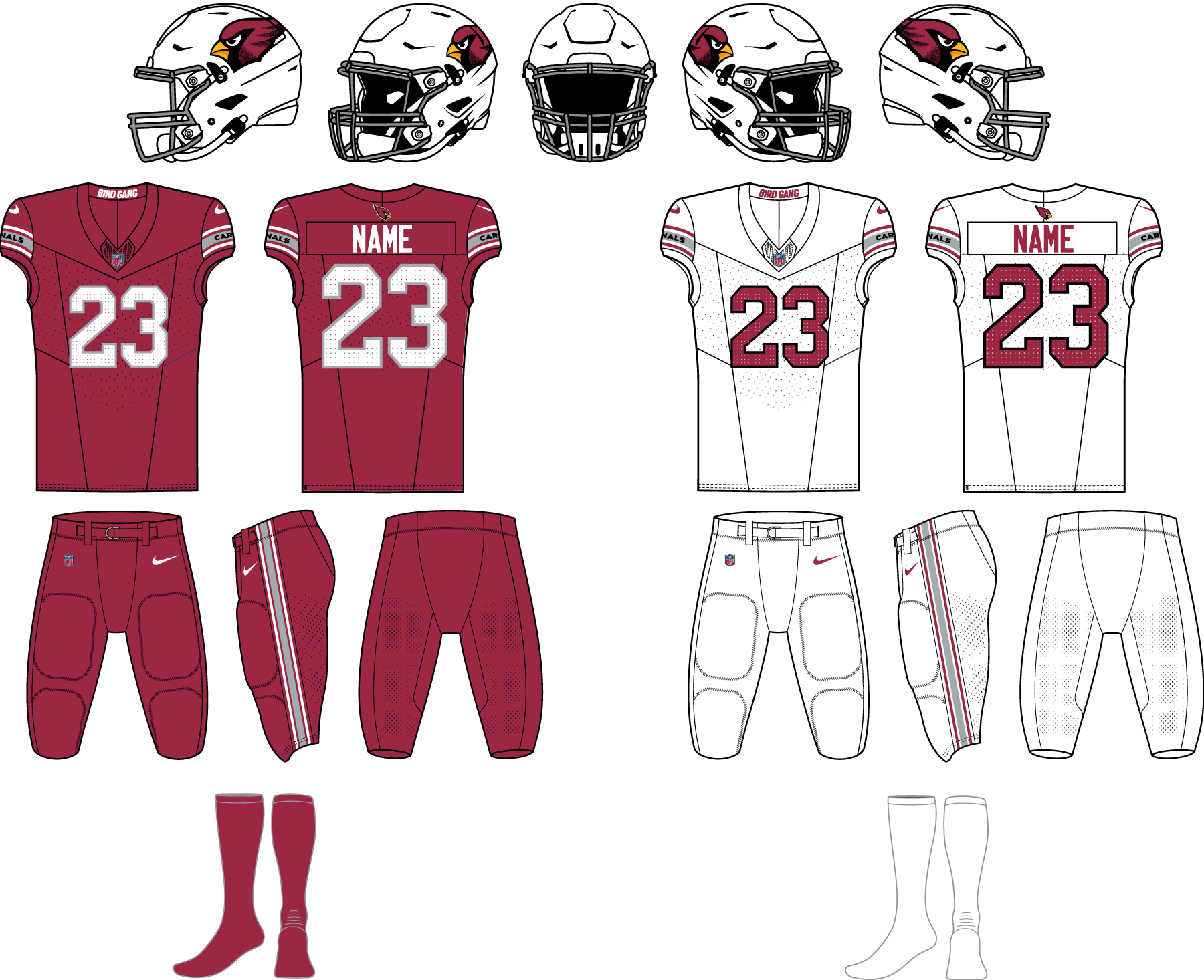
Techfit is such hot garbage. And the new Cardinals home set is the closest we’ve seen to Nike copying it. Anything to emphasize the shoulder swoosh.
The idea that you have to prioritize a jersey where the opposition MAYBE has a tougher time grabbing onto it, over aesthetics and common sense, drives me crazy.
-
The Rangers’
statecity connect would be a great concept jersey for celebrating title IX, because I can only see those numerals when I look at the “TX”-
2
-
-
1 hour ago, AJM said:
Designer speak
Drink every time she says “amplify” and you’ll end up in a hospital.-
5
-
2
-
-
6 minutes ago, plastictaxicab said:
I know there have already been suggestions/mocks for fixes, but if they just stop with the monochrome, this set could be half-decent. They just need to field the right parts together.
Why is the A R I Z O N A so close to the top of the number? And so low below the collar? What kind of amateur hour crap is this? Reminiscent of an Adidas Eastern Washington template (and I despise Adidas college templates).I do agree with the OP that ditching monochrome is superior. Great road look.
-
1
-
-
14 hours ago, upperV03 said:
A few Mariners city connect leaks:
I think there’s good potential there. The blue and yellow is classic & I like the beveled number font which sort of matches the styling of the compass rose. I really hope they don’t go with blue pants, but I fear they probably will. I don’t really care for the sleeve logo, but it’s not horrible. If you look closely in the first two pictures you can see a little bit of the front word mark. I think it may well be the same as what’s on the leaked shirt below, but it seems to have pointed serifs and a black drop shadow to match the number styling.
This ain’t a city connect, it’s a reverse retro.At least it’s decent and fits with the overall branding but this further blurs the line between us being a teal/blue team or a blue/gold team.
I really thought they would go with a green/white Washington State Ferries theme. Methinks they noticed how well loved the Kraken RR’s were and wanted a piece of the action. No one in Seattle is nostalgic for the Pilots… and there are better actual “city”connect ideas like using the city flag, or ferries, grunge, Mount Rainier (which they did a little in this set), pike place, etc.
-
1
-
-
More thoughts with a day to digest these:
- The road and black set are actually quite great. I don’t get Nike’s new insistence on putting team names on the sleeves but it at least works in this setup.
- STOP THE MONOCHROME. We get it. You did color rush five years ago and people noticed. Congrats. Now let’s move on and make normal uniform combinations again, especially where the pants match the helmet.
- I still think the huge ARIZONA is big time amateur vibes but it probably looks even worse paired with the slim number one. Still it’s an arena league look and should be shrunk at least in half. I dunno, maybe I should just feel lucky they didn’t get real dumb and put BIRD GANG on the front.
-
5
-
-
Congratulations, Nike. You just gave a pro team the Adidas college treatment, complete with an A R I Z O N A wordmark that looks like a better fit for a Walmart T-shirt.
-
1
-
1
-
-
13 minutes ago, JOEYxFRESCO said:
I love the metallic face mask. I wish Carolina had used that with their black helmet to compliment the silver accents on the uniform
The helmets are absolutely beautiful. The ATL and number font should be tarred and feathered.
Block numbers, some sort of simple trim and a pants stripe could have made these all-timers. instead it is firmly in the Nike era of jerseys designed to be replaced in five years.
-
4
-


/cdn.vox-cdn.com/uploads/chorus_asset/file/19935385/458222176.jpg.jpg)


2023 - 2024 NBA changes
in Sports Logo News
Posted
I figured out what bothers me so much: the basketball is way too far to the right (the player’s left). So much that it looks like the player is trying to smuggle a basketball in their armpit.
They should have kept the same font/logo size of the Barkley era jersey and just modernized the font and ball (and I agree with keeping the ball orange). That would be a true home run.