


TenaciousG
-
Posts
886 -
Joined
-
Last visited
-
Days Won
1
Posts posted by TenaciousG
-
-
15 hours ago, Kevin W. said:
I wish I could like this more than once. The NCAA really needs to reign that crap in. No more oversized helmets and no more asymmetrical helmets with different logos on each side or a logo on one side and a number on the other.
It looks dumb in college and it looks dumb when the Steelers do it.
The Steelers at least have history with it. Boise State’s original helmets were cool but the trend has been overblown since then.The funniest thing was when Oregon State did a Steelers helmet (late 90s, I think) with a regular sized Beaver logo on one side and nothing on the other. No explanation whatsoever.
-
 3
3
-
-
Adidas is either cheap as hell or trying to make people buy Authentics. Likely both.
My first MLS jersey in 2009 was $60 and high quality, and I thought that was a lot at the time. It’s despicable what the apparel companies are doing to drive up profit. Of course the good thing is I can choose just not to buy it.
-
3
-
-
I swear to God, if the Seahawks don’t finally do throwbacks with the two helmet rule I might quit rooting for the franchise.
Of course, they could make things a lot easier and just go to gray helmets full-time.
On a related note, I put the Hawks in action green pants with the road whites on retro bowl and it looks goooood. How have they not done this yet?

-
9
-
-
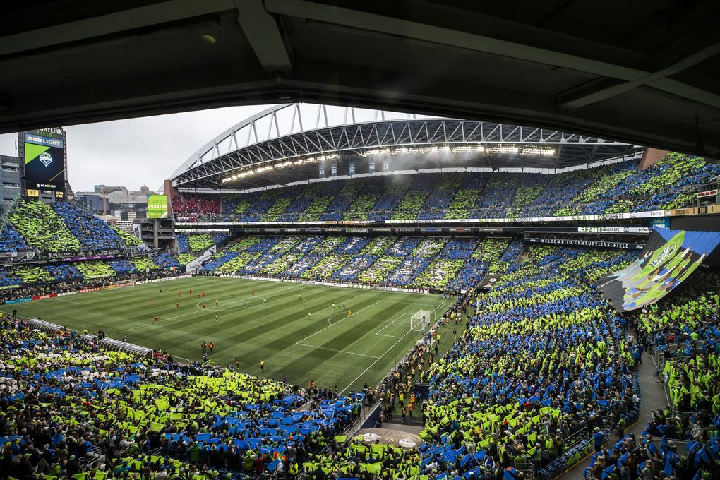
What Seattle should do: checkerboard or blue/green vertical stripes.
What Seattle will do: Some trash 2022 Adidas template rejected by Euro teams, in rave green with minimal sounder blue accents.Also for good measure I’m sure we won’t get a third kit yet again, even though we consistently sold ours in the past. We probably didn’t hit the sales target this year given we are a state that actually follows Covid guidance on crowd size and most Seattleites blew our yearly budget on a $1000 trip to a single Kraken game ($300 for tickets, $400 for merch and $300 for a single beer and hot dog).
-
2
-
-
On 1/12/2022 at 2:06 PM, DCarp1231 said:
The weird and sad middle ground attempt to merge the Texans and Oilers identities
Annnnd let’s throw in a star and a silver helmet because Houston loves the Dallas Cowboys-
2
-
-
Does the NFL have any centralized control or approval of branding?
Even if they don’t, how do you allow a multibillion dollar franchise to launch a second-rate MLS crest as their logo?
-
45 minutes ago, habsfan1 said:
I disagree.
A lot of soccer teams use FC for their names. Montreal followed along into the trend and use the french translation of FC. I think it's great. I'm pretty sure they shortened "Football" to "Foot" so that nobody confuses it with Canadian Football and the Alouettes. Franchises with NFL teams usually only have FC in the logo, again probably to set the 2 sports apart. Miami, one of the exceptions, spell it in spanish "Fútbol".
For American Football, every single team has a standard name. I don't think it will work for any of the big 4 sports franchises to simply call themselves the *insert city* Hockey Team, or Baseball Team, etc.
CF Montreal would have been fine as a new club but the city already had an established identity, even into the MLS era. History does matter, it’s why I wouldn’t mind something like RedHogs for the WFT. I could easily see KC becoming the Wizards again, the whole Sporting thing feels dated already and we’re only like 10 years in to that brand. -
-
31 minutes ago, officeglenn said:
Joma has released another, follow-up statement:-
5
-
-
On 11/24/2021 at 11:28 AM, QCS said:
It's always funny to me when a soccer club outside of the States/Canada upgrades their crest by improving it in like every way and the fans are livid because it doesn't include a poorly drawn lion/bird/crown/whatever that's been there since like 1890. Such a different world compared to how the US does it.
Paging Watford-
1
-
-
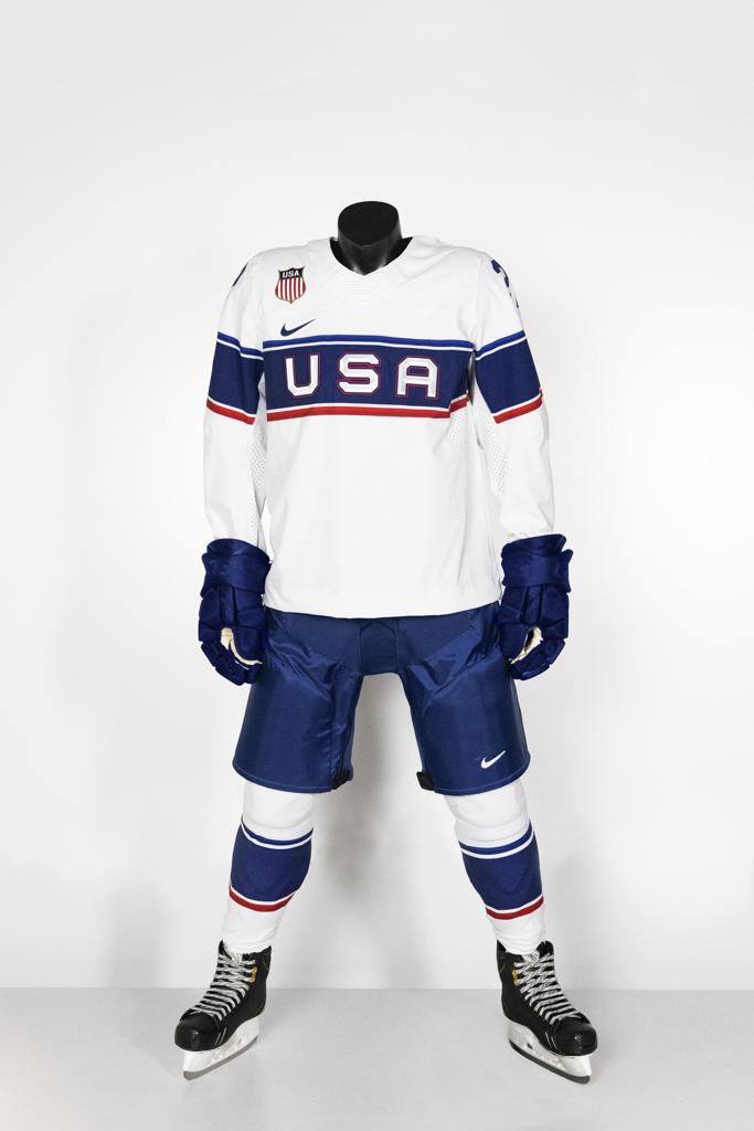
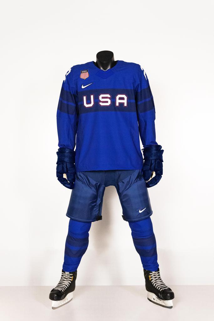
16 hours ago, colinturner95 said:
https://teamusa.usahockey.com/news_article/show/1195682
I don't hate these for Team USA. but the double blue is dumb IMO.
Canada's uniforms, again IMO, aren't complete dogwater. I think the red is honestly the worst of them.
I think this is the maddest I’ve been about a sports jersey in quite some time. Complete garbage. I wouldn’t use these as a dish rag. The absolutely insane crest placement above the swoosh would be the worst thing on most jerseys but is somehow one of the least offensive things about these. The US has great elements with the crest and our flag. Nike decides to gloss over any of these with a crap design on yet another crap hockey template. Nike is to hockey what Adidas is to college football. Both should be banned from those respective sports, especially since they actually make mostly quality uniforms for their flagship sports.-
1
-
-
Wow, KC really did downgrade from the placeholder crest. That’s almost impressive in its sadness.
-
6 hours ago, monkeypower said:
Blue Bombers wearing helmet decal designed by an Anishinaabe artist in tonight's game.
Both the Bombers and Elks are going to wear orange jerseys for the warmup and they'll be auctioned off after.
Winnipeg’s blue and Washington’s purple look incredibly similar. Someone’s in the wrong here and I suspect it’s the Huskies. -
I’m sad about the current inevitability of corporate ads on unis. I think at some point we as fans actually need to start boycotting the companies that pay for them. It’s the only way it’s gonna stop. The teams are too greedy.
-
1
-
-
If the Bucks win the title tomorrow are we going to be stuck with their Soviet Bloc font forever?
-
49 minutes ago, the admiral said:
burned cities to the ground
I didn’t know a couple blocks of Milwaukee qualified as “cities”-
6
-
-
Liverpool with a pretty awesome France change kit

-
1
-
-
______Hawks is starting to venture into the same overuse category as Wildcats or Color Names
-
2
-
-
I love WMU going to athletic gold over Vegas gold. But they need to keep the Bronco in a prominent role. A generic W is… generic.
-
3
-
-
I just wanted to take a moment to reminisce about Real Madrid’s so-bad-it’s-almost-good “stencil” font circa 2003:
-
Glad Puma could really bring the heat with these Puma x Costco collaborative sport shirts for the next Euro.
-
6
-
-
The Patriots’ current uniforms are almost perfect. They just need to go silver pants at home instead of monochrome:
But since they insist on COLOR RUSH
 , or maybe because Robert Kraft or someone in the organization has bad taste, they look incredibly dumb in their primary uniform.
So for now I will just sit back and enjoy the Patriots sucking at both football and aesthetics.
-
6
-
-
On 4/15/2021 at 6:40 AM, upperV03 said:
New primary (blue) and secondary (white) jerseys for the Reign:
So here’s my problem with the Reign branding: Olympique Lyonnais is not a strongly recognized brand in the US. “OL” is asking people to take it a step further and recognize an acronym for a brand that isn’t strongly recognized.
Perhaps a more significant issue is that the branding now has next to nothing to do with the region, other than “reign” being a soundalike with “rain”. And the fact that the Reign are an established franchise in the area. But this current branding feels like ownership could just pick it up and move it anywhere, anytime. Maybe they want to.
A better compromise in my mind would be to use “Olympique” since this is still the closest NWSL franchise to the Olympic mountains, regardless of whether they play in Tacoma or Seattle. Olympique Reign sounds kind of silly but at least reconciles the two brands better. Olympique Tacoma or Olympique Seattle could also work although I’m sure it would spark unnecessary debate over which city can lay a stronger claim to the team.
Meanwhile OL Reign will just get read as Ol’ Reign by many. I don’t know, it’s acceptable in the end, but it just irks me.
-
9
-
-
7 hours ago, kutztown said:
The NFL just released the proposed rule changes that the owners will be voting on. Looks like teams will be voting on expanding the position groups who can wear single digit numbers, but unfortunately there's no mention of the one helmet rule, so my guess is we're living another year without quality throwbacks for most clubs.
***DISCLAIMER: THIS IS NOT AN APRIL FOOLS JOKE***
I swear to God, if we never get to see Russ in the original Seahawks unis... (although based on the media hysteria he could be gone this offseason)-
2
-


:no_upscale()/cdn.vox-cdn.com/uploads/chorus_image/image/69128734/kitreveal21_51.0.jpg)
/cdn.vox-cdn.com/uploads/chorus_asset/file/22445178/OLR_Shop_2021_Jersey_Away4.png)
/cdn.vox-cdn.com/uploads/chorus_asset/file/22444467/kitreveal21_16.jpg)
/cdn.vox-cdn.com/uploads/chorus_asset/file/22444470/kitreveal21_24.jpg)
Washington Commanders to debut new NFL identity
in Sports Logo News
Posted
Monochrome
BFBS
No triple helmet stripe, for no reason and with no explanation
Garbage number font with stencil lines
Congratulations Washington!! You’ve been Nike’d.