


TenaciousG
-
Posts
883 -
Joined
-
Last visited
-
Days Won
1
Posts posted by TenaciousG
-
-
That’s the pinkest red I’ve ever seen in my life. It would be fine if the league hadn’t just added a pink team not that long ago. Then again it’s not like “city” is the height of originality either.
The ads have to stop. Completely out of control. I haven’t bought an MLS shirt in years with the poor replica quality and the ads. I’m trying to vote with my wallet but I suppose it’s hard to teach the league its lesson when they add a shiny new franchise every single year.
-
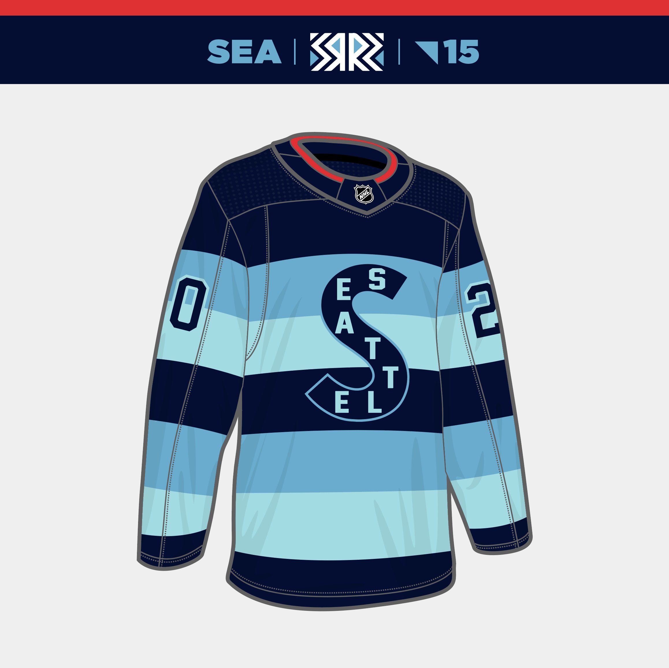
I must admit I was wrong. The Kraken RRs look good in person… like really good. The big fat block numbers balance out the stripe and while it should still be the anchor on the front I can live with the S. (Wondering if supply chain issues messed up any chance of getting a detailed anchor?)
Unfortunately Carson Soucy decided to ruin the night for everyone so that may be another L in the column for “look good, play good”.
-
 5
5
-
-
The Panthers need a custom number font. The uniform has so many curved elements including striping on the pants, jersey and helmet. Plain old block numbers look silly. The all-black set makes it even more noticeable.
-
3
-
 4
4
-
 1
1
-
-
The quasar is about the only good thing about LAG’s current branding. It’s honestly the one thing they should keep.
It will also be interesting to see what happens as I can’t imagine AEG will be thrilled with LAFC being the cool kids in town. They probably make a run at Ronaldo or another aging euro star.
-
19 hours ago, DCarp1231 said:
Boise StateDukeMemphisBYUSMU looks like crap
This is straight out of NCAA Football 08 create-a-team.
Meanwhile I can’t believe Boise saw those trash Nike NFL collars after the Reebok switchover and they’re like “man, we really need one of those”-
1
-
-
I don’t know what some of y’all are thinking because the Abbotsford Canucks green sweaters are a awesome. Although they should ditch the gray on the bottom.
In fact the Firebirds/A-Canucks game in Seattle was a visual delight. And the next Kraken game I went to was against the Penguins so I’ve been in hockey visual heaven for the past month.
-
1
-
-
On 10/31/2022 at 4:56 AM, spartacat_12 said:
I’m guessing they want to save the Metros jerseys for when they inevitably host a Winter Classic.
I think this is exactly it… but it’s lame. The Metros unis are dated with an unusual (but historic) color scheme and they are fine as a one-off throwback.
But these are gorgeous. The only thing I would change is a red “S”.-
4
-
-
36 minutes ago, DG_ThenNowForever said:
New Seattle alt:
This makes me like it even more. Watch out for your thatched roof cottageeeeeees-
2
-
-
Hot take potentially but the Sea Dragons logo is an upgrade! Not in terms of design but by being actually specific to our city AND no longer a blatant UAB ripoff.
-
2
-
-
WSU: What do you want?
Fans: Cougars script!!
WSU: Okay, Wazzu script it is!
Personally I still like it since we’ve been starved of secondary logos relative to other schools. (This is the first “new” thing in like 30 or so years???) But I’d still rather see the throwback WSC Cougar, and I’d REALLY rather see a uniform set with some actual life and detail rather than the plain sets they keep marching out
-
3
-
-
On 10/24/2022 at 1:18 PM, Sec19Row53 said:
Ken Ruettgers would like a word with you (10/31/94 at Chicago)
This would be a lifetime ban in Goodell’s NFL-
 1
1
-
-
5 hours ago, JohnnyCowboy5 said:
I don’t think it’s an overreaction here to nuke the TD headquarters off the face of the Earth for refusing to modify their shade of green-
1
-
-
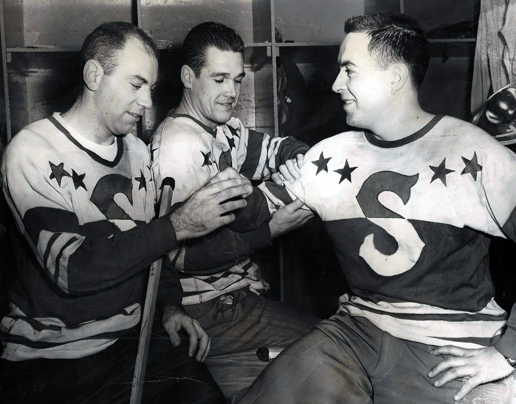
9 hours ago, Ridleylash said:
They did take on a specific team, though, because the jersey is very clearly based on the Seattle Ironmen of the PCHA;
Seattle has had so many short-lived minor league hockey teams I can’t fault anyone for forgetting an old one. Most people don’t know the original “Sea Hawks” were hockey. -
Ugh the Kraken RR is extremely disappointing.
-No anchor or alternate logo
-The dark blue stripe placement is awkward with the logo
-Block numbers when the font is one of the best things about our branding
-Not metropolitan-related even though people have started wearing Metros throwbacks here
-Not even accurate to the Ironmen
I’ll pass. Glad I caught the Adidas sale on the white jerseys although I had to get a size too big.
-
3
-
-
STOP CENTERING CRESTS IT LOOKS AWFUL

Meanwhile Nike just continues their run of producing hot garbage for football. The templates are bad, the designs are bad and their fixation on minimalism for several kits screams “why even try since the supply chain is broken”.
-
1
-
 1
1
-
 1
1
-
-
This a weird thing to get annoyed about but “C of Red (tiny font) lives here” is such a bizarre slogan. “C of Red” is really all you need, why is the “lives there” even necessary? Where else would it live? But another shout out to whatever marketing company decided five years ago to give like 60% of sports teams color-based slogans.
-
I still think the USMNT should go vertical stripes a la Atlético or Chivas. But anything would be an upgrade over the current uninspired trash.
-
1
-
-
No joke: this is one of my favorite college uniforms of all time. I loved the Titans font on UA. Block numbers are too thick, this font is just vertical enough.
-
4
-
-
Don’t forget everyone, TV market money is the only thing that matters. Literally no other factors define the success of a franchise or a sport.
-
1
-
-
I’m so grateful to have the Kraken in Seattle, but I also think it’s messed up we have an NHL team and Quebec City doesn’t. Hartford too (our home TV announcer even called the last Whalers game). The NHL’s lust for Southern US markets sucks and I think really is a driver behind waning nationwide interest.
-
3
-
 1
1
-
-
13 hours ago, IceCap said:
This is such a misguided take.
"Never look backwards" is the equivalent of limiting yourself. A team should consider everything. From the current look to the past to potential future designs. Everything should be on the table. Refusing to consider past identities, when they might be the best option, in the name of some self-limiting design ideology is dumb to me.This is disheartening. It's the end of hockey aesthetics. I'm a Leafs fan. I HATE the Habs.
But their uniform is THE class of the NHL. It's hockey's version of the Pinstripes.
And seeing this is just sad. I hate it.
Yep. Despicable. Our society has finally sold out. I won’t buy a sweater with an ad on it, ever. Screw the NHL for being this greedy. Can’t wait for people to defend it too. I may just check out of sports in general by the time they all start looking like Mexican soccer jerseys. I bet college football is next.-
2
-
 1
1
-
-
Credit where credit is due: Oregon looks phenomenal. The Duck uni fanboys will actually be correct today.
I had forgotten JMU went up to FBS. Good for them; semi-unrelated but I hope Idaho can return soon.
-
1
-
-
1 hour ago, 4_tattoos said:
Howard University sporting silver helmets again. This is after many alums complained when Howard went that route with their first set of Under Armour uniforms, because their archrival Hampton University has always worn silver helmets (Howard colors are officially navy blue, white and red). Howard and Hampton are no longer in the same conference, but how does this happen twice in a relatively short time period?
Somebody within the football program must really want it to be a silver/gray team in spite of historic tradition and rivalries. Even after switching back to white helmets, their second set of UA uniforms kept gray accents. None of Howard's other teams have worn silver/gray, with perhaps the exception of softball.
That helmet in the first picture may be the worst logo placement I’ve ever seen in my life.-
2
-
-
OF COURSE we’d make our return to the World Cup during a Nike downturn.
The Waldos deserved better.
And why do we have to be plain white for the primary kits?? What vaunted history are we protecting here???


MLS kits 2023
in Sports Logo News
Posted
Facts. We should have been allowed to rob Bright Verde from Austin lol.
In reality they just need to tweak it or maybe go a little more sea foam-y with it. Get that weird tinge out of it and find a color that plays better with our beautiful secondary colors.