


TenaciousG
-
Posts
883 -
Joined
-
Last visited
-
Days Won
1
Posts posted by TenaciousG
-
-
On 8/9/2022 at 6:48 AM, WSU151 said:
All of these are just awful except for the Sparky helmet. It's like they used a dartboard to pair the helmets and the jerseys/pants. By far the worst unis in the Pac12 (especially all the pitchfork helmets)

Even the mannequin jerseys are completely overstretched. Look at the dark gray one in particular. I know form follows function, but Adidas should at least pretend like they care about looks.
Someone should crunch the numbers on whether these Adidas leotards actually reduce holding on the uniform. Because if they don’t, they ara a complete waste.
-
Nike’s work comes in cycles and they are definitely in a down cycle now: minimalist, cheap looking design and crap templates in basketball and football. Meanwhile baseball is just a whole other can of worms right now.
But maybe they’ll be on the upswing by 2024. We can hope, right?
-
7 minutes ago, IceCap said:
Speak for yourself, America.
“I just need to find a way to put more teams in climates where it never snows” -Gary Bettman, probably-
 1
1
-
 2
2
-
 1
1
-
-
7 hours ago, JayMac said:
I think, at this point, there is no way we escape the summer without an action green Seahawks helmet...
Also, can't wait for that green Packers helmet.

Honestly, for a team with experience pushing the boundaries I don’t mind an action green helmet for the Hawks.BUT - never getting Russ in a Seahawks throwback is an absolute travesty.
-
1
-
-
Presented by Swift Meats
-
I thought the minimalist era was going to end someday but Nike just loves rolling out professional practice jerseys (Cleveland, Utah)
-
10 hours ago, MJWalker45 said:
Ohio State will wear their blackouts vs Wisconsin.
Nike should sublimate tattoos on the numbers in honor of Jim Tressel
-
1
-
1
-
-
2 hours ago, oldschoolvikings said:
I feel pretty confident in saying the worst is yet to come.
Hey now, Seahawks throwbacks should arrive soon! Although not this year for some probably supply chain related reason.But the Texans red is totally so they can do Color Rush even though that jumped the shark 3 years ago. Nike is so dumb. A white Texans helmet would look absolutely beautiful.
-
1
-
-
What are you doing, Texas?? The sleeve numbers are a key part of the uniform. Can’t imagine Vince Young pointing at the confetti without them.
-
2
-
-
I’m so excited for Washington. Our department of licensing is the worst - over the last several years, they
1. Got rid of the cool font (same one as Oregon) and replaced it with some boring Arial type font
2. Stop raised lettering 6 digit plates; for 7 digit illegible printed letters that can only be seen if you’re directly behind the other car
3. Forced people to change their plate numbers every few years unless you pay more in an obvious cash grab
And all this from the Evergreen State, which continues to not have a single speck of green on our plate. And it is a little easier to understand the DOL’s need to make people pay when we have massive infrastructure needs but live in a state that claims to be liberal but in reality is a tax haven for the ultra-wealthy.-
1
-
-
Patiently waiting here for a Kraken reverse retro…
-
1
-
-
This has to be the case of an owner demanding two colors and then nixing any good design ideas until Nike just said screw it and made practice jerseys
-
5
-
-
These were perfect.
i agree - why change so much? Even incorporating old identities no one was really attached to anyway. I suppose their comic sans owner is just greedy for bumps in merch sales?
-
6
-
 1
1
-
-
The super high decal on the (real life) white Georgia helmet looks like absolute trash.
-
MLS playing 5G chess with their new branding strategy of releasing a bad identity, which makes the fixed up average identity seem great two years later
-
6
-
-
1 hour ago, O.C.D said:
I wish the city connect uniforms were approached like "how do we design the coolest looking baseball uniforms" and not "how do we make these baseball uniforms a community art project"
I don't know why I had high hopes for the Rockies version. I should have known better
Amen. I feel like there’s a lot of cool things they could do with my Mariners but they’ll probably just blow it and make the whole design look like a giant 5 foot tall salmon or something.-
1
-
-
This new centered crest fad has gotta stop
-
Why couldn’t Akron just do this if they wanted a better subliminal “Z”?
Excuse my quick photoshop job.-
2
-
-
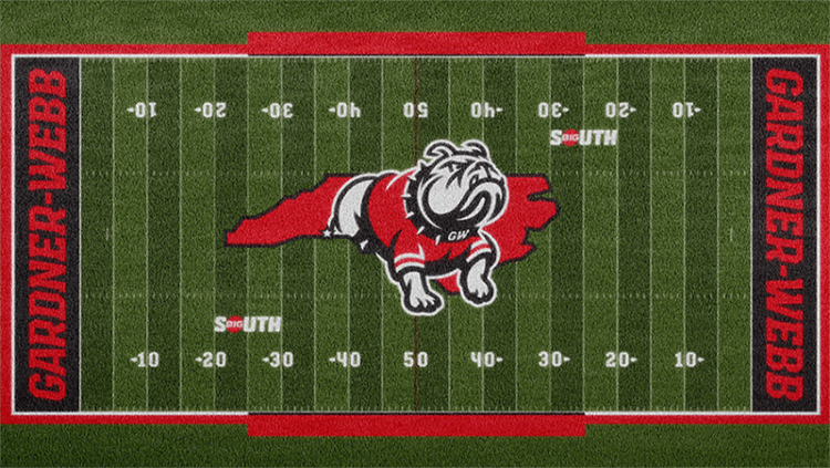
On 4/29/2022 at 5:32 AM, stumpygremlin said:
This rebrand is fantastic. I've got a couple of TINY nitpicks.
-
They should've designed left-facing marks as well. That way you could have the bulldog face forward on both sides of the football helmet. As it stands, I have a sinking feeling that they'll go asymmetrical (probably numbers on the left), and asymmetrical helmets need to die.
-
The territorial mark is not centered on the football field. Notice it goes from the 22 on the left to the 28 on the right. They should've centered it on the 25's.
Other than that, they really took the ball and... ran home with it.
Are they even allowed to cover the hashmarks like that? This is a marching band’s worst nightmare lol.As for Akron, one of the blandest rebrands I have ever seen. Is the “Z” in the A even a worthwhile design element if it’s asymmetric like that? Actually there’s two Zs if you go all the way down to the bottom of the A. Really the whole thing is dumb. The 2000s branding never needed to change. Use the Kangaroo if you want us to fear it.
-
They should've designed left-facing marks as well. That way you could have the bulldog face forward on both sides of the football helmet. As it stands, I have a sinking feeling that they'll go asymmetrical (probably numbers on the left), and asymmetrical helmets need to die.
-
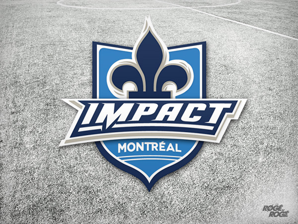
15 hours ago, MJWalker45 said:
Even just replacing the CF Montreal de Foot with Montreal Impact would improve the current logo, but I think they need to go old school with a new logo.
The one on the far left was their best ever logo and it sucked they didn't try something similar when they moved to MLS.
The fleur de lis is just such a wonderful element. The current logo is the cleanest, but boy did they botch the identity. MLS has to learn the league doesn’t have to Euro-copy any more. Respect the nostalgia and the soccer fans who have been around since the 60s/70s. You’d think they would have learned their lesson when the Cascadia clubs got off to such a successful start using their North American identities. Instead someone seems to have though “oh well we added FC and that’s why these great soccer cities are revitalized” rather than realizing what most cities want is just top tier competition.-
3
-
1
-
-
2 hours ago, pepis21 said:
How the hell this guy became a billionaire?
Buddy I got some bad news for you regarding most billionaires… they aren’t that smart. Smart, yes, but only a few are actual geniuses. Most are just money hoarders who got lucky and are beneficiaries of a system that lets their wealth grow exponentially. They aren’t actually 30,000 times more productive or irreplaceable than a janitor.These jerseys, if true, are some of the most offensive items Nike has ever produced. Detail-free, 1st grade level crap. And they’ll still short details on the replicas and ask for $100+
-
8
-
-
“Is there a way we can make a jersey an NFT?” -Some college marketing person somewhere
-
2
-
-
13 hours ago, EJ_Barlik said:
I used to work for this company:
Yeah, nobody at the company liked that logo. They changed it (eventually) to this:
My point is simply that the "split X" (or x as a negative space) has been done before. It's not going to be confused, in my opinion.
And even though I don't work for them anymore, I think the purple is WAY WAY better.
I like the first logo… WAY more unique and I’m a sucker for negative space. The wordmark is trash.They Axe body spray’d the second logo. I like it, but it’s forgettable.
-
2
-
-
12 hours ago, DDR said:
Rumored new logo.
Hyped for the new XFL body spray-
2
-
10
-


College Football 2022
in Sports Logo News
Posted
I cannot believe I actually like the new Miami BFBS.
Did they get permission from the heat to use that Miami script, or…?