


Discrim
-
Posts
10,844 -
Joined
-
Last visited
-
Days Won
2
Posts posted by Discrim
-
-
Ah, I was wondering why I hadn't heard Jack about him this year. Jerry can't be sure Odell can even play RN, so he grabs someone who's more likely to.
-
On 12/8/2022 at 10:47 PM, Cujo said:
Worse Josh McDaniels loss:
Losing to at home to ESPN's Jeff Saturday in his first ever game?
-or-
Losing to Baker Mayfield 48 hours after joining a 3-9 team?
Yes.
Josh McDaniels' only win in this situation: the fact that Mark Davis can't afford to fire him yet.
-
 2
2
-
-
18 hours ago, TrueYankee26 said:
I feel for Anton Hall Jr. who had the Game losing fumble at the 1 in the 2nd OT period.
Reminded me of Trent Steelman sobbing after the 2012 game...
-
1
-
-
5 hours ago, TrueYankee26 said:
First overtime in Army-Navy Game history.
And it was glorious.
-
Tonight's offerings need saddles
 first, the Colts...figured some Indy 500 inspiration was in order, so a less intense mint green than I'd used for the Saints and Packers in honor of the starting flag, and then a milky cream in honor of the bottle of milk the race winner traditionally drinks post-race.

Broncos...on top, pale sky blue, one of the few things higher than Denver
on the bottom, the cherry blossom pink tint inspired by Denver's Japanese American community.
-
1
-
-
6 hours ago, ManillaToad said:
The NFCS has a nice range of helmet colors, when the Aints aren't wearing their black alt
really, all of the NFC's divisions have a good range of colors when you think about it.
-
2
-
-
On 12/4/2022 at 5:13 PM, Red Comet said:
Last time the Washington franchise and the Giants tied:
Chiefs-Bengals game is as tight as I thought.
Ah man... haven't thought about that guy in a long time....for a minute dude looked like a rising star...and then the headbutt heard round the world happened.
-
Been meaning to get back to this, but life happens. Anyway, I give you three for the price of two
I've known what I wanted to do with the Cowboys since I conceived this idea...in this case, I went with giving their normal whites and throwbacks a tint alluding to the old metallic blue, and honestly, I easily could have done this but with the navy jersey or the double star jersey.
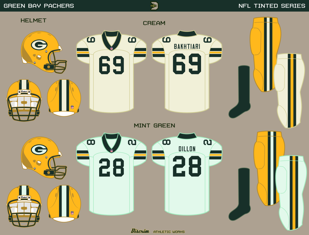
Two for one with the Packers...went with a cream version and a mint green version...took the cream from the Rebirth of a Legend patch, and I gotta say this manages to work well with gold. Then there's mint green, which is its own flavor, so to speak.
Packers #2...the same deal, but with matching helmets in case anyone's interested in that sort of thing. I debated mentally on whether I should make the G tinted, but give it a gold outline or what I ended up doing, making the G gold. I'm honestly not sure I made the right call there, but we'll see. The funny thing is this isn't even the first time I've done a cream Packers helmet.
-
3
-
-
2 hours ago, Sec19Row53 said:
Wah - I hate this. It sucks.
Me - then don't watch.
Or clean your fridge or something

-
1
-
-
On 11/28/2022 at 12:19 PM, NicDB said:
As much as I can understand the desire to get rid of the old name, they replaced it with something that basically amounts to "We're the Canadian schools that plays against the American schools.... go team!" Ugh......
That angle seems like it would make much more sense for a school from the Toronto area to do...but then this is college sports, nothing makes sense

-
17 hours ago, Dynasty said:
. Teams like Memphis would only have blue and white in their color scheme, but feel the need to saturate it with black, grey, or (God forbid) chrome. It gives them more uniform options.
Um, blue and gray are Memphis' actual colors.
-
5
-
-
Melvin Gordon signs practice squad contract with Chiefs
Should he appear in a game, all MG needs for the complete AFC West collection is a stint with the Raiders

-
I've been wanting to do something with Pitt's new panther for a while, so here goes Pitt.
The home and clash both use a V design, the home version using a vee yoke for Golden Triangle symbolism. The three stripes are taken from Pitt soccer's crest, representing the three rivers, these also are used as the shorts' striping. The third uniform is a footy version of Pitt's classic football jerseys, with shorts mimicking the football pants.
-
1
-
-
UAB:hiring Trent Dilfer
Me: wonders whether @FiddySicksas still not met anyone who bought into his own hype more than Dilfer.
-
1
-
-
22 hours ago, MNtwins3 said:
Also with the Eagles black helmets: I genuinely could not tell the difference from a distance since their normal helmets are so dark anyways
19 hours ago, BBTV said:Agreed. If you didn't tell me they were black, it would have taken me a while to pick up on it.
It's like I said after they were unveiled...this black helmet doesn't add anything to the Eagles' aesthetic. No attempt to differentiate from the green helmet in any way besides shell color, no attempt to include green in any way, just a weak helmet overall. Might as well not have bothered.
-
8
-
-
16 hours ago, stumpygremlin said:
Don't the Chicago Bears have the same issue?
Not quite...yes, the outlines are thick, but not to the extent that they look like the throwback Dolphins numbers. Interestingly, it appears the outlines weren't as thick in the early 60s...anyway, I give you young Mike Ditka in the 60s, Jay Hilgenberg and Wilber Marshall in the 80s and Roquan Smith a month ago.
-
2
-
-
Cue up the Tecmo Super Bowl injury music...this is either gonna be an early GG Eagles or Jordan Love pulls a Matt Flynn and pulls off the improbable comeback.
If only the Packers defense wasn't tackling like Notre Dame was last night.
-
As far as backup QB performances went, Trevor Siemian wasn't half bad, probably the best Bears backup day I've seen since Josh McCown. The Jets were just better though.
As far as tonight's going, Packers-Eagles is a lot closer than I figure many thought it'd be. Mostly bc Rodgers is looking like himself for the first time in a while.
-
Man that's lazy. Might as well have unveiled a cardboard cutout for all the care that wasn't put into this.
-
Go go Power Lawyers!
-
 4
4
-
-
So Colorado is tired of being tired has-beens, I see. Why else offer the job to Deion Sanders?
Honestly, as much as I like Jim Leonhard, the very idea of Deion at Wisconsin is a comedy that would write itself. He'd probably be able to get a QB, at least.
How bout them Beavers, eh? Pulling their best 92 Bills impression just now.
Edit: apparently Notre Dame has decided form tackling is lame. Sadly for them, badly whiffing is more lame.
-
On 11/23/2022 at 3:31 PM, Echo said:
The capes might be a mistake. They'll be much easier to tackle with them on.
*Puts on Edna Mode mask*
NO CAPES!
-
5
-
-
In the absence of a CFL thread... congratulations to the Argos

Somehow, friggin Swag Kelly now has more championships than his uncle.
-
 1
1
-
-
Once again, the Bears are a bout of poor execution away from victory...and on that last drive, poor play calling.
Since there's no CFL thread, it's Grey Cup night...go crazy Canada and Go Argos!


:format(webp)/cdn.vox-cdn.com/uploads/chorus_image/image/50863687/72376088.0.jpg)

:format(webp)/cdn.vox-cdn.com/uploads/chorus_image/image/71567052/1244361778.0.jpg)


Let's Fix Things That May or May Not Be Broken
in Sports In General
Posted
That one was the Rangers, but the point still stands