


Discrim
-
Posts
10,842 -
Joined
-
Last visited
-
Days Won
2
Posts posted by Discrim
-
-
Eagle Mustangs...hm. Guess something eagle related was judged to be too hokey or something.
-
So jaguars don't exist and everybody knows the famous Cowboy horseshoe. Got it, Titans fans

-
 6
6
-
-
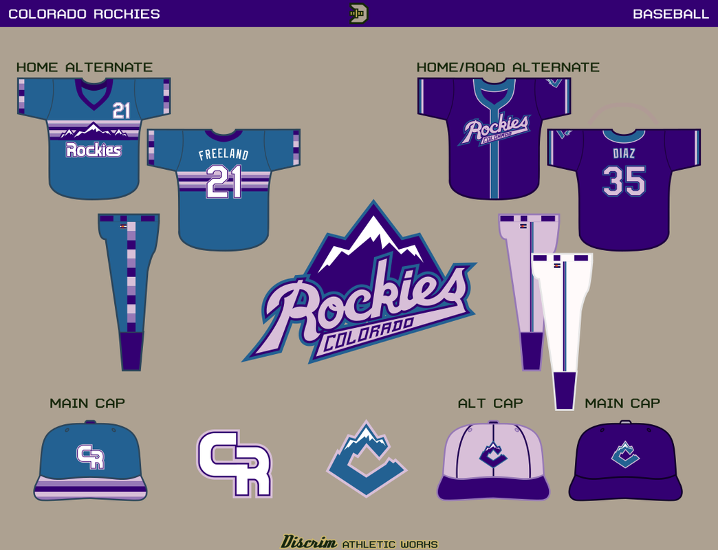
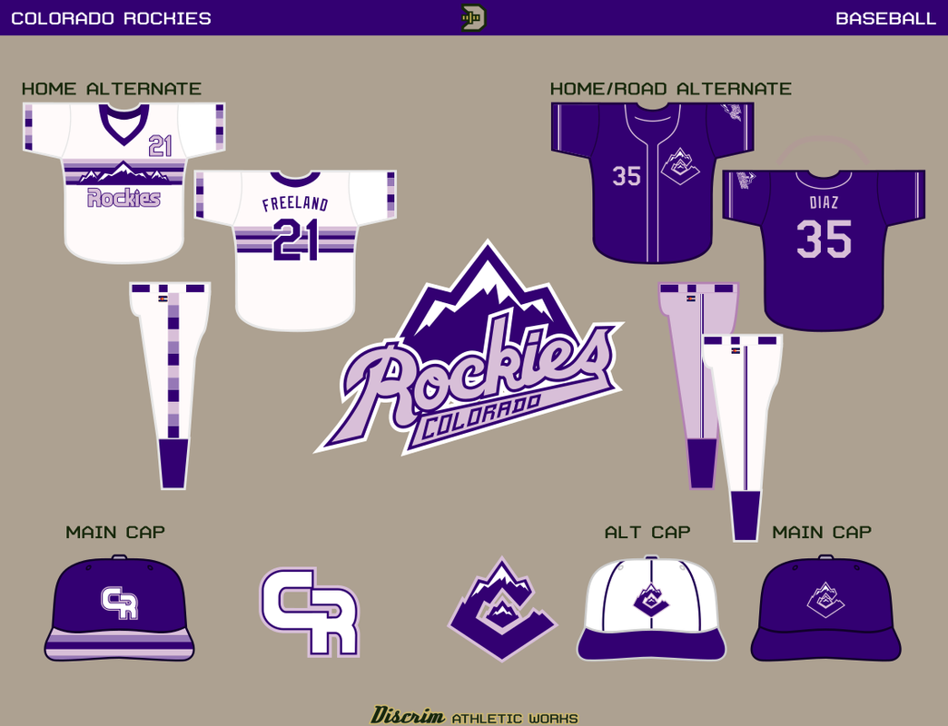
Tweaked the mountain C by removing the smaller mountain, and moving onto the variant scheme with Avs blue...I'll post alts later, the most obvious changes are to the caps, with the C now blue and the white cap replaced by one with a lavender crown, though I also used slightly different piping and added a blue outline to the scripts and numbers.

Going the quick and dirty route tonight, though I'm planning to change things up more next. Blue version of the Nuggets uniform and new purple jersey with blue placket here.
-
 1
1
-
-
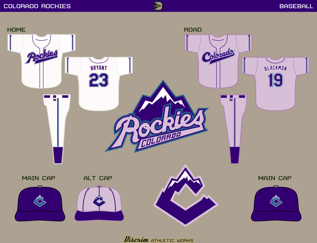
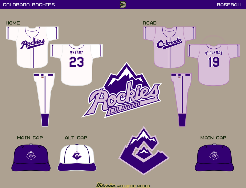
Purple/lavender...figured reinventing the wheel wasn't really in the cards here. Might be a bit tough to see, but figured I'd have a small mountain in the middle of each sleeve's piping. Do not adjust your monitor, yes folks, the roads are lavender. For the folks who didn't feel like looking through the older thread, the scripts were based on the 1960s Denver Bears, though it's less obvious on the road script, where the detached tail I went with here looked less awkward than the versions in the older thread with attached tails.
Figured I'd do something a bit different on the purple alt: the C on the left chest. Also removed the small mountains from the sleeve piping in favor of having the primary as a sleeve patch....and for those who didn't look at the older thread, Nuggets tribute! For those who did, I tweaked a few things: the mountain was altered a bit, cleaned up the script, and changed the collar and cuffs, as well as the pants stripes and cap logo, where I felt a CR would fit.
Figure I'll show the historic influences, so here ya go...and if anyone's wondering if I ever thought about something inspired by the "strike zone" uniform, I have indeed done a Rockies version of it. That went about as well as Josh Rosen's NFL career

-
1
-
1
-
-
On 5/7/2023 at 10:17 PM, Bomba Tomba said:
Honestly I'd probably stick to this scheme, lavender is both underused and underrated
My main conflict basically remains the same as it was a decade ago: I really like lavender as the secondary color...but I also really like light blue as the secondary. Probably gonna post in at least two or three color schemes, but I'm leading off with lavender.
On 5/8/2023 at 8:54 AM, coco1997 said:So far so good! It's interesting to see a traditional baseball script used for a Rockies concept. The alternate wordmark feels like a glimpse at how the Rockies might have looked as an expansion team in the '70s or '80s.
I think the cap logo could use a little tweaking, as something seems off about the inner mountain running into the opening of the "C." Honestly, I don't think you even need that smaller mountain in the logo.As far as the alternate wordmark, you definitely got the decades right
And as far as the cap logo, I might post a version without the smaller mountain. Making the whole thing read as a CO without making it too obvious/corny has been tricky (I didn't even really try for a CR...that was a corny, unbalanced mess in the sketching stage). Didn't want just the C, there are enough of those caps already, but then again this would be different enough from the other three.
And regarding the first one...cmon now.
 you've seen me make traditional scripts for the Blue Jays. With their split. This was nothing by comparison.
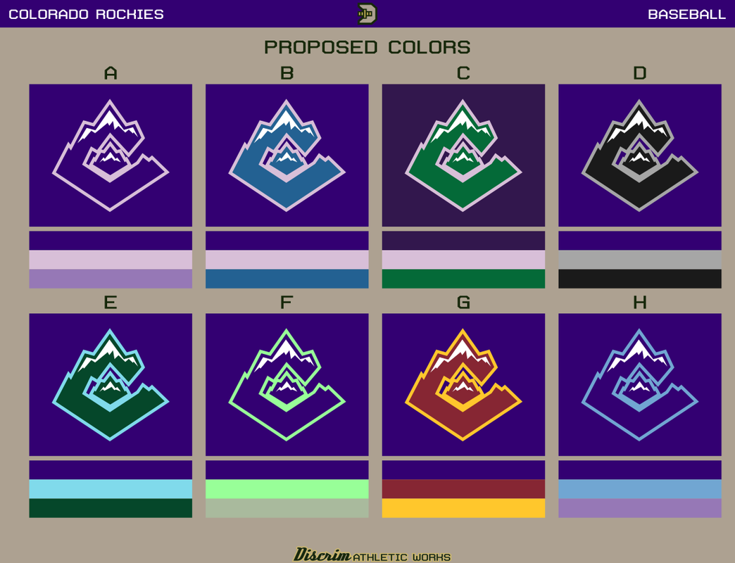
Anyway, I give you some color schemes I'm throwing out there, I'm probably not going to post uniforms for all of them, but then again I might. In order...
A- purple/lavender, the darker lavender will be used only on a certain alternate uniform
B- purple/lavender/Avalanche blue
C-purple/green/lavender
D-ol' reliable purple/black/silver
E-purple/green/light blue
F-purple/mint green, the grayish green would be used for the roads
G-purple/dark red/gold, the closest I figure I'd go to a flag-based look without either using blue or the flag C for obvious reasons
H-purple/light blue/lavender...in this case, light blue would be the secondary, lavender would be the road
Purple/Lavender uniforms after the jump
-
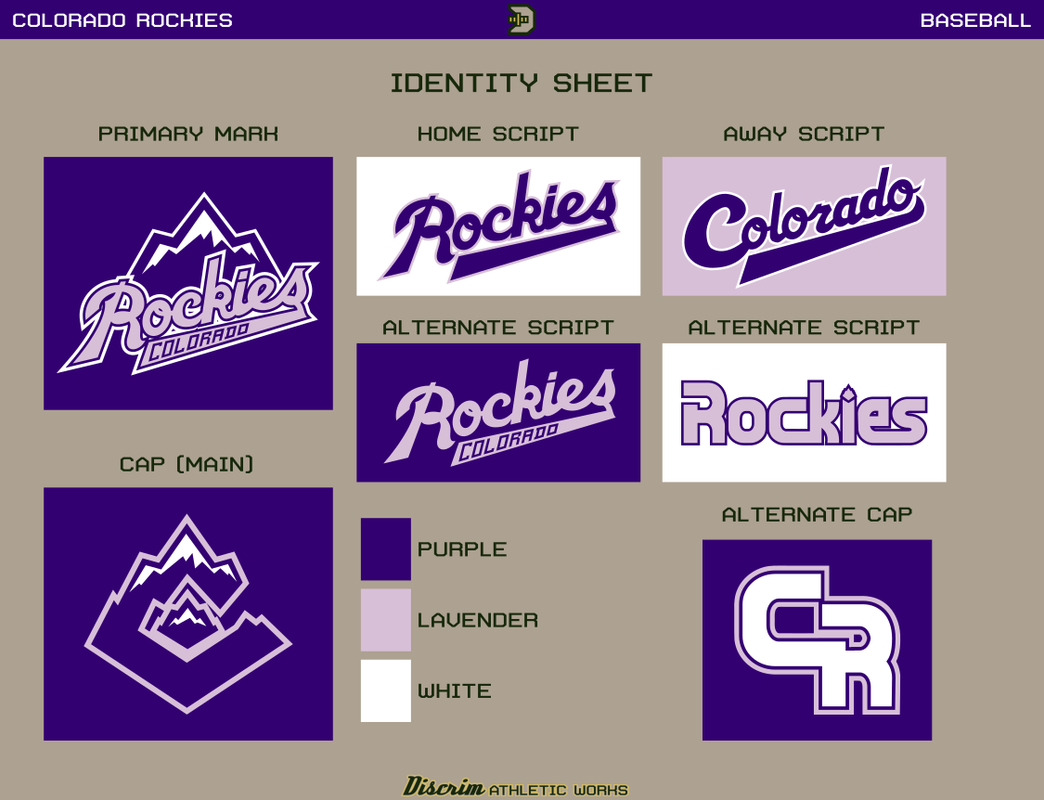
It's been a while, so I figured I'd revisit an oldie but goodie. I don't have the uniforms as down pat as I'd like yet, and there are a couple more color schemes I'd like to try out, but here's the ID sheet. Check out the old thread for reference...anyway, compared to 10 years ago, the scripts are admittedly only tweaked at most from what I did 10 years ago (though the tail of the Colorado script is now detached and starts in a curl, based on the 80s Denver Bears, mainly because the versions with an attached tail just looked too awkward to me), though I figured I'd take the baseball out of the mountain logo. I was dissatisfied with the C I'd used in the first version, so I introduce a mountain CO as the new cap logo.
In addition to the purple/lavender shown here, purple/sky blue, purple/blue/lavender, purple/green/lavender and purple/silver are all being considered. If all goes well, jerseys are coming within the week.
-
5
-
-
So the Frederick Team had it's first ever opening day. In related news, the Frederick Team also had it's final opening day.
-
 1
1
-
-
22 hours ago, colinturner95 said:
Equipment - Like Borah, the football team has been long known for their gold helmets, though Capital for a long time was doing gold helmets on offense and black on defense, which I'm not entirely sure how that was legal at all, but that probably is above my pay grade.
Odd...definitely very odd. What, did the guys who played both ways have two helmets? In any case, I strangely wonder if that coach played electric football, where having your offense in color and defense in white is common among serious players.
-
On 4/21/2023 at 9:26 AM, TenaciousG said:
- I still think the huge ARIZONA is big time amateur vibes but it probably looks even worse paired with the slim number one. Still it’s a
arena leaguecollege look and should be shrunk at least in half. I dunno, maybe I should just feel lucky they didn’t get real dumb and put BIRD GANG on the front.Fixed it for you...pet peeve of mine. Some teams wear ugly Zubaz unis in the early 90s and the whole league never lives it down even though there were many teams who wouldn't have looked out of place in the NFL.
About the "getting real dumb" part...granted, it's semipro, but a team in Chicago actually chose Birdgang for their name.
If the Cards wanted to look like Oklahoma, then congrats, they succeeded beyond their wildest expectations. Would rather they'd have used copper, or if they'd felt adventurous, turquoise instead of silver, but I'll take em no longer looking like complete crap.
-
4
-
-
Mine is the New York Cityhawks' secondary logo, which they used on the shoulders of their jerseys: a hawk spreading it's wings over NYC.
-
2
-
-
20 hours ago, Sodboy13 said:
If it interests you, Royal Retros has been doing quite a bit of 1983-85 USFL merch, and recently started making jerseys in the current league styling with the original logos I bought a Pittsburgh Maulers jersey because it was getting cleared out for $45, and the quality was good enough that I would consider buying one at or close to full price from them. Held up through the wash, too.
As for Memphis, between the white names on the yellow background, the yellow stripe on white pants, and the lack of shoulder/sleeve numbers, it has the feel of a project that got rushed through the night before it was due.
I've seen those, I've thought about pulling the trigger on a Showboats jersey as a Reggie White fan and because I have relatives in Memphis, though I'd be more likely to pull the trigger on something from the WLAF, CFL USA or Arena ball, given the original USFL was a bit before my time.
-
Unpopular opinion: if the Tigers didn't exist, the Rangers would have the makings of a good rebrand here.
-
9
-
-
7 hours ago, adsarebad said:
Still just a dark blue blob though.
Not just any dark blue blob, though...a dark blue blob that flips us off during the fall

-
1
-
-
On 4/14/2023 at 9:49 AM, WSU151 said:
They were painted on the inside? Why?
This thread from a few years back should be informative on that front... basically though, some of these helmets consisted of two shells, the inner shell got painted and decaled up, then they set the clear shell on top. (This might be completely wrong and the second method I mentioned might have been the only one)
Other models used a single clear shell and had decals applied from how we'd see as inside out, these being more similar to waterslide decals, then painted. Though some teams defeated the purpose by applying decals on the outer shell.
In both cases, the clear outer got roughed up but the paint job and decals were protected from damage. Didn't see the damaged decals or chipped paint that you see today. Not sure if that was the intent or a happy byproduct, but they lasted from basically the dawn of plastic shells to the 80s.
-
5
-
-
So lime green then.
-
3
-
 2
2
-
-
^I wanna say "please tell me that wasn't varsity," but that was varsity, wasn't it? Only because I know this is occasionally on display at state up here. Normally though, the kids in the mismatching jerseys are 5th-6th stringers who aren't sniffing the field past warmups.
-
Wait, this is real?

-
On 4/3/2023 at 5:24 PM, the admiral said:
I think number-sized abbreviations -- PC, HC, BC, 1B, 3B -- could be a relatively elegant solution to the Yankees' number troubles. You can mock up pretty much all those out of varsity block numbers, with only an M or FM for "[Field] Manager" proving tricky (and a standalone "M" looking pretty dopey in my imagination). I think some teams have already done it with BB for Bat Boy. As for "quality assurance" coaches and other guys who hang around a dugout without picking up a bat or glove, I dunno, maybe they go numberless, but the true on-field personnel among coaches could come up with something.
I remember a bench coach on the Cubs used to do this back in the early 2000s (I forget his name but remember he was Latino and was also the only one doing it). Dude wore BC rather than a number, though IIRC he later switched to 80 after MLB disallowed him from wearing letters.
-
On 4/2/2023 at 10:56 AM, the admiral said:
Tank becoming famous.
I must've been sleeping under a rock around that time...still wondering how the heck that happened.
-
5 hours ago, Digby said:
Can't think of something more quintessentially Celtics in this era than losing to the Wizards' bench but beating a full-strength Bucks by 40 (shoulda been 50) in a 3-day span.
Granted, this was the back end of a back to back for the Bucks and they'd just got done playing a Pacers team that likes to imitate the 80s Nuggets.
-
Saturdays, there's often a hockey game on in the break room...and I thought "man, seems like these games always involve either the Bruins or Penguins."
Cue skating penguin at center ice...and when I was close enough to get a good look...the spoked B on the top portion of the scorebug.
-
That's on par with the time a Wisconsin politician compared UW getting taken to the woodshed by Miami to Pearl Harbor

Anybody watching this Bucks-Pacers game...crazy pace they've been at, like they're both roleplaying as the 80s Nuggets...Bucks are already past 100, Pacers will pass 100 in a second, Giannis already has a triple double, Jrue just hit 40 points. Holy crap...it was close until this run the Bucks have been on. Wouldn't be shocked if the losing team ends with 120 or more.
-
2
-
-
The old one...without the Cougars text, I don't think I'd be able to figure out what it was supposed to be. The new one is much more apparent...but runs into the problem of looking like every other cougar logo ever.
Conundrums...

-
1
-
-
I remember in my middle school days, I could buy what were basically fancier versions of the ol' paper football with NFL logos. They actually did perform pretty well IMO, but my usual opponent had no interest in them...in any event, color me surprised when I came across XFL versions. I forget whether they were sold in their own package or if I got them with the lone pack of XFL cards I bought, but I have a Las Vegas Outlaws ball and a San Francisco Demons ball.


College baseball 2023
in Sports Logo News
Posted
So I tuned into BTN for a minute and learned that these things exist...
We are who we are, I guess.