

Lights Out
-
Posts
15,364 -
Joined
-
Last visited
-
Days Won
22
Posts posted by Lights Out
-
-
http://www.theglobea...article4525357/
Jamison, who could not be reached for comment, has been trying to buy the Coyotes for more than a year. It's understood that one stumbling block has been his inability to find financial backers, which could be resolved with Ice Edge.I can see the headlines now.... "Man with No Money Backed by Group with No Money to Buy Team with No Money"
-
So, yeah.... if you're wondering why the NHL is considered a third-rate joke in the American sporting landscape, wonder no more.
-
So in addition to a Big Ten with 12 teams and a Big XII with 10 teams, we have two schools with teams in the Big East and Big West.
You can thank the BCS and the ridiculous poll system for this crap - everyone's trying to climb up the ladder now hoping for one of the limited spots in the favored superconferences, in order to ever have a chance at a national title or at least a decent bowl invite. It sucks, but this crap is going to keep happening until it all gets figured out.
-
In the most idiotic move they could possibly make, Idaho is going independent for football.
It's this or drop to the Big Sky, so who could really blame them for wanting to give independence a try first.
Considering how horribly independence went for Utah State, and the general :censored:tiness of the Kibbie Dome, they probably would be better off going to the Big Sky.
-
In the most idiotic move they could possibly make, Idaho is going independent for football.
-
Why the hell would Penn State leave the Big Ten for the MAC anyway?
They wouldn't leave voluntarily.... but when the Sandusky scandal inevitably gets even deeper throughout this season, who says the Big Ten will want to keep them around?
-

lol jayson werth

The resemblance is uncanny.
-
Wow, that's crazy - same thing with the Victorino card I posted above. (Victorino was drafted by the Dodgers in '99 and stayed in their minor league system until the Padres claimed him in the Rule 5 Draft in '02.)
-
-
The Rockets' classic uniforms looked better like this...

-
He'd never even consider contracting the Coyotes because that would mean admitting he was wrong.
It wouldn't be the first time. He already let the Thrashers move.
In order to keep his Coyotes in Glendale.
-
He'd never even consider contracting the Coyotes because that would mean admitting he was wrong.
-
Could the numbers from this era look any cheaper? The Champion number font has to be one of the worst ever.
Segueing nicely into an unpopular opinion of mine: I like the Champion number font. It's legible and classic without looking too "blocky".
-
Why the heck would Buffalo want to play with all those big boys?
The last three times Buffalo has played a top 25 team in basketball they have kept it within 8 points. The football team isn't that bad, well now they are, but they were beasts in '08. I can see them possibly moving to the Big Ten in about ten years or so. And I'm pretty sure that they would rather play Ohio State in basketball/football rather than Eastern Michigan
Yes, I totally see the Big Ten saying "screw consistent success and relevance, let Buffalo in because they were beasts in '08" ten years from now. Solid logic.
-
I forgot about the shamrock logo though, that one is a good look, and I personally would like to see that, or something similar to that become their become their primary logo.
Uh, no. The Celtics logo is a classic, it doesn't need replacing.
Oh please. It's a poorly rendered, childish cartoon. The shamrock logo is a classy, iconic representation of the team name.
-
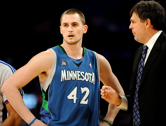
Not sure how unpopular this is, but these unis are perfect. IMO these were the best unis in the NBA in the early '00s.


I think these were better:
-
Ugh... hell no. They're bland and generic. The general plainness projects an image of ripping it all down to the floorboards because LeBron left.
Best Cavs uniforms ever:
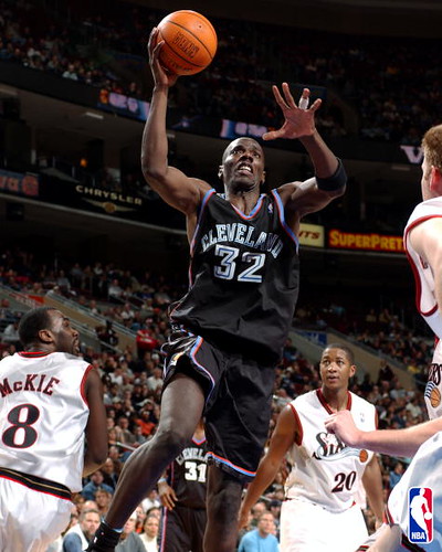

The idea that the on-court results sully the aesthetic value applies here too, unfortunately.
-

Greatest Hawks uniform of all time. I don't understand why anyone would want to bring back the McDonalds color scheme or the outdated Dominique era jerseys (Face it the tilted numbers/team name sucks.
Love the design, hate the bland, cliche color scheme. Those uniforms would look sharp in red, black, and yellow.

-
Greatest Hawks uniform of all time. I don't understand why anyone would want to bring back the McDonalds color scheme or the outdated Dominique era jerseys (Face it the tilted numbers/team name sucks.
People want to bring it back because 1) It was currently unique in the NBA, and 2) It's what the Hawks had historically worn. Teams shouldn't just change their colors for the hell of it after wearing them for the past 30-40 years. Also, they went to the most overdone color combos in pro sports. Oh, and colors aside, everything about the current uniforms and logos is really bad.
Agreed on almost everything... but the uniform design is great. It would just be better in red, yellow, and black.
-
With the Devils, they're in a good market, the team just spent too much. The Coyotes are in a bad (hockey) market and don't have the money to squander away, so they're screwing the city of Glendale into doing it for them. Devils stay, Coyotes go.
It's the NHL. We're not talking about a competent league here.
-
Watch the Devils get moved to Quebec as hastily as possible.
-
How on Earth have the owners not revolted against this idiot Bettman yet? He's only hurting their possible revenue streams with bull
 like the Coyotes saga, which is preventing the NHL from being viewed as a serious sport.
 -
Nah, they could just wear the purple or black/silver sweaters in Nashville.
-
I know that the Kings purple and gold color combination is highly popular among a certain amount of fans and they want it to be used full time. But with the Kings Stanley Cup win, I guess the "Gretzky era" silver and black will from here on out be associated with winning. Silver and black are now their official championship colors.
Will that affect anyone's opinion on purple and gold?
Maybe this could work as a compromise, with the current black jerseys serving as their "Stanley Cup/Fauxback" alternates:


 like the Coyotes saga, which is preventing the NHL from being viewed as a serious sport.
Name That Font!
in General Design
Posted
Looks to be Journal Sans Bold.