

Lights Out
-
Posts
15,364 -
Joined
-
Last visited
-
Days Won
22
Posts posted by Lights Out
-
-
I liked the current Broncos uniforms when they came out, but I'm sick of them now, especially since a ton of college football teams started wearing that same template. Hopefully the tweaks that Nike is allegedly going to make will freshen up the look.
-
My intentions were good.
FWIW, I got it immediately... and for the record, even I don't like those hideous Sabres uniforms. The only Sabres set that remotely appeals to me is the Buffaslug set, but that logo is so bad. If they updated the classic Sabres logo (and by that I mean something more sophisticated than just slapping silver outlines on everything), those would have been fantastic modern sweaters.
-
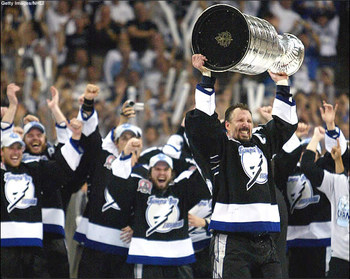
What's the deal with the victory stripes anyway? They wore them before they won the Cup.
The idea is that you raise your arms in victory after a win or goal and show off your glorious armpits of triumph. One of the dumbest uniform idiosyncrasies around.
Yes, it's a silly idea, but it's their silly idea, and has WAY more tradition for the Lightning than their new ripoff of other teams' traditional looks.
As for the Hawks... I'm in the middle. Like the uniform design, hate the cliche, derivative color scheme. Recolor those uniforms in red/yellow/black and they're perfect.
-
Exactly. It's not BFBS because black was always a primary team color until this uniform set/identity.
-
But I still love the new Lightning uniforms. They're beautiful. I don't see what not to like.
If they were an Original Six team, they'd be okay (but still unspectacular). What drags the uniform down for people, including myself, is that a non-traditional franchise in Tampa Bay is playing Original Six Dress-up and borrowing heavily from the Maple Leafs and Red Wings to do so. Not to mention, in their rush to force in elements of a tradition they don't have, they eliminated the one defining aesthetic tradition they did have - the victory stripes.
-
I think the Chicago Bears have some of the most dull and boring uniform sets in all of sports.
Agreed. I can see why people believe they shouldn't be messed with, but I personally think it looks dated and boring.
I also agree. The navy jerseys are way too dark and dreary-looking. I think the Bears should make their orange jersey the primary home look.
-
Those uniforms were okay. These were better:

-
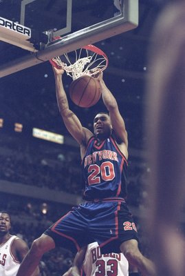
I liked the '90s Knicks uniforms with the wide side panels.
-
Those silver Mavs jerseys looked so cool on the court... they almost looked chromed out.

BTW, that Mavericks wordmark needs to go on their home jerseys.
-
Agreed. I also loved these:


What can I say? I'm a sucker for the '90s aesthetic.
-
as long as counterfeits exist and I find a decent one I like, I have no problem getting one.
Just a fake jersey that represents my interest in sports and teams and color. I dont need it to be exact in every way. And paying $300 for a football jersey is legal, unlike the knockoffs.
Fixed that for you.
-
SAN DIEGO State in the Big EAST... Sure.
Don't blame the schools, blame the BCS. Boise State, et al. would like to not get screwed over every year come bowl season.
In the Big East, you can lose three games and back in to a BCS bowl bid. Plus, the money is better and so is the television exposure. The Mtn. Network is a huge joke that hardly anyone gets.
-
This was the best Warriors uniform set and color scheme:

-
That's Albertus.
-
I also liked aspects of the old look, but the overreliance on black and gray ruined it. I think if there was more blue in the uniforms, blue caps, and blue alternate jerseys, people wouldn't have hated it so much.
-
The handwringing over the Big East picking up these non-AQ's just cracks me up. Firstly, after years and years of the SOS argument and cries of "join a REAL conference", it's very telling that many big conference fans are now complaining because those schools are going AQ. What, did they expect those schools to not jump at the chance to put that lame argument to rest?
Second of all, even the Big East comes with a lot more money and access than a non-AQ conference. You don't have to be absolutely perfect and still hope for other teams to drop games they shouldn't just to make the Fiesta or Sugar. You don't have to slum it on CBS College Sports, the MTN, West Bumblecrap Cable Access, and other boondock channels nobody gets. You can finally think about upgrading your small stadiums and less-than-stellar facilities. Moving to the Big East provides a real growth opportunity to these mid-majors, and crapping on that in the name of tradition is so myopic.
-
They're still going to have more money and more TV exposure than any mid-major conference, which still makes them a better option for Boise, Houston, SMU, etc. even in that scenario.
-
Not sure we would get the two BEST teams with a playoff system
Yes we would. It's simple - if you keep beating everyone in your way and make it to the title game, you are one of the top two teams in the country that year.
-
Why? At that point, there's really no point to the BCS. And once again, I'd like to point out that without a playoff system, we'll never know if the top two teams are really the two best teams.
-
To go with the Brewers talk on the last page, here's an unpopular opinion:
I actually prefer their current scheme to the old blue and athletic gold. And I like their uniforms and logos, generally. They look better now than they ever have in their history, I'd say.
You're the guy!
Oh, you already knew that I'm that guy. Current scheme = terrific.
Germanic unis > all other Brewers unis.

-
Sifting through the homer-eroticism in this post
What can I say? It ain't a rivalry without some liberties taken.
 Boise didn't exactly have much more of a fanbase
What they did have was more of a potential fanbase. In 1990 (the last count taken at the time), Boise had 125,738 people, while Moscow had 18,398. That's a lot more TV sets in Boise State's market, and that's not even counting the greater Boise metropolitan area (population of 295,851 in 1990). Is that a huge market? No, but certainly far bigger than what Idaho had to work with. Of course, BSU has maximized that and much more by now.
or prestige than Idaho when they came to D1-AThat's debatable. Idaho made the 1-AA playoffs two more times than Boise did, but Boise won a national title at that level in 1980 and made another title game in '94, losing to Jim Tressell and Youngstown State. (This isn't even counting BSU's 1958 NJCAA national title.) I'd say the championship would give BSU the advantage in prestige, but then again, I'm biased.
 Athletes who can play at the FBS certianly don't want to spend 4-5 years playing the game they love in what could easily double as a livestock hall.
Or if your program isn't winning. Boise's facilities aren't exactly world-class, but recruits still want to go there because BSU has built up cachet and created a winning tradition. Idaho hasn't, so they can't really convince a 3-star recruit who has both BSU and UI on their list to come to Moscow over Boise.
it sure seems like Idaho belongs in the Big Sky where they can play the likes of Idaho State and the Montana schools.Exactly. And they can compete from Day 1 in the Big Sky. The fans can finally enjoy winning on a regular basis and having a program that they can be proud of.
-
Don't look now, but Eastern Michigan is actually one win away from being bowl eligible for the first time since 1987. It looks like Ron English is turning that program around.
Isn't that what we said about Robb Akey and Idaho just a couple years ago?
I wasn't saying that a couple years ago, but then again, I hate dislike now no longer care about the Vandals.
-
On the field, Idaho was better than Boise head-to-head (although, BSU was no slouch in 1-AA, they won a national title and appeared in another title game). But BSU already had a larger market and a larger stadium, and they were called crazy at the time for trying to move up. You can imagine what the chances of Idaho, in tiny Moscow with their 16,000-seat stadium, moving up on their own would have been - slim to none.
-
Don't look now, but Eastern Michigan is actually one win away from being bowl eligible for the first time since 1987. It looks like Ron English is turning that program around.

Unpopular Opinions
in Sports Logo General Discussion
Posted
The Giants should have never changed from this road jersey: