


henburg
-
Posts
1,053 -
Joined
-
Last visited
-
Days Won
2
Posts posted by henburg
-
-
The City Connects definitely are starting to feel a bit formulaic with the continual emphasis on dark monochrome and/or angular fonts, which are two design choices that I generally enjoy in baseball when not being oversaturated with them. That said, I saw this picture online of the new Guardians jerseys and it looks much more striking in person than their reveal photos-
The racing stripe with art deco detailing is a really great feature that I would love to see them incorporate into their regular uniforms.
-
 10
10
-
 2
2
-
 1
1
-
-
14 hours ago, Silver_Star said:
This guy has the most favorite uniform designs I can ever imagine

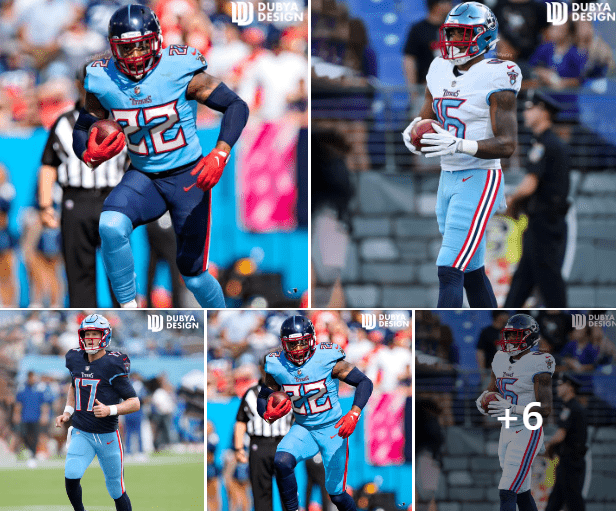
I think these really get the color balance right for what I would like a new Titans uniform to look like, good find.
-
4
-
1
-
-
3 hours ago, rfraser85 said:
Michael Vick's number was 7, and the 7 and 1 don't look alike in the Falcons' current font.
This is such an awful number set, I think easily the worst in the league now. The rest of the Falcons current uniform set is fine but these numbers are what's really dragging them down.
-
5
-
-
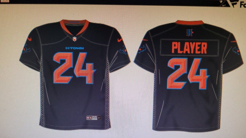
The great irony surrounding this Titans-Texans situation is that when the Texans incorporate the "H-Town Blue" into their color scheme, they end up looking a lot more like the Titans than the Oilers. It completes this weird cycle of teams feeling like their identity is being infringed on by somebody else.
Amy Adams Strunk defending her family's IP from organizations brazenly trying to steal it is not equivalent to throwing a fit either. I don't think that the University of Houston literally just trying to appropriate a uniform that has nothing to do with them shouldn't be viewed as some great moment of justice either, but rather a bush league move for a mid level program trying to create impressions online.
It's like Warren said, create your own identity, and I honestly think that the new Texans uniforms do a pretty decent job of that outside of the H-Town Blue costumes.
-
4
-
-
19 hours ago, nuordr said:
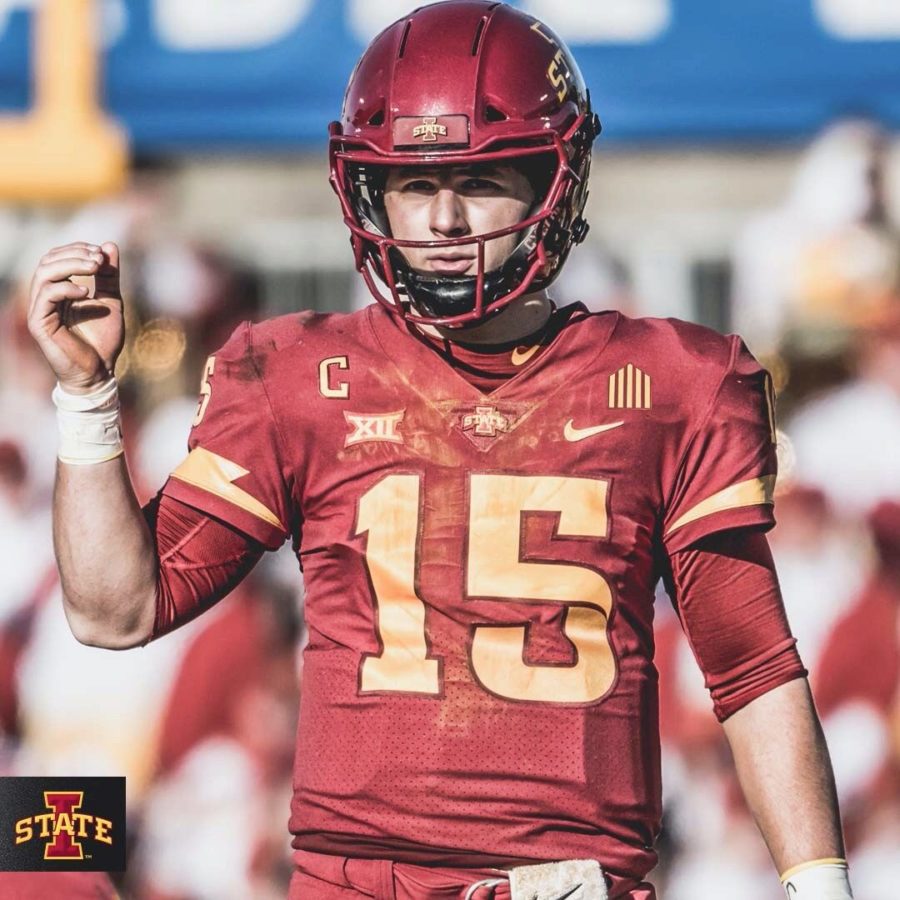
New uniforms for the Iowa State Cyclones:
I don't think that every college has the iconic throwback look that they think they do, and this new set could be a prime example of that to me. I'm sure some Iowa State alums may disagree, but this set in general feels like a huge downgrade, like a high school catalog version of the old set which had a lot of interesting design features. The number font in particular is scrunched inward improperly and the emphasis on white striping on the home jerseys just feels wrong.
This set with gold pants and maybe red and white options for the road only would be a pretty much perfect look for them. Put the Cyclone cardinal on the helmet and it's even better, but this new one takes steps backwards in almost every direction for the sake of harkening back to some nostalgia that feels unwarranted as an outsider.
13 hours ago, Dynasty said:Iowa State is an improvement IMO. The previous set didn't have any white on the home red jerseys, which looked weird with the white helmets and pants combo. This update corrects that issue by providing more color cohesion.
I think the shoulder stripes are my favorite addition. They really make the jersey pop, even more so on the away whites.
My question would be why wear this combo at all? Are they eager to seperate themselves from USC by any means necessary, or is this some kind of classic ISU combo? It looks worse than pretty much any other option they would have at home if you asked me.
-
6
-
1
-
-
Outlaws isn't bad but it does feel sort of out of place for such a goody two-shoes community like Salt Lake City lol
16 minutes ago, tigerslionspistonshabs said:Agreed fully. That's kind of why I believe that Jazz actually works well. It's a nice alliteration and if you think beyond the 'UTAH ISN'T KNOWN FOR JAZZ!!!!!!!!!!" sentiment, I feel it almost describes more of the flowing, upbeat movement of the game of basketball.
I feel Stingers could work (although it would sound waaaaay better with Salt Lake/City in front of it). Rattlers (there are 6 species of venomous rattlesnakes in Utah), Sidewinders (also a venomous snake native to Utah) I feel could hold some weight.
Rattlers and Sidewinders aren't bad suggestions, but I can't see them picking something like that. I could also imagine something more like Swarm or Hive if they tap into the Beehive State imagery at all.
That said, I increasingly feel like Smith may lean toward Fury. It's simple, abstract enough for multiple mascot ideas that Doubleday and Cartwright can play with, and keeps a sort of short synergy with the Jazz name which I think is something that will be important to him.
-
This striping is awful, such a huge downgrade. The only team that has pulled this style off is the originator, the Seahawks, and watching the Saints and now Broncos try to emulate it is sad. Its placement really reminds me of a rat tail too.
The Broncos logo is also so perfect for the navy shell and trying to shoehorn it onto a white shell for no reason is baffling to me.
-
3
-
 2
2
-
-
The jerseys themselves are nice but I think I hate the pants. The helmets are both slight downgrades by the looks of them too.
-
2
-
-
5 minutes ago, Cujo said:
You answered your own question.
The other 3 are good looking uniforms though, that's my point, and yet a lot of people are talking about them like they dropped another Buccaneers 2014 set on us.
They're gonna look like this most of the time.
-
1
-
-
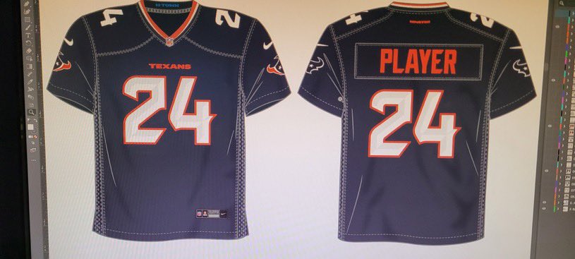
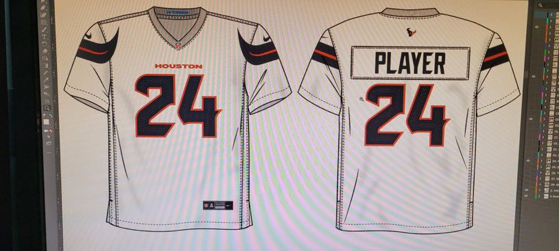
7 hours ago, Cujo said:
Houston Texans leak ??
What is supposedly so bad about the Texans uniforms? If anything, these leaks tell me that these are waaaay more restrained than I ever imagined them being based on the initial descriptions we were given. Barring any surprises from the pants and helmets paired with these sets (which the leak of the away would seem to confirm there won't be) then these are a perfectly fine update that emulates the original set a lot more than I was expecting them to.
Now the The H-Town blue set on the other hand looks just as lame and desperate as you could imagine for a uniform with that concept behind it, for which I am thankful as a Titans fan.
-
5
-
2
-
-
Venom with a Snake or Scorpion themed identity and a purple-based color scheme could work well.
Blizzard is just a bit too similar to Avalanche for me as @FinsUp1214 said.
In general, I don't know if I've heard a nickname that I've totally fallen in love with and I think that a lot of that is due to the fact that it's hard to pair "Utah" with a nickname that compliments it well. Alliteration is basically impossible and some of the more organic options like Yellowjackets infringe too much on existing team names.
-
Listening to Elliotte Friedman's podcast, he says offhand in a confident tone that the team will go by "Utah _____" rather than "Salt Lake City _____" with their new nickname, which makes sense in aligning with the Jazz. Not a huge bombshell but felt like it was worth mentioning.
-
Is there any chance we see a sort of "Washington Football Team" situation next year in Utah if this all goes through? Seems like a very rapid turnaround to rebrand the team, which sounds like a necessity due to some deals with Muruelo/Arizona, and Smith will probably want to get this right considering how the last rebrand he oversaw was received by fans.
I could really see them rolling with something like what the PWHL has this year before committing to an identity full time.
-
16 minutes ago, Brave-Bird 08 said:
I think it's fair that people tracking this thread specifically, and uniform trends in general, are more negative than "usual."
I really appreciated Paul Lukas' interviews he posted with that former Nike creative, but it showcased to me a dynamic between the parties that be when these uniform projects are undergone that has potential to be worse now than ever -- there's too many cooks in the kitchen and events that can happen during these processes where poor opinion/input/perception can take over.
Call me crazy -- or cynical -- but I just feel like that in the past uniform designs always felt polished, thoughtful, congruent and in the past few decades we've instead slipped into this meta where not only is quality control down, but companies are cheapening internal processes (when they think they're streamlining them) and folks who aren't qualified to make decisions are unfortunately in the position of power to make them (could go on a tangent about this in every industry, not just sports design).
Did you see the quote in that interview about either Malcolm Glazer, or one of his children, where they used one of those notorious bad "Nike NFL" photoshops from circa 2012 and was like "why can't you do this?" And the Nike team basically had to be like, "well s---, we have to execute on their orders. These are going to suck!"
That's how we got the Buccaneers, Titans, Jaguars, Browns, Jets, Falcons, etc.
Add to the mix that the trend of wearing monochrome head-to-toe is becoming universal across the league because of brainless trend-following that has been perpetuated by this TikTok, social media clout-chasing era we live in, and it's more likely we keep seeing more of the same poor uniform elements versus actually getting something that is both interesting and looks good.
Between the chorus of rejected uniform designs and downgrades in the NFL, the dilution of the meaning of a uniform in the NBA, and the absolute hilarity happening in MLB right now, what reason do any of us have to anticipate anything but more of the same in the next few weeks?
The "too many cooks in the kitchen" bit is particularly on target in my opinion. Everything is heavily focus-grouped or run up and down the hierarchy of an organization multiple times before we ever get to see it. This Broncos redesign in particular has apparently been through a years long design process where many rounds of fan input were taken. Even the Texans new uniforms sound like they're aiming to please everybody through using a unique design philosophy for each uniform. Now do good designs still come out of these processes sometimes? I believe so, but it's more difficult and we're less likely to see truly interesting ideas come out at the end.
-
7
-
1
-
-
26 minutes ago, Clintau24 said:
The South Carolina uniform is their "Cocky" uniform based on the mascot.
Appreciate you providing the context, I suppose that makes sense although it still doesn't really feel right for South Carolina to me.
-
4
-
-
2 hours ago, LEWJ said:
South Carolina Women just won wearing these:
Is this a championship game thing? Seems a lot of people are bewildered by the choice but mainly because Iowa is known for similar color gold (and black).edit: technically it is the color of the gamecock’s beak and legs, I’d think

For real though, these colors were distracting to me while watching the game. Would love to see if anybody has insight as to why this color balance even exists for them
-
1
-
-
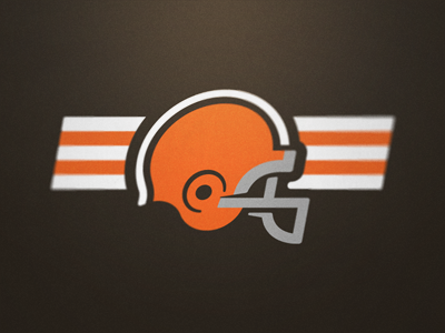
It's crazy that the Browns have managed to make themselves relevant in uniform discussion for yet another offseason haha
The idea that they're simply going to update their current stock illustration helmet facemask color rather than seizing the opportunity to simply adopt a proper logo is insane to me, but I suppose it's also consistent with their recent history. It doesn't really even matter to me if it's a dog, an elf, or simply just a stylized helmet like many talented designers have rendered over the years-
(by Fraser Davidson)
(by Matthew Harvey)
(by Michael Irwin)
Just pick something and quit the act that not having a proper logo is a cool tradition instead of just a remnant of years of dysfunctional management.
-
1
-
-
15 hours ago, aawagner011 said:
Couple more looks at FSU’s turquoise. This looks like a lock to happen this year.
This just looks so bad to me, the colors don't complement each other whatsoever. They look like the non-contact practice jerseys that QBs wear-
6
-
1
-
-
1 hour ago, coborjobs2010 said:
LMAO the owner of the Texans just posted this on Reddit.
https://www.reddit.com/r/Texans/comments/1bi1nii/leaked_pic_how_about_a_real_photo_of_nico_and/
...and there's a wonky numeral. Not the worst I've seen, but that 3 could certainly be improved a lot. However, the pant stripe looks great and provides that much needed pop of red to the mix.
I do really respect the move to be flexible and share an official image after recognizing that the leak was making the rounds. I've said this before, but as much as I love leaks for the sake of discussion here, they're such a hype killer and awful for shaping the public perception of new designs. The way it looks on real athletes in professional lighting versus the video model wearing an oversized jersey in a cellphone pic is just a night and day difference. Kudos to the Texans for getting ahead of it.
-
3
-
-
30 minutes ago, coborjobs2010 said:
Honestly, this looks fine. Will need to see the jersey striping better and the likely stripe-less pants will be a donwgrade, but the number font looks pretty cool and it still really resembles the current well-liked road uniform.
That said, I could also easily see this being the most tame of the upcoming set. There are supposed to be 4 unique designs, right? This would likely check the "Toro" look off the list.
-
2
-
-
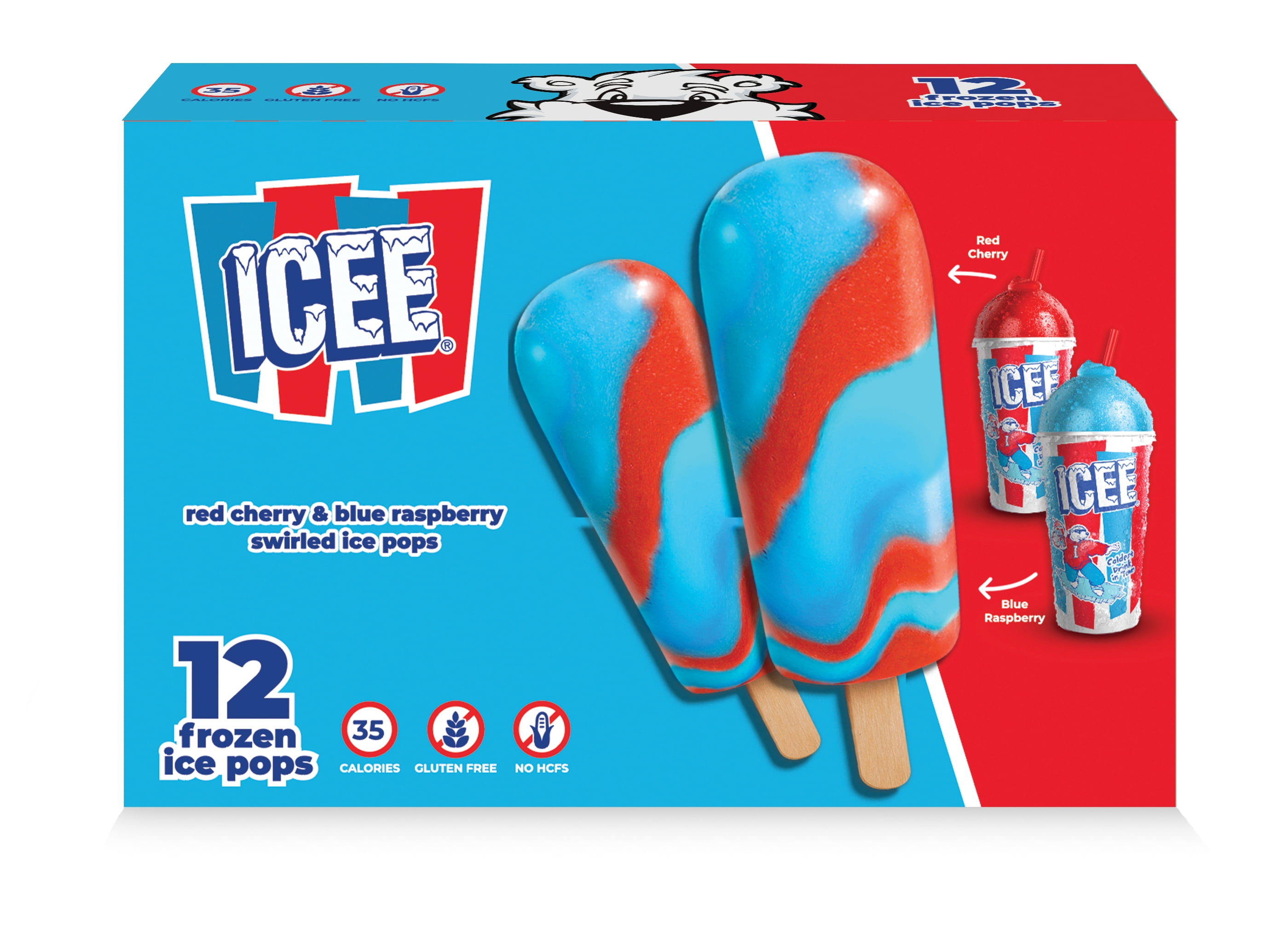
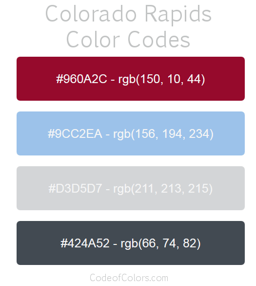
The current Colorado Avalanche look just makes me think of an ICEE, especially when the red and blue flavors start to bleed together.
Would it be too derivative to do something like the Colorado Rapids and change the current denim blue to a sky blue? Would provide much better contrast at least.
-
1
-
 1
1
-
-
The Flames finally have it pretty much perfect with their current set. The classics are right for the main look while the Blasty alternate is a prefect switch up that scratches any itch I have to see the black incorporated with the red and yellow again. It doesn't hurt that the Blasty alternates are some of my favorite jerseys in the NHL.
13 hours ago, ruttep said:
Don't get me wrong, this is a really nice, well-balanced set visually, but it always irks me from a logic perspective. The "C" is obviously on fire, so it shouldn't be colored as though it is burnt charcoal or something like it is here.
That's me overthinking of course, but it still crosses my mind everytime I see this Flames look.
-
3
-
1
-
-
I like the current logo, but I really enjoy this concept done by Twitter user @lolwtferic that emphasizes the proportions of a Clipper ship in a more traditional way. Well, it's great except for trying to cram the "LA" into the top sail at least.
-
7
-
1
-
-
I would be interested to see what this could have looked like with all of the red replaced with orange. I get why they wouldn't go that route, but would've been a singular color scheme for them and I could envision it looking super sharp
-
1
-


/cdn.vox-cdn.com/uploads/chorus_image/image/71405637/1243312732.0.jpg)
:no_upscale()/cdn.vox-cdn.com/uploads/chorus_asset/file/25428962/Cardinal_Uniform.png)


 Would it be too derivative to do something like the Colorado Rapids and change the current denim blue to a sky blue? Would provide much better contrast at least.


24-25 NBA changes
in Sports Logo News
Posted
100% agree, and I actually find the Mavericks emo horse logo and uniforms with piping to be more dated and offensive than what OKC sports now. It's mind boggling to me that they still insist on wearing them and completely missed the boat on creating an updated image for the Luka or even the Kyrie era of the team.