


fouhy12
-
Posts
2,341 -
Joined
-
Last visited
-
Days Won
11
Posts posted by fouhy12
-
-
-
 4
4
-
 1
1
-
 1
1
-
-
So the Jets went the entire lifespan of these uniforms without wearing the main one against one of their division rivals, the Patriots. Went white at home against NE twice, blackout twice, and green/green/green/white once.

-
3
-
-
This doesn't match up with the other leak at all. And this one seems more reputable IMO.
-
1
-
-
21 hours ago, Weapon X said:
I hope I never actually start an NFL redesign series because a lot of my ideal looks for these teams look nearly identical to what you've posted.
The only CC I can think of that aren't just minor creative differences are:
Eagles
- Don't care for having the collars be colored while the cuffs aren't. Should be one or the other imo.
- Number font still isn't working for me. It maybe could be with just an outline instead of the drop shadow but the grey and white lose themselves within each other. (like the black, charcoal, and grey do for the birds rn)
Seahawks
- that green has to be more of an accent color with how dominant it is. (A shade closer to their throwback green would be nice but that probably wouldnt mesh well with the blue you have)
Jets
- the traditional stripes on the pants and socks clash with the sharp stripes on the shoulders a little.
Ravens
- would prefer TV numbers with some design on the sleeve caps. (could be a small sublimated pattern or just the B or the crest/sheild logo they use)
Lions
- maybe would see where white could fit on the home look (other than the numbers) if possible. Have no idea where it would come from though and it already looks great, so not a big deal.
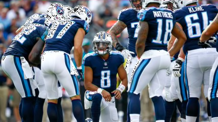
Titans
- While the original look is 10x nicer than what they have now, I wouldnt consider it a great one. Would love to see what a unique take from you could look like. If you're going to go with this one thought, somehting on the sleeve cap would be nice. Maybe a one color wordmark too?
Overall, even if none of it is too ambitous, it looks great and is presented cleanly!
Figured I'd go through these one by one:
Eagles - fair critiques, just a difference of styles. I prefer to just have the collars colored with this color scheme, and I've always liked this current Eagles font. I do hear you on the grey and white losing themselves in one another, I can come back around when I make tweaks and see if I can clean that up.
Seahawks - I like the splash of neon green, but I see where it could be too much for some. I can look at toning that down a bit by using it more as an accent color.
Jets - this is the concept I like the least in here. very tough to blend the modern and the traditional with the Jets. may come back and re-do this entire thing at some point.
Ravens - I wanted to go simple here, with the number font and color scheme carrying the day. I also think the Maryland flag gets a bit overdone, and adding a logo just to add a logo doesn't do much. If I think of a design I like, I'll add it. Otherwise, this one is going to stay the same for me.
Lions - went through the same dilemma when making this. I think it looks good anyway, so I'm not going to try to shoehorn in white if it doesn't need to be there.
Titans - Similar to the Ravens, I was trying to let the color blocking and larger design carry this one and stick to simplicity. I could definitely add a wordmark on the front, but I do get worried that adding more to the shoulder design would actually take away from it. I'll mull that over, but the shoulder yoke like that is quintessential Titans to me, so I was always going to build around that.
Thank you for the feedback!
21 hours ago, WideRight said:These are all really solid. I like what you did with Seattle particularly. I am still not sold on silver being the secondary color for the Cardinals, but that is not on you. Absolutely wish the Titans would go back to something closer to their original uniforms. Now, the question, will you get rid of or keep Carolina's weird helmet swooshes. To me they are one of the weirdest and most dated elements of any current uni.
Thank you! I have a feeling Carolina is going to come later in my list, mostly because that's one team where I have a ton of different ideas I like a lot and I need time to narrow it down. But I can assure you, those helmet swooshes will be gone (just like they are for my Ravens and Titans concepts).
12 hours ago, Bomba Tomba said:Seeing the Ravens and Lions in those bangers makes it hurt even more that they didn't advance
Here's what that would have looked like for you.
-
2
-
 1
1
-
-
-
11 hours ago, gregor630 said:
I find it interesting how the grounds crew essentially demo'd field artwork on the ground level turf before doing the real thing on the roll-in grass tray that will actually be used for the game. It makes me wish they were using the raiders block yard numbers for the game instead of the standard schoolbook font.
I'm guessing they're just doing the turf field on the inside as well so they have a stand-in field for all the media stuff that goes on at the stadium before the game this week. It looks better than a blank field, and they clearly have the resources to paint two fields.
13 hours ago, gregor630 said:I've never understood that either. I know it's your accent color in uniforms, but it's no where in your current logo and that yellow specifically isn't terribly flattering as a field color either (much less a full end zone color). But for the sake of offsetting the niners end zone like it was for LIV, it feels like they've just kinda...stuck with it. I thought the red end zone would've played well with the Eagles last year, to really bookend the field with the SBLVII logo design colors between.
I think we've seen every team that uses yellow that's made the Super Bowl use it as their endzone color at least once. Kansas City has in every Super Bowl, and Minnesota, Green Bay, Washington, Pittsburgh, and both current LA teams. You also have teams like the Giants (red), Falcons (red), Patriots (red), Saints (gold), Dolphins (orange), Bears (orange), Eagles (grey), Titans (Columbia blue), and Broncos (navy blue) that all used secondary colors in the endzone at points. The Chiefs using a secondary color is not at all abnormal, especially given the tradition angle for them.
Sometimes it's just nice to see your team's colors against an accented background.
-
1 hour ago, BBTV said:
Missed the fact that they eschewed the Patriots helmet logo since it would be redundant since it's part of their wordmark.
Looks odd in contrast - maybe they could have used some alt mark there, or doubled-up and not worried about it?
I also wonder if there's an "official" version of the wordmark that doesn't have Elvis on it, in which case that's what they should have gone with.
That was the first year of that Patriots wordmark, and they didn't use a logoless version at the time. They used the one with just text starting in Super Bowl LI two years later. It looks horrendous uncentered.
-
2
-
-
On 1/19/2024 at 9:24 PM, Brave-Bird 08 said:
If this is true, the NFL teams that have quickly moved on from a Nike-lead redesign are:
- Buccaneers
- Jaguars
- Browns
- Lions
- Jets (rumored)
- Titans (rumored, badly needed)
And my guess is the Falcons explore this for next offseason, while the Commanders under new ownership without question probably will).
If you're Nike, how are you not seen as an objective failure at this point? Everything you're cooking in the kitchen is getting sent back.
The fact that Nike keeps making jerseys just good enough for people to buy but continuously bad enough that people will demand a new set and then buy another one is why they're successful. I'm 100% sure what they do drives up jersey sales, which is everyone's definition of success here except for us.
-
5
-
As long as the Titans stuck to these combos, I thought the old set was mostly fine.
-
31
-
2
-
-
1 hour ago, DisneyNole said:
Not for nothing, but the Rose Bowl always has the designated home team's end zone painted on the "left" from a TV perspective and away team "left" side. Not sure if the NFL does something similar when assigning the end zones.
The NFL had the home team on the left from 1972 with Miami and Washington all the way through 2009 with the Saints and Colts. It was then home team on the right through 2016 with the Pats and Falcons. It has been AFC on the left, NFC on the right ever since then, until this year it seems. This returns to home team on the right for at least a game.
-
2
-
-
The Super Bowl patch itself does look tremendous. This latest generation of Super Bowl logos may be the best yet, in my opinion. You get a nice mix of regional flair with standardization, and they look phenomenal on jerseys.
-
7
-
-
It's harder to see, but you'll also have NFL shield vs NFL 100 logo on the collar as well.
-
6
-
-
2 hours ago, pitt6pack said:
Since the sod gets completely replaced for Super Bowl fields on grass, I'm assuming we will see the standard Century Schoolbook Bold, as the NFL likes to be consistent with the fields from year to year. I'd be a little surprised if we saw the Raiders block numbers, but I don't think it would be completely out of the question.
From what I can tell, they've kept the Raiders number font when they've replaced the grass with turf for other events. Feels like it's a 50/50 thing to me. We'll find out very soon!
-
Popping on to add my Championship Weekend concepts. My Ravens concept is already upthread, and I'll add the other three teams that played this weekend here. The Chiefs, Lions, and 49ers all have a good base for their uniforms already, so you won't see drastic changes here.
For the Chiefs, my goal was simple: make the stripes consistent. When worn correctly, the Chiefs currently have one of the best sets in the NFL. My only gripe is having differing stripe patterns on the sleeves, pants, and socks. I cleaned that up in this concept.
Paired with my Ravens concepts, here's how the AFC Championship would look.
Now, let's move to the NFC. I'll start with the visiting Lions. Their current set has strong components to it, but the double grey, logos in the stripes, number font, and insistence on wearing bad combos all detract from the overall picture. This concept takes the idea of the current uniforms and mixes it with more traditional Lions aesthetics. Also, we're bringing back the shiny silver pants.
Their hosts, the San Francisco 49ers, just about nailed their uniforms with the saloon font wordmark on the front and the three stripes on the sleeves. I added those stripes back to the socks, introduced a wider pants stripe, and returned the gold pants to a shiny finish.
My NFC Championship:
And, as a bonus, here's what the Super Bowl would look like:
-
6
-
-
Which number font do we think they'll be using?
-
I just kind of assume the NFL has been fining these guys and they wear the socks the way they want anyway. The league doesn't usually make these kinds of fines public, right? Tyreek Hill said they were fining him all the time.
-
1 hour ago, fouhy12 said:
Looks like we're headed for this.
I jinxed it.
-
 3
3
-
 1
1
-
 1
1
-
-
41 minutes ago, VDizzle12 said:
Have to disagree. Watching the Browns go brown over white and white over white for like 10 games sounds so incredibly boring. That's one team whose primary home and road sets are the most bland out of all their options.
The 3 alternate jersey/helmet games are honestly enough for me.
I wouldn't make it 10 games, I'd just say that whatever the primary combinations are must be worn like 4 times each. The Browns could go white over orange as their primary with two white over white and two white over brown games or something like that. That's plenty of variety, but with a clear hierarchy.
It could also change from season to season, that's fine with me.
-
3
-
-
The Lions and Chiefs both have patches on their right chest where the Super Bowl patch typically goes, so we're looking at two non-traditional patch placements in all likelihood.
-
Looks like we're headed for this.
-
3
-
 1
1
-
1
-
1
-
-
So best case scenario is a redo of LIV.
-
8
-
-
I would definitely be in favor of each team having to declare primary home and road uniforms, complete with pants and socks, and the league setting minimums on how often those uniforms must be worn. Those would also be the uniforms teams would wear in the playoffs.
I have no issue with rotating pairs of pants or switching things up, but part of a brand is establishing your color blocking.
-
9
-
2
-
-
I shouldn't like Baltimore's yoga pants, but, for some reason, they've always been an exception to me. I think this game looks tremendous all around. The darkness of Baltimore's looks against the bright red and yellow works really well and played outdoors on a grass field in gloomy weather just sets the tone perfectly for playoff football.
-
12
-
-
Baltimore's 2012 Super Bowl run came with the black pants as well. If they win it all this year, I'm guessing these just become the playoff pants full time.
-
2
-


MLB 2024 Uniform/Logo Changes
in Sports Logo News
Posted