Est1980
-
Posts
180 -
Joined
-
Last visited
Everything posted by Est1980
-
Would like to see that logo without the circle, larger and with the the badge itself outlined in white.
-
100%. That change alone is a full point upgrade.
-
So they're going with long sanitary sock look huh? Man, these would be half a grade better they just fixed the socks. Other than that, so far so good, especially Birmingham. Pittsburgh went away from their original gray but it doesn't look bad. I agree with @gosioux76 though, they should have gone with that secondary logo on the sleeve.
-

Washington Commanders to debut new NFL identity
Est1980 replied to DCarp1231's topic in Sports Logo News
They probably noticed the error of their ways when they used the year the SB was played instead of the year the season started. -
Washington Commanders to debut new NFL identity
Est1980 replied to DCarp1231's topic in Sports Logo News
Creating a fight-song in modern times? Good luck with that. Fight songs that still exist (PHI, CHI, MIA, etc) have been been "grandfathered" into the fabric of those teams through time, shielded from ridicule by the armor of tradition. 'HTTR' was one of those fight songs (RIP). I think it's easier to adopt a song like the Bills have with "Shout" or something that isn't hokey-ra-ra, otherwise you'll end up with some cringy fight song like Real Salt Lake. -
Shaking it up! I think gold needs to be in there somewhere. Granted, I was never a fan of their shield anyway but this is a welcome modernization that would probably piss their fans of . Btw that "R" looks like the Rhymesayer's logo R.
-
Would much rather have this minimal-style Stallion silhouette than the new "thick-border-syndrome" logo. Not that the latter is a bad one but it has that style of horse that feels like it's been used a million times before. Maybe if the streaking horse of the current iteration was more like the Baltimore CFLers (Stallions) streaking style with no shadows, I'd like it a little more. Shout out to SMU & Calgary Stampeders for arguably the best silhouette- style horse logo in the game
-
Decent candidates: All members of this year's CONCACAF League (2nd to last edition): https://www.concacaf.com/en/concacaf-league/schedule-results/ Interested to see one of these get the 'treatment': * CD Guastatoya (GUA) * Communicaciones (GUA) * CD Plaza Amador (PAN)
-
If only the Bills used those socks with today's edition of that style of uniform. I'd take blue stripes (opposite of sleeve stripes) but the red quarter works as well.
-
Great work, Sir! CONCACAF (Central American and Caribbean region specifically) has more than a few club teams that could use your treatment. Since you're doing most of Europe, have you seen FC Sheriff Tiraspol from Moldova? Sheesh. With the money they'd be making in this year's UEFA Champion's League appearance (currently 1st in Group D, wth!) , they should be able to afford a badge refresh.
-
I thought that at first since a couple might still be controversial for some reason (Warriors/Sentinels?) BUT I think they mean that no one's seen the final 3 yet.
-
It's gotta go with the the fight song, no? "Hail to the ____ _____ ! ...." ? Otherwise, it's another cool fight song down the drain. (RIP SD Chargers fight song).
-
Ha! Aww, I was hoping for an actual rendering of the actual logo with a T but I can picture it. Tennessee could claim the "T" is for both "Tennessee" and "Titans" which in my world is the exception to the rule.
-
The Bills could easily match these but even if they did, they'd never look like this good. Days of socks looking that clean and balanced are pretty much gone.
-
I actually like really like the "boat" and "warrior" logos but always thought letters in logos should represent the city and not the nickname, especially if the symbol reppin' the nickname is already there. Wonder how both logos would look like with a "T" instead of an "A".
-
Ahh the mid '90s. Birth of the "thick-dark-borders" on logos.
-
I've always felt that the Giants should revisit THAT logo and uniform which they only used once in '75. Of course I always welcome the TB's orangecicles. No problem with the Randall era Eagles set but would love to see Jaworski era threads that uses no black.
-
Sports Graphics Packages, Historically
Est1980 replied to billman29's topic in Sports Logo General Discussion
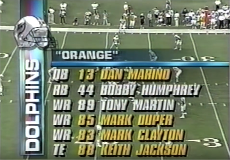
Marino injured his achilles in week 6 @ Cleveland. Steve DeBerg started this game @ Dallas (week 13). Sucha nightmare season . Remember it like it was yesterday. -
Sports Graphics Packages, Historically
Est1980 replied to billman29's topic in Sports Logo General Discussion
Actually, MLS does have their own proprietary package. You can see it on MLS Live (channel/website/media) or in FIFA '18. They're one of the few leagues that have their signature package in the game. -
Sports Graphics Packages, Historically
Est1980 replied to billman29's topic in Sports Logo General Discussion
oh, I love this thread. For me, NFL on NBC (1990-1994). The font, the helmets, line-ups, game-updates/breaks...my favorite. Really enjoyed how things like the line-ups were subtle and were adjusted based on a certain formation. I think I prefer the minimal stuff than today's photo or live clip of a players torso on a stat line or line-up.