


coco1997
-
Posts
4,843 -
Joined
-
Last visited
-
Days Won
14
Posts posted by coco1997
-
-
This has been a great series and I'm just getting caught up on it now. A few comments & suggestions:
- For Boston, I'd use just the shamrock logo on the caps instead of the full roundel.
- I love the switch to the "Bats" name for Brooklyn.
- For both the Pacers and Lakers, I'd recolor the baseball in the cap logo white, so it pops better against the gold of the cap.
- Maybe a white front paneled cap for the Grizzlies road alt?
Keep up the awesome work!
-
 2
2
-
-
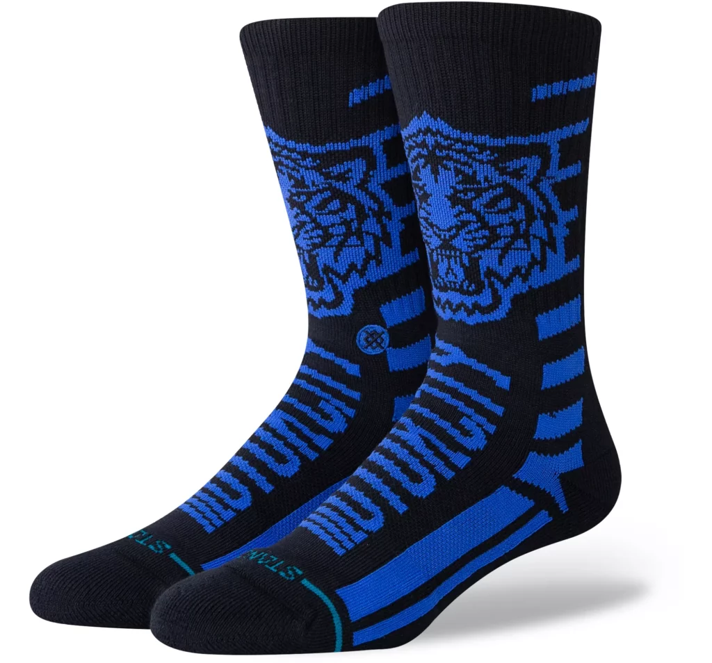
Tigers City Connect socks leak:
Detroit Tigers City Connect Socks Appear Online (uni-watch.com)

Looks like it'll be a very dark navy and royal blue with "Motor City" across the front.
-
1
-
-
1 hour ago, Silent Wind of Doom said:
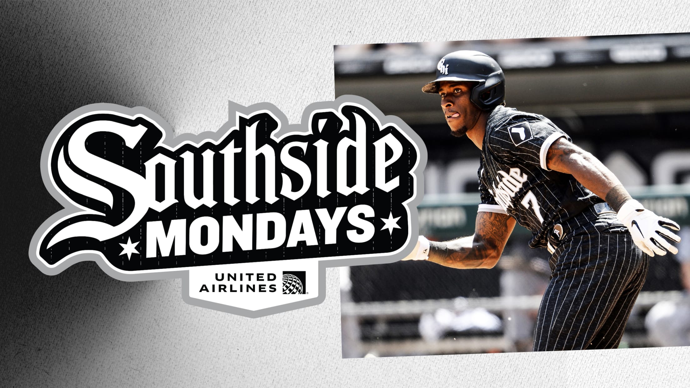
Also, the White Sox just randomly broke out their City Connect. Any locals know if there was a reason for this?
They've been wearing them for Monday home games the past year or two:
This week, was, I believe, their third Monday home game of the season. For some reason they didn't wear them the first Monday, and the second was Jackie Robinson Day, so they just wore their classic home pinstripes with blue "42."
-
2
-
-
On 4/28/2024 at 2:31 PM, GrayJ12 said:
I always love it when White Sox concepts bring the historical red back into the mix. Great stuff!
On 4/28/2024 at 10:43 PM, cubbeblue88 said:As usual, you hit the mark. The red in lieu of the silver for the city connect is masterful. Always good to relate to the other teams in town as well. The road alt also

Thank you both!
TAMPA BAY RAYSHOME:
ROAD:
HOME ALT:
ROAD ALT:
CITY CONNECT:
Notes:
- I think most would agree that after 16+ seasons, the Rays’ current look has pretty much run its course. In contrast, the team’s Devil Rays throwbacks seem to be more popular than ever—as evident by their massive influence on the Rays’ newly-unveiled City Connect design. Given that those throwbacks are included in Tampa Bay’s 4+1 anyway, I figured it wasn’t much of a leap to promote that look to primary status again, with a few updates.
- The above being said, I would like to see the return of the Rays’ ‘70s fauxbacks, as those uniforms made the best use of the team’s current navy/Columbia blue/sunshine yellow color scheme of anything they’ve worn. The fauxback therefore returns and becomes the new home alternate.
- The biggest criticism of Tampa Bay’s City Connect has been the illegibility of the wordmark and numbers, which I’ve addressed by recoloring in a solid gradient. The St. Pete pelican/palm tree logo also replaces the sunburst on the left sleeve.
- I honestly didn’t expect the City Connect design to go all-in on the original gradient, which prompted me to actually “tone down” my previous updates to the home and road by replacing the gradient-colored numbers with solid purple and white ones.
C&C appreciated!-
2
-
-
Can't believe I never thought to design a Yankees jersey based on that old dugout sweater. Brilliant!
-
It’s funny how this Rays uniform wound up featuring more purple than the Mets one.
-
 1
1
-
-
On 4/27/2024 at 10:23 AM, Old School Fool said:
First the Rockies and now the Orioles, let's see if the Mariners follow suit and wear cream pants with their City Connect jersey. I tried that Mariners look out on MLB the Show and it's huge upgrade, in fact, I would argue it's a great starting point for a rebrand.
I actually think it's pretty lame that the Dodgers, Rockies and Orioles backtracked on their original dark-colored pants in favor of white ones. The colored pants went a long way towards making those City Connect designs feel more like their own "thing" and less like ordinary alternates that fit comfortably within the rest of each team's respective uniform set. Look at the D-Backs, for example, who did the opposite, introducing their Serpientes set with white pants before listening to fan feedback and switching to sand-colored pants the following season. I was lukewarm to Arizona's City Connect set at first, but I can honestly say I like it a LOT more with sand-colored pants.
The reason the black pants don't particularly work for Seattle is because black feels shoehorned into the design. I'd much rather see the Mariners' set with white, or hell, even blue pants.-
4
-
-
A different Guardians sock design, this one featuring a “The Land” wordmark:
-
1
-
-
1 hour ago, JohnnyCowboy5 said:
The “Skyray” could end up being one of the better logos to come out of the City Connect program.Meanwhile, here’s a possible Guardians City Connect leak:
-
5
-
 1
1
-
-
Rays City Connect sock leak:
Looks like they’re going all-in on the gradient.
-
7
-
1
-
-
On 4/25/2024 at 3:47 PM, maxwasson said:
Nicely done Mets jerseys! I don't think I've ever seen the Mets have a script "New York" on their aways before, but maybe I haven't been paying to attention to recent uniform changes enough.
Yep, @BlueMoon18 is correct. The road script I used was worn only in 1987, and the last script "New York" used by the Mets was in 1994.CHICAGO WHITE SOX
HOME:
ROAD:
HOME ALT:
ROAD ALT:
CITY CONNECT:
Notes:
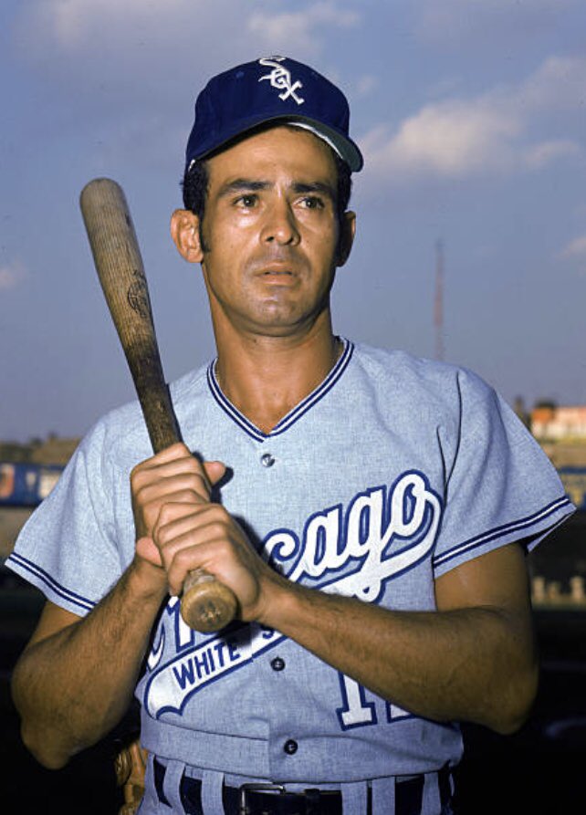
- The less said about the current state of the Chicago White Sox the better, but they do have great uniforms, so at least they've got that going for them.- No MLB organization celebrates or rewards mediocrity quite like the White Sox. Case in point: Since 2013, the team has regularly worn throwbacks of the 1983 team, which not only did not win a championship but didn’t even reach the World Series. If the South Siders want to honor an historical team actually worth celebrating (and who also had great uniforms), and with the '83 throwbacks seemingly being shelved this year, they should make the 1917 throwbacks the new Sunday home alt.
- The primary uniforms now use actual white stocking befitting the team's name, and the thick black & white stripes return to the road pants where they belong.
- I switched to a white script and numbers for the road jersey both as a nod to the team’s great 1969 look, and because they play off the white socks a bit better.
- The City Connect trades in silver for red, which evokes the team’s past as well as the local Bulls and Blackhawks.
C&C appreciated as always!-
4
-
-
Rays City Connect tease:
Sky blue gradient and palm trees as part of the design?
-
4
-
-
On 4/23/2024 at 5:06 PM, colinturner95 said:
I felt like that the pinstripes might be a potential issue. First things first, I went back to the two stripe trim the team currently uses. I can't remember what the rationale for the original change was but it was iffy, even while I was designing it. As for the pinstripes, I went to grey across the board which might create more issues on the white jersey, but everything is now consistent across the two jerseys. But the potential other option of pinstriped jerseys/plain pants wasn't even a halfway decent option.
I completely forgot the pants number! It was right in front of me on my reference images and my reverse retro design I was pulling stuff from and it just didn't make it onto the final design.
Reducing the new trim/piping on the home and road uniforms to just the sleeves is a definite improvement.-
1
-
-
2 hours ago, selgy said:
I am really really really for some Rays City Connect leaks!
They've certainly done a much better job preventing a leak than the Phillies or Mets did.-
3
-
-
On 4/20/2024 at 9:35 AM, ORLMagic86 said:
The Gastonia Baseball Club of the Atlantic League debuted their White Sox-inspired unforms.
Can't imagine anyone being inspired by the White Sox right now.-
3
-
4
-
-
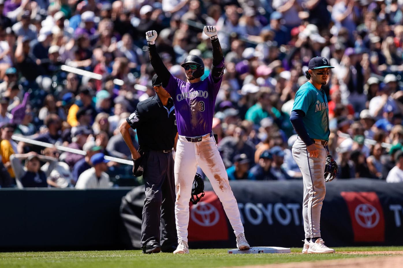
6 hours ago, SportsFan12 said:
Loved this uniform matchup in Colorado yesterday.
Purple vs. teal/Northwest green is really nice, but I have to say I'm not a fan of how those jerseys look with the road pants and wish they'd only wear them at home. I also hate how the silver wordmark looks.
-
1
-
 1
1
-
-
On 4/18/2024 at 10:14 AM, Victormrey said:
Great work for the Mariners!
 Your set is just perfect. Also, the red looks great on the City Connect uni!
The Reds' designs also look really good. I love the home uni with pinstripes and the tweaked CC wordmark.
On 4/19/2024 at 2:05 AM, FrutigerAero said:I like the one with the red pants
Thank you both!
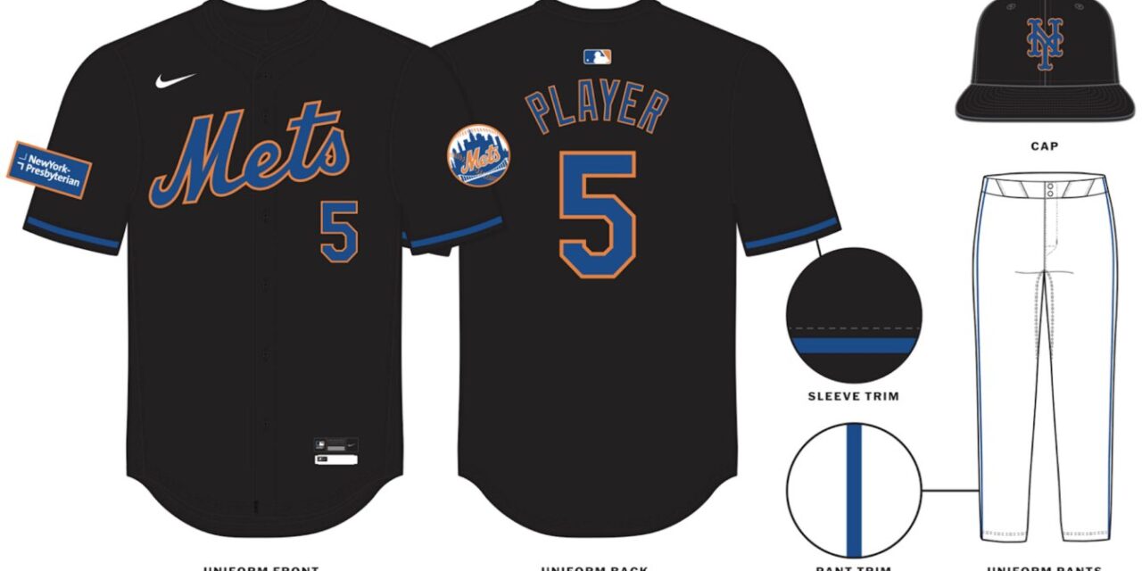
NEW YORK METSHOME:
ROAD:
HOME ALT:
ROAD ALT:
CITY CONNECT:
Notes:
- The Mets’ newly unveiled City Connect set prompted me to make a few previously unplanned changes to New York’s current set, the biggest being the removal of pinstripes from the team’s home uniform. This was done so that 1) the Mets can look as different from their crosstown rivals as possible, and 2) the pins are now unique to the City Connect.
- Despite orange being part of their colorway, the Mets had not one but TWO blue alternates for most of the past decade. Here, the team finally gets an orange alt (similar to their 2013-14 “Los Mets” jerseys) which replaces their awful new black “throwbacks.” I was never big on the Mets in black to begin with, yet the changes made to that design actually have me longing for those original jerseys to return.
- Because the City Connect also uses a Tuscan style “NYC,” I decided to bring back the Mets’ 1987 script “New York” for the road and road alt.
- Yesterday I shared my City Connect tweak here, so here's a quick summary: More purple, matching pants, and an extra pop of white on the roundel and sleeve trim.
C&C appreciated and have a great weekend!-
5
-
1
-
-
1 hour ago, Sodboy13 said:
We haven't seen the 1983 White Sox Sunday throwbacks, though I did see an unconfirmed tweet that they've been flat-out dropped. Also not sure if their City Connects have been worn or not, because that would require watching White Sox baseball, and I've got enough problems right now.
Not sure what’s going on with the Sox City Connects. I doubt they’ve been discontinued or else we probably would’ve heard about it by now. In past years, they’ve worn them for “Southside Mondays” home games, but so far this year they’ve only played two of those, and one of them was on Jackie Robinson Day. -
Can't say I'm a fan of the new trim on Chicago's home and road unis. I like the use of the City Connect logo on the black jersey, but I think it would look odd to pair the black pinstriped jersey with white pinstriped pants.
However, I LOVE that throwback, and I'd buy that white front paneled cap in a heartbeat. If I could make one suggestion, I'd slap some numbers on the pants which could be a reference not just to the team's '82-86 but their '87-90 look as well.-
1
-
-
Next up are the Mets!
Notes:
- I find it funny how the teaser for the Mets' City Connect had everyone convinced the uniforms would be mainly purple, when it wound be being nothing more than an accent color. My goal here was to crank up the purple a bit, which I did by recoloring the "NYC" jersey letters, cap logo and cap bill.
- Even though I don't hate how it looks as much as I thought it would, I still think pinstriped jerseys need to be paired with matching pants, so we end up with a monochrome concrete gray look.- A small pop of white is added to the roundel and sleeve trim.
C&C appreciated! The Rays are next on the City Connect schedule, so I'll be back with a tweak of that design soon.
-
2
-
 1
1
-
-
4 minutes ago, BC985 said:
Won’t happen. You can’t sell youth gear with the word cigar on it.
-
2
-
6
-
 1
1
-
-
Just now, WBeltz said:
I hate that NYM CC hat with such a burning passion. The roundel logo one looked so much nicer.
At the very least it would look better if the "NY" was purple.-
4
-
-
I like how the teaser convinced everyone the uniforms would be heavily purple and it's basically just an accent color on the uniforms.
-
5
-
-
10 hours ago, JohnnyCowboy5 said:
I really hope TB's City Connect set isn't based around that dumb sunray logo.-
2
-


:format(jpeg)/cdn.vox-cdn.com/uploads/chorus_image/image/49631251/usa-today-8025059.0.jpg)
/cdn.vox-cdn.com/uploads/chorus_asset/file/24796152/824681976.jpg)
MLB 2024 Uniform/Logo Changes
in Sports Logo News
Posted
I like this, and I hope we see more of it. Obviously, not all the designs are great, and not all matchups would work, but it would be cool to see some intracity/intastate rivalries bust out their City Connects against one another once or twice a year. A few possibilities:
Lone Star Series:
Crosstown Classic (Cubs would probably have to pair their jerseys with their home pants for contrast):
Citrus Series:
Vedder Cup:
Freeway Series:

The Dodgers vs. Giants would also work, although that would be a matchup of two of the worst designs in the whole program. That being said, I'm really curious to see what L.A. does for their new design in June.