


coco1997
-
Posts
4,831 -
Joined
-
Last visited
-
Days Won
14
Posts posted by coco1997
-
-
Always happy to see a new MLB series around here, and I'm excited for this one! I really like the ground rules you've laid out for this series, and I'm interested to see how you manage to follow them for certain teams.
-
 1
1
-
-
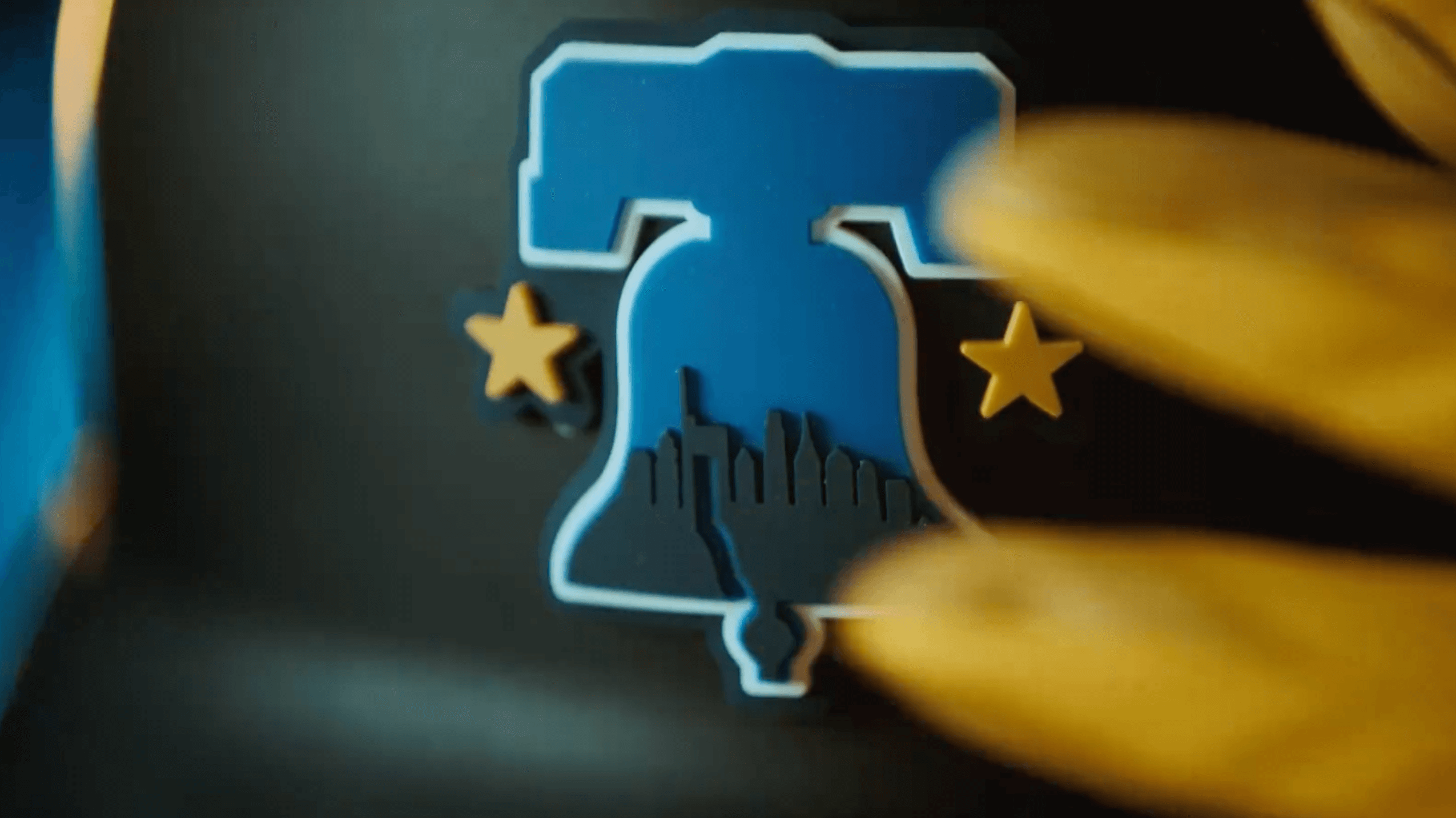
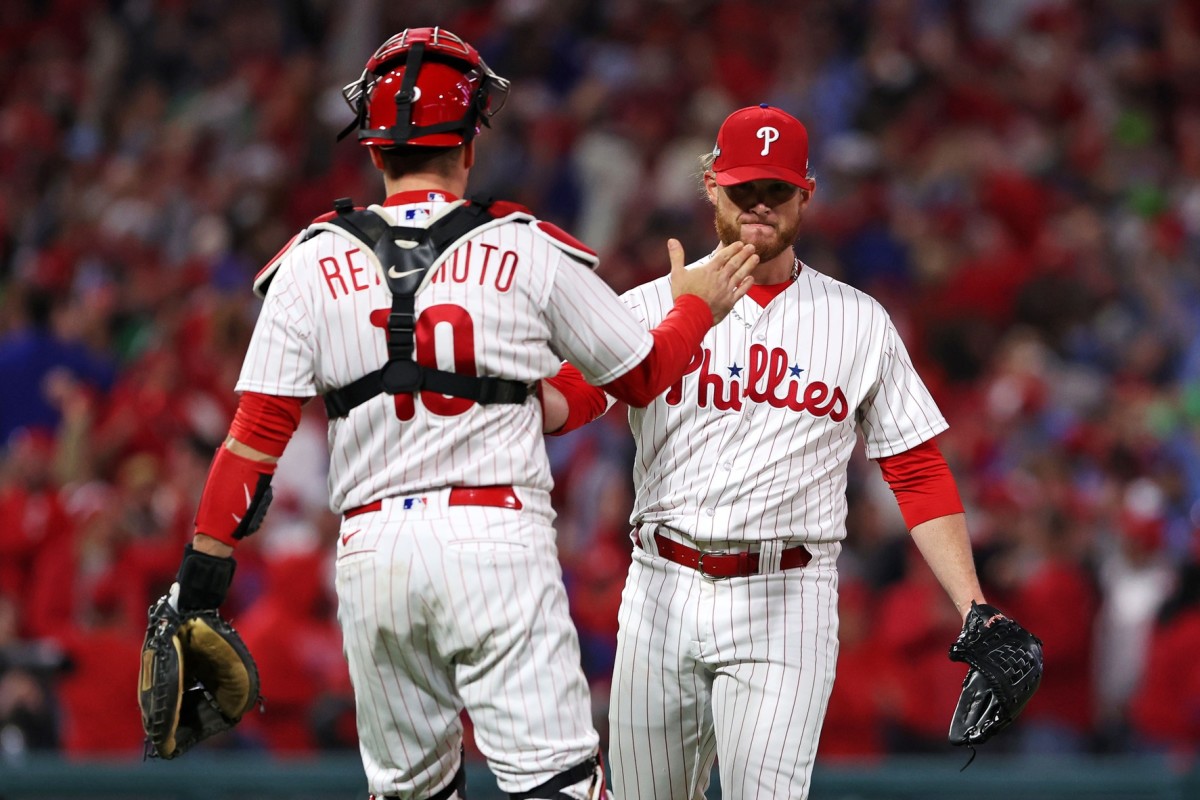
I'm back again with the first team from the final year of initial City Connect designs, the Philadelphia Phillies!
My first tweak is cross-posted from my new Nike 4+1 series:

Notes:
- Put me down as one of the who actually like the Phils’ new City Connect uniforms. They’re pretty much the prototypical City Connect design: wildly different team colors, city iconography-inspired logos, “edgy” looking numbers and dark pants.
- One thing I did feel the need to change was the jersey gradient; I’ve always felt the best uniforms and logos are ones that can be easily recreated with a simple pen and paper, and it’s a bit hard to do that with a gradient. The jersey instead now features the Philadelphia skyline, a la the cap logo. I also converted the jersey into a partial pullover.
- This is a super minor detail, but I made the Liberty Bell letter "O" on the sleeve patch gold to match the socks.
- Thanks to @MJD7 for helping with the wordmark!
The next tweak is a bit more significant:
Notes:
- Funnily enough, the inspiration for this version came from this women's fashion shirt I found on the MLBShop.com.- I was worried this design might veer a little too closely to the Cubs' City Connect, but in my universe the North Siders' design would be green, so the similarities would be minimal.
- Front numbers are added for balance.
I like to think that this second version might have been a little better received than what we actually got. C&C appreciated!
-
1
-
-
Apparently this art has been on the MTA for years, but it would be funny if this more or less wound up being the Mets' design.-
2
-
 5
5
-
-
The Mets in purple…I hope somebody does a wellness check on Paul Lukas on April 19th.
-
1
-
 1
1
-
12
-
-
A former MLB.com writer is claiming on Twitter that the Mets City Connect uniforms will be black. This wouldn’t really bother me if the team didn’t already have that awful new black alternate in their jersey rotation.
-
3
-
-
1 hour ago, JohnnyCowboy5 said:
"There have been 20 uniforms released so far, with nine more to be added during the 2024 season -- starting with the Philadelphia Phillies (April 12) and followed by the New York Mets (April 26), Tampa Bay Rays (May 3), Detroit Tigers (May 10), Cleveland Guardians (May 17), St. Louis Cardinals (May 25), Toronto Blue Jays (May 31) and Minnesota Twins (June 14). We'll also get another set this season from the Los Angeles Dodgers (June 21), which will make them the first team with two City Connect looks. After this new batch arrives, the New York Yankees and Oakland Athletics will be the only teams without one.
Here's our breakdown of the uniforms that have dropped to date. We'll continue to update the list as new City Connect unis are unveiled."
Tracking all of MLB's City Connect jerseys and debut dates - ESPN
Is this true?
If it was posted by a reputable site like ESPN, I’m sure it’s legit. I’m guessing we’ll get confirmation from MLB soon enough.Side note, going by that schedule, May is going to be a loaded month!
-
2
-
-
On 4/2/2024 at 10:21 AM, Victormrey said:
I really like the idea of making the Rangers a red team at home and a blue one on the road, specially with the powder blue uni!
Also, I'm a huge fan of the Pirates sleeveless main set, great job!
Thanks!On 4/1/2024 at 12:16 PM, johne9109 said:I generally don't like that the Rangers feature different fonts between their home and away, but the fact that each alternate uses each font kinda brings it all together
Agreed. I definitely feel the "Rangers" script should have been used on more than just one jersey.PHILADELPHIA PHILLIES
HOME:
ROAD:
HOME ALT:
ROAD ALT:
CITY CONNECT:
Notes:
- When the Phillies announced they’d be retiring their red alternates prior to the 2024 season, I assumed it was because their City Connects would be red. We now know that was wrong. As such, I’ve reintroduced a red home alt for Philly.
- It seems odd for a team not to have an alternate in their primary color, but I also love both of Philly’s home looks as well as their road throwbacks. To make room for the new alt, I combined the team’s two home uniforms into one by making the home set off-white and adding sleeve and collar trim.
- There’s a bit more blue across the board, which is also reflected in the new striping pattern on the road uniform.
- Sleeve numbers are back, as I wasn’t inclined to sacrifice a classic design feature to accommodate an ad patch.
- Maybe I’m an easy lay, but I actually like the Phils’ new City Connect uniforms. They’re pretty much the prototypical City Connect design: wildly different team colors, city iconography-inspired logos, “edgy” looking numbers and dark pants. One thing I did feel the need to change was the jersey gradient; I’ve always felt the best uniforms and logos are ones that can be easily recreated with a simple pen and paper, and it’s a bit hard to do that with a gradient. The jersey instead now features the skyline of Philly, a la the cap logo. I also converted the jersey into a partial pullover.
- Thanks to @MJD7 for helping with the wordmark!C&C appreciated!
-
2
-
 1
1
-
-
1 hour ago, burgundy said:
These were good uniforms? Collars and all?
-
1
-
1
-
-
39 minutes ago, shaydre1019 said:
Can somebody who's more well versed with Philly/US History explain the typeface? Is it supposed to look like ripped paper?
“This text is reminiscent of those found in the historical documents throughout the city.”-
1
-
-
14 minutes ago, Bruhammydude said:
This is just the Mariners uniform with an edgier font. Really revolutionary stuff by Nike
This raises an interesting question: I wonder how many of these designs are designed in a vacuum and, if it’s truly a collaborative process between Nike and the MLB teams, how often Nike has to tell a team “Actually, we might want to go in a different direction because Team A’s uniforms look too similar to Team B’s.” -
Eh, I kind of like these. I think the lighter blue with darker blue/black pants combo works better here than it did with Seattle.
-
2
-
-
I didn't realize the Reds' current wordmarks and numbers were so disliked around these parts. I've always liked them, though they would definitely look better sans drop shadows.
-
8
-
-
30 minutes ago, Sodboy13 said:
Now that the "temporary" move to Sacramento is official, my guess on the A's 2025 uniforms is this: No change to the home whites, the road grays get the "Athletics" script across the front instead of "Oakland," the kelly green jerseys get mothballed, and the still-active yellow alts get pulled out of storage. Like everything involving the Fisher A's, the bare minimum will be done.
Agreed. Seeing as this relocation is only short-term, I'd bet anything the "new" A's uniforms will be half-assed and bare bones. At least this move will provide plenty of fodder for the Concepts forum, though.
-
14 hours ago, aawagner011 said:
I love each of those uniforms, but this seems more like an organizational decision rather than something spearheaded by Nike. They can have 5 uniforms under the 4+1. All they’d have to do would be to shelve the red or navy (or both) and they could reintroduce either of those.
They could also pull a Seattle or Tampa Bay and ditch their road gray jerseys. I wouldn't want them to do that, but it wouldn't be unheard of. -
Per their social media, Blue Jays City Connects are being unveiled May 30th.
-
-
29 minutes ago, projectjohn said:
Something like this would be pretty decent, as long as it's paired with regular gray or white pants.
If Detroit's City Connect jersey is navy, I actually hope they pair it with matching pants. After all, there's a precedent for it:
-
3
-
-
3 minutes ago, GrayJ12 said:
Tigers feel like a team that would have worked perfectly in the heydey of the racing stripes.
Yeah, they weirdly started wearing them by the time most teams had already stopped:
-
2
-
-
12 hours ago, GFB said:
good 90s Tigers CC inspiration:
bad 90s Tigers CC inspiration:
if you want the tiger-in-D cap to be ruined for you forever, have you ever noticed how the old English D has an orange outline, but the tiger parts had white outlines for reasons?
compare that to the superior no-outline version on the infamous one-day-navy-alternate jersey... it makes no sense.
Looking at that top jersey, monochrome navy with racing stripes could be pretty cool.-
1
-
 1
1
-
 1
1
-
-
5 hours ago, MNtwins3 said:
Texas Rangers
Oakland Athletics
Toronto Blue Jays
Atlanta Braves
Minnesota Twins
San Diego Padres
Los Angeles Dodgers
Los Angeles Angels
Miami Marlins
St. Louis Cardinals
I'd argue the Rangers road greys are better than their home whites, and the rest the road greys are on par with the home whites (some of them are literally the same design both home and away). This isn't to say I hate all the road greys not mentioned, but some of them are definitely the weaker uniform
11 hours ago, floydnimrod said:More of an overall question: not considering the new template, are there any teams whose road grays are better, or at least on par with the home whites? I can't think of a single team where the road gray isn't just a worse uniform design than the home uniform
It's a odd question, because most teams' road uniforms are just a gray version of their home set, usually with a different wordmark, so it really comes down to whether you find a white or gray uniform more appealing. -
On 3/28/2024 at 1:33 PM, Coiler said:
Not a bad concept, especially the dull gold and coal colors.
Although forcing the Yankees to have alternates would probably just lead to them wearing big NY Highlanders throwbacks.
That's actually not what I have planned for New York. You'll have to just wait and see.
Up next are the reigning World Series champions!
TEXAS RANGERS
HOME:
ROAD:
HOME ALT:
ROAD ALT:
CITY CONNECT:
Notes:
- I ditched Texas’ powder blue set (oddly used by the team as a home alternate) in order to make room for a new red alt which uses the home script. As a compromise, I gave the road a slight blue tint.
- The color balance on the home uniforms reverts to the current set’s 2020 debut. My idea would be for the Rangers to be a primarily red team at home and primarily blue on the road.
- My City Connect design is one I previously shared in my City Connects tweaks thread, based on suggestions from @VampyrRabbit. Changes include switching to a sleeveless jersey, flipping the placement of the “TX” and front numbers and adding a headspoon.
C&C appreciated as always!-
9
-
1
-
-
51 minutes ago, floydnimrod said:
More of an overall question: not considering the new template, are there any teams whose road grays are better, or at least on par with the home whites? I can't think of a single team where the road gray isn't just a worse uniform design than the home uniform
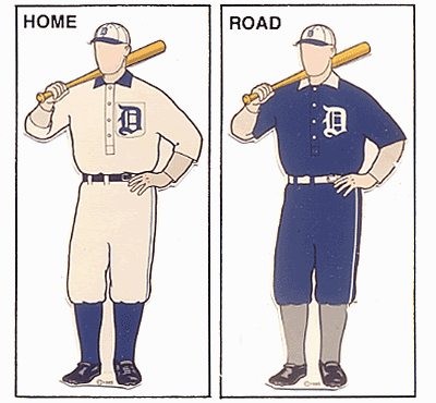
I'm biased, but I love the current White Sox road unis. Of course, they were better when they had the dual thick pant stripes as seen below:
-
10
-
-
2 hours ago, GriffinM6 said:
Did we just see an intentional leak of the Dodgers new city connect?
Highly unlikely. This just looks like a fashion jersey from the early-mid 2000s. -
24 minutes ago, MNtwins3 said:
I liked that throwback. Probably wasn't the best choice for them when two of their division rivals had the same color scheme though
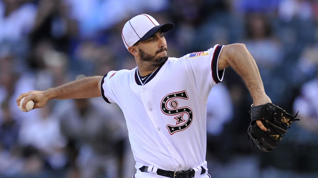
I like the '83s too, but it's so typical of the White Sox organization to celebrate mediocrity. The '83 team not only did not win a championship, they didn't even reach the World Series. It was fine when they brought those uniforms back for the 30th anniversary in 2013 but to continue to wear them for another ten seasons was overkill.If the Sox wants to honor an historical team more worthy of celebrating (and who also had great uniforms), then make the 1917 throwbacks the new Sunday home alt:
-
5
-
2
-


Reimagining Superheroes as Hockey Teams #15 - New Jersey Devils (Daredevil)
in Concepts
Posted
Always love to open the Concepts forum and see an update to this series! The NJ Devils do not disappoint. Daredevil's original yellow costume is actually my favorite of his, so I'm glad you were able to work that into this set as an alternate.
Still hoping to see a Ghostbusters-themed team at some point!