


coco1997
-
Posts
4,841 -
Joined
-
Last visited
-
Days Won
14
Posts posted by coco1997
-
-
On 2/20/2021 at 4:57 PM, TheGiantsFan said:
The Dbacks look much better, and it's much easier on the eyes now! Also, that orange Dbacks jersey is an absolute beauty; well done!
")
Thanks!
On 2/20/2021 at 4:41 PM, jaytavo305 said:Lighten that up a hare and its perfect
Yeah, I tend to agree. I think the best option would be somewhere between the original brighter purple and this darker one. I'll keep tinkering.
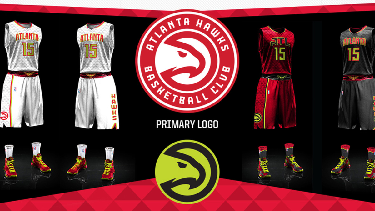
I'm back today with the Atlanta Braves!
BRAVES HOME
BRAVES ROAD
BRAVES HOME ALT 1
BRAVES HOME ALT 2
BRAVES ROAD ALT
The most popular fix for the Braves seems to be swapping navy for black, which is fine because 1) it's a good look, and 2) it creates some visual unity with the local Falcons and Hawks. However, I wanted to make things more interesting and add a third color, so I decided on volt green from the Hawks' 2015-20 set. I had originally tried these colors on the Braves' current uniforms, but it got too busy looking with all the triple piping so I brought back their iconic '70s look.
C&C appreciated! The Phillies will be up next.
-
 9
9
-
 1
1
-
-
1 hour ago, TheGiantsFan said:
Arizona is really close to being a home run, but the color scheme currently has a somewhat harsh contrast, in my opinion. I know you based the shade of purple on the 90s Suns and/or early Dbacks, but I think the contrast would look much better if you used the darker purple of the current Suns look.
Other than that, the Dbacks look great! I look forward to seeing how the rest of this series goes~
Thanks for the feedback! I think you make a good point. Here's the entire Arizona set using the Suns' darker shade of purple. Let me know what you think!
DIAMONDBACKS HOMEDIAMONDBACKS ROAD
DIAMONDBACKS HOME ALT
DIAMONDBACKS ROAD ALT
-
11
-
-
21 hours ago, Megildur said:
I love Cleveland's colors, they look great! As for the Yankees, yeah, I propose just straight up replacing the navy with maroon, so maroon pinstripes and a maroon logo, etc. It'd be similar to the Phillies of the 70's and 80's, but I absolutely think there should be a maroon MLB team.
Thanks! I'll try out the Yankees in maroon once I finish the other teams on my list.
3 hours ago, Victormrey said:Wonderful job! I think both Indians, Marlins and Twins sets look like a "natural transition" for the teams, with the colours really fitting them. I also like the use of the Bears' scheme for the Cubs, not only for the combination itself, but also because of the name similarity

Keep it up!
Thanks, man!
2 hours ago, NormMacdonald said:I can see my grandpa wearing a hat like that while hunting. I absolutely love the outdoorsy feel of this Twins concept. Keep up the great work
As someone whose own grandpa also was a hunter, I agree 100% and take that as a compliment . Thanks for following!
Today's team is the Arizona Diamondbacks!
DIAMONDBACKS HOMEDIAMONDBACKS ROAD
DIAMONDBACKS HOME ALT
DIAMONDBACKS ROAD ALT
Ok, so this one doesn't exactly follow the premise of the series. The Diamondbacks have never worn blue and red, but they do wear black and red, and in my opinion ever since they strayed from their classic purple and turquoise they've lost their way. I looked to the '90s Phoenix Suns and brought back the purple, replacing turquoise and copper with the Suns' vibrant yellow and orange. I also ditched the black, as I always felt it was totally unnecessary and muddied up that identity. This design uses Arizona's early scripts and pinstripes but keeps their modern numbers. I think it's a great look, though in my re-colored universe the NL West would end up being a very, very purple heavy division!
C&C appreciated! The Braves are up next.
-
15
-
-
21 hours ago, DNAsports said:
For the Yankees, maybe go with the Jets colors? Or even the limbo-relegated XFL New York Guardians?
We'll see if I decide to do something with the Yankees. I'm warming to the idea.
15 hours ago, Megildur said:The Cubs' home and Twins' away have to be my favorites so far. The orange and blue really work for Chicago, while forest green pinstripes on a sand jersey is out of the box but amazing. I'm not sold on the Rangers, but I understand the reasoning. If there's a team that shouldn't go away from the red and blue color scheme, I'd point at the Rangers though. I'd put my hat in the ring for a Dallas Stars version of the Rangers as there's not enough green in the league. In a similar vein of thought, I think Miami is good in the Miami Vice colors, but I would always vote for a return to the teal, black, and silver days. Lastly, I know maroon is literally blue and red combined, but I think the Yankees would look pretty good in just a solid maroon set... (though the Jets colors as @DNAsports recommended would look pretty good too!).
Thank you! Yeah, I'm very happy with how the Cubs and Twins turned out. And I too would love to see the Marlins return to teal and black, but in lieu of that the Vice colors would be my second choice. I think you'll be happy with how the Rangers look in Stars colors.
Never thought about the Yankees in maroon...So are you suggesting a straight swap of their dark navy for maroon?
Up today we have the Cleveland Indians!
INDIANS HOMEINDIANS ROAD
INDIANS HOME ALT
INDIANS ROAD ALT
The Indians get the Cavaliers treatment of wine, navy and gold. Who knows if the Cleveland Baseball Club will change its colors when they rebrand, but if they do maybe they can go this route. I really like how the athletic gold pops against the muted wine and navy.
C&C appreciated! I'm going to keep the next team a surprise so watch this space.
-
12
-
-
17 hours ago, DNAsports said:
When you get to the Nationals, may I suggest the Capitals old blue-black-gold scheme?
Great start to the series! Looking forward to the rest!
Thanks! I think you'll be happy with how the Nats turned out.
16 hours ago, OnWis97 said:The Twins/Wild mashup is pretty sharp. Their current (stupid) use of gold just slides right in there. However, I bet it would look even better without gold.
After 60 years, I would not want to see the Twins change this much, but this would work really well if they were coming in today as an expansion team.
I actually like the athletic gold, as it breaks up the shades of green and red which are both fairly dark and muted and keeps the design from looking too "Christmas-y."
15 hours ago, TrueYankee26 said:It would be interesting if you go this route Coco:
Nationals in the 2000s Capitals & Wizards blue black gold
Red Sox in Celtics colors (green to match Fenway)
Yankees in Brooklyn Nets colors (Nets used to be owned by YankeeNets now Yankee Global Enterprises)
Angels in Ducks colors (Mighty ducks or current ducks colors)
Indians in Browns colors
Phillies in the A.I. era Sixers colors or the Eagles Colors
Braves in Hawks Colors
Cardinals in Blues colors
Loving this series so far
Thanks! I will say you guessed five teams correctly. I don't think I'll be doing the Yankees, because changing their colors sounds sacrilege (also, Nets colors would make them look just like the White Sox). I'm on the fence about doing the Cards x Blues (that would basically just mean swapping out navy for royal blue, correct?) but I suppose if there's enough demand I can do it.
Next up we have the Miami Marlins!
MARLINS HOMEMARLINS ROAD
MARLINS HOME ALT 1
MARLINS HOME ALT 2
MARLINS ROAD ALT
I decided to go full Miami Vice for the Marlins with colors from the Heat's City Edition uniforms. I honestly think this is a look the Marlins could pull off assuming MLB could get over its "no pink in baseball" insecurities. And it's not terribly far off from their current colors--just tweak the blue a bit, replace red with pink and stop emphasizing black so damned much.
C&C appreciated! The
IndiansCleveland Baseball Club will be up next.-
15
-
-
12 hours ago, John1988 said:
Loving that Dodgers/Lakers concept, the colors work perfectly for their set
Thanks!
12 hours ago, MJWalker45 said:Dallas teams should not use San Antonio colors but these look pretty good.
Thanks. I have a Rangers set in Stars colors prepared that I'll post at the end of the series.
Up today we have the Minnesota Twins!
TWINS HOMETWINS ROAD
TWINS HOME ALT
TWINS ROAD ALT
While @Jake3roo suggested I put the Twins in purple and gold, I opted instead for the forest green, scarlet and harvest gold colorway used by the Minnesota Wild. Something about these colors just screams “Minnesota” to me. The “Minnesota wheat” trim color is used as the base for the road uniform.
C&C appreciated as always! The Marlins are on deck.
-
22
-
-
On 2/15/2021 at 12:38 PM, Blindsay said:
Well done
2 hours ago, Victormrey said:Great sets to start with!
I think the Rangers turned out great, despite the tricky colour scheme. As for the Dodgers, you can't go wrong with the Lakers colours for their iconic branding, well done!Thanks!
2 hours ago, alexandre said:I am certain that if Laker colourway Dodger merch doesn't already exist, it'd make a killing.
I was at Dodgers Stadium a few years ago and a version of the gold design I posted seemed to be fairly popular.
Up today we have the Cubs!
CUBS HOME
CUBS ROAD
CUBS HOME/ROAD ALT
With the crosstown rival White Sox sharing a similar color palette with the Bulls and Blackhawks, I decided to put the Cubs in Bears colors. I brought back their mid-90s design for the alt and gave their home unis an off-white base to distinguish them from the White Sox.
C&C appreciated! I'll have the Twins up tomorrow.
-
12
-
-
18 hours ago, _DietDrPepper_ said:
I’d drop the orange and pink alts and add a Rangers text on the home rather than all the uniforms saying Texas.
I’m also curious why you chose the Spurs fiesta color scheme over something actually belonging to Dallas. Both the Stars and Mavericks schemes would be unique in the MLB too.
I considered the Stars but didn't want the Rangers looking too much like Oakland by being another green-heavy team. I may go back and do another take on the Rangers in green and black once I get through the other teams I plan to do.
13 hours ago, Jake3roo said:Ooh I love this. May I suggest the angels back to red & yellow? The Phillies back to powder blue & maroon? The cubs back to blue and gold? The cardinals to red and powder blue? The twins to Purple and blue? The
IndiansCleveland Baseball Team to just blue/black?Thanks! I'll be doing all the teams mentioned above expect for the Cardinals, since they have to be in red by virtue of their name. However, the other teams will have different color schemes than the ones you suggested. Remember, teams will use colors worn by or previously worn by other teams in their same city/state.
2 hours ago, Blindsay said:This screams Old Marlins to me
That's fair, but the new scheme I have planned for the Marlins will dispel any similarities between the two.
")
Next up are the Dodgers! The Los Angeles Lakers have one of my favorite color schemes in all of professional sports, and it works really well for the Dodgers. This color scheme could also work well for the Twins, but I went in a different direction for them.DODGERS HOME
DODGERS ROAD
DODGERS HOME ALT
DODGERS ROAD ALT
C&C appreciated! The Cubs will be up next.
-
19
-
-
Hi everyone,
For my latest project, I wanted to do address the overabundance of blue & red teams across Major League Baseball. For inspiration, I figured I'd look at the colors of other local teams to create some regional visual unity, similar to the way that all Pittsburgh teams use black and gold. Note that some teams will be using throwback colors of local teams, such as the first team below.
We start today with the Texas Rangers in the San Antonio Spurs' fiesta colors. Thanks to @Victormrey for the suggestion!
RANGERS HOMERANGERS ROAD
RANGERS HOME ALT 1
RANGERS HOME ALT 2
RANGERS HOME ALT 3
RANGERS ROAD ALT
C&C appreciated! Another team will be up soon.
-
13
-
-
D-Backs: I like the red & purple color combo. Not a fan of the gold road uni. I think a traditional gray set would work fine in this case. Maybe flip the colors of the “A” for the red cap and jersey.
Spiders: Solid set. Great logo.
Royals: I like the use of athletic gold over metallic. Not sold on the gold script with white trim on the powder blues.
White Sox: I’d work on making the blue more of a sky blue like on the Chicago flag.
Rays: I really like the choice of colors and the color balance.
-
Great work on the Cascades! I love the double green.
I agree that just purple and gold would work best for the NOLA team, based on the preview you posted.
-
1
-
-
On 6/21/2020 at 8:38 AM, coco1997 said:
Anyone else stop receiving notification emails from the forum? I haven’t gotten an email from the forum in several days despite several of the topics I follow receiving new content. I made sure my notification settings didn’t change and that I didn’t accidentally block the notification email account.
Any updates on this @CC97? -
22 minutes ago, panthers_2012 said:
Have you checked your spam folder for the messages?
Yep, nothing’s there. -
Anyone else stop receiving notification emails from the forum? I haven’t gotten an email from the forum in several days despite several of the topics I follow receiving new content. I made sure my notification settings didn’t change and that I didn’t accidentally block the notification email account.
-
The Unions have a nice, classic baseball identity. Definitely reminds me a lot of the Cubs and Dodgers.
-
3
-
-
This just goes to show how much better the Marlins would look if they were blue team first, and a black team second. Great job!
-
2
-
-
Solid start! Looking forward to seeing where this series goes.
-
1
-
-
I don't think I've ever seen anyone on these forums mock up a Sox concept based on one of those rejected '80s fan designed uniforms. Great stuff!
-
2
-
-
That Cubs fauxback is good enough to be their everyday home set.
-
2
-
-
Stumbled upon this on eBay. Any chance it’s legit?
-
I actually think the flipped outline colors on the D-Backs are an improvement, but different strokes, I guess.
The Braves also look great!
-
1
-
-
Small suggestion for the sand set: Flip the turquoise and black outlines on the numbers and scripts, since the turquoise bleeds into the sand a little.
-
1
-
-
Love the idea of a “Cooperstown Collection” alternate for each team, and it works really well for Arizona given the popularity of their original look and colors.
Really digging the new template, too!
-
3
-
-
New Winston-Salem Dash unis:
The White Sox have maybe the best dressed minor league system from Single A-AAA.
-
1
-


Recoloring MLB (Formerly Un-Blue & Redding MLB) - Mariners in 2023 All-Star Game colors 7/25
in Concepts
Posted
Thanks, bud!
You guessed it!
Today we have the Philadelphia Phillies!
PHILLIES HOME

PHILLIES ROAD

PHILLIES HOME ALT

PHILLIES ROAD ALT
Since neither the Flyers' nor Sixers' colors would really work for the Phillies (the Sixers being because they're nearly the same as the Phillies' actual colors anyway) I decided to put them in the Eagles' classic Randall Cunningham-era colors of Kelly green, black and silver. The Phillies actually wore green briefly for the 1910 season, so it's not that huge of a stretch. Big thanks to @Carolingian Steamroller for the idea and for helping with this set.
C&C appreciated as always! The Rays are on deck.