


coco1997
-
Posts
4,876 -
Joined
-
Last visited
-
Days Won
14
Posts posted by coco1997
-
-
On 6/9/2021 at 7:35 PM, Coiler said:
Just returning to the classic Braves uniforms already makes them look more distinct than the more generic-seeming modern ones.
Thanks! I actually decided to tweak my Braves design a bit, making the tan/sand color the base of the road uniform and replacing gray entirely:
BRAVES ROAD:

BRAVES ROAD ALT:
On 6/13/2021 at 5:27 AM, Coiler said:A weird concept would involve making the Cardinals in the duller colors of the female bird instead of the existing bright red.
Cool idea! I'll work on that next.
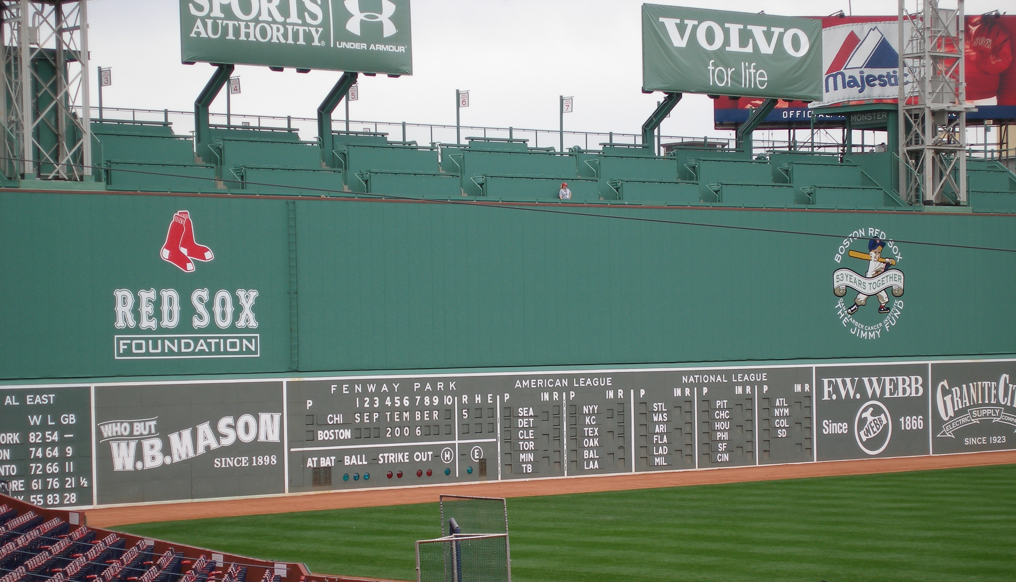
Today we have the Red Sox:
RED SOX HOME:
RED SOX ROAD:
RED SOX HOME ALT:
RED SOX ROAD ALT:
To the surprise of probably no one, I gave the Red Sox a touch of Fenway green. I've done the Red Sox in red and green before, so it was fun/challenging trying to balance all three colors in one design.
C&C appreciated! Let me know if you have any team + color requests.
-
 3
3
-
-
On 6/12/2021 at 7:52 PM, NicDB said:
Not feeling the red pins, otherwise this is a pretty solid look. Only I'm not sure I'd consider it an upgrade from the actual set if only because the White Sox hit a grand slam with theirs.
Fair enough. The silver is just fine, but I thought the red would be a bit more distinctive. Any feedback on the first two teams?
Skipping the Red Sox for now to post my D-Backs tweak:
I wanted to get my Arizona concept up while the D-Backs City Connect unis were still fresh in the news. I'm pretty disappointed the team kept their very generic black and Sedona red color scheme when three of the other City Connect teams so far have been treated to new color schemes by Nike, so this one undergoes some pretty significant changes. First, I replaced Sedona red with turquoise and added a turquoise outline to the script and back numbers. Second, I used pinstripes, as they add a bit more character to the design and are a nod to the D-Backs' classic original look. Third, even without having seen the full uniform on the field, I already know I'm not going to like the sand colored top + white pants combo, so I made the pants sand as well to complete the look. Once I get a clearer look at the triangle sleeve patch, I can add that to the socks and sleeve.
C&C appreciated! The Red Sox are next (for real, this time).
-
13
-
-
I unabashedly love those Disco Turkeys uniforms. Sharp color scheme and the Braves-esque feather design on the sleeves is really well executed. A rare example of a minor/independent league team with a stupid name but great logos and uniforms.
On another note, the Chicago Dogs will be having a Negro League Tribute night on 8/14 and will be wearing "special uniforms" as they face the Kansas City Monarchs:
https://thechicagodogs.com/promotional-schedule/text-2021-promotional-schedule/
-
1
-
-
On 6/8/2021 at 6:20 PM, bcon_731 said:
You’d think they’d do something with green, it’s right there under their nose. Where’d they pull dark blue from? Way to go tho, solid tweak
Thanks!
Today we have the Crosstown rival White Sox:
As a White Sox fan, I really like the South Sider's City Connect unis. However, I wanted to try the design with red in place of silver, both as a nod to the local Bulls and Blackhawks and also because it's a color scheme commonly suggested for the team. I'm also not a big fan of the "Chi" cap logo, so I replaced it with a tasteful Old English "C." Lastly, WHITE SOCKS.
The Red Sox are next!
-
9
-
-
I decided I'll just use this thread to post my City Connect tweaks for each team as they roll out. Today we have the Marlins:
Even though I actually really like Miami's City Connect colors, I wanted to try the design in a teal and orange scheme which I've long felt are the colors the Fish should use full time. I also made the front panel of the cap white so the crown logo pops a little better. C&C appreciated!
-
9
-
 1
1
-
-
7 hours ago, Coiler said:
The red and yellow I'm not that impressed by. It looks kind of like a hot dog, to be frank.
I see what you did there.
Up this evening are the Atlanta Braves:
BRAVES HOME:BRAVES ROAD:
BRAVES HOME ALT:
BRAVES ROAD ALT:
For the Braves, I used the tan/cream color from the unused 2021 All-Star Game logo. I figured the feathered sleeves design would be yet another touch to set the Braves apart from the other navy & red teams.
C&C appreciated. The Red Sox are next!
-
2
-
-
While I'm pretty happy with how the Cubs City Connect uniforms turned out given how poorly the initial jersey leak was received, I still think it would have been interesting had the team gone with a solid green design to mimic the famous ivy on Wrigley's outfield walls.
Let me know what you think!
-
8
-
1
-
-
On 6/3/2021 at 2:27 PM, mrcubfan415 said:
I’d take these over their current uniforms any day of the week. Powder blue is a much better trim color for the Twins IMO.
On 6/3/2021 at 3:01 PM, BayBaseballFan said:The Nationals set reminds me of their first few years after moving from Montreal where everything seemed to be trimmed or shadowed with gold.
Thanks! Agreed on both counts.
Today's team is the Cleveland Indians!
INDIANS HOME:
INDIANS ROAD:
INDIANS HOME ALT:
INDIANS ROAD ALT:
For the Indians, I chose a shade of dark yellow as seen on this old Chief Wahoo logo. Red dominant look at home and navy dominant on the road.
C&C appreciated. The Braves should be up next!
-
14 hours ago, Coiler said:
Gold on the Nationals gives them a bit of "turn-of-the-millenium Wizards" style to them. Don't know how intentional that was, but it was what I saw.
Thanks! The Wizards similarity was unintentional, but I don't consider it a bad thing.
Today we have the Minnesota Twins!
TWINS HOME:
TWINS ROAD:
TWINS HOME ALT:
TWINS ROAD ALT:Let's face it: The Twins' current identity is a mess. They have two navy alternates, a recent Kasota gold trim color addition that seems wildly unpopular and a powder blue fauxback that doesn't fit with any of their other uniforms. Since I gave Kasota gold to the Nationals, I chose powder blue as the Twins' trim color. It also serves as the base for the road uniform, which I added pinstripes to as a nod to their 1987-2009 road look.
C&C, please. The Indians are next!-
2
-
-
I decided to revisit the original premise of this thread and ask, "Instead of changing navy and red teams' colors altogether, what about adding a third color to set them all apart?" So let's start today with the Nationals:
NATIONALS HOME:
NATIONALS ROAD:
NATIONALS HOME ALT:
NATIONALS ROAD ALT:
For the Nats, I decided to add Kasota gold, as used by the current day Minnesota Twins (yes, this means the Twins will be getting a different trim color for their redesign). The Nats had gold as part of their inaugural look but it was too dark and metallic-looking; this shade works much better, in my opinion.
Either the Indians or Twins will be up next!
-
3
-
-
On 5/8/2021 at 8:04 PM, bcon_731 said:
Not sure if you’ve done this yet but a Racing Stripe Thread. Arizona and Tampa have wide color palette to fool around with.
That's a cool idea!
On 5/10/2021 at 9:45 AM, Coiler said:I think my favorite uniforms in the set are the Nuggets/Rockies and Ducks/Angels, because of the slightly unconventional for baseball colors.
Thanks!
On 5/11/2021 at 3:06 AM, mrcubfan415 said:Just caught up with this series. Great work!
Also, have you considered doing minor league baseball cities that have a major league team in one of the other sports (e.g., Portland)?
Thanks for the feedback! I'm not sure re-coloring MiLB teams is a rabbit hole I'm willing to go down, but it's an interesting suggestion nonetheless.
As requested by @BayBaseballFan, here are the '90s Brewers in Packers colors!
BREWERS HOME:BREWERS ROAD:
BREWERS HOME ALT:
BREWERS ROAD ALT:
-
4
-
-
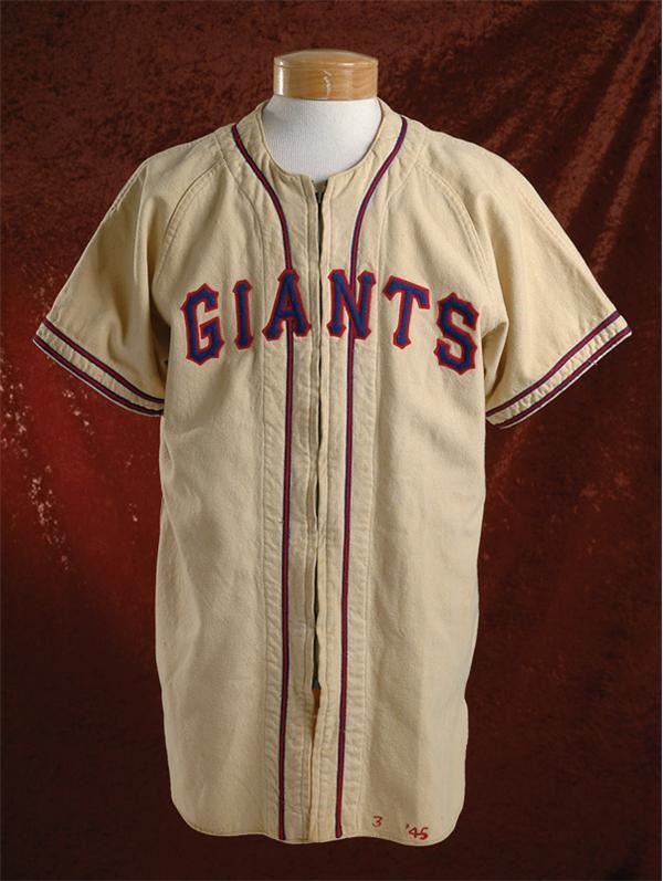
On 5/4/2021 at 10:36 PM, packerfan21396 said:
The only real route to make something that doesn't look like the 1940's Baseball Giants would be to recolor the 50's uniforms:
Of course this is up to you though, congrats on a solid thread!
Thanks! Here are the New York Giants (MLB) x the New York Giants (NFL)!
GIANTS HOME:GIANTS ROAD:
GIANTS HOME ALT:
GIANTS ROAD ALT:
Truth be told, the Giants used colors very similar to this before they switched back to black and orange in 1947. This design is essentially the one they were using right before they moved to San Francisco in 1958 but in blue and red.
On 5/5/2021 at 11:43 PM, BayBaseballFan said:Hey @coco1997,
Great series so far. I'll admit that even as a Niners fan, the modern Seahawks-Mariners set does actually look pretty nice. Their neon green color really pops as an accent color and the piping, especially on the road jersey script. Those stirrups are great.
Other faves in the series:
- KC A's in Chiefs colors - if the Chiefs ever moved away from the arrowhead logo, I'd vote for that monogram to replace it. The all yellow set is is gorgeous.
- The Indians in Browns colors - I've always really liked that style of the Indians uniforms from the late 40's. That color scheme works well and gives me St. Louis Browns vibes, which I have a soft spot for.
- Astros in Houston Oilers colors - The Oilers are another team I've had a soft spot for. That combo looks good on a baseball uniform. Definitely prefer the color palette on 90's set rather than the 2000's style.
- Padres in Chargers powder blue & yellow looks great. I really like the simplicity of the home and road unis. Gives me UCLA vibes.
- Tigers in Lions colors - I really like the road uni. White lettering on a road jersey is underrated.
- Brewers in Bucks purple and green - was never a fan of this color scheme for the actual Bucks, but that is my favorite Brewers style. Would be interesting to see that version Packers' green and gold.
- Diamondbacks in Suns' vibrant purple & orange - Maybe it's because it reminds me of the D-backs original colors, but I really like the more vibrant version. That blend of orange, yellow and purple embodies the desert for some reason.
Thanks for all the feedback! Really appreciated. I can definitely try the '90s Brewers in Packers colors soon.
-
4
-
On 5/2/2021 at 9:29 AM, packerfan21396 said:
The follow-up to the Cardinals Cardinals could be the Giants Giants. Back when the Sacramento Giants were in New York, there were 2 New York Giants, hence the New York Football Giants name distinction.
That's interesting. Not sure how I'd apply that for this series, however. Any suggestions?
On 5/2/2021 at 11:43 AM, Coiler said:It's through no fault of your own, but the Cardinals x2 (unsurprisingly) isn't as inherently distinct as some of the other concepts. I will say the darker shade of red reminds me of the Phillies.
For a more out-there St. Louis color swap, you could do the Cardinals in the burnt-orange style of the short-lived ABA Spirits of St. Louis.
Thanks for the feedback, and I agree completely. I much prefer my first Cardinals x Blues design in red, blue and yellow. The Spirits of St. Louis suggestion is an interesting one; I might try that out at some point.
Let's move on today with the Astros x Oilers (again)!ASTROS HOME:
ASTROS ROAD:
ASTROS HOME ALT:
ASTROS ROAD ALT:
As suggested by @Htown1141, here are the Houston Oilers color applied to a different era of Astros uniforms, specifically their 1994-99 design. I've never really cared for this look for the Astros, but I do feel the Oilers colors help give it a bit more life.
And with that, I'm officially caught up on all the teams I had planned to design! However, I'm not ready to close the door on this thread just yet in case I get any new ideas or suggestions for other color schemes to try out. Thanks for following!
-
5
-
-
8 hours ago, Coiler said:
The blue fits a nautical (ie, "pirates") team really, really well.
Agreed!
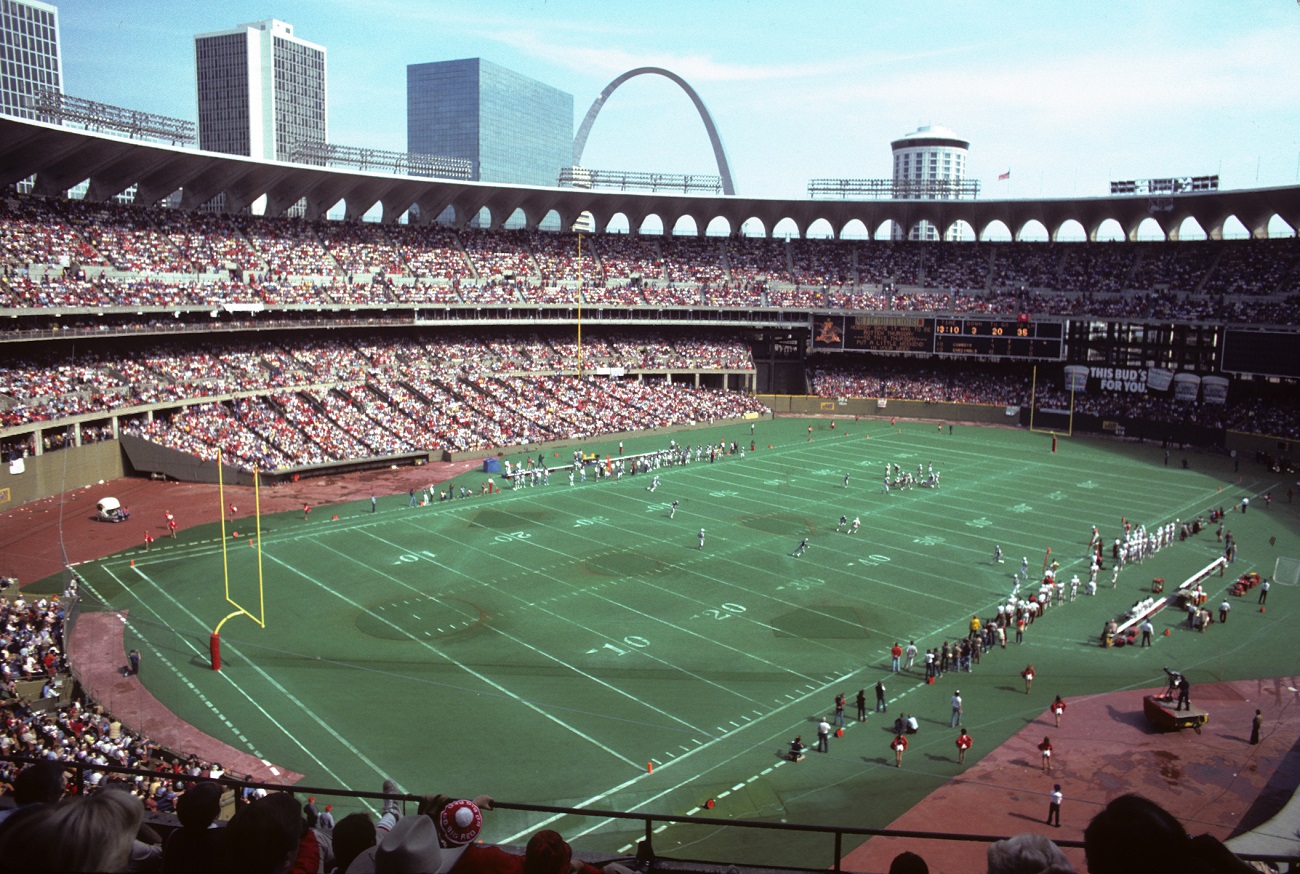
Next up we have the MLB Cardinals x NFL Cardinals!
CARDINALS HOME:CARDINALS ROAD:
CARDINALS HOME ALT:
CARDINALS ROAD ALT:
In doing research for this series, I was astounded to learn that at one point there was both an MLB and NFL team called the St. Louis Cardinals that played at Busch Memorial Stadium from 1966-87. (Side note: How was that not confusing as HELL?) With both Cards teams playing the majority of their time in the '70s-80s, I went with an era-appropriate double knit & sansabelt design with the NFL Cardinals' scarlet and black color scheme.
C&C appreciated! A different take on the Astros in Oilers colors is up next.
-
4
-
-
On 4/28/2021 at 6:06 AM, Coiler said:
I love alternate Yankees uniforms, and the Giants scheme looks better on them than the Jets would.
(And I'll admit to a bit of trepidation about the Pirates/Penguins because all the Pittsburgh teams have a similar yellow-and-black color scheme).
Thanks! Let's see if I put your trepidation to rest today!
PIRATES HOME:PIRATES ROAD:
PIRATES HOME ALT:
PIRATES ROAD ALT:
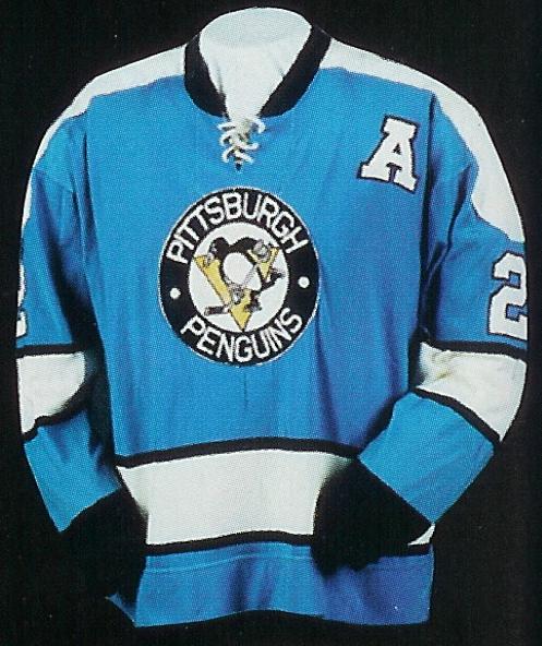
The three major sports teams in Pittsburgh all famously share the same color scheme, but for a period in the 1960s-70s, the Pittsburgh Penguins included Columbia blue in their identity. I wanted to apply that scheme to the Pirates to see how it would work. Rather than being used as an alternate color, the blue is both a trim color and the color of the road set. This was a bit of a juggling act trying to balance three colors (not counting white) but I think I somewhat pulled it off. Thanks to @Carolingian Steamroller for suggesting using this great former alternate logo as a sleeve patch.
C&C appreciated! The Cardinals x NFL St. Louis Cardinals are coming soon.
-
8
-
-
On 4/26/2021 at 1:13 PM, Coiler said:
Both look great. I love "weird" colors like the lime green.
17 hours ago, John1988 said:Diggin' the Mariners set, that Seahawks lime green really pops nicely with that color set.
Thanks!
Up today we have the Yankees!
YANKEES HOME:YANKEES ROAD:
YANKEES HOME ALT:
YANKEES ROAD ALT:
The Bronx Bombers use the blue and red color scheme of the New York Giants, who played at old Yankee Stadium from 1956-73. The home alt uses the fantastic Yankees script from this old dugout jacket, while the road alt is an inverted version of the home set.
C&C appreciated as always. The Pirates x Penguins are on deck!
-
1
-
-
On 4/24/2021 at 3:35 PM, Coiler said:
Can't wait to see it!
For another red-black uniform, I'd be interested in seeing what the Phillies would look like in turn-of-the-millennium Sixers colors.
Really funny that you should suggest that as I've been working on some designs based on Hat Club's MLB/NBA Crossover series. Here you go!
PHILLIES:Up tonight, as suggested by @jwinters, are the Mariners in modern Seahawks colors!
MARINERS HOME:MARINERS ROAD:
MARINERS HOME ALT:
MARINERS ROAD ALT:
Since I've done the Mariners x Seahawks before, this one doesn't require a ton of explanation. @Carolingian Steamroller did on excellent job on the current Mariners uniforms in modern Seahawks colors a few years back, so I decided to apply the 'Hawks navy and volt green to the Mariners' '70s look, though with more modern piping than my first version.
Let me know what you think. The Yankees are up next!
-
5
-
-
After a small break I'm back today with the Braves!
BRAVES HOME:
BRAVES ROAD:
BRAVES HOME ALT:
BRAVES ROAD ALT:
The relocated Braves and expansion Atlanta Falcons played at Atlanta-Fulton County Stadium starting in 1966 through 1991. I've done the Braves in black and red before, so I changed a few things this time around, namely simplified piping and a new cap design for the home set. The colors have another local connection to the Hawks and University of Georgia Bulldogs. It's a fun to imagine an alternate history where the Braves moved from Milwaukee to Atlanta and tweaked their colors.
C&C appreciated! A new take on the Mariners is up next.
-
3
-
-
10 hours ago, Victormrey said:
Top notch work! I think the Rockies set looks great in the Broncos' vibrant colours.
The Padres road alt uni is a thing of a beauty

Thank you!
This afternoon we have the Minnesota Twins!TWINS HOME:
TWINS ROAD:
TWINS HOME ALT:
TWINS ROAD ALT:
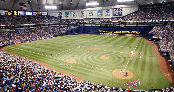
The Twins shared the Hubert H. Humphrey Metrodome (AKA the "House of Horrors" if you're a White Sox fan) with the Vikings from 1982-2009 before moving into Target Field in 2010. I went with an era appropriate pullover/sansabelt design and tried something different by going with gold scripts and numbers on both the home and road sets.
C&C appreciated. The Braves x Falcons will be up soon!
-
3
-
-
20 hours ago, Silence of the Rams said:
I'm surprised you didn't do the Arizona Cardinals and Oakland Athletics because Kyler Murray was on both payrolls
 . All joking aside this is clean. All AFC West, AL West and AL Central teams are now triggered
Haha, thanks! I agree it's weird to see the A's in red instead of green but it's a great color scheme nonetheless.
16 hours ago, MCM0313 said:Man, talk about outside the box! Also - yes, spumoni is way better than Neapolitan.
Thanks! Pistachio is criminally underrated.
Today we have the Colorado Rockies x Denver Broncos!
ROCKIES HOME:
ROCKIES ROAD:
ROCKIES HOME ALT:ROCKIES ROAD ALT:
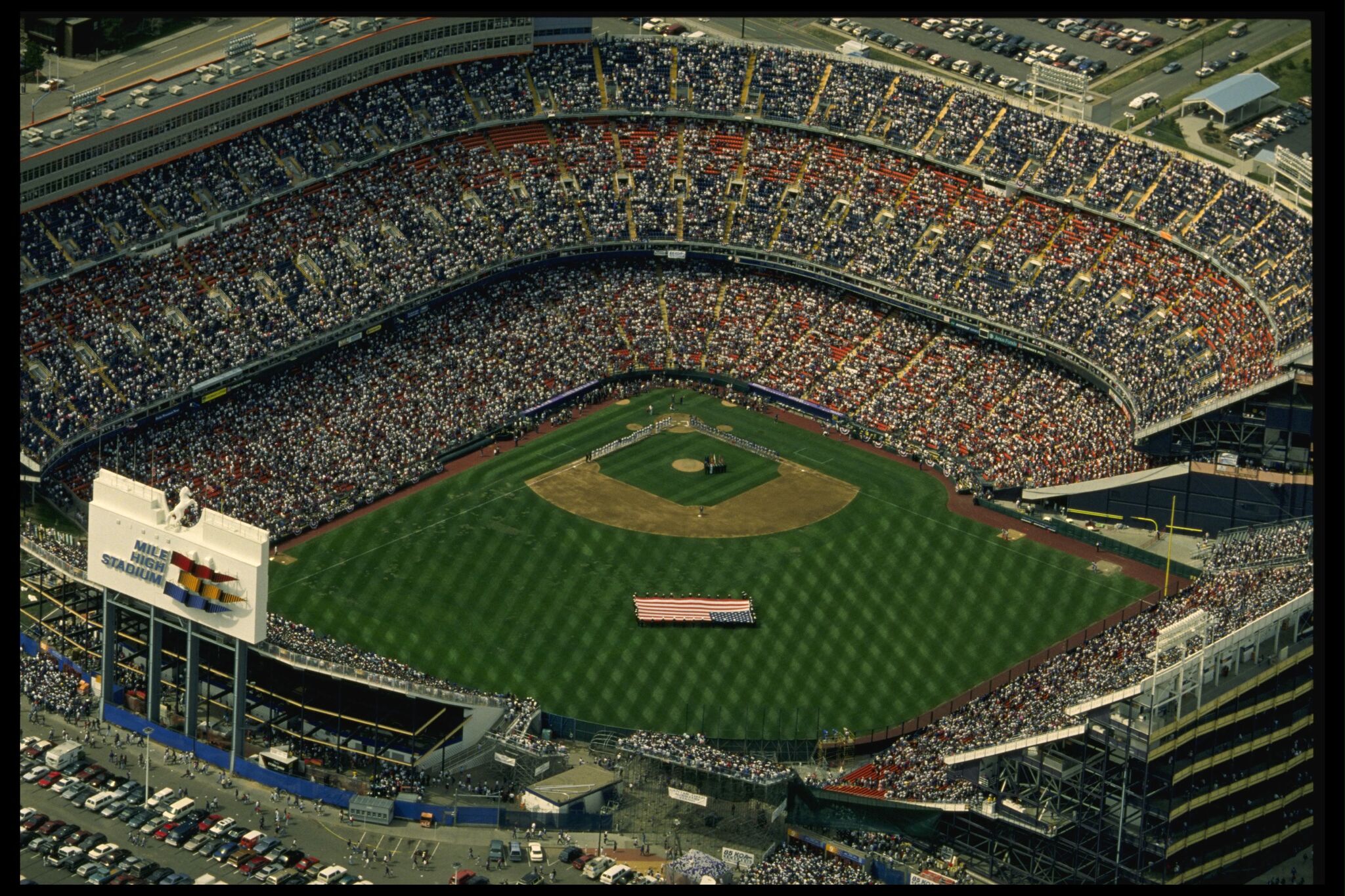
Everyone knows that the Rockies play at Coors Field, but some may forget that for the first two years of their existence they shared Mile High Stadium with the Denver Broncos. Unlike my previous two Rockies designs, this one uses simplified scripts (no inserts) and single outlined numbers. I also added pinstripes on the road to separate this design from the Mets' road uniform.
C&C appreciated! The Twins x Vikings are next.
-
6
-
-
8 hours ago, jaytavo305 said:
I actually really like that dodgers set
I feel ashamed saying that but it's pretty great, especially the black alt. Looks very rockies already, but I'd maybe like to see a black cap with a purple brim for that alt
Thanks! Here's the road alt with the black cap you suggested:
DODGERS ROAD ALT:
Today's team is the Kansas City Athletics!
ATHLETICS HOME:ATHLETICS HOME ALT:
ATHLETICS ROAD:
ATHLETICS ROAD ALT:
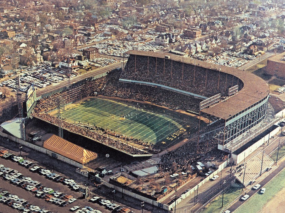
This one is purely a throwback what-if. The Chiefs and Athletics both played at Municipal Stadium from 1963-67 before the A's headed west to Oakland in '68. In keeping with historical accuracy, each set is the same design just in different colors.
C&C appreciated as always. A new Rockies set is up next!
-
5
-
-
On 4/9/2021 at 7:31 PM, jwinters said:
Some others that I think would be cool to see if you're up for it: Dodgers in late '90s Kings colours (especially in light of the revelation they almost switched to purple), or the Mariners in the modern Seahawks navy/grey/lime.
Ask and ye shall receive!
DODGERS HOME:DODGERS ROAD:
DODGERS HOME ALT:
DODGERS ROAD ALT:
With the recent revelation that the Los Angeles Dodgers may have considered switching from blue to purple in the '90s, and, inspired by @jwinters' suggestion, here are the Dodgers in late '90s-early 2000s L.A. Kings colors. I decided to lean hard into the late '90s aesthetic, which means lots of busy piping, black and silver and, of course, vest uniforms. The basic design of the home and road uniforms is based on this one season alternate from 1999.
C&C appreciated! The Athletics x Chiefs are next up.
-
5
-
-
6 hours ago, Carolingian Steamroller said:
Love the Cardinals/Sox design!
The connection to U of C is really interesting given that the Cardinals are the Cardinals because they wore faded U of C Maroons jerseys.It's also nice to have an all South Side set with U of C being located in the lovely Hyde Park neighborhood on South Lakeshore Drive.
Looking at it now, I'd be tempted to use a wishbone "C" on the cap, even though its not accurate to that era just to cement the connection since the Cardinals used to use one and the Maroons continue to feature it.
Thanks! Here's the home set with a wishbone "C." I actually used the Bears logo:
WHITE SOX HOME:
11 hours ago, O.C.D said:The Miami Marlins in Dolphins colors is fantastic. Great color scheme and it looks great with the old template
The Rockies/Av's crossover look really good too. The avs color scheme would stand out and look better than the black and purple.
The Nationals in the old Wizards/Caps colors looks really good. I always really liked that scheme but I have a hard time arguing for it's use over red white and blue
Thanks for the feedback!
My next design is actually inspired by your post in this other thread, @O.C.D:Also, @Ark:
PADRES HOME:
PADRES ROAD:
PADRES HOME ALT:
PADRES HOME/ROAD ALT:
Here's the Padres 2020 redesign swapping out athletic gold for pale pink and making the home uniform off-white for the full Neapolitan ice cream effect. I also added a new home alt to really embrace the pink. On a side note, spumoni >>>>>>>>>>>>>>>>>>> Neapolitan.
C&C appreciated as always! Another take on the Dodgers is up next.
-
6
-
-
On 4/11/2021 at 5:15 PM, Paul Lucas said:
Man, I’m a sucker for that ‘87 script. Love this whole series. Great work, brother!
Thanks, man!
Today we have the Chicago White Sox!
WHITE SOX HOME:
WHITE SOX ROAD:
WHITE SOX HOME ALT:The Chicago Cardinals played at Comiskey Park throughout the 1920s and again from 1940-58 before relocating to St. Louis in 1960. This set is based on the White Sox early 1940s zippered design. The maroon and tan color scheme may not scream "Chicago" as loudly as black & red or sky blue and red, but there is a local connection to the University of Chicago.
C&C appreciated! A small surprise is next.
-
3
-


.jpg)


_RWD.jpg)
/cdn.vox-cdn.com/uploads/chorus_image/image/67465752/2021_All_Star_Game_Logo_and_Fact_Sheet.0.png)
/cdn.vox-cdn.com/uploads/chorus_asset/file/13708959/AA40DF88_D17E_431B_8F6F_CA85F97E810D.jpeg)
/cdn.vox-cdn.com/uploads/chorus_image/image/59219063/Dave_Hampton.0.jpg)
/arc-anglerfish-arc2-prod-tronc.s3.amazonaws.com/public/HNBLOBCMFZD6JD4LQTYC6FTTOA.jpg)
City Connect tweaks (Full Rays Redesign 5/10)
in Concepts
Posted
Thank you! Yes, the red with the black definitely hearkens back to the late '50s Sox (their best look, in my opinion).
Thanks! @johne9109 I can definitely play around with Coyotes colors for the D-Backs. I'm not against using Sedona red, but only in addition to a "classic" color like purple or turquoise.
Up today we finally have the Red Sox!

I think Nike really blew it by launching the City Connect program with Boston's set. The problem is that absolutely nothing about this uniform screams "Red Sox," and I think that really dashed people's expectations right off the bat.
For my tweak, I used a non-arched version of Boston's Tuscan script along with stencil style numbers akin to the actual jersey's script. I also went with a yellow cap logo because I'm not a fan of the blue on blue look. Not as major of a change as Arizona, but I think it's an improvement.
C&C appreciated! New tweaks will be posted as additional teams are unveiled.