


coco1997
-
Posts
4,878 -
Joined
-
Last visited
-
Days Won
14
Posts posted by coco1997
-
-
On 8/20/2021 at 7:32 PM, Coiler said:
Like the different colored sleeves.
If you wanted another scratch built Dodgers uniform, you could do one with a Hollywood sign imitation font. That would fit and look good.
Thanks. The Hollywood idea is nice but maybe a bit cliched. I like the Latino heritage concept they went with, but I think it could have been executed much better.
Up today is another Cubs City Connect tweak:

The Cubs' City Connect set has surprisingly grown on me, though I'm not still not sold on the "Wrigleyville" script. I decided to just slap the cap logo on the front of the jersey, as I think the combination of the flag colors and the six pointed star does a better job representing the whole of Chicago than just having the name of one specific neighborhood on the front. @Carolingian Steamroller suggested the back numbers be outlined, and I agree.
C&C appreciated!-
 4
4
-
 1
1
-
-
12 hours ago, mrcubfan415 said:
Those colors IMMEDIATELY made me think of the Diamondbacks lol
That's fair. In this alternate universe the D-Backs would have stuck with purple and turquoise thus avoiding any comparisons with this Padres redesign.
7 hours ago, Victormrey said:Great work overall! The scarlet + gold scheme really works for the Padres, and the Twins with that unique blue-ish teal shade is one of my favourite sets of the project!
Thanks!
Up today are the 1976-86 Twins!
TWINS 1976-86 HOME:TWINS 1976-86 ROAD:
TWINS 1976-86 HOME ALT:
TWINS 1976-86 ROAD ALT:
Another take on the Twins, this time using the royal blue and red color combo from the team's 1976-86 primary logo. This one is pretty straightforward. Red emphasized at home and blue on the road.
C&C appreciated!
-
2
-
-
6 hours ago, Coiler said:
Blue and yellow does make it a little Brewers-ish, but gold fits with a team called the "Royals".
Thanks. Yeah, there was some concern about looking too much like the Brewers, which is one of the reasons I went with gold scripts and numbers.
Next up are the 2004-11 Padres!
PADRES 2004-11 HOME:PADRES 2004-11 ROAD:
PADRES 2004-11 HOME/ROAD ALT:
For the Padres, I used the scarlet and metallic gold of the 2004-11 Padres' Swinging Friar alternate logo. Sand is used both as a trim color and as the base of the road uni.
C&C appreciated! Another take on the Twins is up next.-
3
-
-
On 8/24/2021 at 2:02 PM, Coiler said:
On one hand, the colors look ugly, like a cross between a mustard hot dog and the North Vietnamese flag. On the other, it does look very 1970s, like something that would appear in "bad uniforms of the decade" retrospectives.
Haha! Yes, "very 1970s" is exactly what I was going for. And hey, if the Padres can get away with having "pee and poop" colored uniforms (not my sentiments) I'm shocked no MLB team has latched onto a red and athletic gold color scheme.
Anyway, up this evening are the 1969-85 Royals!
ROYALS 1969-72 HOME:
ROYALS 1969-72 ROAD:
ROYALS 1969-72 ALT:ROYALS 1973-82 HOME:
ROYALS 1973-82 ROAD:It wasn't until Kansas City won the World Series in 2015 that the Royals finally started to lean into a gold-tinged look. This redesign adds the deep, almost orange-y gold from to their 1969-1985 primary logos to their 1969-82 uniforms with gold scripts and back numbers at home and a gold squatchee on the caps. Unfortunately, I had to roll with gray for the '73-82 road set because this particular shade of gold and powder blue just did not go well together.
C&C appreciated as always!
-
3
-
-
On 8/22/2021 at 6:00 PM, Coiler said:
Looks very 70s in a good way and the teal-blue is a nice distinct color. Another great job!
Thanks! I'm having fun with these designs.
Next up are the 1971-72 California Angels:
ANGELS 1971-72 HOME:ANGELS 1971-72 ROAD:
ANGELS 1973-85 HOME:
ANGELS 1973-85 ROAD:
The 1971-85 Angels primary logo is mostly red and halo gold. This design replaces navy with gold and uses a new gold crowned cap with a white front panel for use at home.
C&C appreciated!
-
4
-
-
20 hours ago, SpenserRM said:
I cannot wait to see how they butcher the Rays city uniforms.
I mean, almost anything would be better than their drab everyday uniforms. -
16 hours ago, Coiler said:
Like the brown and tan. It's neither red nor bears orange, and looks distinct without being ugly.
Thanks!
The next team is the 1961-75 Twins:TWINS 1961-71 HOME:
TWINS 1961-71 ROAD:
TWINS 1972-75 HOME:
TWINS 1972-75 ROAD:
The first Twins' primary logo strangely used a distinct shade of teal-ish blue along with red. The 1961-71 set is pretty straightforward, with navy replaced by this teal-ish blue. I used this teal-ish shade as the base of the 1972-75 road uniform which I feel would have been right at home with the wacky aesthetic of baseball at the time.
C&C appreciated!
-
5
-
-
3 hours ago, Anubis2051 said:
Anyone have a link to the 2022 ST hat leak?
What hat leak?
-
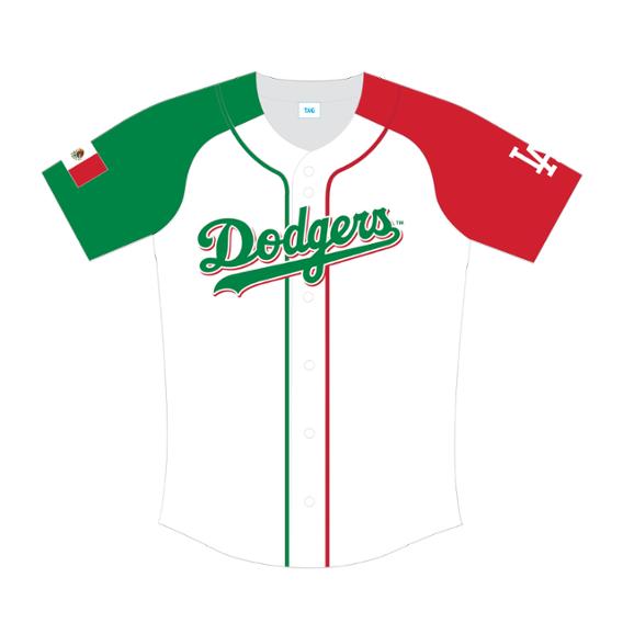
I'm back today with the Dodgers!
Ok, this one is a little more than just a "tweak." Frankly, I'm hugely disappointed at how boring the last few City Connect designs have been. The Dodgers one is fine, but after years of enjoying other people's concepts (and creating some of my own) of the Dodgers in blue, seeing that same basic design come to life feels somehow underwhelming. Also, slapping "Los" in front of the Dodgers script as a way to honor the city's Latino community reeks of lazy pandering. (Not to mention, the "spray paint" effect at the edges of the sleeves are stupid and practically invisible from a distance). For my version, I leaned much harder into the Latino tribute idea, using the colors of the Mexican flag and a "Los Doyers" script. The general design/color scheme is based on this Mexican Heritage Night giveaway jersey.
C&C appreciated!-
3
-
-
16 hours ago, Coiler said:
One big problem: The socks are not colored white. On a team called the White Sox.
(Also, having them be colored BLACK of all things would not be good optics given the incident).
Fair comment, but you'll notice that the actual uniforms from this era did in fact use black stirrups with white sanitaries. My '69-70 home and alt designs above use white socks.
21 hours ago, NicDB said:Not bad in a vacuum, but in real life, the similarity to the Pirates is too jarring for me. This would look more "Chicago" to me with red instead of yellow.
Very true. As I mentioned, the only way this could work in real life is if the Pirates owned a color scheme other than black and gold.Up today we have the 1941-45 Cubs!
CUBS 1941-45 HOME:CUBS 1941-45 ROAD:
The Cubs' 1941-45 primary logo features a fearsome growling brown bear without a trace of the Cubs' secondary color of red. Blue is emphasized at home and brown on the road. The khaki color from their 1908-10 logo serves as the base for the away uniform.
C&C appreciated!-
3
-
-
On 8/17/2021 at 1:57 PM, Coiler said:
That looks so much like the turn of millennium Wizards. And it's actually better IMO than the drab red or red-blue the real Angels have always used.
Thanks! And you're absolutely correct about the similarity to those Wizards uniforms.
Up today we have the 1950s-1960s White Sox!
WHITE SOX 1951-63 HOME:
WHITE SOX 1951-63 ROAD:
WHITE SOX 1969-70 HOME:WHITE SOX 1969-70 ROAD:
WHITE SOX 1969-70 ALT:From 1949-70, the the White Sox used this sharp roundel logo. I decided to go gold logos and numbers on the '69-70 home set similar to the A's. If the Pirates didn't have a monopoly on black and gold, I think this is a color scheme the White Sox could absolutely own. Big thanks to @Carolingian Steamroller for the consult on this one.
C&C appreciated!
-
2
-
-
1 minute ago, Coiler said:
Teal and orange gives it a Dolphins/Hurricanes flavor, so it fits very well.
Thanks!
Next up are the Disney era Anaheim Angels:
ANGELS 1997-2001 HOME:
ANGELS 1997-2001 ROAD:
ANGELS 1997-2001 ALT:
This Angels' 1997-2001 alternate logo is oddly devoid of any red which is the Angels' signature color. To that end, this design replaces red with the metallic gold from that alternate logo. This is definitely one of the most "late '90s" designs I've ever done. I also decided to go all in on periwinkle as the base color of the road set.
C&C appreciated!-
1
-
-
After a few months of inactivity, I'm back!
My latest inspiration came from old logos. Looking through the history of teams' primary and alternate logos on the mothership, I found that there were several teams throughout MLB history whose former logos made prominent use of colors that never appeared anywhere on their actual uniforms. So the next phase of this series is MLB teams in old primary and alternate logo colors. We start today with the 2003-11 Florida Marlins:
MARLINS 2003-11 HOME:
MARLINS 2003-11 ROAD:MARLINS 2003-11 ALT:
The Marlins' 2003-11 alternate logo features a sunburst of orange that never appeared on any of their actual uniforms from that era. The home set is a hybrid of their original sleeveless jerseys using the "F" crest from their 2003-07 home alternates, and the road jersey uses the superior arched "FLORIDA" script from their inaugural road design. I also whipped up a teal alt based on their BP jerseys from the time to replace their drab black alternates.
C&C appreciated. Another team will be up soon!-
1
-
-
The Chicago Dogs will be donning Homestead Grays unis for their game against the Kansas City Monarchs tonight:
Not sure why they didn't choose the uniforms of a Chicago team, but I'm always happy to see Negro League teams in action.
-
2
-
-
21 hours ago, CaliforniaGlowin said:
Vice colors live on!!!
This is what the Marlins uniforms should look like.
-
2
-
-
16 hours ago, johne9109 said:
Great job again.
Thanks!
17 hours ago, AusGiant said:Blue Giants jersey = we riot
Here's a version without white:
-
1
-
-
On 6/24/2021 at 10:39 PM, GoCubsGo said:
The Only Problem I See is the Red Sox Uniform looks like a faded out Miami Dolphins Jersey.
Hmm, I don't really see that. The red is quite distinct from Dolphins orange.
Up today we have the San Francisco Giants:
Is it me, or does it feel like these City Connect designs have been getting worse and worse? Anyway, I tried to do what I could with the Giants. The biggest change is that I made the jersey sky blue. Orange and white seems too plain, and if the concept is supposed to be based on the visual effect of the Bay's fog against the Golden Gate bridge, it makes sense to incorporate sky blue. I also replaced orange with the official Pantone color of the Golden Gate Bridge--Pantone 180, which is much more of a rusty red than Giants orange. Lastly, while I don't dislike the "G" on the jersey as much as others, I decided to swap it out for the "SF" monogram. Big thanks to @MJD7 for the bridge design.
Here's hoping the Dodgers designs ends the season on a high note. C&C appreciated!-
3
-
-
4 hours ago, Coiler said:
I'm wondering what existing teams would work well with a "cotton candy" color scheme (pink and light blue) besides the already done (and well-done) Marlins going vaporwave/vice neon.
How about the Rays? Those colors sounds like they could work for the other Florida team.
Or even the Mets, who briefly toyed with using a black and pink color scheme before settling on royal blue and orange.
-
1
-
-
On 6/22/2021 at 12:40 PM, Davidellias said:
Baseball road uniforms should be team colored not grey .
You just gave me an idea for a concept series.
-
3
-
-
On 6/16/2021 at 6:04 PM, johne9109 said:
I still think this is way TOO radical of a change for the Red Sox. I do agree that in general it was misstep starting with this uniform with how much of a departure it was for the Sox, but I think that was Nike's way of saying expect the unexpected. They could've done something green and said it was Green Monster or done something modeled off of the red brick architecture of New England or the Giant Citgo sign above Fenway
Here's a version of the Red Sox in Fenway green I worked up:
This time around, I kept the script and number styles from the original City Connect design, but I traded the Marathon colors for Fenway green and red. I also made the "B" cap logo match the stencil style of the script. I originally tried the design with red scripts and white outlines, but the contrast wasn't very good.
-
5
-
-
On 6/20/2021 at 3:42 PM, johne9109 said:
I like the numbers for the White Sox!
Thanks!
Another idea for the White Sox. I swapped out the "Southside" script for my gothic "Chicago" script:-
7
-
-
17 hours ago, DNAsports said:
It works for the home and alt, but not the away. Otherwise it looks great!
How about now?
-
4
-
-
On 6/13/2021 at 5:27 AM, Coiler said:
A weird concept would involve making the Cardinals in the duller colors of the female bird instead of the existing bright red.
This was a weird idea for a design but here you go:
CARDINALS HOME:
CARDINALS ROAD:
CARDINALS HOME/ROAD ALT:
Tan and black on its own is too drab so I still kept some red but tried to relegate it to a trim color. And since a gray road uni with tan/khaki scripts & logos would look horrible (I'm looking at you, Diamondbacks City Connect uniforms) I made tan the base of the road set. The black alt could be worn at home or on the road.
C&C appreciated!
-
3
-
-
A few tweaks for the end of the week...
First, I wanted to re-post a Cubs tweak I shared in another thread. Just a blue version of my original design:
Next, a tweaked version of my original D-Backs design, using the triangle sleeve patch and a less yellow shade of sand:
Big thanks to @Umachines for the cleaned up logos and scripts!
Lastly, I wanted to see what the White Sox City Connect numbers would look like on their regular uniforms:
WHITE SOX HOME:
WHITE SOX ROAD:
WHITE SOX HOME/ROAD ALT:
C&C appreciated!
-
2
-


_RWD.jpg)
Recoloring MLB (Formerly Un-Blue & Redding MLB) - Mariners in 2023 All-Star Game colors 7/25
in Concepts
Posted
Thanks!
Today we have the 1977-1979 San Francisco Giants!
GIANTS 1977-79 HOME:
GIANTS 1977-79 ROAD:
GIANTS 1977-79 ALT:
The 1973-79 Giants' primary logo is a pale orange-colored baseball outlined in the Giants' regular orange. For the Giants' '77-79 look, I incorporated this lighter orange, and rather than try to juggle all three colors on the road uniform, I made the entire set this shade of powder orange, if there is such a thing.
C&C appreciated!