


coco1997
-
Posts
4,871 -
Joined
-
Last visited
-
Days Won
14
Posts posted by coco1997
-
-
Nats City Connect unveiled:
-
 4
4
-
 1
1
-
-
Speaking of the Braves, anyone know what this is?
-
23 minutes ago, LA_Angels said:
So braves are getting city connect now. Interesting… I wonder if they’re going to fit all the clubs in the program this year. I think that was rumored a while ago could be wrong.
Where did you hear the Braves are getting one this year? -
Just now, BltzW said:
At my local Scheels they have the Cubs City Connect jerseys available, they're the blue ones from last season, but I would assume any team that had one last year would just keep their CC uniforms for the '22 season.
All teams from last year will use those designs for at least three seasons.-
3
-
-
6 hours ago, Raptorman415 said:
Is there a full list of who's getting a City Connect this season?
Not yet, but based on those Stance leaks from a few weeks ago sounds like it’ll be the Padres, Rockies and Nats for starters. -
Not sure if this has been mentioned yet, but it sounds like the Nats’ City Connect look is being unveiled next Tuesday.
-
Speaking of City Connect, I wonder when we'll see our first new design. There should be about twice as many teams rolled out this year than last, so I imagine we’ll get about two teams each month of the season.
-
1
-
-
10 minutes ago, ThunderCeltic said:
So will all 30 clubs have "City" editions this year and the clubs that had "City" sets last year will be retained?
I always love guessing on the NBA edition sets so I'll try for MLB.
Atlanta- Navy 70's Hank Aaron Fauxback
Washington- Cream Senators Fauxback
Philadelphia- Maroon Liberty Bell Inspired
Cincinnati- White w/Red Pinstripes Fauxback
Milwaukee- Royal Blue County Stadium Inspired
St. Louis -White Honoring Stan Musial (Cardinals follow Lakers of NBA who dedicate City editions to past players)
Pittsburgh- Black w/Yellow Pinstripes Fauxback
Colorado- Dark Green and Purple Rocky Mountain Inspired
San Diego- Brown 80's Fauxback
Baltimore- Black & Orange Earl Weaver Fauxback
New York- White/w Pinstripes 1927 Fauxback
Tampa Bay- Dark Green 1998 Fauxback
Toronto- Red Honoring Canada
Cleveland - Brown & Orange honoring the Browns
Detroit- Cream 1920's Fauxback
Kansas City- White w/Red honoring Kansas City Monarchs
Minnesota- Purple Prince Inspired
California -Navy 1980's Fauxback
Houston -Orange Astrodome Inspired
Oakland- Monochrome Green honoring Charlie Finley
Seattle- Blue & Gold 1980's Fauxback
Texas- Blue & Red 1980's Fauxback
No. Unless something's changed, the way it was originally announced, the City Connect program is a slow roll out over three years, so a few more teams than last season (I'm guessing 11-12 total) will debut theirs this year, and the remaining teams will unveil theirs in 2023.-
1
-
-
1 minute ago, EJ_Barlik said:
I'll trade you the 75th anniversary patch for 2 extra teams in the MLB playoffs....... LOL
You're right, I meant to include 75th.
-
 1
1
-
-
20 minutes ago, EJ_Barlik said:
Kinda yeah - and it looks better than what happened for the 60th.....
But like someone else here said before, all these "special anniversary" patches are just for sales.
When do we realistically need them? 5th, 10th, 25th, 50th, 75th, 100th ?
I'd say even a 5th anniversary is unnecessary. 10th, 25th, 50th, 100th, and then every 25 year anniversary after that seems fair.
-
1
-
-
3 hours ago, ltjets21 said:
So Derek Jeter stepped down as the CEO and in that amount of time removed all the character out of their ballpark and uniforms and accomplished nothing on the field. What a schlub.
Remember when people were speculating that Jeter's involvement was going to somehow result in the team looking more like the Yankees? So much for that.
-
1
-
-
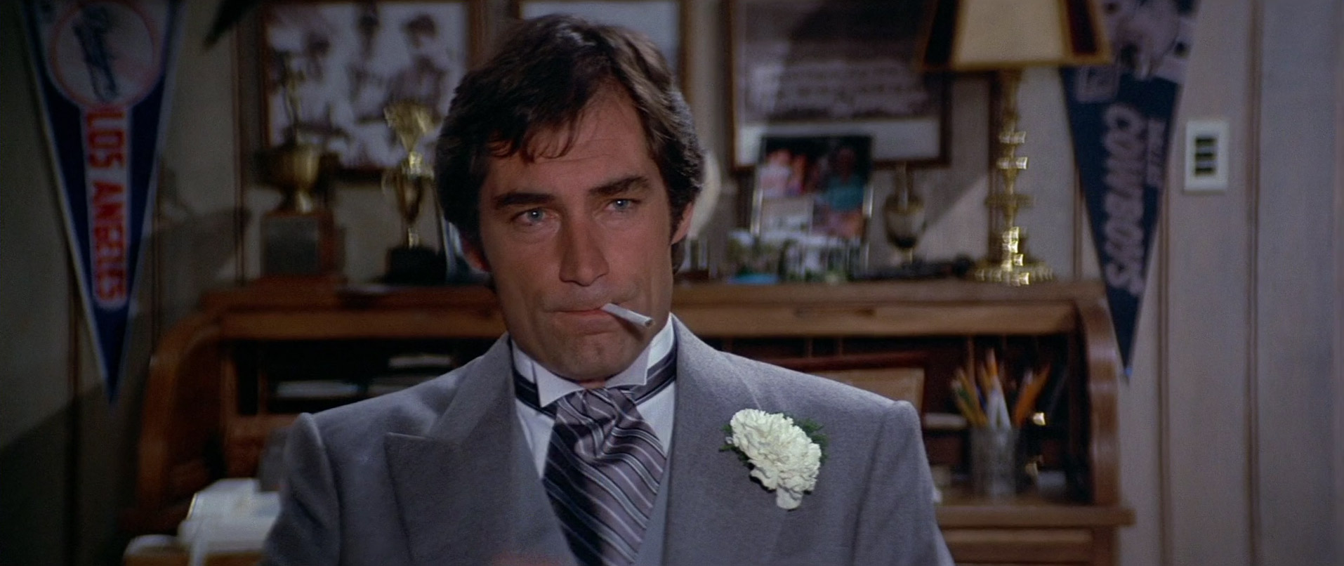
In the 1989 James Bond film LICENCE TO KILL, 007's CIA buddy Felix Leiter has several pennants hanging in his home office including the Yankees, Cowboys, Dodgers, Cubs and Reds:

Lots of other sports memorabilia and team photos as well but I can't make out who they are.
-
1
-
-
Will the other two acts in this play include the other professional sports leagues?
-
The White Sox 1917 cap logo in black and white is a cool look:
-
5
-
-
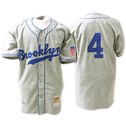
Another stab at the Dodgers, this time using the 45th Annual Hollywood Stars Night jerseys as inspiration:
LOS ANGELES DODGERS:
Essentially those Hollywood Stars jerseys with matching pants, a tweaked cap design and new numbers style (plus the Stance designed socks). Thoughts?
-
2
-
-
20 hours ago, CaliforniaGlowin said:
Unusual name and VICE COLORS!!!

Is it bad that I kind of dig this? I much prefer this kind of weird to something like the "Lexington Bluegrass Ponies" Brandiose-style of weird/bad. I'm curious to see how the uniforms look.
-
1
-
-
-
I think you need some kind of red and/or white piping on the Cubs alt. The complete lack of trim on their current blue alt is my biggest problem with it.
-
Thought it would be fun to squeeze in one final concept before the year ends. With the Virginia Tech Hokies wearing the Yankees logo on their helmets this past Wednesday, I decided to read up a bit more about the special relationship between the Bronx Bombers and Virginia Tech, so here are the Yankees in VT Hokies colors:
YANKEES HOME:YANKEES ROAD:
YANKEES HOME ALT:
YANKEES ROAD ALT:
C&C appreciated and Happy New Year!
-
1
-
-
13 hours ago, O.C.D said:
Atlanta Braves
San Diego Padres
Washington Nationals
Los Angeles Angels
I could see people making a case that these names are problematic.
If you're going to include the Angels then I'd argue you could add "Padres" to this list since their name is inspired by a religious order and some people might find that "icky."
Note: I don't personally feel the Padres should ever change their name nor am I aware of anyone currently demanding they do. But this might be where the road we're heading down leads us in a few decades (if not sooner).
-
On 12/11/2021 at 8:17 AM, WSU151 said:
This logo leads me to wonder, how would you guys feel about the Rangers adding some gold trim to their unis? I think it could work for Texas better than it does for the Twins and set them apart from most other RWB teams (assuming the Twins get their act together and eventually ditch the gold themselves).
-
Gonna be great when Max Scherzer secures the final out of the 2022 World Series while wearing the black alternate and then those jerseys are NEVER going away again.
-
2
-
 1
1
-
-
On 11/24/2021 at 12:38 PM, SFGiants58 said:
I want to like it, but the red front number that works so well with cursive script kind of doesn’t work with an insignia. Maybe going all-in on a vintage look (with the Brooklyn-style trim) would be better.On 11/25/2021 at 12:35 AM, DarthBrett said:I like it but would change three things that would improve it. Drop the white trim on the piping, add piping/stripes down the pant legs and ditch the number on the front altogether. There have been many jerseys with logos but without numbers and they usually look good ('90s Angels navy alt, Dbacks black alt and original vest, the current Giants black alt and retired but recent road alt, the Marlins mid-2000s alt, the Padres 2010s unis, the early 2000s first Reds red alt, the most recent Royals blue road alt, the Tigers home whites and the Yankees home whites.
Something like this...
On 11/25/2021 at 7:17 PM, lgbaseball8 said:Maybe a front red number on the same level as the LA logo?
I took these suggestions into consideration and made some tweaks to my original idea:
@DarthBrettI minimized the white trim to just the monogram and numbers. Eliminating it entirely makes the uniform look too drab, in my opinion. The white provides a necessary pop of bright color. @SFGiants58, the piping matches these Brooklyn Dodgers road unis. @lgbaseball8, the front numbers are now level with the "LA." I also added the Nike mark and a flannel texture to the design. I do think it's an improvement on my first idea.
-
3
-
-
30 minutes ago, SFGiants58 said:
I’m cool with a tail under two words, which is why I like the Dodgers’ “Los Angeles” road and the Giants’ jacket script. However, the Dodgers could easily have a road grey with the “LA” insignia on the chest and the Giants have always looked good with the block wordmark or the “SF.”
Would this work?-
2
-


MLB 2022 Uniform/Logo Changes
in Sports Logo News
Posted
“Following their in-game debut on April 9, future City Connect on-field debuts will be made by the Houston Astros on April 20, the Kansas City Royals on April 30, the Colorado Rockies on June 4, the Los Angeles Angels on June 11, Milwaukee Brewers on June 24, and San Diego Padres on July 8.“