


coco1997
-
Posts
4,878 -
Joined
-
Last visited
-
Days Won
14
Posts posted by coco1997
-
-
Royals City Connect revealed:
I like these!
-
 2
2
-
-
On 4/22/2022 at 2:14 PM, Carolingian Steamroller said:
That 30's Sox emblem works perfectly with that template. It's smooth and clean in a way that doesn't get in the way of the more outlandish elements of the design.
Thanks! It's an underrated logo that I might have to think about using more often in future Sox concepts.On 4/23/2022 at 8:23 AM, Coiler said:Both look great, though I wonder how you're going to do the Yankees and Mets without the former looking tacky and the latter looking bland.
Who says I'll be doing the Yankees and Mets?
Nah, of course I will. They'll be up soon. In the meantime, here's the next pair of teams:
INDIANS x 1961 REDS

My Cleveland design uses the sleeveless, pinstriped Reds look of the late '50s and 1960s. The 1970s "caveman" C logo works as a good substitute for the Reds' classic wishbone "C."
REDS x 1989 INDIANS
The Reds are based on the Indians' "Major League" look of the late '80s and early '90s. Here Mr. Redlegs' disembodied head replaces Chief Wahoo on the cap and left sleeve.
C&C appreciated!
-
4
-
 1
1
-
-
Nice work on the O's. I've never been a fan of the realistic looking bird, but that's just personal taste. Maybe think about putting "Baltimore" on the away alt just so you don't have "Orioles" on three of the four main jerseys.
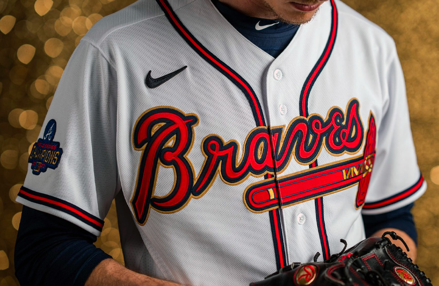
For Atlanta, I'm curious how it would look if you also included the gold piping on the home and road sets (think the Braves' championship jerseys from this season, with the gold trim extended to the soutache, sleeve and pant piping) for cohesion across all four primary jerseys. I'd also think about playing around with the shade of gold as it sort of bleeds together with the red and starts to look orange, especially on the away alt. And nice outside the box choice for the home throwback!
-
1
-
-
Recently I've been going back to some of my earliest hand-drawn baseball and "remastering" them in MS Paint. One interesting idea I had way back when was "reversed" MLB identities; essentially, taking (mostly) geographic rivals who share a city or state and swapping recognizable uniform designs with one another. See below:
CUBS x 1983 WHITE SOX
I felt the Cubs' identity lent itself well to the 1982-86 White Sox design with its use of blue and red. I used the block "CUBS" from their 2014 road alt for the jersey and a modified version of the "angry bear" logo for the cap.
WHITE SOX x 1942 CUBS
I always thought there was something really cool about the zippered 1942 Cubs home uniform, especially with its unusual vest/sleeve design. Turns out it also looks great in black and red for the White Sox. Thanks to @Carolingian Steamroller for suggesting I use the South Siders' 1930-31 jersey logo.
C&C appreciated! I'll post more pairs of teams as I finish them.
-
6
-
2
-
-
33 minutes ago, CaliforniaGlowin said:
Beautiful. I want a shirt and a poster.
This is just a painful reminder of how many cool directions the Dodgers could have take with their City Connect unis. Instead, we just got a blue version of their road set.-
5
-
-
1 hour ago, BltzW said:
Was their an image that was actually supposed to be attached?
-
1
-
-
That Toros-inspired D-Backs design is SICK! Reminds me a little of their Turn Ahead the Clock unis.
I'd still like to see the prototype Padres in in brown and orange and the Bears in purple and silver. The straightened out letters on the Giants are an improvement.-
1
-
-
15 minutes ago, johne9109 said:
Good call. I'd still probably prefer the lighter grey, but could easily go either way and be happy
The sand definitely stands out better against the darker gray.-
1
-
-
Nice work. Since you opted for sand colored scripts on the road set, maybe it would work better against their 2016-19 dark gray road color instead?
-
1
-
-
A few more fauxback designs this afternoon:
RED SOX 1974
The pullover style 1974 Red Sox in Boston Marathon yellow and blue. I couldn't think of anything both clever and era-appropriate for the front of the jerseys so if anyone has any ideas, I'd love to hear them.
WHITE SOX 1976
A design that sort of bridges the early '70s White Sox with the South Side Hitmen look of the 1977 team. "South Side" in Tuscan style with red pins on a solid navy uniform and the batterman on the cap.
DIAMONDBACKS 2001
A pinstripe-less take on the classic vest style D-Backs in purple and turquoise with "Serpientes" in the original Diamondbacks typeface.
C&C appreciated! If anyone has any other fauxback ideas or requests, let me know.
-
5
-
1
-
-
I think you outdid yourself again with the NL West! I really like what you did with all five teams. I do have a few suggestions:
Rockies - The Bears mashup is really fun but the "c" in the cap logo is not really reading as one. I'm also curious how it would look if you replaced black with silver.
Padres - I prefer the prototype design but I'd swap out gold for orange.
Giants - The angled "S" and "F" look awkward so I'd straighten them out.-
1
-
-
Royals City Connect cap has apparently leaked:
-
6
-
-
Some outside the box designs in these last two divisions, particularly the Phillies, Cubs and Cardinals. Nice work!
-
1
-
-
Great work, man! Always nice to see some baseball concepts from you. Dare I say it, I may actually prefer this to the Astros' actual set. The use of gradients and the "space-y" font give the uniforms some much needed personality.
I do think I would like the navy alt more if the script and numbers were full gradient with a white outline. Also, what's the name of the script/number font you used?
-
1
-
-
2 hours ago, McCall said:
The bottom of the letters and numbers.
And Black.
Ah, but then that sounds just like something they'd wear every day of the season.
I'm starting to think the Giants just needed to go in a completely different direction for their City Connects.
-
The Giants City Connect uniforms feel like they’re missing something. I can’t quite put my finger on it though.
-
2
-
-
Here's an idea I had for a full Nationals set in their City Connect cherry blossom colors:
NATIONALS HOME:
NATIONALS ROAD:
NATIONALS HOME ALT:
Decided to go with the Nats' 2005-10 wordmarks so I could make use of the beveling of the City Connects' "WSH." Slate gray becomes the base color of the road uniform.
On an unrelated note, anyone else craving Neapolitan ice cream all of a sudden?
-
10
-
 1
1
-
-
24 minutes ago, monkeypower said:
Take this for what it's worth (because it's the Twitter account of a subreddit).
The account adds saying it's cream (though the picture there seems pretty white) and says "Angels" on the front. It then responds to another tweet saying it's "Not official but very very very likely legitimate", so yeah...
The rumor going around last season was that it was beach themed, so that might track at least.
The surfboard detail is promising!Speaking of future City Connects, I find it strange there are no teams scheduled to debut theirs in all of May.
-
On 4/6/2022 at 6:54 AM, Coiler said:
Love the checker uniforms and Cubs pseudo-throwback.
For the Giants, you could do the all-black 1905 World Series uniform. For the Diamondbacks, you could do something in early Suns colors.
Thanks! I have a few ideas in mind for the D-Backs. I'm struggling with San Francisco because I want to take the basic idea of their City Connects (orange with no black, Golden Gate Bridge trim) and apply it to an older uniform but I'm having a hard time making it work. I think it's made me realize that the Giants really have the worst ones so far, unfortunately.Anyway, up today I have an Astros fauxback:
ASTROS 1975I like the Astros' newly unveiled City Connect unis so much that I probably won't even be tweaking them. The new design lends itself quite nicely to a 1975-mid '80s fauxback design. Instead of actual gradients, I used block gradients (specifically, Houston's tequila sunrise/rainbow guts pattern) and applied them to the script, numbers, cap logo and piping on an era-appropriate pullover style uniform. I also recreated "Space Land" using Kabel Black, a font very similar to the Astros' '70s-80s wordmark.
C&C appreciated as usual!
-
1
-
1
-
-
These are excellent!
-
3
-
-
-
Another Astros City Connect tease:
-
1
-
-
I don't think I've ever seen someone try the '83 era White Sox in just powder blue and navy. Very original! I also really like that Guardians fauxback.
The updated gradient for the Rays is also a big improvement.
-
2
-
-
Possible Astros leak?
-
1
-
 1
1
-

 They'll be up soon. In the meantime, here's the next pair of teams:


/cdn.vox-cdn.com/uploads/chorus_asset/file/3971758/GettyImages-479128244.0.jpg)
/cdn.vox-cdn.com/uploads/chorus_image/image/66930736/57039328.jpg.0.jpg)
/cdn.vox-cdn.com/uploads/chorus_asset/file/23352719/Screen_Shot_2022_03_29_at_10.51.19_AM.png)
/cdn.vox-cdn.com/uploads/chorus_asset/file/19911545/AP_17299486750460.jpg)
MLB 2022 Uniform/Logo Changes
in Sports Logo News
Posted
I feel like these hats find a way to get uglier and uglier every year.