


coco1997
-
Posts
4,927 -
Joined
-
Last visited
-
Days Won
14
Posts posted by coco1997
-
-
Awesome! I thought about doing something like this for my White Sox but realized I'd probably only end up having to do 3-4 designs.
-
 1
1
-
 5
5
-
-
11 minutes ago, Silent Wind of Doom said:
Who is now the greatest remaining legend? Nolan Ryan?

-
2
-
 2
2
-
4
-
-
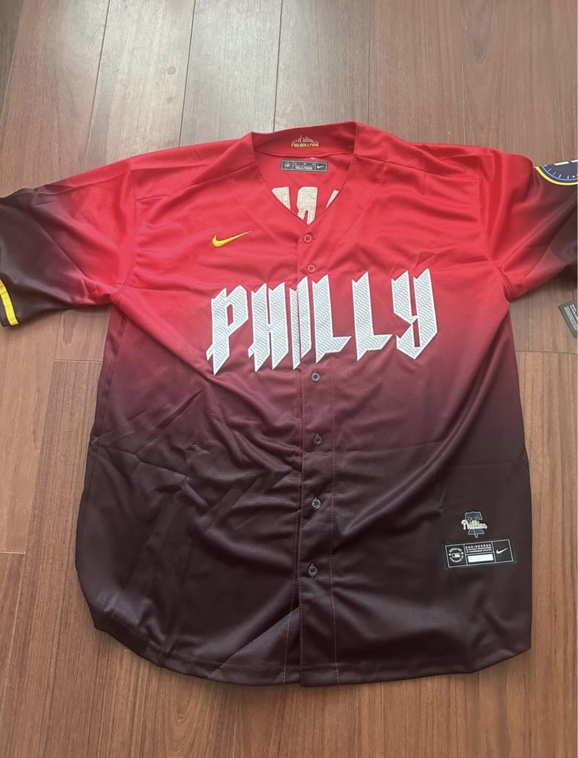
I have to imagine the red version of the Phillies' City Connect would have been better received than what we got, because it contains two actual Phillies colors that are absent from the final design: red and maroon.
-
2
-
-
1 hour ago, mcrosby said:
As long as the Dads' City Connect is as wild as it is, why not try those pinstripes on the white panel of the hat too?
Not a bad idea. Here's how that would look:
On 6/15/2024 at 7:39 PM, Paul Lucas said:Way to take the Jays’ amazing set and somehow manage to make it better. Also, I like the changes to the Twins. Lovin’ this series!!!
Thanks, man!LOS ANGELES DODGERS
HOME:
ROAD:
HOME ALT:
ROAD ALT:
CITY CONNECT:
Notes:
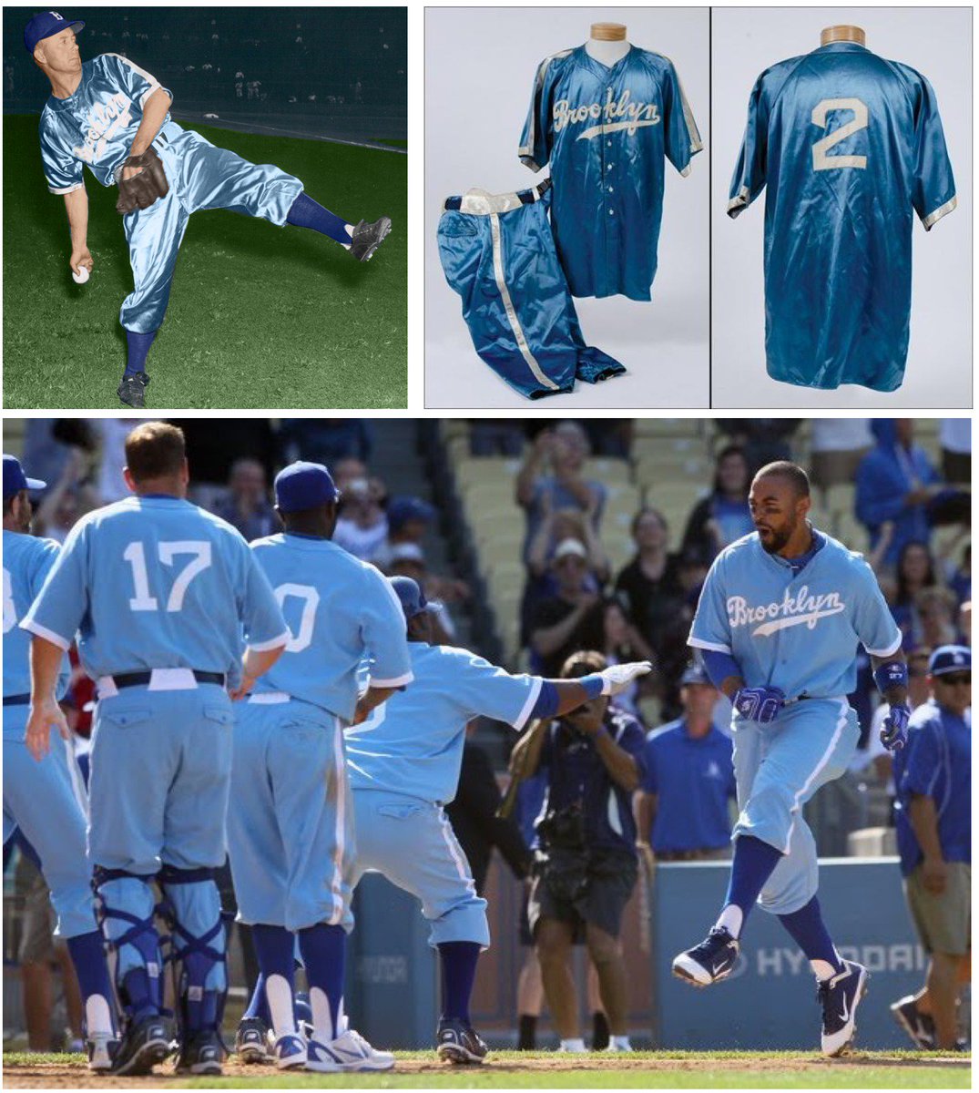
- Sorry Dodgers, I don’t care how rich you are, no team needs two gray road jerseys. To that end, I ditched the “Dodgers” version and restored the team’s late '90s-early 2000s road look with white trim.
- The road alternate is a fauxback based on Brooklyn’s 1944 baby blues, while the team gets a new home alt featuring their LA monogram.- Neither of the Dodgers’ City Connects have been particularly great, but at least the new design has some more going for it. For my tweak, I went with dark blue pants, as most people were probably expecting them to, and, since I’m not sold on the “galaxy of stars” Funfetti/sprinkle pattern, I kept the Dodger Stadium-inspired colors confined to sleeve and pants trim, as I also did for my Cathedral Connect concept. Lastly, I opted for an off-white cap inspired by this one I found on MLBShop.com. Big thanks to @MJD7 for helping out with the number font!
C&C appreciated! Just a handful of teams left before we wrap up the series!-
2
-
-
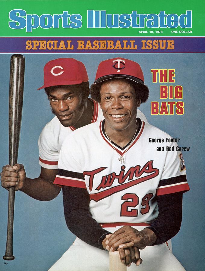
Apparently, the Phillies City Connect was going to be red at one point:
-
2
-
 2
2
-
 1
1
-
-
There doesn’t seem to be any explanation given for the odd placement of the TV numbers.
-
-
2 minutes ago, FrutigerAero said:
Here is mine. Perfectly balanced, as all things should be.
Looks like you're giving a giant middle finger to the City Connect program (or Nike).-
2
-
-
-
4
-
2
-
2
-
-
On 6/13/2024 at 2:00 AM, Saturn said:
I love you.
On 6/12/2024 at 3:34 PM, cubbeblue88 said:Love the pinstripe tweak on the SD city connects! Looks fantastic. Also love the minor edits to the Blue Jays design. In my opinion Toronto’s are the best we’ve had in a good long while.
On 6/13/2024 at 9:58 AM, Coiler said:The Blue Jays are great, a classic "don't fix too much what isn't broken" uniform.
17 hours ago, FrutigerAero said:Huh. Something about those Nationals home and away uniforms really gets the "USA" theme done in a really good way without being gaudy. Nicely done, this would be a solid look for them.
Thank you!MINNESOTA TWINS
HOME:
ROAD:
HOME ALT:
ROAD ALT:
CITY CONNECT:
Notes:
- Segregating navy and red for their 2023 redesign implied (to me, at least) the two colors are meant to be co-dominant, which means the Twins should have a red alternate—as they did from 2016-22—but they don’t. The new red alt is based on the one worn by the FCL Twins. This left the “Twin Cities” alt as the odd man out.
- The above being said, the “Twin Cities” alt is simply too good to discard entirely, so I poached elements of it for other jerseys in their set. With three of the four other AL Central teams using plain white home uniforms, I feel there’s room for the Twins to be the “off-white” team of the division, so the home uniform reflects that, and the “Twin Cities” script now appears on the road alt.- The home cap is now red (a la the Twins teams of the late '70s-mid '80s) while the road "M" cap features a white front panel. Part of my rationale for this was to try to make the Twins look as different from the Guardians as possible while working with a similar color scheme.
- Since the Minnesota stage logo is featured so prominently on the City Connect, I replaced the Minnesota silhouette logo on the home and road with the twin flags logo from the Twin Cities alt.
- Inspired by @Victormrey, the tittles above the “i’s” in “Twins” and “Twin Cities” are now North Stars.
- As I mentioned in another thread, the Twins’ City Connect is less than the sum of its parts. For my tweak, I swapped yellow for green, which would hopefully quell the criticisms that the design looks too much like Milwaukee or Seattle. These particular shades of blue and green are used by the Timberwolves.
- The placement of the “MN” leaves the rest of the jersey looking too empty, even with all the “ripple” patterns. My solution was to enlarge the logo and move it front and center, similar to how other teams (Pirates, Mets, Guardians) have used airport/railway codes in large letters on their City Connects.
- I replaced the “ripple” patterns (which don’t read well on TV, as we saw last night) with wavy lake pinstripes, a la the Cardinals’ City Connect jerseys.
- Lastly, the Minnesota cap logo and loon sleeve patch switch spots.
C&C appreciated!-
5
-
-
I really like most of what you've done with the Angels. The yellow/gold trim is a great idea and something I wish the Halos would do in real life, and the Halo Heritage set is a real beauty.
But something about the white "A" against the red cap doesn't look right for some reason. I might take the City Connect influence one step further and make the white front paneled BP cap the primary cap (and maybe go with a sand front paneled cap for the alt).
-
On 6/7/2024 at 6:18 PM, johne9109 said:
Kings doesn't look bad with Sac on the cap
But I think if I were to change the cap logo I would go with their crown logo on the cap (is that a hat on a hat?)
Great call on the Raptors
The Wizards did feel empty and numbers on the front is the perfect touch and it now feels like a complete jersey, thank you for that recommendation
I could alter the yellow on the Jazz uniforms, but I'll one up that. With the Jazz recently announcing new and much better uniforms; I decided to redo the Jazz (almost) completely. The home is based on the new association uniform with a matching gray uniform, the icon uniform becomes their purple alternate while the black statement becomes their second alt. I did keep the City Connect however to help break up what feels like a very similar uniform compared to the other new unis
- Sacramento and Washington look great! The crown on the Kings cap gives me Rockies vibes with their mountain logo.- For the Raptors, I was actually referring to the Maple Leaf on the black cap from their road alt.
- The Jazz set is so infinitely better with their new/throwback colors and logos, it's not even funny. One small nitpick: the notehead on the road alt is still a basketball.
-
1
-
-
Looks good! Making the roundel the sand color of their road uniforms was a great choice.
-
Great idea for a thread! Here's mine:
As you can see, I feel about half the designs fall squarely in the "good, not great" category.
-
1
-
-
-
-
On 6/10/2024 at 2:13 PM, cubbeblue88 said:
I honestly wish WSH would keep those city connects. They are one of the best of the bunch. Really dig the San Diego road alt. City Connect - wish they had some sort of stripes - not entirely sold on the plain white.
Thanks! I never would've thought of putting pinstripes on the Friars' City Connect, but it's an interesting idea. I used navy, both to balance out the vibrance of the mint green, magenta and yellow, and because it's a past team color:
Let me know what you think!
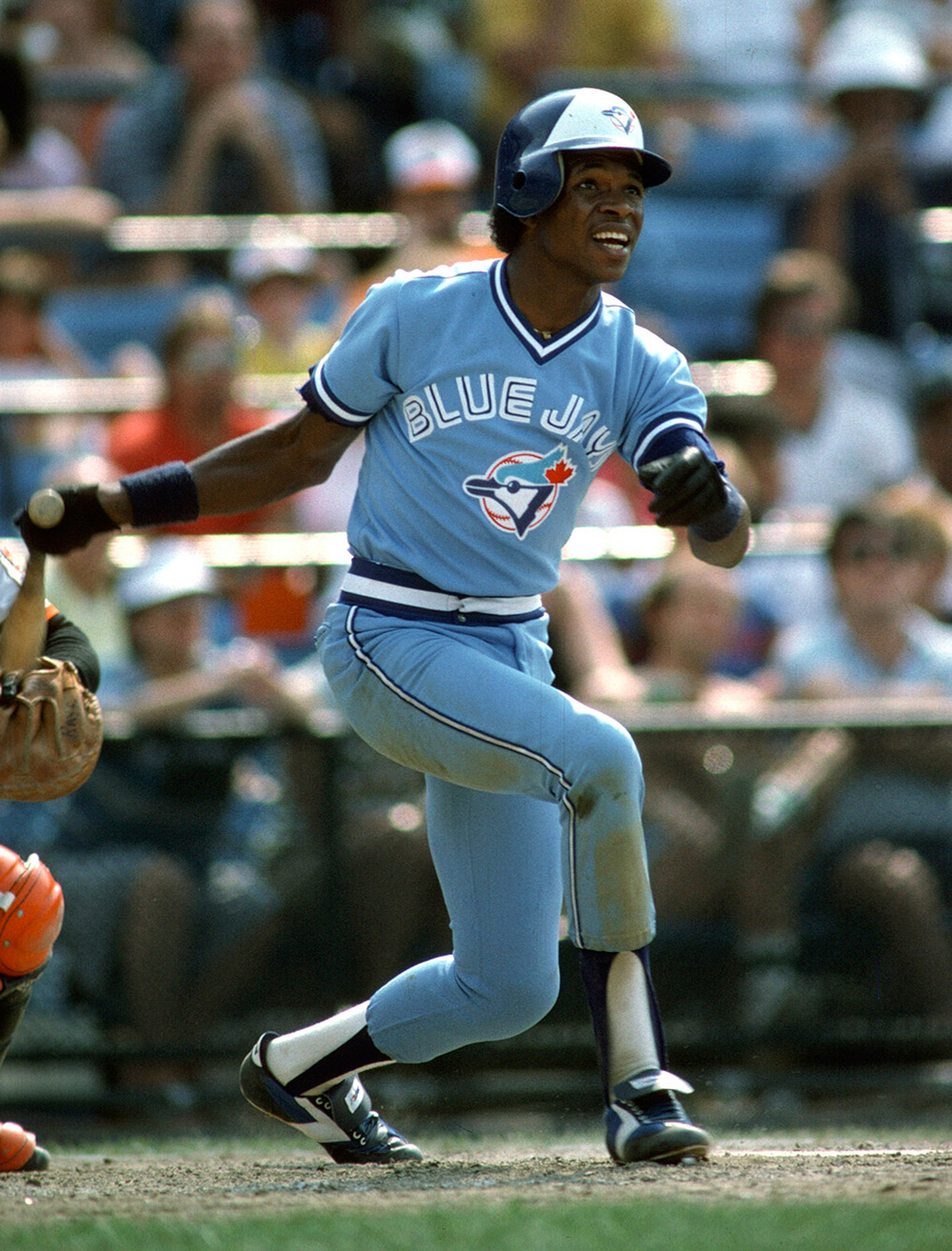
TORONTO BLUE JAYSHOME:
ROAD:
HOME ALT:
ROAD ALT:
CITY CONNECT:
Notes:
- The Blue Jays have a near-perfect set, but I’m not a fan of their “new blue” introduced a few seasons ago; the blue is too saturated, which forced the addition of navy to the team’s colorway to balance it out, so Toronto’s original, paler shade of powder blue--complete with white wordmark and numbers--returns in its place.
- Softball tops don’t really work with powder blue pants; therefore, the powder blue set becomes the new home alt, and the royal blue jersey is now designated as the road alt, with the wordmark and numbers recolored powder blue.
- The Jays’ new Spring Training cap becomes the alternate cap here.
- I actually like Toronto’s City Connects, so my only goal was to fix the legibility of the wordmark, which is now red outlined in blue with a black insert.
C&C appreciated!
-
2
-
-
2 hours ago, tajmccall said:this is immediately better
How would it look with Timberwolves green in place of red?-
1
-
-
I think this Twins set is less than the sum of its parts. The cap logo is cool, but it's too busy to work as a cap logo. The front of the jersey feels like it's missing something. How about putting "10,000 Lakes" on the jersey and moving either the "MN" or loon logo to the cap?
-
7
-
-
16 minutes ago, unisRus said:
first twins leak, 2 shades of blue and yellow
https://www.reddit.com/media?url=https%3A%2F%2Fi.redd.it%2Frdap2m1zpm5d1.jpeg
I actually see three shades of blue: navy, royal, and a medium blue shade around the MN logo.-
1
-
-
On 6/8/2024 at 3:47 AM, Victormrey said:
That's a great solution for the Nats!
Personally, I love their new home alt with the navy sleeves, but not the template used by Nike, so I think the main set is perfect

Thank you!
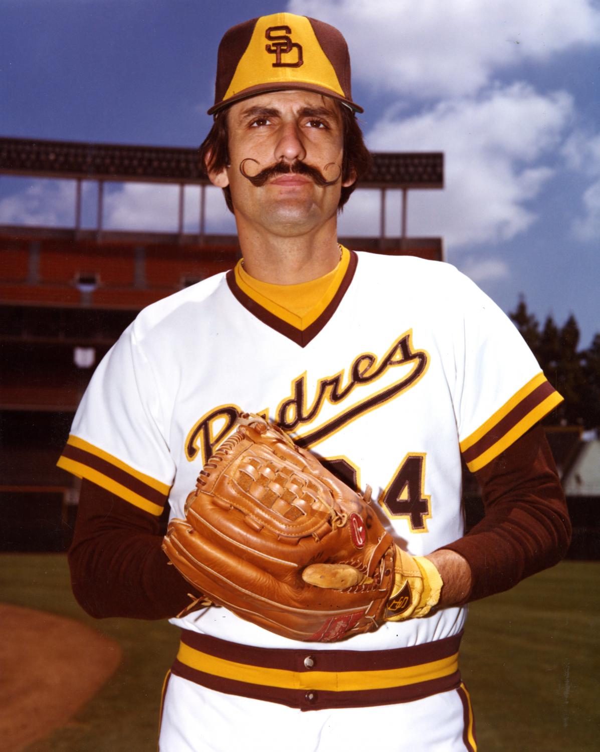
SAN DIEGO PADRESHOME:
ROAD:
HOME ALT:
ROAD ALT:
CITY CONNECT:
Notes:
- Of any MLB team, the Padres are probably the most warranted in their use of camo, San Diego being a big Navy town. Still, I find camo jerseys tacky in general and would much rather the Friars have a gold home alt instead.
- The bell-shaped gold front paneled cap returns for the road and road alt.
- I swapped out the “San Diego” wordmark for the monogram on the road alt and dropped the white trim for a cleaner look. And, since I’m not big on teams having pants specially designed to be worn with an alternate, the jersey is paired with the pinstriped road pants.
- Count me as one those who LOVE the Padres’ City Connect set, so the biggest change I made here was switching to a white front paneled cap with magenta bill, the solid mint green look being a little too “fashion cap” for my tastes. The back numbers also now match the style of the wordmark. Everything else stays the same.C&C appreciated as always, and have a great weekend!
-
9
-
-
The tweaks to both versions of the A's are big improvements!
-
1
-
-
For what it's worth, the Reds had player names below the numbers in 1964:
I think I find the "42" above the wordmark more jarring, to be honest.
-
4
-
-
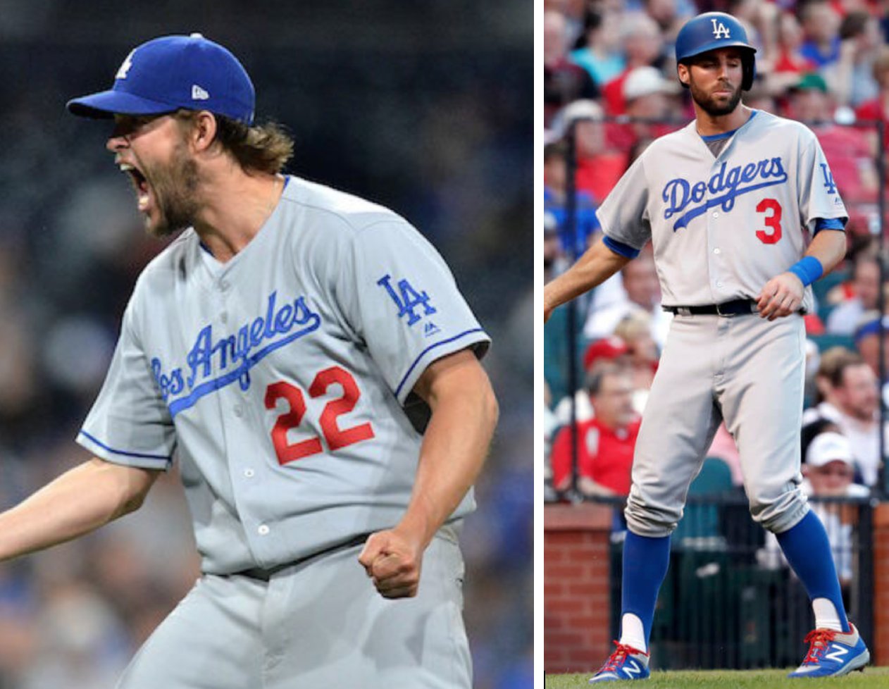
Dodgers’ new City Connects will apparently have player names below the numbers…
-
3
-
 1
1
-
 3
3
-


/cdn.vox-cdn.com/assets/685213/1126305.jpg)
/cdn.vox-cdn.com/uploads/chorus_image/image/72649513/1666697187.0.jpg)
:no_upscale()/cdn.vox-cdn.com/uploads/chorus_asset/file/25295887/usa_today_22568521.jpg)
MLB: Trying to Please Everyone With Nike's 4+1 Rule (Rockies 6/21)
in Concepts
Posted
Thanks! Those Dodgers baby blues are some of my absolute favorite uniforms ever.
COLORADO ROCKIES
HOME:
ROAD:
HOME ALT:
ROAD ALT:
CITY CONNECT:
Notes:
- Prior to the 2024 season, the Rockies retired their sleeveless black jerseys, which had the distinction of being the last full-time vest in the league. I hated those jerseys, so my solution was to introduce a new, sleeved road alt with the “CR” monogram in place of the “Colorado” wordmark.
- As I mentioned with the Padres, I’m not big on teams having pants specially designed to be worn with an alternate, so the purple jersey is paired with the pinstriped home pants.
- Purple is now undoubtedly the primary color of the home and road uniforms, and the “CR” replaces the “ROCKIES” wordmark on the home jersey.
- The numbers on the home alt are recolored from black to silver for better contrast.
- I hate that Colorado wimped out and switched from green to white pants the second year of their City Connects. For my tweak, I restored the green pants, converted the jersey from a button up to a partial pullover, added purple/gold/red sleeve & pant stripes to mimic the cap logo and made the back numbers purple for improved legibility.
C&C appreciated!