


coco1997
-
Posts
4,843 -
Joined
-
Last visited
-
Days Won
14
Posts posted by coco1997
-
-
On 2/18/2024 at 5:53 PM, Coiler said:
Nice to liberate the As from the shackles of green!
Thanks!
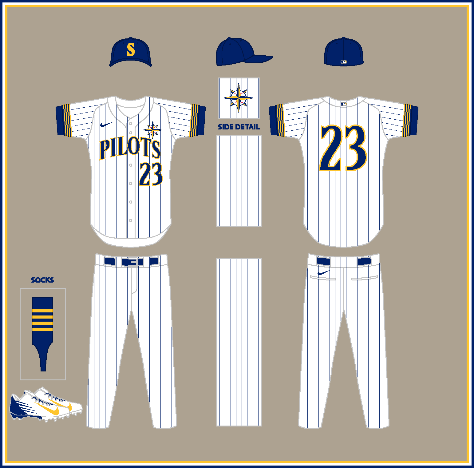
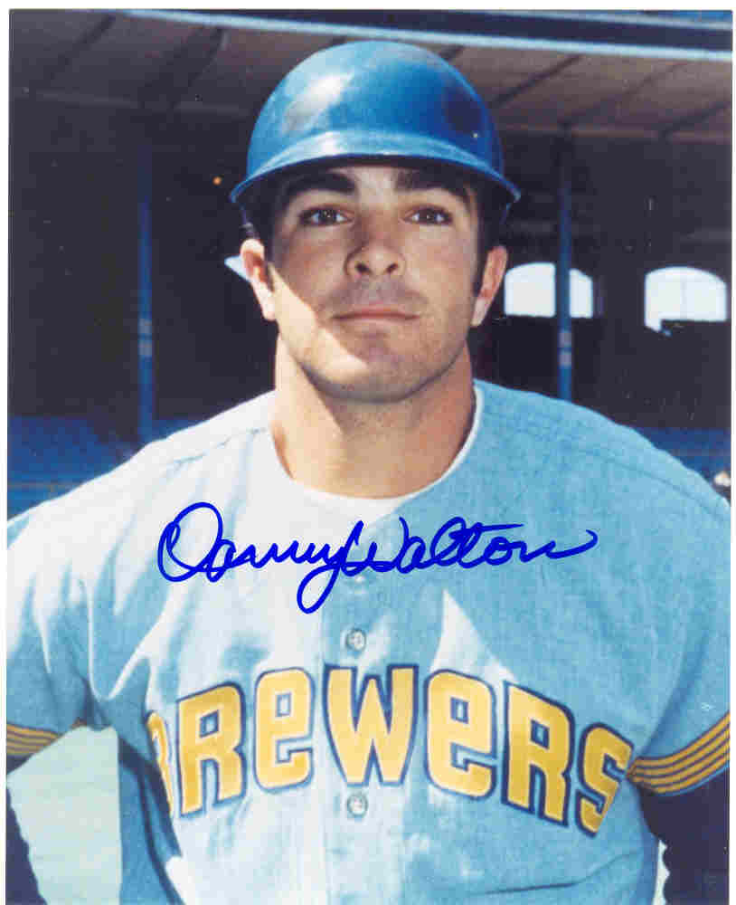
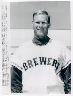
What if the Milwaukee Brewers became the Seattle Pilots?MILWAUKEE BREWERS (1969)
HOME:

ROAD:
Notes:- I wasn't planning on tackling the Brewers/Pilots, given the Pilots only lasted one season. However, since @Coiler asked, I felt it was only right to include them.
- The home set is based on Seattle's home uniforms, with a beer barrel and tiny "BREWERS" wordmark on the left breast and wheat stalk-styled sleeve stripes.
- Seeing as those original Brewers' unis were essentially Pilots hand-me-downs, I figured Milwaukee would've had a slightly different look had they predated the Pilots. The Tuscan-style wordmarks and numbers are thus based on these Brewers prototype unis from 1970.
SEATTLE PILOTS (2024)
HOME:
ROAD:
HOME/ROAD ALT:
Notes:
- The modern day Pilots' are based heavily on the Brewers, with home pinstripes and a gold-front paneled road cap.
- I was tempted to go navy and teal (presupposing that the Pilots, like the Mariners, would eventually ditch their original blue and gold in favor of the M's' current colors) but ultimately decided against it, as I was dead-set on keeping Seattle's captain's sleeve stripes, which don't work in any color but gold. The captain's stripes also carry over to the sock design.
- The alt features a new "Seattle" script and Washington state sleeve patch, a la the Wisconsin patch on the Brew Crew's alternate jersey.
And that should do it! C&C appreciated as always, and thanks to everyone who followed along!-
 5
5
-
 2
2
-
-
On 2/17/2024 at 1:34 PM, Coiler said:
Brewers to Seattle?
I actually hadn't planned on doing that one, but you just gave me an idea for what I can do. Watch this space.
What if the Kansas City Athletics moved to Philadelphia?KANSAS CITY ATHLETICS (1921)
HOME:
ROAD:
Notes:
- A touch of red is added to the Philadelphia A's royal blue to create a look similar to the Kansas City Monarchs.
- Both jerseys feature the A's primary logo on the front.
PHILADELPHIA ATHLETICS (2024)HOME:
ROAD:
HOME ALT:
ROAD ALT:
Notes:- My modern-day Philadelphia A's swap out Oakland's green and gold for the blue and gold of the Philadelphia flag, which are seemingly the same colors as the Phillies' upcoming City Connect uniforms.
- The road jersey repurposes the block "PHILA" wordmark used by the Sixers. Oakland's early-mid '80s A's unis featured a similar arched block wordmark.
- An Old English style Philly "P" is used for the road cap logo.
C&C appreciated!
-
5
-
-
https://uni-watch.com/2024/02/18/all-but-two-mlb-teams-scrapping-spring-training-jerseys-this-year/
Uni-Watch confirming what Chris hinted at on Twitter a few days ago: Every team but the Yankees and Tigers are scrapping their Spring Training-specific jerseys.
There’s an interesting implication to this in that several teams still wear ST jerseys that are never worn during the regular season, such as the Reds’ red jersey with Mr. Redlegs and the Dodgers’ blue jerseys, which seems to imply those jerseys may now be worn during regular season games.
Are there any others that I missed?
-
On 2/16/2024 at 11:43 AM, OnWis97 said:
Question. Would you rather have:
- Previous quality fabrics, stitching, etc. with ads
- This garbage material but with no ads?
I'd take #2. The "Quickrete" patch is still the cheapest-looking part of Atlanta's uniform. And while that might be the worst add, I think they're all tasteless.
I honestly couldn't disagree more. Yes, ads suck but they're (at least currently) a detail confined to just one part of the jersey and could technically go completely unnoticed from certain angles. With these new uniforms, the whole thing looks like cheap garbage.-
4
-
8 hours ago, Coiler said:
Ah, the Bees! Nice work on all of them.
Thank you!What if the Minnesota Twins became the Washington Senators?
MINNESOTA TWINS (1912)
HOME:
ROAD:
Notes:
- Minnesota's uniforms are pretty straightforward off-white and gray versions of one another.
- I wanted another solid-colored placket design in this series, and the early 1900s Twins, inspired by the 1910s Senators, presented the perfect opportunity to do so.
- The cap and jerseys feature a reimagining of the Twins' classic "TC" logo with interlocking Old English-style letters.WASHINGTON SENATORS (2024)
HOME:
ROAD:
HOME/ROAD ALT:
Notes:
- It turns out @MJD7 and I were on very similar wavelengths when I was working on this project and he was simultaneously working on his MLB Multiverse series, as we ended up producing nearly identical concepts for a modern day Washington Senators set based on the Twins' new look.
- There are a few small differences from Matt's design, including the striping colors and cap logo. I was also conscious of avoiding letting this set to look too much like my previous Rangers-to-Washington concept, which is one reason why I went with off-white home unis over white.
C&C appreciated! I currently have just one team left planned, but please let me know if I managed to miss any.-
7
-
-
On 2/15/2024 at 9:59 PM, Bomba Tomba said:
Would the NFL Giants be black and orange in this universe too?
That's a good question! I honestly hadn't even thought about it.On 2/15/2024 at 12:30 PM, VampyrRabbit said:The NY Giants look awesome, though I would like to think they would have an orange squatchee for the home and road cap and an orange billed alternate cap in this universe, the SF Giants orange billed cap I have is one of my faves.
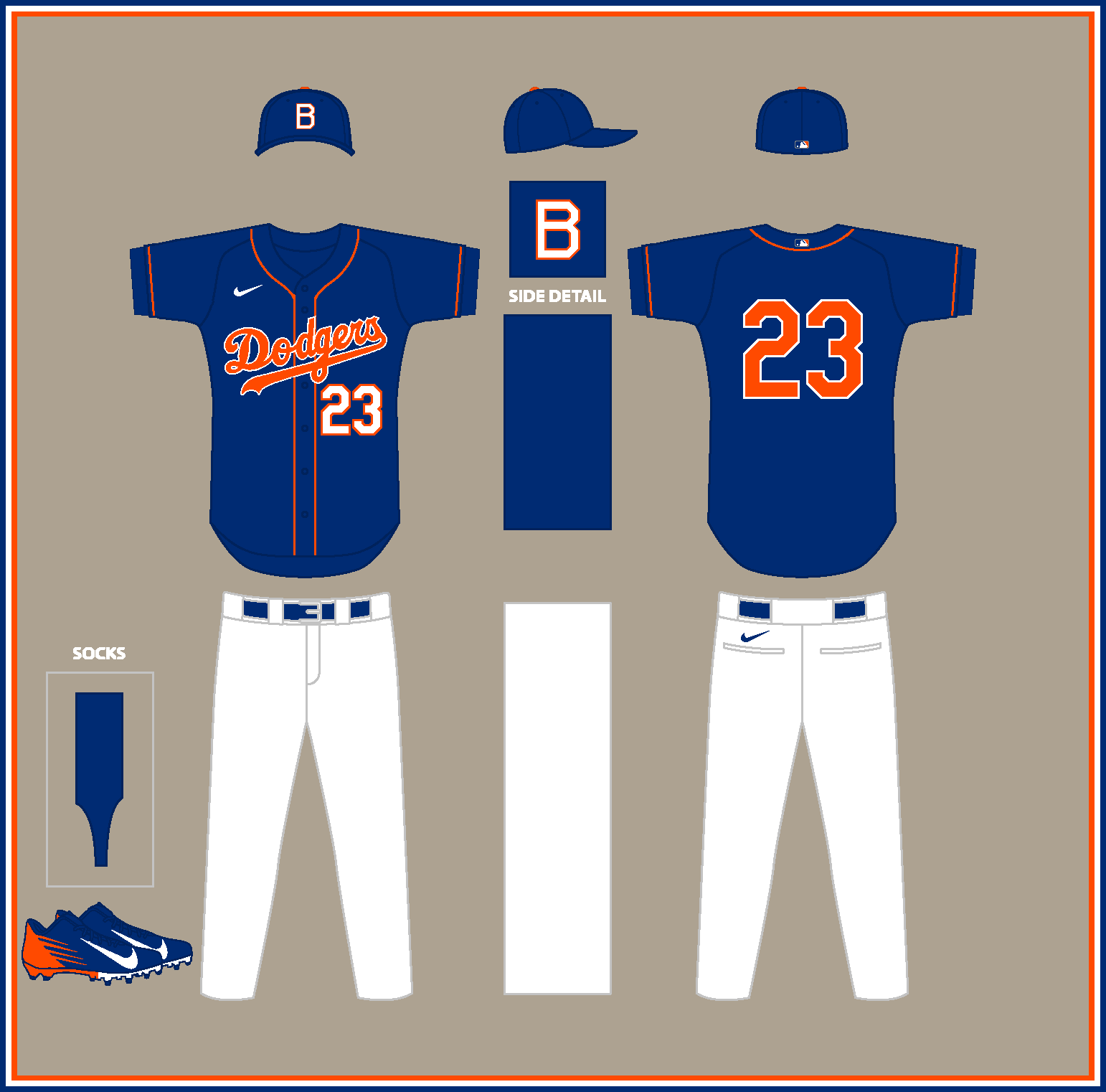
Good call. I've edited my previous post with your suggested tweaks. I also added a white stroke to the logo on the alt cap so it makes the jersey script.What if the Atlanta Braves moved to Boston?
ATLANTA BRAVES (1939)
HOME:
ROAD:
Notes:- My 1930s Braves concept puts a spin on Boston's 1939 set, albeit with a more navy dominant look than red.
- The home uni features an ornate letter "A" evoking the Old English "B" worn by Boston in their early years and throughout the early 1940s.
BOSTON BRAVES (2024)
HOME:
ROAD:
HOME ALT:
ROAD ALT:
Notes:
- I wanted to go in a wildly different direction for the modern day Boston Braves, so I used the colors from the Red Sox City Connect set. These colors are also similar to those worn by Boston when they took the field as the Bees from 1936-40.
- Pinstripes return to the home uniform, which, when paired with double outlined scripts and numbers, result in a look somewhat resembling Atlanta's 1976-79 unis.
- I wasn't sure what do for a sleeve patch (if one is even needed), so suggestions are certainly welcome.
C&C appreciated, and I hope everyone has a good weekend!
-
6
-
-
I didn't realize the Nationals' block numbers were so hated around here. Why is that?
-
1 hour ago, aawagner011 said:
Great catch. I’d be shocked if this is a ST only jersey and fully expect it’s the new road alt. The times they had a special jersey just for ST, it used the home script. I found some better photos and it looks like they have swapped everything that was gray for red (including placket piping). I kinda liked the gray trim on the road jersey, but this looks good, too. While the gray looked good, it didn’t quite make sense since it was a single braid of trim and they wore it with their standard gray pants which have a blue/red/blue stripe. This red stripe jersey now matches the pants stripe pattern, so I call it either a push or even a slight upgrade. I will miss the contrast of the gray piping since red will be harder to see, but it’s still good.
For comparison:
Just confirmed by Uni-Watch that this is indeed their regular season road alt. The white piping is now red.I'm totally cool with this change.
-
3
-
-
Uni-Watch is reporting the Nats are dropping the front numbers from their home whites and navy alts. That's a shame, because I liked the contrasting numbers look.
-
9
-
 1
1
-
-
On 2/14/2024 at 1:41 PM, GrayJ12 said:
The royal gold with the A's branding surprisingly fits very well. Keep it up!
Thank you!
On 2/14/2024 at 12:56 PM, Blindsay said:I wonder what would happen with Oakland and Vegas in this Universe...
That's an interesting question. I might have to revisit this thread in 2-3 years and reverse engineer the Vegas A's uniforms to imagine how they would have looked in the 1910s or '20s.
What if the San Francisco Giants moved to New York?
SAN FRANCISCO GIANTS (1923)
HOME:
ROAD:
Notes:
- San Francisco's set is based on the Giants' 1923 look, with home and road pinstripes, tri-colored headspoon & sleeve piping and pinstriped caps.
- I repurposed the Negro League Seals' cap logo, which happens to look like a more crudely-rendered version of the Giants' monogram.NEW YORK GIANTS (2024)
HOME:
ROAD:
HOME/ROAD ALT:
Notes:
- I wanted the modern New York Giants to look as different from the Yankees as possible, so I went all-in on the '80s Mets racing stripes and kept the off-white from San Francisco's home uniforms.
- The home script comes from the Baltimore Elite Giants Negro League club.
- Since racing stripes only really work with a matching jersey and pants, I went mono-black to produce a look that could be worn at home and on the road.
C&C appreciated!
-
5
-
1
-
-
4 hours ago, Paul Lucas said:
Man, that Senators one is
 . I’ve seen a lot of Washington concepts, this is great and unique. Excellent work!That Baltimore B is beautiful; classy set. The “B’s” are perfect! Script is spot-on. White sleeve on the Dodgers is a really nice touch and makes everything pop. Lots to love here, looking forward to the rest of the Series.
3 hours ago, LaGrandeOrange said:
. I’ve seen a lot of Washington concepts, this is great and unique. Excellent work!That Baltimore B is beautiful; classy set. The “B’s” are perfect! Script is spot-on. White sleeve on the Dodgers is a really nice touch and makes everything pop. Lots to love here, looking forward to the rest of the Series.
3 hours ago, LaGrandeOrange said:Yeah really great concept, no real reason the Nats couldn't look like that.
3 hours ago, TrueYankee26 said:Oh that senators one looks incredible
Wow, thank you all!
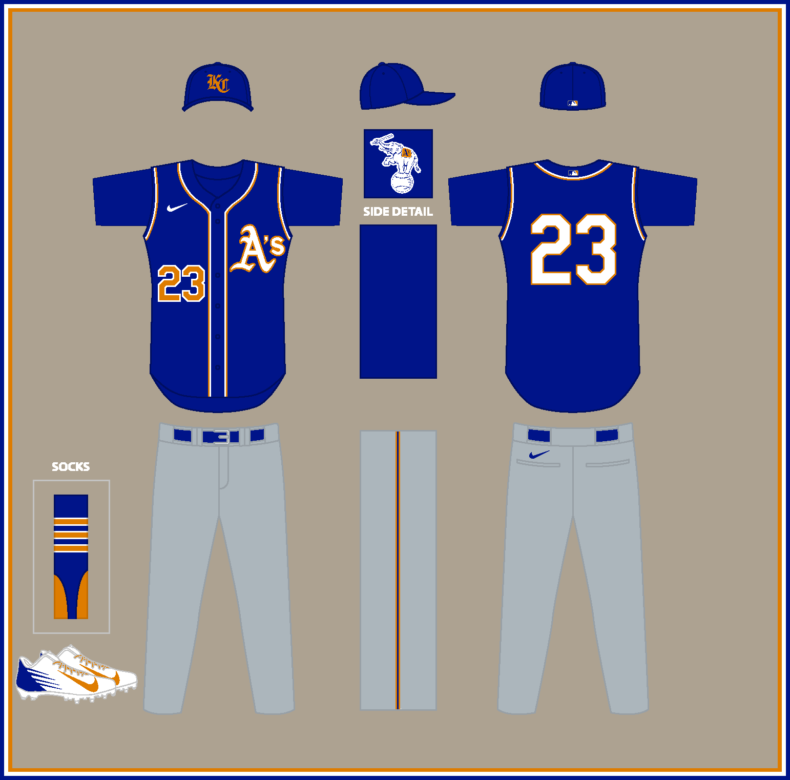
What if the Oakland Athletics moved to Kansas City?OAKLAND ATHLETICS (1919)
HOME:
ROAD:
Notes:
- The 1900s Oakland A’s keep their classic green and gold while adding pinstripes to the home set.
- I used the Philadelphia A's 1902-19 "A" logo--which would eventually evolve into the one currently used by Oakland--for both the home and road jersey.
KANSAS CITY ATHLETICS (2024)
HOME:
ROAD:
HOME ALT:
ROAD ALT:
Notes:
- Vest style jerseys are meant to mimic those worn by the A's during their final years in Kansas City.
- Royal gold from KC's 1969-92 primary logos is promoted to secondary color status to pull off the dual-color look of Oakland's uniforms.
- The road cap features an Old English style “KC” monogram.As always, C&C appreciated!
-
7
-
-
9 hours ago, JohnnyCowboy5 said:
no they arent one of teams getting a city jersry
How do you know? -
Two more BP caps have leaked:
UPDATE: Two More MLB 2024 Batting Practice Caps Appear (uni-watch.com)
Much as I currently loathe the idea of spending money on anything White Sox-related, I really like this cap.
-
4
-
-
10 hours ago, JohnnyCowboy5 said:
Whats this meaning?
What I want to know is, why are they using Princess Leia's theme?-
2
-
-
4 minutes ago, Coiler said:
Nice, always like the Browns colors.
For a real "what-the-what-if", you could mix the Orioles with the Astros. The 1890s Orioles had more or less the exact same reputation as the contemporary Astros: Good but dirty and ruthless.
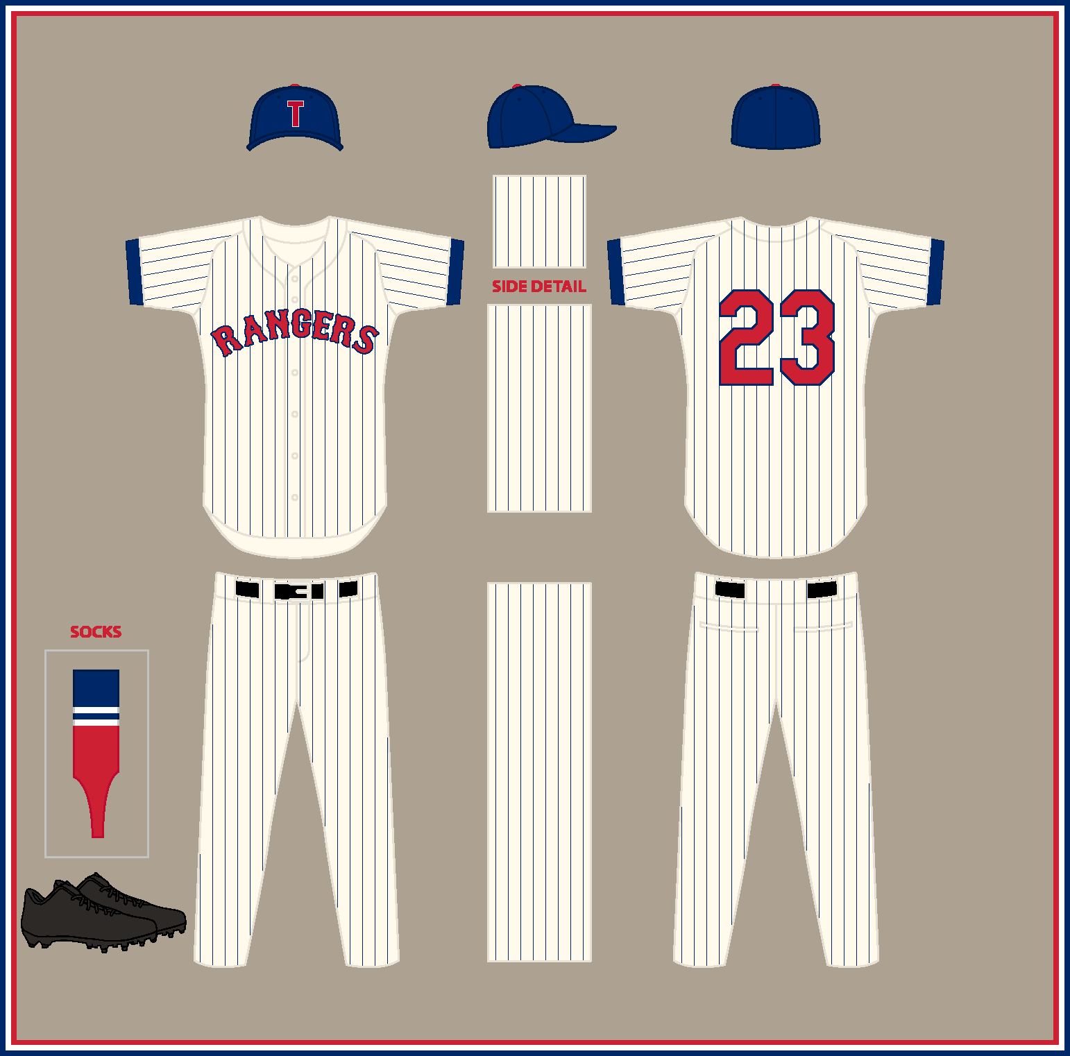
Interesting suggestion. They both wear orange, so that might be a place to start...What if the Texas Rangers became the Washington Senators?
TEXAS RANGERS (1961)
HOME:
ROAD:
Notes:- Much like the Senators, the ‘60s Rangers would boast very simple uniforms, with pinstripes at home and road grays with no trim or piping.
WASHINGTON SENATORS (2024)HOME:
ROAD:
HOME ALT:
ROAD ALT:
Notes:
- The modern-day Senators feature a drop shadowed version of Washington’s 1959-60 home script, as well as a block “W” cap logo and numbers in the style of the Rangers.
- A billowing D.C. flag adorns the sleeves of all four jerseys, a la the Texas flag on the Rangers’ unis.
C&C appreciated, and Happy Super Bowl Sunday!-
3
-
2
-
 1
1
-
-
26 minutes ago, Victormrey said:
Congrats for finishing the series and great start for a new one! Brilliant idea, as usual
 These 4 first teams all look great, specially the Nats.
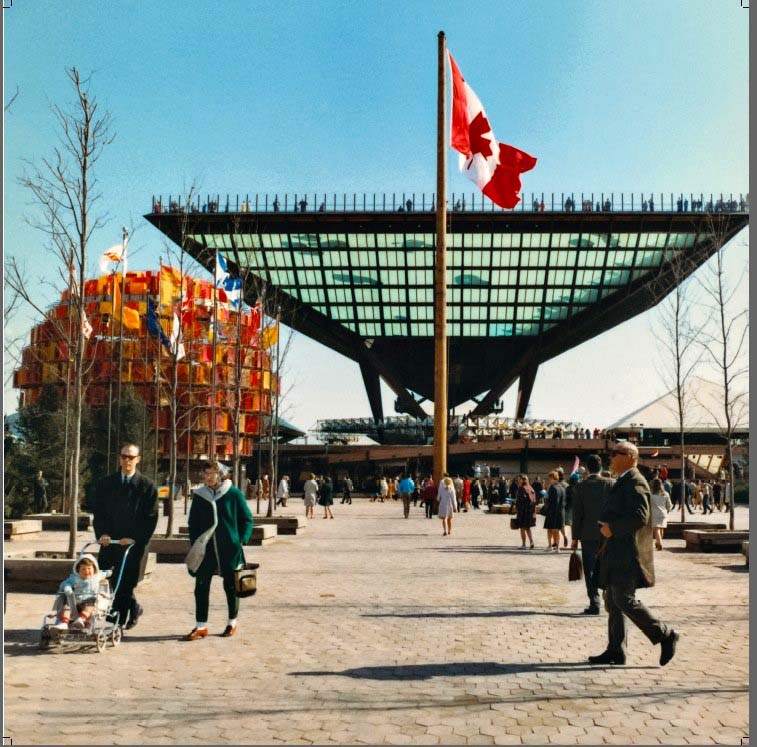
Given the Expos' name, what about using the Canadian pavilion for the home and alt unis?
9 minutes ago, LaGrandeOrange said:It's not that St. Joseph's isn't a recognisable building and doesn't have the nice parallel with Washington, but I'm not sure it's quite an iconic enough building to qualify for logo silhouette level.
Thank you! Very reasonable comments about the use of St. Joseph's. I'll try it out with the Canadian pavillion or another more iconic landmark once I wrap up the rest of the series.What if the Baltimore Orioles became the St. Louis Browns?
BALTIMORE ORIOLES (1916)
HOME:
ROAD:
Notes:
- Yes, I'm aware the original Baltimore Orioles played from 1901-02, but that team has no relation to the modern day O's who descended from the St. Louis Browns.
- I chose a more orange-forward look to set the Orioles apart from brown-dominant St. Louis, which you'll see below.
- The caps and home jersey feature the ornate "B" used by the 1890s Orioles, while the sleeves use a recolored version of the cross from the Maryland flag.
ST. LOUIS BROWNS (2024)
HOME:
ROAD:
HOME ALT:
ROAD ALT:
Notes:
- The modern-day Browns look more or less how you'd expect, with scripts, piping and block numbers consistent with the Orioles' current look.
- Just as Baltimore's jerseys use a roundel containing the Maryland flag, all four jerseys here feature a new roundel incorporating the St. Louis flag.
- The home cap features the face of mascot Brownie the elf, while the road features a shorthand "B's" mark as a nod to the "O's" cap used by Baltimore.
C&C appreciated as always!
-
6
-
1
-
-
This is super fun and clever. Great creativity!
-
1
-
-
28 minutes ago, WSU151 said:
Edit: And the BP hats are down 25 minutes after being shared.
Uni-Watch just posted all of them:
2024 MLB Batting Practice Cap Collection Appears Online (uni-watch.com)-
3
-
-
23 hours ago, Coiler said:
Since the Mets only exist due to New York not having had an NL team anymore...
Nice work.
Thanks!
What if the Washington Nationals became the Montreal Expos?WASHINGTON NATIONALS (1980)
HOME:
ROAD:
Notes:
- My 1980s Nationals design makes use of the Washington Stars prototype logo intended for the Padres' aborted move to Washington.
- A third stripe is added between the Expos' red and blue racing stripes to produce a patriotic red, white and blue effect.- Similar to those '80s Expos uniforms, the road uniform is just a powder blue version of the home set.
MONTREAL EXPOS (2024)HOME:
ROAD:
HOME ALT:
ROAD ALT:
Notes:
- Raglan sleeves were a recent addition to the home and road designs after the Nats unveiled their new alternate a week or so ago.
- Just as the Nats use both a script and block style "W," so too would the Expos with a Montreal "M." The home and home alt feature a block “M” set against the silhouette of St. Joseph’s Oratory (which conveniently has a similar silhouette to the Capitol Building), flanked on either side by fleur-de-lis.
- Inspired by the Flag of Montreal, the sock pattern features a red symmetric cross.C&C appreciated!
-
4
-
1
-
-
Loosely inspired by my recently competed series, I wanted to imagine an alternate history in which Major League Baseball found a foothold out West and then expanded east, rather than the other way around. What would it have looked like the Dodgers and Giants departed California to give the NL two present-day New York teams? Or if the A’s started out in Oakland and ultimately wound up in Philly? My main prompt here was to depict what current-day teams who relocated in the second half of the 20th century would have looked like in the dead-ball era, and visa versa. We'll start things off today with...
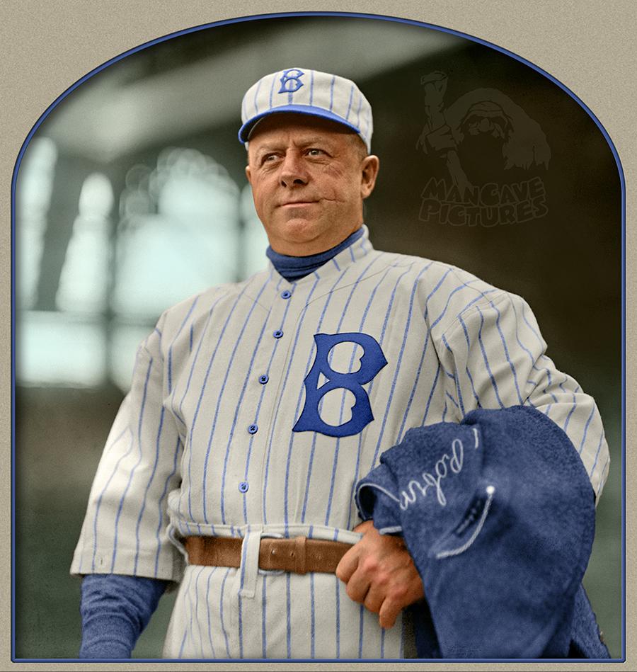
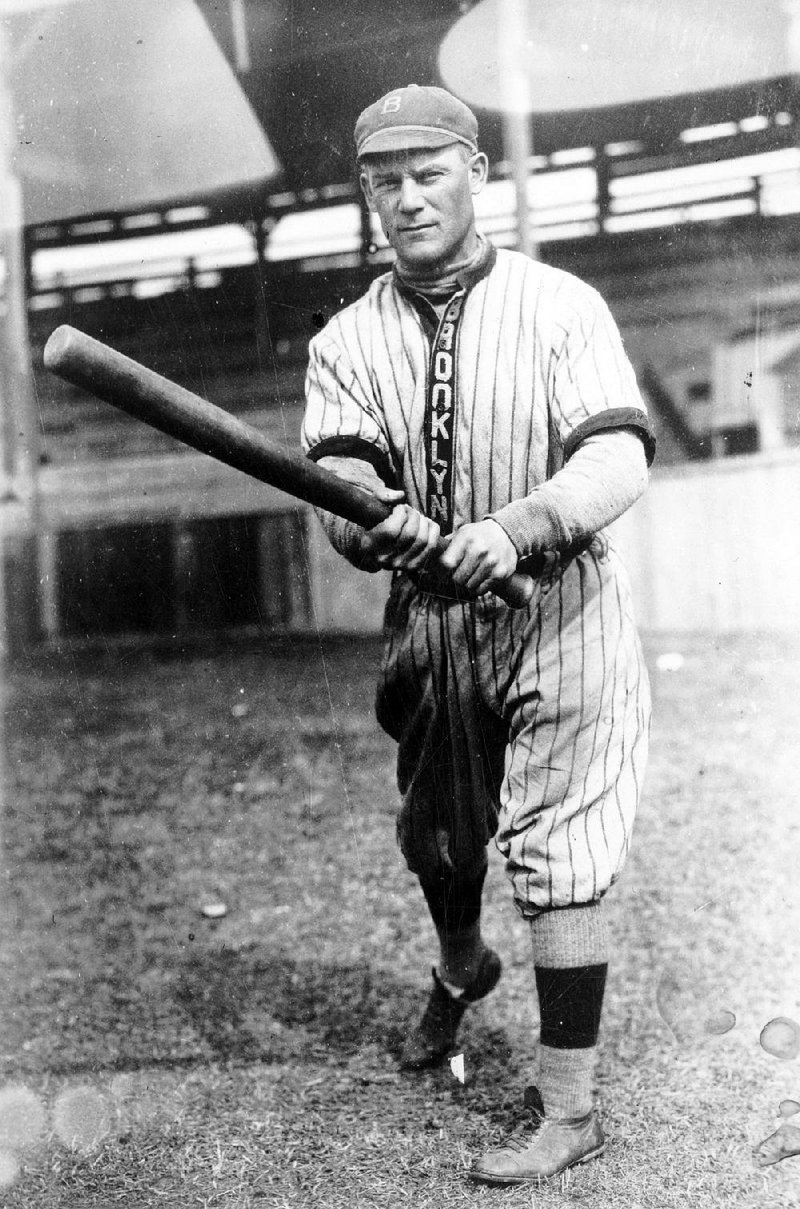
What if the Los Angeles Dodgers moved to Brooklyn?
LOS ANGELES DODGERS (1914)
HOME:
ROAD:
Notes:
- The L.A. Dodgers are based on Brooklyn’s 1914 look, which featured pinstripes and a Tuscan "B" on the breast of the home jersey.
- The road set features a vertical “LOS ANGELES” wordmark down a solid-colored placket.
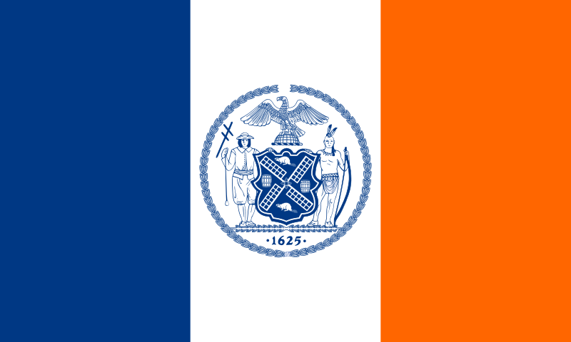
BROOKLYN DODGERS (2024)HOME:
ROAD:
HOME/ROAD ALT:
Notes:
- The modern-day Brooklyn Bums are essentially the Dodgers meet the Mets (specifically, the late '90s Mets, sans black), with a royal blue and orange color scheme based on the New York City flag.
- I went with an arched block "BROOKYLN" wordmark, as the modern-day New York Giants will be using a script for their road jersey.
C&C appreciated as always!
-
7
-
1
-
-
NEW YORK GOTHAMS (est. 1883)
HOME:
ROAD:
HOME ALT:
ROAD ALT:
Notes:
- The NL's original New York team began life as the Gothams in 1883 before rebranding as the Giants in 1885.- This identity is built around the branding the great Todd Radom designed for Gotham Baseball magazine. The colors are pretty close to those of the New York/San Francisco Giants, with a very deep, almost purplish shade of blue in place of black. Here, the script "G" is replaced with the Mets' "NY" monogram, and I added an "s" to the "Gotham" script.
- Even though I tend to dislike color-on-same-color jerseys, something about the dark blue on blue look just seemed to work for the road alt (sort of a "Gotham nights" feel).
- Fun fact: According to Todd himself, the real life Gothams were the first team to wear a logo of any kind on their uniforms.
C&C appreciated as always!
-
7
-
-
On 2/1/2024 at 11:07 AM, Victormrey said:
Really nice homage to LV's first team. The colour scheme along the double border for the wordmarks and logos look fantastic!
Also, those stirrups look gorgeous
 On 2/2/2024 at 5:16 AM, Coiler said:
And so the A's broke out of the purgatory of green and yellow to make a spectacular uniform!
Great conclusion to a great series.
Thank you both!-
1
-
-
Is this Angels cap logo new?
Men's Los Angeles Angels New Era Red 2024 Clubhouse 59FIFTY Fitted Hat (mlbshop.com)It looks like a stylized version of their 1970-85 alternate logo. I'd love it if this logo returned in some capacity.
-
1
-
-
I actually like the Phillies' City Connect, but I'd like it a lot more without the weird gradient, which I know is a pretty major detail to ignore. The rest of the design, from the distinct wordmark and numbers to the decidedly un-Phillies color scheme (clearly inspired by the Philadelphia flag) is, IMO, pretty par for the course for what we've come to expect from the City Connect program at this point.
I can't wait to read what kind of goofy Nikespeak is used to justify the use of the gradient.
-
5
-


:format(jpeg)/cdn.vox-cdn.com/uploads/chorus_image/image/39707660/Mets_Pirates_03_Oct_1999_Linda_Cataffo_NY_Daily_News_Archive_via_Getty_Images_97318649.0.jpg)
MLB Reverse Relocations! (Brewers/Pilots 2/20)
in Concepts
Posted
I actually had this exact idea a few years ago and shared it here: