


coco1997
-
Posts
4,841 -
Joined
-
Last visited
-
Days Won
14
Posts posted by coco1997
-
-
23 hours ago, Bomba Tomba said:
I wonder how you're going to deal with the team now known as the Guardians
Wonder no further:
Up next:
NEW YORK METS (est. 1962)HOME:

ROAD:
ALT:
Notes:
- Like the Royals, the Mets’ current uniforms are virtually identical to what they were wearing in their inaugural season of 1962. That being said, there wasn’t much to change here.
- The only real changes are the use of the Mets’ original “NY” and more vibrant shades of blue and orange. I also made the home uniforms cream, a la the team's 2012-14 look. New York's original home unis were off-white, as well.C&C appreciated!
-
 4
4
-
-
11 hours ago, Coiler said:
Padres look too much like their current "perma-throwbacks", but I guess that's unavoidable.
That's fair. If I had done this series four years ago, this design would have been a slam dunk. 11 hours ago, Coiler said:
Also the Red Sox/Americans are a good way to troll the Yankees if their design is what I think it is (OG Highlanders with just the big N and Y).
Coincidentally, you just predicted the next team in the series!
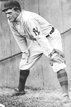
NEW YORK HIGHLANDERS (est. 1903)HOME:
ROAD:
Notes:
- The winningest franchise in MLB history started out as the “Highlanders” in 1903 before becoming the Yankees in 1913.
- Prior to introducing their iconic “NY” logo to the world in 1909, the Highlanders wore separate oversized “N” and “Y” letters on the front of their jerseys.
- It’s next to impossible to imagine the Yankees sans-pinstripes, so the home set is just a pinstriped version of the Highlanders’ home unis.- Per Yankee tradition, no alternates.
C&C appreciated!
-
6
-
-
5 hours ago, Coiler said:
Love the mixture of old and modern styles in the Americans uniform.
Thanks! I considered using a Tuscan style "B" and "A" to match the road wordmark, but I decided the Old English letters would be more distinctive.
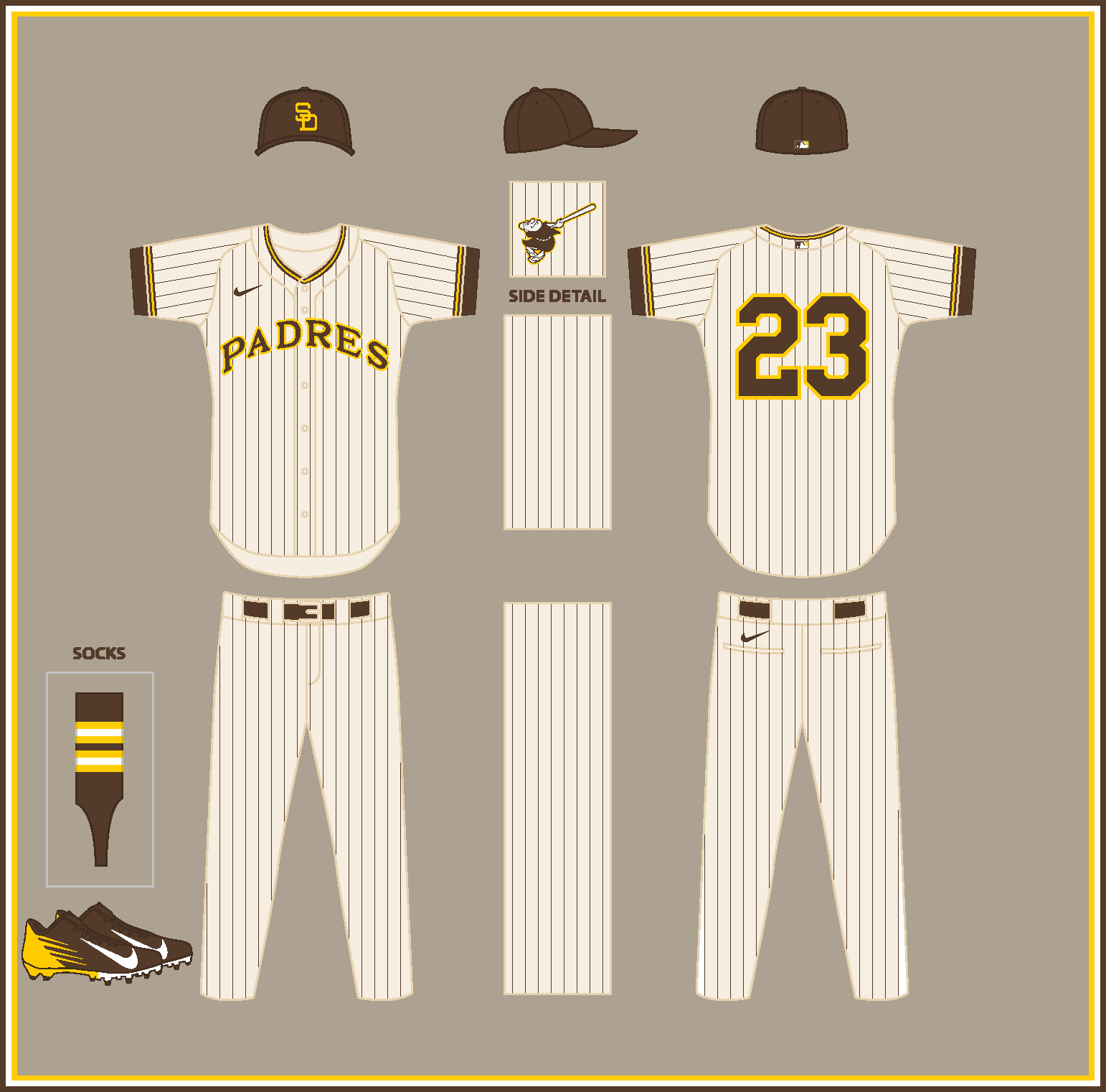
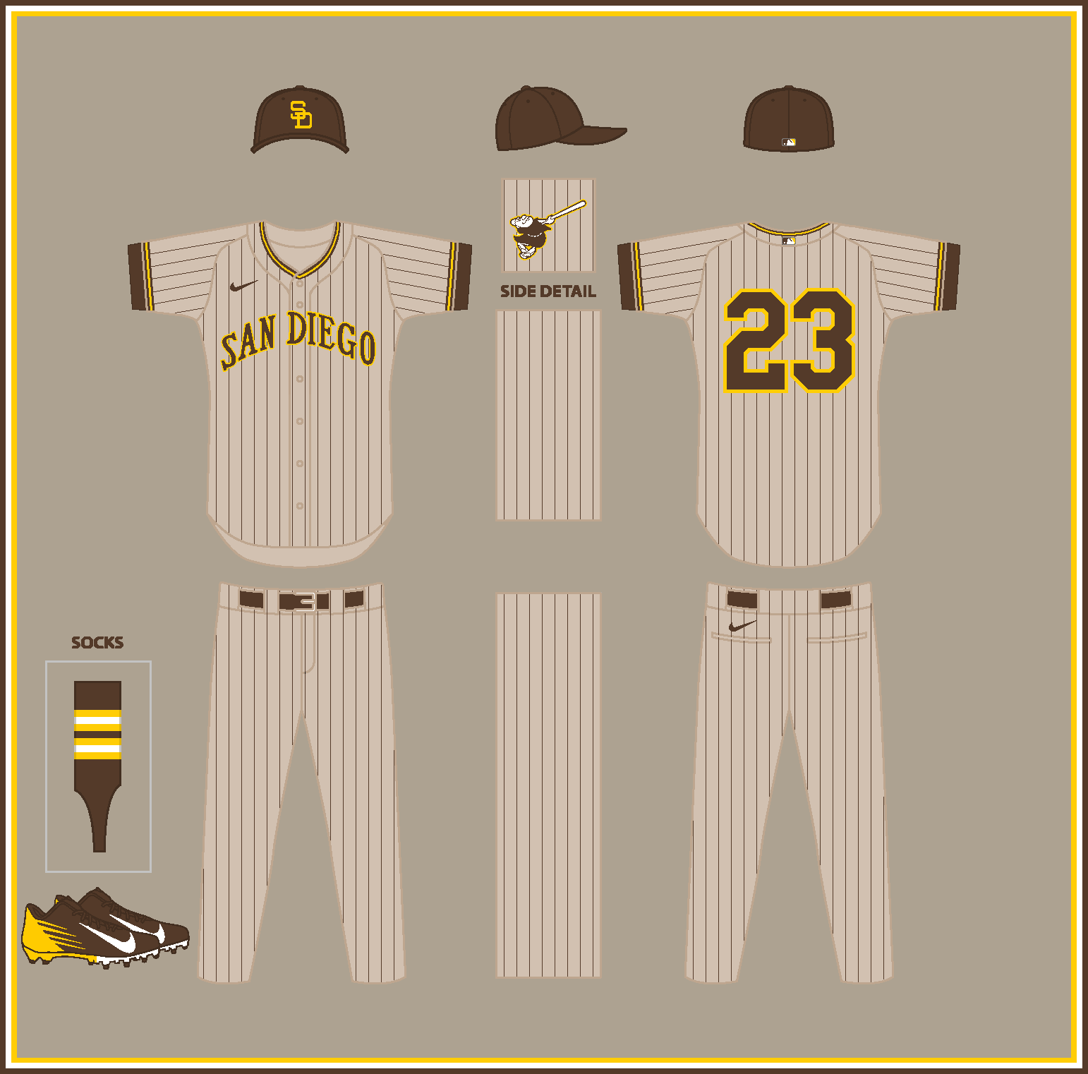
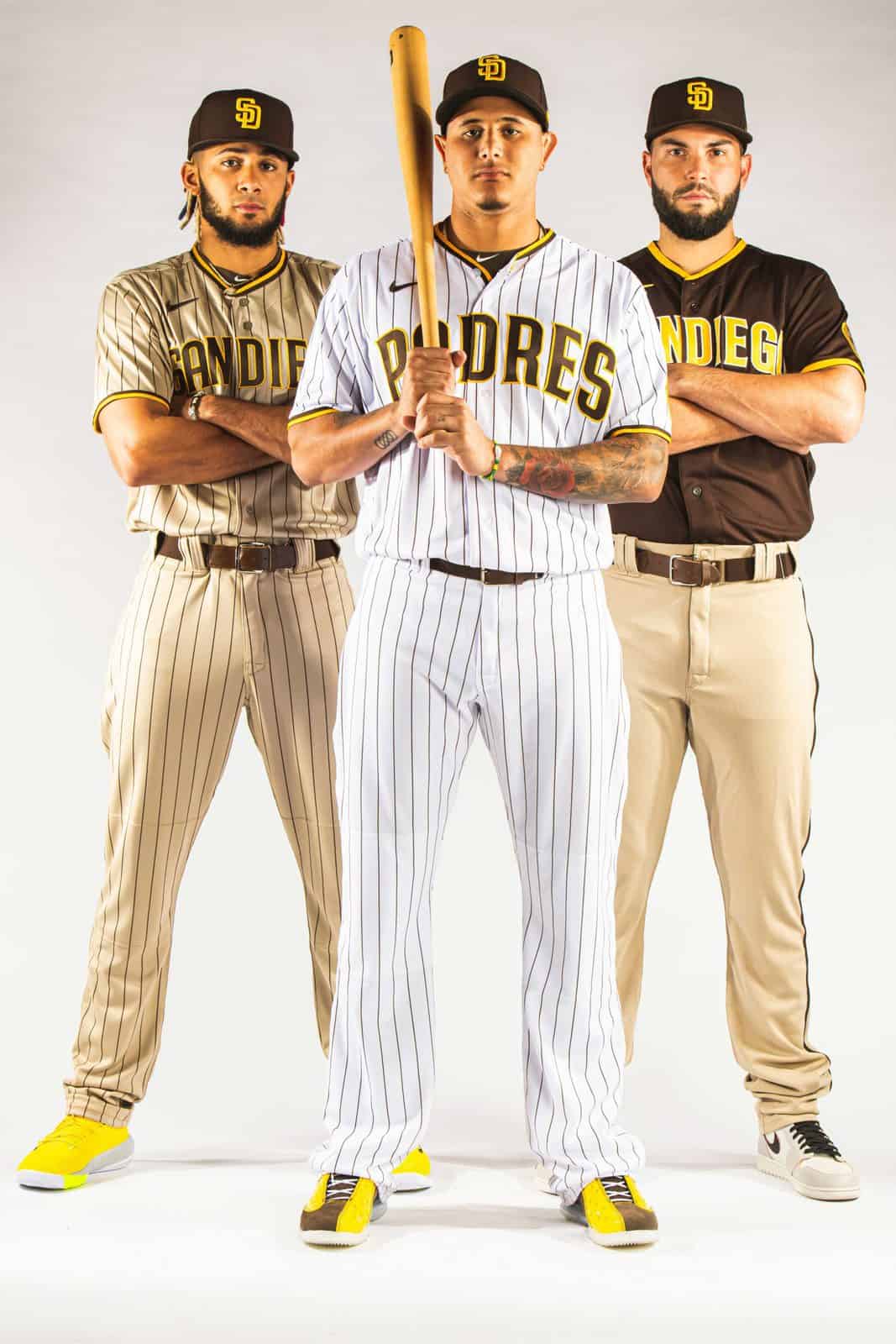
SAN DIEGO PADRES (est. 1969)
HOME:
ROAD:
HOME/ROAD ALT:
Notes:
- This design is essentially a hybrid of the Friars’ original and current looks, utilizing their arched wordmarks and block “SD” and numbers from 1969.
- I split the difference between the team’s original, brighter shades of brown and gold and their current, more muted tones.
C&C appreciated!-
10
-
-
BOSTON AMERICANS (est. 1901)
HOME:
ROAD:
HOME/ROAD ALT:
Notes:
- The Red Sox began life as the Boston Americans in 1901 before formally adopting the “Red Stockings” nickname in 1908.- Royal blue becomes the primary color here, with two large “B” and “A” letters occupying the front of the home and alternate jerseys.
C&C appreciated as always!
-
9
-
-
Love the Lanterns! Very cool of you to pay tribute to Alan Scott with the alternate. The crossed sticks within the logo are top notch.
-
1
-
-
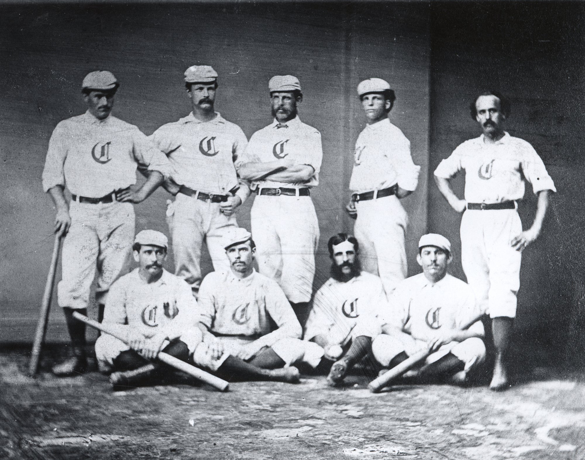
CINCINNATI REDS (est. 1869)
HOME:
ROAD:
HOME ALT:
Notes:
- The Reds are the oldest team in MLB, but their original 1869 uniforms (back when they were called the "Red Stockings") bear almost no resemblance to the baseball uniforms of today. Therefore, this design is based primarily on their look from 1900, which marked the start of the Modern Era. The Old English “C,” however, remains.
- Seeing as those original Red Stockings jerseys were essentially polo shirts, I went with a pullover style with two buttons below the collar.
- Cincinnati’s City Connect uniforms normalized the idea of the Reds in a monochrome dark color, so I made the slight shift from navy to black for the road set.- The alternate features a new "Reds" wordmark in the style of the cap logo.
C&C appreciated! Another defunct identity is up on deck.
-
11
-
-
On 11/6/2023 at 9:05 AM, raysox said:
Another Todd Radom special, this time the Texas Rangers
I really dig a number of those "TR" logos.-
1
-
-
Any MS Paint users notice the new "layers" function that's been added to the program? Any easy fix suggestions on getting the old plain white background back?
Also, not sure if this is connected to the previous issue, but now when I try pasting a monochrome .bmp image into another file, it turns out "grainy" and pixelated. Why on earth would this be happening? -
On 11/4/2023 at 1:07 PM, MilSox said:
This is essentially how I expect the Brewers to look. I judge all Brewers uniforms by how closely they follow this basic template.
2 hours ago, Victormrey said:What a wonderful idea for a series!
So far, my favourite set is the Angels'. I think the blend between their original identity and the City Connect look turned out great!
I love the "A" monogram you've used for the Braves, their cap looks amazing!
Can't wait to see more designs!
Thank you both!
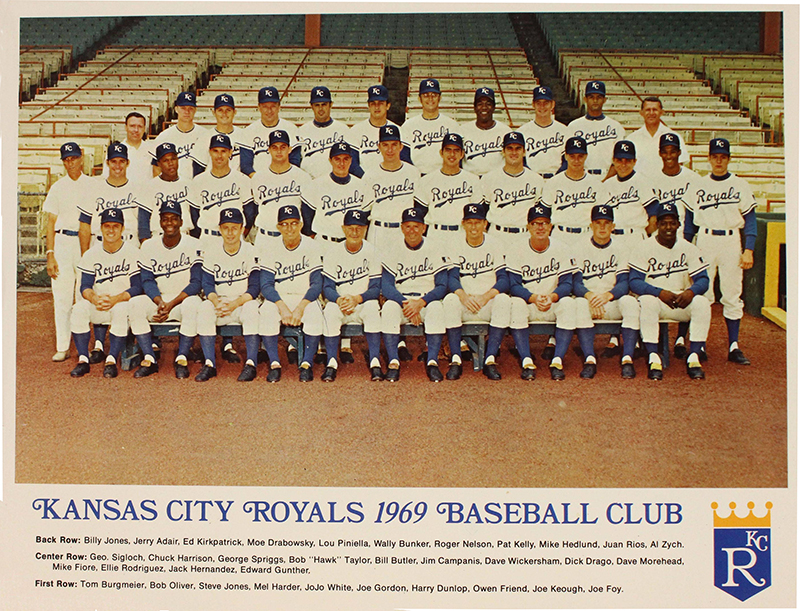
KANSAS CITY ROYALS (est. 1969)HOME:
ROAD:
HOME/ROAD ALT:
Notes:
- The Royals have maintained a remarkably consistent brand going back to their inaugural season in 1969, so there really wasn’t a lot to touch here.
- The only noticeable change is the use of the script style “Kansas City” on the alternate.
C&C appreciated! With the exception of maybe one or two other teams, things will be a lot more interesting from here on out.-
7
-
 2
2
-
-
Great to see this thread back in action!
I love the relative simplicity of the Spiders uniforms, which allows the giant arachnid logo to take center stage on the front of the jersey. Having said that, I do think it’s somewhat of a missed opportunity that you didn’t use some sort of web pattern somewhere.
I also feel the spider would pop a bit better, particularly on the home jersey, if you either darkened the blue or brightened up the red just a touch.
-
1
-
-
On 11/4/2023 at 6:05 AM, Coiler said:
For me the best Cleveland team name will always be Spiders, but I love the idea of the Ohio teams coming, like Pokemon, in Red and Blue versions.
On 11/4/2023 at 12:04 PM, Dozap17 said:Definitely a fan of the Cleveland Blues concept, simple but it works; I agree that keeping the Blues name all this time would have saved a lot of trouble, in all honesty I prefer it to Guardians!!
Thank you both!
ATLANTA BRAVES (est. 1871)
HOME:
ROAD:
HOME ALT:
ROAD ALT:
Notes:
- I was a little stumped at first on how to approach the Braves, as I wasn’t sure whether to go with a more Boston or Milwaukee-forward design. I ultimately settled on something based on the original Milwaukee Braves, while using a Blackletter-style “A” for the jersey and cap logo, akin to the Boston “B” worn by the team off and on between 1900-11.
- Arched Tuscan wordmarks, first used by Boston in 1925, replace the scripts on the road and home alt.
- I made the subtle shift from navy blue to black, both to produce some nice visual synergy with the local NFL and NBA teams, and because the Braves actually wore black with red in 1902.C&C appreciated!
-
13
-
3
-
-
Next up:
CLEVELAND BLUES (est. 1901)
HOME:
ROAD:
HOME/ROAD ALT:
Notes:
- @maxwasson not sure if this is the type of thing you were referring to, but the Guardians got their start in the American League as the Cleveland Blues in 1901.
- I went with a mono-blue color scheme and used the Indians' 2014-21 block “C,” as it’s pretty much identical to the original Blues logo.- In my research, I discovered the Indians were the first MLB team to ever wear numbers--on their sleeves. The placement of the TV numbers on the road and alt is a small nod to that.
- Side note: In hindsight, Cleveland might have been better off staying as the “Blues,” as it could've avoided decades of annoying debate over the use of Chief Wahoo and the “Indians” name. Plus, I like the symmetry of the two Ohio teams being named "Reds" and "Blues."
C&C appreciated as always!-
12
-
-
On 10/31/2023 at 7:46 AM, coco1997 said:
Can anyone remember a time when a team won the World Series and then immediately introduced new uniforms the following season?
Welp, guess this is a moot point now. -
16 hours ago, Coiler said:
The Angels has that quirky look. Question: Are you going to try and go 1871-vintage for the two oldest teams (Braves and Cubs) and later slightly less extreme cases or date just back to 1903?
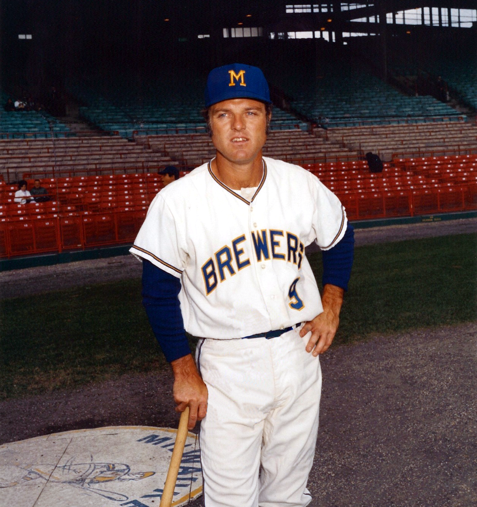
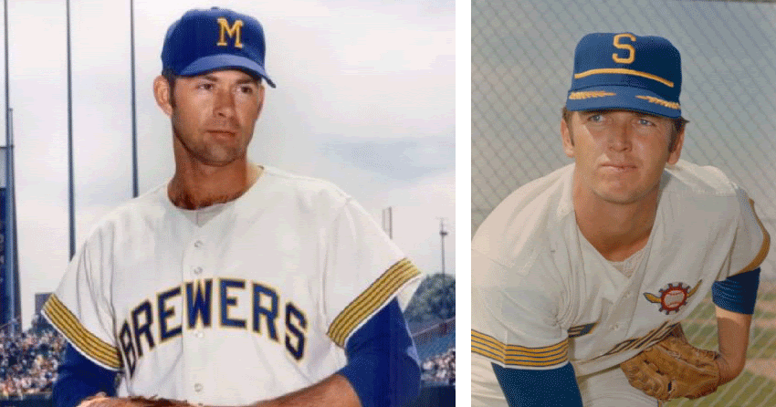
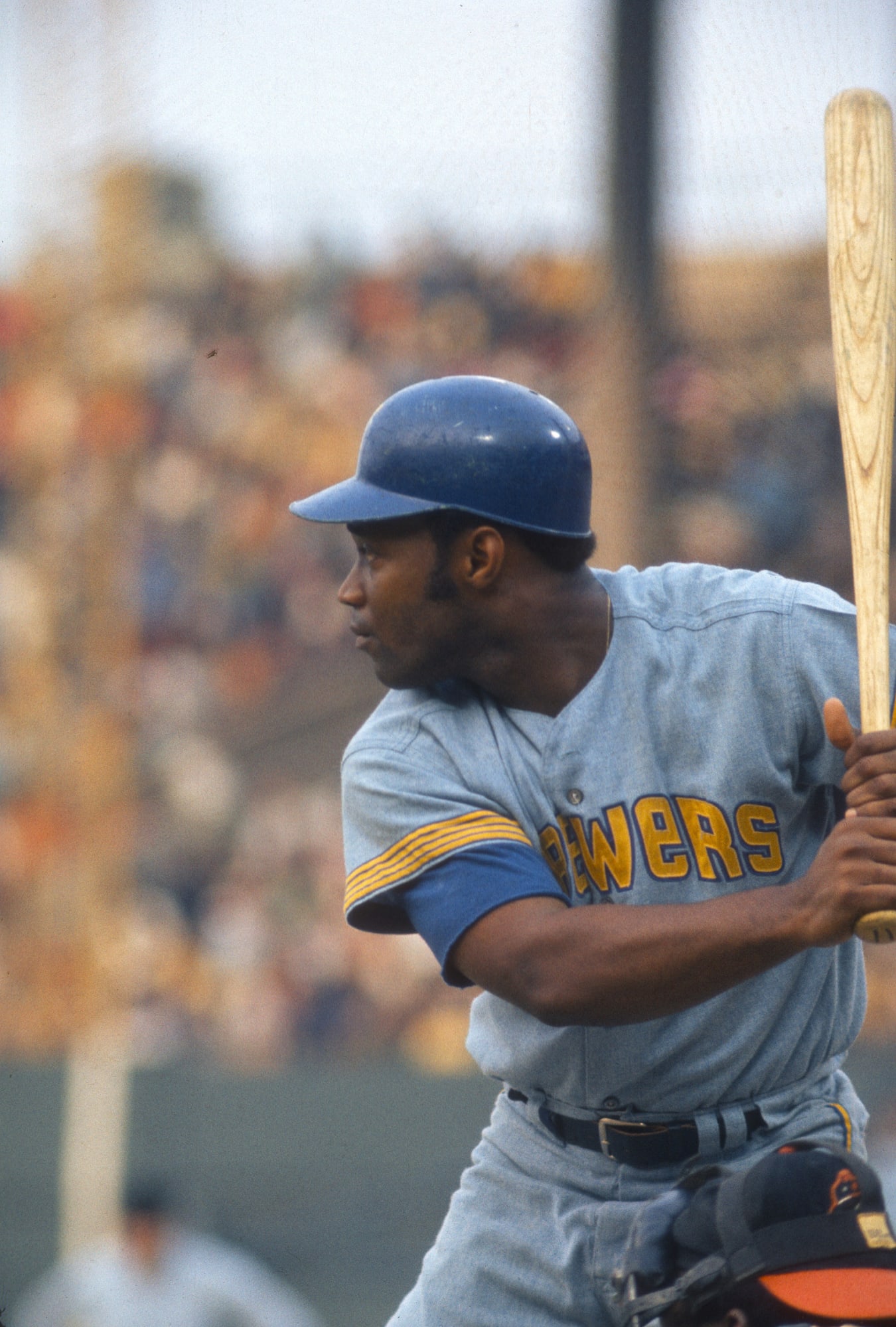
Great question. I thought about it, but considering uniforms from that period basically all looked the same, I decided to use 1900 as the starting point for most of those original teams, since that marked the beginning of the Modern Era. Having said that, I can tell you I'm planning to use the original Old English "C" logo for the Reds.MILWAUKEE BREWERS (est. 1970)
HOME:
ROAD:
HOME ALT:
Notes:
- This set is based on Milwaukee’s 1971 look, rather than their Pilots hand-me-downs from 1970. This is primarily because I intend to use the captain’s sleeve stripes for Seattle later on in the series.
- We get the return of the baby blue roads, something I’m still shocked the Crew didn’t revive for their otherwise excellent 2020 redesign.
- The road and alternate feature a new block arched “MILWAUKEE” wordmark to match the “BREWERS” one.C&C appreciated! For the next team, we go a lot further back in time--to a period when they were called something else entirely.
-
9
-
-
If those D-backs rumors are actually true, I wonder if the team’s plans to roll out this new look will change should they manage to clinch a title this week.
Can anyone remember a time when a team won the World Series and then immediately introduced new uniforms the following season?
Side note, I remember reading about the Cubs focus testing new uniforms and logos around 2014/15, and then 2016 happened and those rumors were never mentioned again.
-
6 minutes ago, maxwasson said:
Okay, I wonder if this series would be using team's old names and cities like for example, the St. Louis Cardinals would still be the St. Louis Browns
I'm afraid not. The closest I came was going with an Expos-inspired design for the Nats, but I ultimately decided against it.-
1
-
-
10 minutes ago, maxwasson said:
Is this series gonna be in alphabetical order or just completely random?
Completely random, but alternating between AL & NL teams. It was just a coincidence that I started with the Angels. -
California Angels (1961)
Milwaukee Brewers (1970)
Cleveland Blues (1901)
Atlanta Braves (1871)
Kansas City Royals (1969)Cincinnati Reds (1869)
Boston Americans (1901)
San Diego Padres (1969)
New York Highlanders (1903)
New York Mets (1962)
Baltimore Orioles (1954)
St. Louis Cardinals (1900)
Toronto Blue Jays (1977)Minnesota Twins (1961)
Los Angeles Dodgers (1900)
Oakland Athletics (1901)
Miami Marlins (1993)
Houston Astros (1965)
San Francisco Giants (1885)Chicago White Sox (1901)
Chicago Cubs (1876)
Tampa Bay Rays (1998)
Washington Nationals (2005)
Detroit Tigers (1901)
Pittsburgh Pirates (1891)
Texas Rangers (1972)
Colorado Rockies (1993)
Seattle Mariners (1977)
Philadelphia Phillies (1883)
PCL Angels (1903)
PCL Padres (1936)
Sioux City Cornhuskers (1888)
Philadelphia A's (1860)
Grand Rapids Rippers (1894)
St. Louis Brown Sox (1875)
AA Milwaukee Brewers (1902)
Cincinnati Red Sox (1869)
Philadelphia Quakers (1890)
Chicago White Stockings (1890)
Boston Red Stockings (1871)
Brooklyn Grays (1883)
NLB Kansas City Royals (1917)
IL Miami Marlins (1956)
AA Baltimore Orioles (1882)
Pittsburgh Alleghenys (1882)
Boston Red Sox (1908)
New York Yankees (1913)
Washington Senators (1901)
Kansas City Cowboys (1894)Cleveland Buckeyes (1896)
It occurred to me that even after all the MLB-related projects I've churned out over the years, I’ve never done a straightforward redesign series. While this isn’t quite that, it’s easily the closest I’ve come (full uniform sets for all 30 teams). With that in mind, I hope you enjoy what I’ve cooked up.
The premise is this: What if every MLB team had kept more or less the same uniform they were wearing when they first came into the league, bending to current trends and sensibilities only when absolutely necessary, essentially freezing them in time? What would a league that has been around since the mid-1800s and seen expansion and relocation spanning over 150 years look like today? Well, wonder no further. I'll be posting teams in a totally random order, alternating between AL and NL clubs, starting today with the:
CALIFORNIA ANGELS (est. 1961)
HOME:
ROAD:
ALT:
Notes:
- Even though the Halos originally went by the name “Los Angeles Angels,” I chose the “California” moniker to make use of that excellent “CA” monogram from 1965. Plus, there’s the whole fact that Anaheim isn’t actually in Los Angeles.
- Inspired by the Halos’ City Connect unis, I decided to eliminate outlines altogether and segregate the red and navy while going with cream over clean white for the home set.
- I worked up a new “CALIFORNIA” wordmark in the style of the “ANGELS” wordmark and cap logo and also found matching numbers.- The alt would ideally be worn only at home, as the cream would probably clash with the gray pants.
C&C appreciated! The first NL team will be up next.
-
12
-
 1
1
-
-
5 hours ago, Coiler said:
Saved the best for last! I could see an actual Buffalo expansion team wearing this.
Thanks! And as always, thanks again for following along! -
19 minutes ago, MNtwins3 said:
The only reason I'm thinking they'll continue into 2025 is so the A's get one for Las Vegas instead of Oakland
That’s assuming the A’s are actually in Vegas by 2025…-
2
-
-
I'm curious how Nike plans to roll out the remaining City Connect designs. Five next season, five in 2025?
-
1
-
 1
1
-
-
7 minutes ago, Coiler said:
That's not green and yellow
 . Unfortunately, blue and red are the most generic MLB colors imaginable.
Yeah, I get that. But those were the Packers' colors (and blue is a Royals color), so that's what I went with.Let's finish up today with the Buffalo Blues!
BLUES HOME:
BLUES ROAD:
BLUES HOME/ROAD ALT:
Notes:
- Ok, so this one stretches the premise of the series just a bit. Obviously, there's no MLB team in Buffalo, but given Toronto's affiliation with the city (their AAA team the Bisons play at Sahlen Field, and the Blue Jays played home games there during the COVID-shortened 2020 season) I decided to put together a Jays-inspired design.
- The design beneath the wordmarks is the Bisons' alternate cap logo and is meant to evoke the original blue jay head logo.
And that does it! Thanks for everyone who followed along. I'll have another fun series launching shortly, so keep your eyes peeled!
-
3
-
-
How long have the front numbers on the D-backs home jerseys been turquoise? When they debuted their current look prior to the 2016 season, I remember the front numbers being black and just trimmed in turquoise.
-
On 10/19/2023 at 5:32 AM, Coiler said:
My favorite of the set! Love the dog bone and the use of the underappreciated St. Louis Browns style.
Thanks! Once I added the bone, the Terriers wound up being one of my favorites, too.Finishing out the week with the Kansas City Packers!
PACKERS HOME:
PACKERS ROAD:
PACKERS HOME/ROAD ALT:
Notes:
- The Packers' look is loosely based on the Royals, with added pinstripes and a touch of red. The Royals threw back to the Packers in a game against the Cubs (dressed as the Whales) in 2015.
- I incorporated a new home script in the style of the Royals.
C&C appreciated! Full disclosure, I had actually planned for the Packers to be the final team in the series but decided to add one more team at the last minute.
-
3
-


/cdn.vox-cdn.com/uploads/chorus_image/image/71413090/73535825.0.jpg)
Reimagining Superheroes as Hockey Teams #16 - Illinois Flyers (Invincible)
in Concepts
Posted
Alpha Flight looks great! Black and light blue feels very "Canada."
I know you already have a couple of NYC-based teams, but I'd love to see you do something with the Ghostbusters and/or Ninja Turtles.