


coco1997
-
Posts
4,841 -
Joined
-
Last visited
-
Days Won
14
Posts posted by coco1997
-
-
17 hours ago, Victormrey said:
Gorgeous colour combination for the Marlins! You can't go wrong with teal and orange

Agreed! I really wish the Fish would embrace this color scheme in real life.HOUSTON ASTROS (est. 1965)
HOME:

ROAD:
HOME ALT:
ROAD ALT:
Notes:
- When the Astros introduced a neo-retro redesign in 2012 to coincide with their move to the AL, it was an improvement over their previous look (I say this as someone who actually liked those 2004-12 uniforms, just not for a team called the “Astros”) but it was missing one crucial element: the gorgeous shooting star from the team’s 1965-74 uniforms.
- A new "Houston" wordmark matching the home mark replaces the block lettering from the original road jerseys.
- With the shooting star taking center stage on the front of the jerseys, the TV numbers get bumped to the sleeves.C&C appreciated!
-
 5
5
-
-
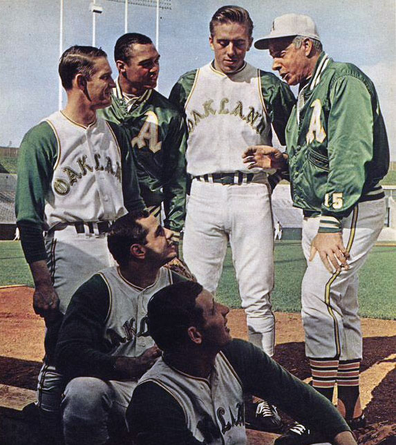
5 hours ago, Coiler said:
Good, but I still have nightmarish flashbacks to all the other slight variations to the standard green and yellow A's uniform I've seen on this board
 . It's not their fault they've tried to/considered move to every major city ever, but still.
Yeah, I considered going with the Phila or KC A's blue and red but just couldn't justify moving away from the classic green and gold.MIAMI MARLINS (est. 1993)
HOME:
ROAD:
HOME/ROAD ALT:
Notes:
- My Marlins set is pretty similar to the one from my Bringing MLB's '90s Expansion Teams into the Modern Day series, the only change being that I kept the team’s original scripts and logos.
- I kept the “Miami” name, as I like the alliteration with “Marlins,” and as a rule of thumb I prefer city to state names.
- Given the original Marlins alternate logo featured a touch of orange, I felt justified in incorporating it into the uniforms, replacing silver in this case.C&C appreciated as always!
-
2
-
 3
3
-
 1
1
-
-
On 1/17/2023 at 11:27 PM, vtgco said:
Thanks for trying that Nationals look. I think it works okay but I agree it's a bit off; certainly the outline helped make it a reasonable size on those 2005 jerseys but I dunno if it'd work here.
Love the banner (and the return of the classic chest logo RIP) for Detroit, though it could stand to be a touch larger compared to the D.
White Sox look great but your reference photo makes me wish for a sleeve patch for them. (And I guess also for the Browns-style Orioles!
On 1/18/2023 at 4:40 PM, GrayJ12 said:I love this idea so much! How you are able to create such unique ideas is awesome. The Cubs one looks fantastic too
")
The A's one, with the elephant on both sides, is great and unique too.
Thank you both!
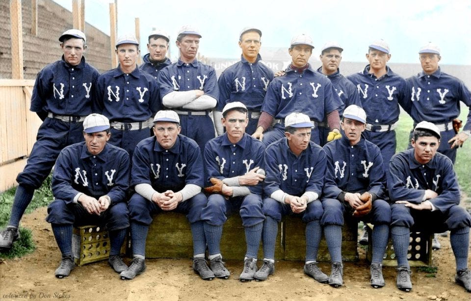
Surprise! After nearly a year, I decided to revisit this series, inspired by some of @vtgco's suggestions:BREWERS:
This very Michigan-esque design is based on this American Association Brewers look from 1936. Note the sweaters worn by the players in the back two rows.
ANGELS:
As vtgco noted, the Pacific Coast League Los Angeles Angels existed in the early 20th century. I was able to find a photo of an 1917 Angels player wearing a solid-colored (navy?) sweater and paired it with an early interlocking "LA" logo.PADRES:
The PCL Padres got their start in 1936. Unfortunately, I couldn't find any reference photos of sweaters from that far back, so this design is based on the 1948 team's dugout jackets.
C&C appreciated!-
4
-
2
-
-
2 hours ago, wildwing64 said:
Made some adjustments to the Spiders based on your suggestions. I've added a web-like pattern to the sleeves on the home and away sets, and made the Spider a slightly darker blue on the home sweater.
Also, I redid the third jersey - in retrospect it was a bit too simple and I wasn't satisfied with it.
Looks great! The web pattern is subtle but conveys exactly what I wanted to see.Any chance we could see a symbiote suit alternate?
-
2 hours ago, Coiler said:
I like this 1900-style "Initials/Cap Logo on the front" trend. Even if it's impossible to go back to the (less than inspired) red without intruding on the Angels turf.
Of course if you turn the clock ahead a bit to 1916, they've gone to plaid!
Thanks! Yeah, I briefly thought about the plaid design, but I had a hard time picturing it working in 2023.OAKLANDATHLETICS (est. 1901)HOME:
ROAD:
HOME ALT:
ROAD ALT:
Notes:
- For the A’s, I originally considered something based on the early Philadelphia uniforms, but as you can see, those designs don’t really have much to offer. Therefore, I went with a look inspired by the team’s first few seasons in Oakland.
- I did, however, keep the (almost) original Philly A’s logo, which is just different enough from Oakland’s current logo.
C&C appreciated!-
4
-
-
44 minutes ago, Coiler said:
I see you used the move as your start point rather than any OG Senators logo (which is understandable given that they were not exactly the most eye-catching or distinctive)
That's true. Maybe I'll do a Senators-inspired set at the end of the series.LOS ANGELES DODGERS (est. 1900 )
HOME:
ROAD:
HOME/ROAD ALT:
Notes:
- The original Brooklyn Dodgers actually wore red for their first two seasons, but I just couldn’t make that work. Thankfully, the team made the switch to royal blue in 1902 and haven’t looked back since.
- It works out nicely that the Blackletter style logo evokes Los Angeles street art, so I used it for the road wordmark, as well.
- The red TV numbers are a small nod to those very first uniforms.C&C appreciated, and Happy Thanksgiving!
-
2
-
1
-
-
I've always enjoyed your commentary on this forum @MilSox, and I'm excited to see you try your hand at a series. Looking forward to this!
I know you said your own design skills are limited, but what program did you use to create the new logos I see above?
-
1
-
-
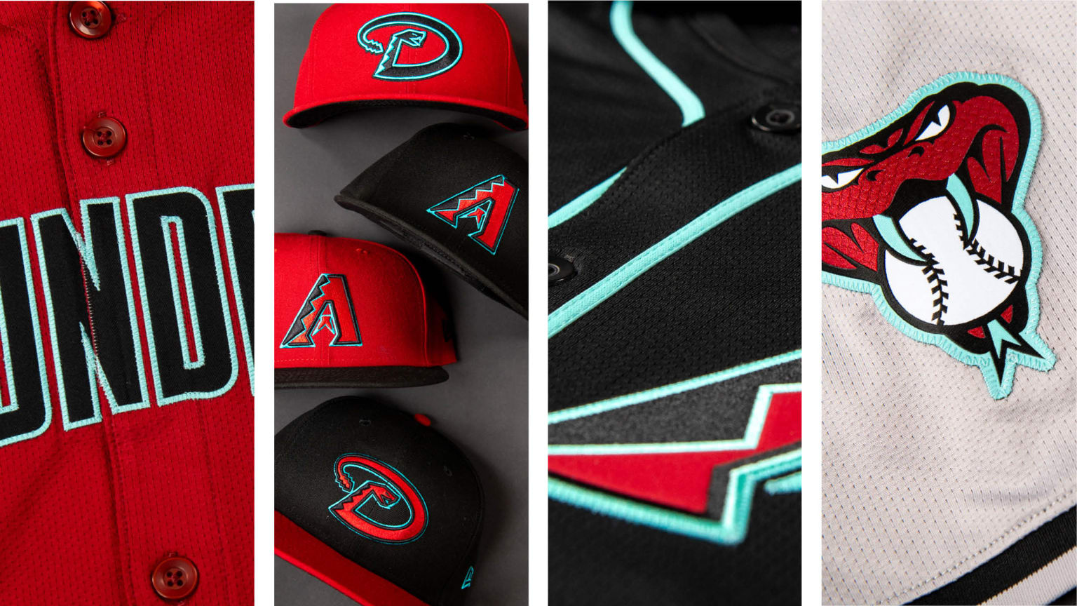
19 hours ago, Coiler said:
I've come to the conclusion it's impossible for a Diamondbacks uniform to look bad, and this is as good as always.
Agreed, though I might make an exception for this uniform.
MINNESOTA TWINS (est. 1961)HOME:
ROAD:
HOME/ROAD ALT:
Notes:
- I love what Minnesota did with their new uniforms this past season, dropping outlines altogether and segregating the use of navy and red. This set maintains that same approach while keeping the team’s original scripts and cap logo.
- Those early Twins unis used the same script on both the home and road jersey, so the “Minnesota” script used here comes from the team’s excellent 1961-65 wordmark logo.
- The home uniforms feature the same subtle pinstripes as the Twins’ new road look.C&C appreciated!
-
6
-
-
17 hours ago, ruttep said:
- No names on the back?
- I do like the two caps you've stuck with
- Really not sure about the turquoise alt. Never been a fan of super bright neon color bases for jerseys. This could end up being just as unsightly as the Seahawks green alt
- Great sleeve caps
Overall, looks great (albeit still unsure about neon turquoise). Would be happy with the Diamondbacks making this their look.
Thanks for the feedback! The only reason I didn't include player names is because I'm not great at arching letters. In general, I'm indifferent to names on the back of jerseys (I think the teams that don't use them look fine without them), but in real life I'd probably have the D-Backs use them.As for the turquoise alt, I figured it would be a controversial choice. My goal was to drop either the red or black alt, and I reasoned that if the Marlins refuse to bring back their classic color scheme full-time, maybe Arizona could be the NL team to "own" a vibrant turquoise/teal like this.
-
The more I've looked at them, the less I like the headspoon on the new home and road jerseys.
Shameless plug for my tweaks to the new D-Backs set here.
-
2
-
 1
1
-
-
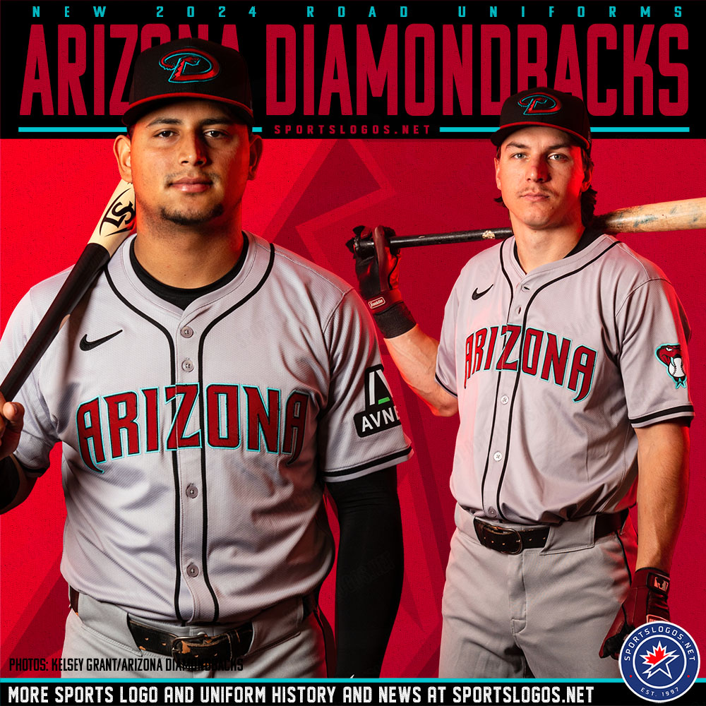
I shared my initial thoughts on them here, and after sitting on them for a few days, I decided to take a stab at tweaking the D-Backs' new uniforms:
HOME:
ROAD:
HOME ALT:
ROAD ALT:
CITY CONNECT:
Notes:
- The main thing I wanted to address with the new set was the overabundance of caps. I simplified the cap situation by paring it down to just two, a red home cap with the "A" logo and a black road cap with the "D" snake.- Front numbers have been added across the board.
- I've decided I'm not a fan of the new headspoon piping, so I removed it from the home, road and road alt.
- Since Arizona seems determined to lean into their history more and more with each redesign, I decided to bring back the diamond pattern sleeve cuffs from their original alternates, which would give the home and road jerseys in particular some much-needed personality.
- I flipped the stroke colors on the wordmark and numbers of the road jersey, since the turquoise is barely visible on the gray.
- This might be a controversial choice, but I decided to replace the red home alt with turquoise. Big thanks to @MJD7 for providing me with his "DIAMONDBACKS" wordmark. I'll try it with the actual wordmark once it's uploaded to the mothership.
- I really wanted to find a way to bring back the "db" snake head, possibly in place of the "D" snake, but unfortunately it just doesn't work as a cap logo, and I figured four different logos would be overkill.
- For the City Connect set, I brought back the team's 2007-15 numbers (the curves fit the script nicely) and replaced the "A" cap logo with the "S" from the script.
C&C appreciated!
-
1
-
-
38 minutes ago, Victormrey said:
You nailed the NY cap!
Gorgeous set for the Jays
That road uni is a beauty.
Thanks!
ARIZONA DIAMONDBACKS (est. 1998)HOME:
ROAD:
HOME ALT:
ROAD ALT:
Notes:
- For the NL champs, I repurposed the D-Backs design from my Bringing MLB's '90s Expansion Teams into the Modern Day series. The only change was switching to a vest-style jersey for the home and bringing back Arizona’s original 1998-2006 numbers.
- At the outset of this project, I wanted to avoid repeating similar schemes for teams in the same division or city, hence the shift from purple to magenta for Arizona. The magenta works just as well, IMO, and, paired with turquoise and copper, evokes a nice Southwestern feel.As always, C&C appreciated!
-
3
-
1
-
-
On 11/16/2023 at 9:12 AM, Victormrey said:
New York: I think the contrast between the navy uniform and the grey cap makes the set look more balanced
 Could you try adding the pins to the cap, like the one from the picture?
Orioles: good job as usual! Specially with the "Baltimore" script. I think it looks perfect.
How's this?
TORONTO BLUE JAYS (est. 1977)
HOME:
ROAD:
HOME ALT:
Notes:
- Toronto’s 2010 redesign was one of the most impressive in MLB history, restoring the team’s identity to its former glory with only the slightest of updates to the wordmarks, numbers and logo.
- This design keeps the same uniforms from 1977-96 while converting them to a contemporary button-down style and upgrading to the Jays’ current, more brilliant shade of royal blue. The original, darker blue as used here as a trim color.C&C appreciated!
-
5
-
1
-
-
13 minutes ago, Ferdinand Cesarano said:
And if the road grey had a front number (preferably in contrasting colours) and if it used the same hat as the home uniform, then this set would be just about perfect.
I argued that they should have added front numbers to all the jerseys in this set. The more I look at the new home jersey, the more naked it looks without them.-
1
-
-
5 minutes ago, ruttep said:
What I don't get is why the home uniform is that vintage off-white color. Off-white makes sense for traditional franchises and/or traditional color schemes. It does not make sense with this modern color scheme.
How did you feel about the original D-Backs uniforms? Those were off-white too, but purple and turquoise wasn't exactly a traditional color scheme.
-
10
-
-
4 minutes ago, Sodboy13 said:
And here, on the opposite end of the spectrum from the Rome Emperors...
I was about to post something to this same effect. -
Other than their classic purple and turquoise look, this is easily my favorite look Arizona has ever had. A few nitpicks:
- No team needs four different caps. Drop the solid colored ones and keep the two with contrasting bills.
- I don't like that the red alt is the only jersey with front numbers. I'd like to see them added across the board.
- I'd flip the trim colors on the "ARIZONA" wordmark. I'm not convinced the turquoise outermost outline shows very well against the light gray of the jersey. I might have to mock that up to see how it looks.
Now, on to the good stuff:
- Love that they finally went all-in on turquoise. The way it pops against the black alt is especially fantastic.
- The elimination of sand means the color can be totally unique to their City Connect set.
- Happy that they're using the "A" on the home jersey, which is off-white (another plus).
- Never thought we'd see the full team name on a jersey again, but here we are, and it looks great.
- I'm indifferent to the return of the snake "D," but I like how it looks in the new colors.
And most importantly, the stupid "D-BACKS" wordmark is finally gone.
-
11
-
-
39 minutes ago, nash61 said:
What? No Rome (insert adjective) (insert ridiculous local name no one has ever heard of)?
My ONLY nitpick on this is that I feel the Pontificating Penguin is too busy for the cap. The column R would be better, but that's the slightest thing. Overall, 9/10 for the uniforms, 10/10 for the logos, and 11/10 for the name.
I agree with this. Just the penguin's face (a la the cartoon Oriole) or the "R" logo would make for a stronger cap logo. -
What an awesome rebrand for Rome. Fun but not goofy identity, great color scheme, and I love the dual meaning of the name. That penguin logo is fantastic, too.
-
10
-
-
1 hour ago, Victormrey said:
New York: I think the contrast between the navy uniform and the grey cap makes the set look more balanced
Could you try adding the pins to the cap, like the one from the picture?
Orioles: good job as usual! Specially with the "Baltimore" script. I think it looks perfect.
Just now, Coiler said:Love the New York teams and the Orioles "semi-realistic bird".
Thanks, guys! @Victormrey, I'll update the Yankees gray cap soon.ST. LOUIS CARDINALS (est. 1900)
HOME:
ROAD:
HOME/ROAD ALT:
Notes:
- It goes without saying that the Cardinals have some of the most iconic uniforms in MLB history. Still, I can’t help but dig the elegant simplicity of these uniforms from 1900-08.
- Although they don’t have one in real life, I gave the Cards a red alternate so that gorgeous “StL” monogram could be showcased front and center. The design is based on this dugout sweater from 1908.C&C appreciated! Funnily enough, the list randomizer website I used grouped the three bird-themed teams together, so you can guess who the next team is.
-
5
-
-
MLB owners approve Athletics' planned move to Las Vegas, sources say - ESPN
I really hope the A's keep their current unis but just change the road script to reflect their new city. I also wonder if any design work was done on an Oakland City Connect uniform, which at this point we'll likely never get to see.
-
4
-
-
This is really great! I especially like the secondary logo with the periwinkle California. Nice work!
-
1
-
1
-
-
The George Strait set is really nice, but I would've loved to see ZZ Top for Texas, as I think they're the artist/group most synonymous with that state. And I say that as a George Strait fan myself.
-
1
-
-
22 hours ago, Victormrey said:
Great work for NY!
Maybe you could re-create this cap for the navy road uni

Nice idea! How's this?
Next up:
BALTIMORE ORIOLES (est. 1954)HOME:
ROAD:
HOME ALT:
ROAD ALT:
Notes:
- Baltimore has maintained a pretty consistent brand since the beginning, occasionally tweaking only their logos and scripts. The main difference here is the color balance, with black vs. orange scripts and numbers on the primary jerseys.
- The original “realistic” bird replaces the cartoon oriole as the cap logo.
- Although the Orioles didn’t have a “Baltimore” script until 1956, I was able to pull a script from this 1950s pennant that works pretty well here.
- Lastly, I worked up a new “O’s” logo from the original “Orioles” script for use on the road alt and cap.C&C appreciated!
-
7
-
2
-


:format(webp):no_upscale()/cdn.vox-cdn.com/uploads/chorus_asset/file/19932293/52600829.jpg.jpg)
A Major League Multiverse, 1972
in Concepts
Posted
That’s definitely a Kansas City Monarchs logo.