


coco1997
-
Posts
4,841 -
Joined
-
Last visited
-
Days Won
14
Posts posted by coco1997
-
-
On 10/10/2023 at 3:45 AM, Coiler said:
Like the green and black.
Thanks!Next up are the Chicago Whales!
WHALES HOME:
WHALES ROAD:
WHALES HOME/ROAD ALT:
Notes:
- The Whales' identity meshes pretty perfectly with the Cubs,' and their 1915 logo was likely inspired directly by it. The North Siders have thrown back to the Whales on multiple occasions.
- Color-wise, I shifted from the Cubs' royal blue to the Whales' darker navy.
- I used the Cubs' one-and-done 1990 road wordmark so I could incorporate the cap logo into it.
C&C appreciated!
-
 5
5
-
-
19 hours ago, Coiler said:
Looks too much like the Dodgers for me, but I can see why you did that.
Fair enough. Perhaps you'll like the next team a bit better:
REBELS HOME:
REBELS ROAD:
REBELS HOME/ROAD ALT:
Notes:
- According to Ebbets Field Flannels, Pittsburgh's Federal League team used green as their primary color, so I paired it with black to produce a Pirates-esque look.
- Since the Rebels also wore pinstripes, I used the Bucs' pinstriped, sleeveless look from 2005-10 for inspiration.
C&C appreciated as always!
-
6
-
-
On 9/30/2023 at 10:01 AM, Dozap17 said:
Nice start to this series so far, the Baltimore Terrapins could well pass for the real-life Orioles, as a Cleveland fan Green Sox is admittedly a more well-thought out name than Guardians
Thanks! And I tend to agree about the Guardians. In hindsight, I wish Cleveland had gone all-in on the identity change and switched to a new color scheme.Starting the new week with the Brooklyn Tip-Tops!
TIP-TOPS HOME:
TIP-TOPS ROAD:
TIP-TOPS ALT:
Notes:
- For the home uniform, I went with subtle pinstripes (a la the Twins' new road set) as a nod to the Tip-Tops' pinstriped look.
- The "Tip-Tops" script was made using a font called "Catchland," which matches the Dodgers' scripts almost identically.
C&C appreciated!
-
6
-
-
Looks good! The Beach Boys are my favorite band, so I love this. Personally I would have saved the Boys for the Dodgers, but this works, too.
-
2
-
-
17 hours ago, Coiler said:
Like the light green color. Have to wonder how you'd do the Baltimore Terrapins or Chicago Whales in a way that isn't just variants on the Orioles/Cubs.
Thanks! And that's a great question. What's interesting is the Terrapins color scheme is pretty much identical to the Orioles', as you're about to see...TERRAPINS HOME:
TERRAPINS ROAD:
TERRAPINS HOME ALT:
TERRAPINS ROAD ALT:
Notes:
- This one is a pretty straightforward spin on the Orioles' set, replacing the home script with a "Terrapins" one in a matching style.
- The smiling bird is replaced by the stylized terrapin logo, which I feel could work on a modern day uniform with little to no updating.
C&C appreciated!
P.S. Congrats to O's fans on the team clinching their division and the top seed in the AL!
-
10
-
 1
1
-
-
Not sure if you've thought this far ahead yet, but the Rangers absolutely have to be ZZ Top.
-
1
-
-
Hi everyone,
After completing my MLB x Negro League series a while back, I decided to put together a batch of concepts reimagining another defunct baseball league from the earliest 20th century: the Federal League, AKA the "third major league," which lasted from 1913-15.
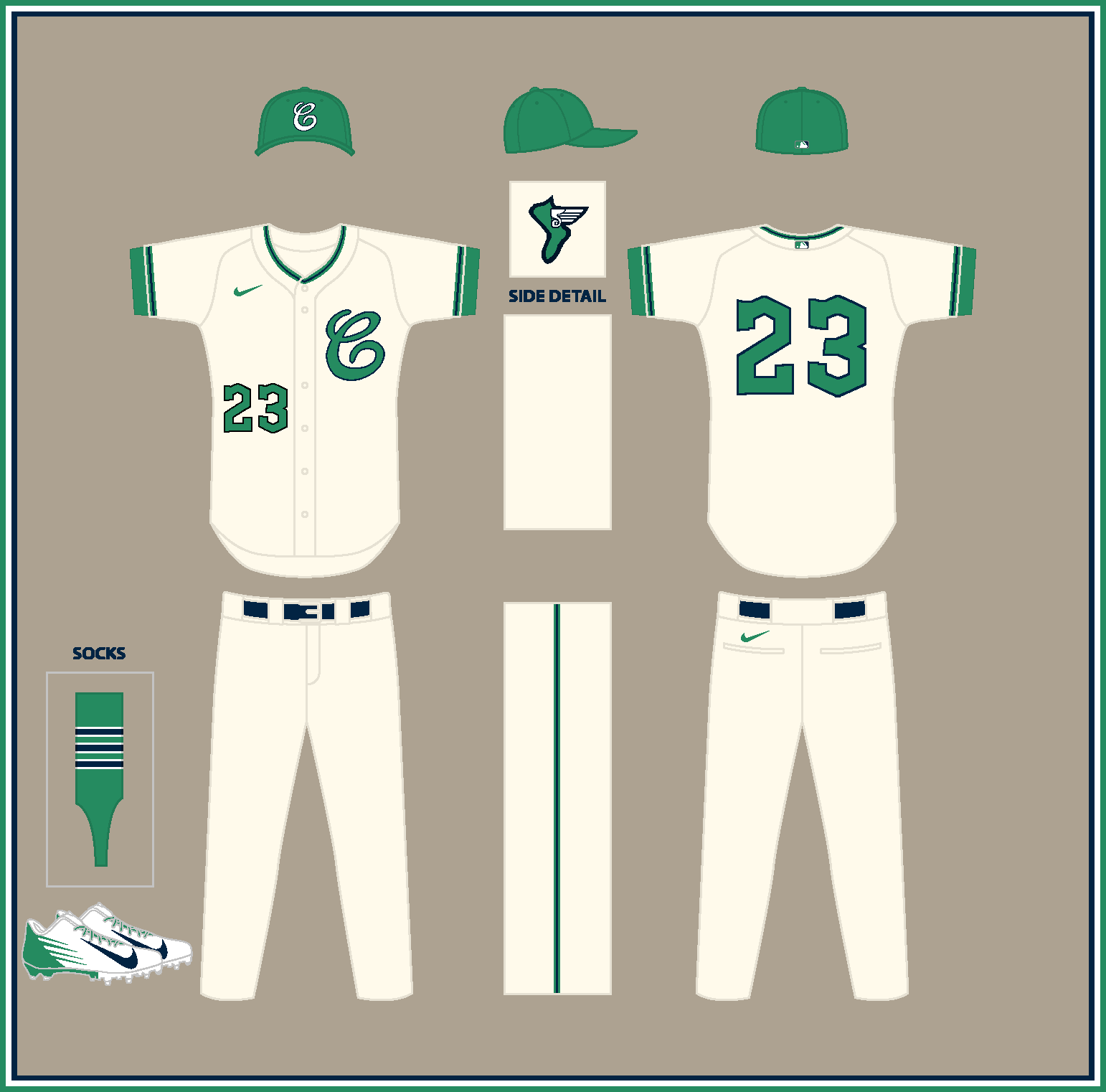
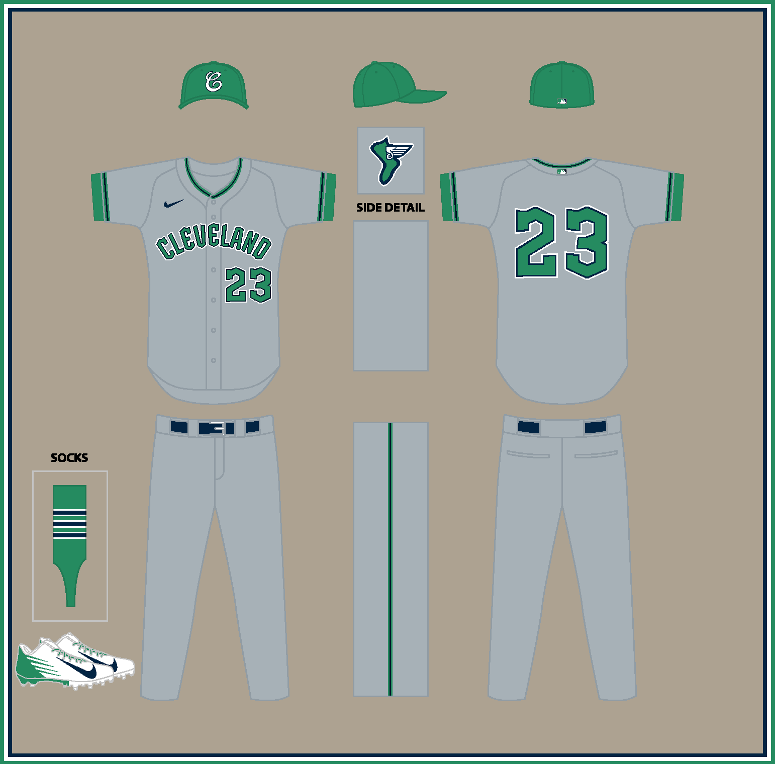
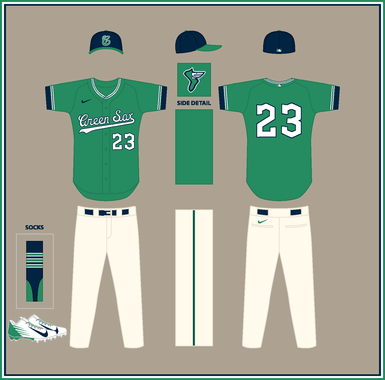
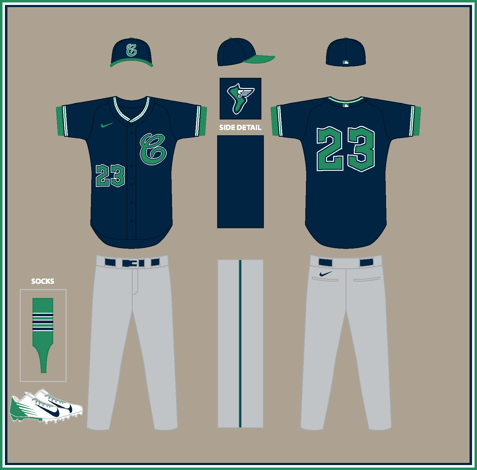
First up are the Cleveland Green Sox:
GREEN SOX HOME:
GREEN SOX ROAD:
GREEN SOX HOME ALT:
GREEN SOX ROAD ALT:
Notes:
- The script "C" is the Cleveland Naps' 1909 primary logo, which comes fairly close to the Green Sox logo.
- I worked up a new "Green Sox" script to go with the cap logo while making use of the Guardians' current numbers and road wordmark.
- My favorite detail here is the flying sock sleeve logo, which features the wings from the Guardian statues' helmets.
As always, C&C is appreciated! The next team will be up soon.
-
7
-
-
Congrats on wrapping up a fantastic series! Even though I know you stated SFGiants58 and Todd Radom provided the majority of the research and inspiration for this series, most of my favorite designs were the ones you undertook after the 60 or so you had originally planned.
These are probably my top 10:
01. Kansas City Cowboys
02. Baltimore Orioles (Cardinals)
03. St. Paul Saints
04. Las Vegas Flamingos
05. New York Reds
06. Tampa Bay Rays (Rangers)
07. Nashville Stars
08. New Orleans Pelicans (Cleveland)
09. Los Angeles Angels (Senators)
10. New Jersey Mets
Honorable mentions go to the Orlando Rays, Houston Buffaloes and Norfolk Tides.
Congrats again!
-
1
-
 1
1
-
-
28 minutes ago, MJD7 said:
Ah gotcha, here you go:
Fantastic!-
1
-
-
2 hours ago, MJD7 said:
Sure:
As much as the Dodgers in Oakland doesn't feel right, this feels even less right:
Whoops! For the road jersey, I meant adding a white stroke to your original design with the "Oakland" script. My fault for not being clearer.As for the blue design, you're 100% correct that it definitely doesn't feel right. I actually miss the red numbers on your original version, but between green and gold or blue and green, the choice is easy.
2 hours ago, MJD7 said:What if... the Pirates relocated to New Orleans (and changed their name)?
This is the same premise as my original Pirates → NOLA design, but if they changed their name to the "Pelicans." Mardi Gras colors felt like the way to go here.
Looks good! Great job balancing the three Mardi Gras colors.-
2
-
-
Very nice!
Could we see the road jersey with white trim, a la the '70s and '80s Dodgers uniforms?-
1
-
-
12 minutes ago, MJD7 said:
Maybe something like this?
Yep, that definitely works!-
1
-
-
2 hours ago, MJD7 said:
What if... Cleveland's baseball team relocated to Minneapolis (and changed their name)?
Per @coco1997: In 1957, GM Hank Greenberg was fired when it came to light that he started a secret campaign to move the team to Minnesota. I figured they'd maybe snatch "Vikings" before the NFL team.
Love this! Something about the "crude" look of the scripts works really well for a team called the "Vikings."
I'd love to see some sort of logo on the sleeve, either the actual Vikings logo or, as you suggested on Twitter, an "M" with Viking horns.-
1
-
-
8 hours ago, MJD7 said:
Thanks! At first I thought the smooth, round shape of the feather would clash with the sharp, jagged wordmarks, but as a throwback, it could work...
The throwback looks great, but I think I have a way to make the feather work across the board. Is it possible to tweak the original feather design to look angular, similar to—and I hate to use this comparison—the one on Chief Wahoo’s head?-
2
-
-
3 hours ago, MJD7 said:
What if... Cleveland's baseball team relocated to Atlanta (and changed their name)?
Per @coco1997: Prior to the Braves landing there in 1966, they were also & a contender for Atlanta. I went with the name "Eagles," as it's what Ted Turner considered renaming the Braves to in 1976.
Great job once again on the scripts!I know you're going for a mainly Guardians-inspired look, but I can't help but think this concept, given the new identity, would be the perfect opportunity to work in the sleeve feathers.
-
1
-
-
5 hours ago, MJD7 said:
Thanks!
A general rule of thumb I've developed for Braves concepts (the Angels follow the same rule for me, too) is that the outline of the script ought to be darker than the script itself, at least on the primary home & away jerseys, because the outline is so thick and the script itself is so thin. Otherwise, it ends up looking like a "re-color concept," for lack of a better term, that disregards a bit why the original wordmark was colored the way it was. Regardless, here's a look at your request:
It honestly looks better than I expected, I took the liberty of trimming the stripes down from 3 to 2, as otherwise it was just too much gold.
Yeah, this looks great. The simplified piping was a good call, too, and looks closer to those Padres jerseys.
5 hours ago, MJD7 said:What if... the Braves relocated to Dallas (and changed their name)?
Per @coco1997: Braves president John McHale also met with representatives from Dallas in 1964 to discuss moving the team there. The Braves' throwback "Hank Aaron" set was a big source of inspiration for this one.
Love this! The “Rangers” script is especially strong.-
1
-
-
2 hours ago, MJD7 said:
I get that. I honestly didn't keep navy & yellow entirely because of the Bees, but because the Utah Jazz also used to have a similar color scheme. Personally, if I ever did a royal blue & kelly green color scheme for the Twins, I'd want to reserve it for Minnesota, as it's one of my personal favorite color schemes and has precedence in the Twin Cities. I suppose I could harken back to an earlier Jazz scheme, which also uses cool colors:
It ends up pretty similar to my Carolina Twins concept, though.
You're right about this version coming pretty close to your Carolina set. I didn't even think of suggesting Jazz colors, but that makes a ton of sense.2 hours ago, MJD7 said:What if... the Braves relocated to San Diego?
Braves president John McHale in 1964 admitted he had met with representatives from San Diego about moving the team out West. I went with a scheme inspired by the city's large naval presence.
Great job creating that "San Diego" script in the style of the Braves! I know that's an especially tricky script to work with, but you pulled it off.I'd kind of like to see the navy & gold on the home and road jerseys reversed, if only because on those 2016 Padres unis, navy was the primary color with gold used as trim. I also realized that if you wanted to, you could use the Padres' original 1969-84 "SD" monogram somewhere, since its blockiness matches the Braves' number font fairly well.
-
1
-
-
11 minutes ago, MJD7 said:
What if... the Twins (temporarily) relocated to Salt Lake City?
I didn't think the 'Twins' name could work in SLC, but a Twitter user pointed out to me that it could represent the 'Twin Peaks' of the nearby Wasatch Mountains.
I really like the idea of "Twins" referring to the mountains, but with this name change, the use of yellow/gold doesn't make as much sense as it did for a team called the "Bees." Mountains make me think of cool tones, so how about a scheme based on Salt Lake City's previous flag?
You'd have to play around with the shades a bit to find the right contrast, but I think it has potential.-
1
-
-
25 minutes ago, MJD7 said:
Thanks! I thought about going with forest green, but it just felt too "drab" compared to kelly green. Here's a look, though:
I think I prefer this version a bit more; the darker green contrasts much better with the red.27 minutes ago, MJD7 said:I'll see what I can do; of those options, keeping "Twins" or going with "Vikings" feel the most promising.
Yeah, I was actually thinking "Vikings" as an MLB team would the most fun to see.-
1
-
-
2 hours ago, MJD7 said:
Sure thing:
Much as I like pinstripes on non-white or gray uniforms, these versions feel a bit more "MLB" to me.2 hours ago, MJD7 said:What if... Cleveland's baseball team relocated to Oakland (and changed their name)?
Per @coco1997: In 1964, the "Oakland Baseball Corp." made a $6.5 million bid to purchase and move the team but were rejected by Cleveland’s board of directors. I went with "Oaks," the name of the PCL team.
Great work creating those scripts in the Guardians' style! I'm curious to see how this set would look with forest green in place of Kelly, similar to how the Guardians pair red with navy blue.
I have to say, it's a nice change of pace to see a concept involving a team moving to Oakland rather than from it.

I was thinking about a potential Indians-to-Minnesota name change, and here are a few ideas I came up with:
Gophers - This name could serve as a nod to both the black baseball club of the early 1900s (the St. Paul Colored Gophers, also called the Twin City Gophers) and the University of Minnesota Golden Gophers.
Lakers - With the Lakers leaving Minneapolis for L.A. following the 1960 season, maybe the Indians could grab that name shortly after their arrival? "Lakers" always made way more sense for a Minnesota team ("Land of 10,000 Lakes") than a Los Angeles one.
(Hero) Twins - You could keep the "Twins" name but have it refer to the "Hero Twins" (or "God Boys") of Native American mythology.Vikings - Perhaps the relocated Indians, still wanting a name that refers to a group of warrior people, could beat the NFL squad to the punch by a few years? Other names the Vikings considered were "Miners," "Chippewas" and "Voyageurs."
-
2
-
-
Nice work on the Bees! I’ve always loved that minor-league identity.
Any chance we could see the alternates without the pinstripes?
-
2
-
-
22 hours ago, MJD7 said:
These seem promising, the most difficult aspect would be recreating the wordmarks (the Braves' script is an especially difficult one to work with).
For San Diego, I was actually thinking you could create a "BRAVES" wordmark in the style of the current Padres wordmarks like you did for the San Diego Reds. Alternatively, you could keep the current "Braves" script and just use an "SD" monogram on the road jersey in lieu of a full "San Diego" script/wordmark, a la the late '80s Padres.22 hours ago, MJD7 said:To be completely honest, none of these names feel promising to me. Maybe they could snag "Hawks" from the NBA team since this would predate them by a few years.
I didn't think of this until just now, but how about the "Eagles"? It's a name the Braves considered adopting in the '70s, it would fit the theme of the other Atlanta teams being named after birds, and, since eagles are sacred in Native American culture, it could also serve as a respectful nod to the team's former identity.22 hours ago, MJD7 said:This is another one where I'm not sure what I'd do for the name. Plus, I'm honestly not too big on any of Cleveland's past scripts, so I'd have a tough time adapting them to my favorite team.

Yeah, that's a tough one. I'll try to think of something that has some historical relevance and sounds good.-
2
-
-
21 hours ago, MJD7 said:
Since I'd likely have to change the name for each of these, I'm probably gonna put these on hold at least for now (I'm open to any recommendations for names).
Well, you could keep the "Braves" name for San Diego, but repurpose it to honor the city's Naval presence ("Land of the free, because of the brave"), similar to how some
have argued the Braves could drop the Native American imagery and have their name refer to firefighters. You could then lean into the Padres' navy and gold color scheme from 2016.
For the Dallas Braves, you could just use "Rangers," since the Senators would not move to Texas for nearly another decade. Plus, there was a minor league team at the time with that name. Other possibilities are "Spurs," "Rebels," "Steers," "Navigators," "Griffins" and "Eagles."
For the Oakland Indians, you could go with "Oaks," as there's a precedent for MLB teams co-opting Pacific Coast League identities. And since you used "Rainiers" for your Cleveland-to-Seattle relocation, "Oaks" would be the logical choice.
For the Atlanta Indians, there's always the Crackers (no relation to the Black Crackers of the Negro Leagues), the minor league team that existed in Atlanta for over 70 seasons. There would also be something deeply funny about a team formerly called the "Indians" changing its name to "Crackers."
Other options are "Colts" and "Windjammers."
21 hours ago, MJD7 said:Also, I believe that's all of the teams I had prepared & the recommendations I've been given (I'm almost afraid to ask if I've missed any
), I have a few more "temporary" relocations to show & then that'll wrap it up!
The only one I previously suggested that you haven't covered yet is the Minneapolis-St. Paul Indians.-
1
-
-
18 hours ago, MJD7 said:
What if... the Expos relocated to New Orleans (and changed their name)?
Along with Buffalo, New Orleans was prepared to swoop in if the Montreal deal fell through. I once again went with the name "Pelicans," and used the New Orleans "Baby Cakes" font throughout the design.
The whole set is gorgeous, but those two alts might be some of my favorite designs in this entire series!I know you're probably going to hate me for this
, but I came across a few Indians and Braves relocations for your consideration:
Atlanta Indians – This article claims that, prior to the Braves landing there in 1966, the Indians were contenders for Atlanta.
Dallas & San Diego Braves - Struggling to keep his team in Milwaukee amidst a steady decline in attendance, Braves president John McHale in 1964 acknowledged he had met with representatives from Dallas and San Diego about moving his team out West.
Oakland Indians – In September 1964, the newly-formed Oakland Baseball Corp. made a $6.5 million bid to purchase and move the Indians to Oaktown but were rejected by Cleveland’s board of directors.
Keep up the amazing work! I'll be sad when this series comes to an end.-
1
-


/cdn.vox-cdn.com/uploads/chorus_asset/file/9561555/usa_today_10376658.jpg)
MLB x Federal League Baseball (Buffalo Blues 10/24)
in Concepts
Posted
Thanks! I wanted to stick with the blue and red color scheme since it was shared by the Whales and Cubs.
Speaking of the Whales, next up are their biggest rivals, the St. Louis Terriers!
TERRIERS HOME:
TERRIERS ROAD:
TERRIERS ROAD ALT:
Notes:
- I had a lot of fun with the Terriers. For the colors, I combined those of St. Louis' two MLB teams at the time--the Cardinals' red and the Browns' brown.
- The jerseys are zip-ups and feature thick T-bars and piping based on the 1940s Cardinals.
- Inspired by the Redbirds' iconic "birds on the bat" logo, the scripts include a dog bone jutting through them. Here's a closer look at the home script.
- The alt would ideally only be worn on the road so that the piping would be consistent with the pants.
C&C appreciated!