


coco1997
-
Posts
4,871 -
Joined
-
Last visited
-
Days Won
14
Posts posted by coco1997
-
-
Nice work on the Bees! I’ve always loved that minor-league identity.
Any chance we could see the alternates without the pinstripes?
-
 2
2
-
-
22 hours ago, MJD7 said:
These seem promising, the most difficult aspect would be recreating the wordmarks (the Braves' script is an especially difficult one to work with).
For San Diego, I was actually thinking you could create a "BRAVES" wordmark in the style of the current Padres wordmarks like you did for the San Diego Reds. Alternatively, you could keep the current "Braves" script and just use an "SD" monogram on the road jersey in lieu of a full "San Diego" script/wordmark, a la the late '80s Padres.22 hours ago, MJD7 said:To be completely honest, none of these names feel promising to me. Maybe they could snag "Hawks" from the NBA team since this would predate them by a few years.
I didn't think of this until just now, but how about the "Eagles"? It's a name the Braves considered adopting in the '70s, it would fit the theme of the other Atlanta teams being named after birds, and, since eagles are sacred in Native American culture, it could also serve as a respectful nod to the team's former identity.22 hours ago, MJD7 said:This is another one where I'm not sure what I'd do for the name. Plus, I'm honestly not too big on any of Cleveland's past scripts, so I'd have a tough time adapting them to my favorite team.

Yeah, that's a tough one. I'll try to think of something that has some historical relevance and sounds good.-
2
-
-
21 hours ago, MJD7 said:
Since I'd likely have to change the name for each of these, I'm probably gonna put these on hold at least for now (I'm open to any recommendations for names).
Well, you could keep the "Braves" name for San Diego, but repurpose it to honor the city's Naval presence ("Land of the free, because of the brave"), similar to how some
 have argued the Braves could drop the Native American imagery and have their name refer to firefighters. You could then lean into the Padres' navy and gold color scheme from 2016.
For the Dallas Braves, you could just use "Rangers," since the Senators would not move to Texas for nearly another decade. Plus, there was a minor league team at the time with that name. Other possibilities are "Spurs," "Rebels," "Steers," "Navigators," "Griffins" and "Eagles."
For the Oakland Indians, you could go with "Oaks," as there's a precedent for MLB teams co-opting Pacific Coast League identities. And since you used "Rainiers" for your Cleveland-to-Seattle relocation, "Oaks" would be the logical choice.
For the Atlanta Indians, there's always the Crackers (no relation to the Black Crackers of the Negro Leagues), the minor league team that existed in Atlanta for over 70 seasons. There would also be something deeply funny about a team formerly called the "Indians" changing its name to "Crackers."
Other options are "Colts" and "Windjammers."
21 hours ago, MJD7 said:Also, I believe that's all of the teams I had prepared & the recommendations I've been given (I'm almost afraid to ask if I've missed any
), I have a few more "temporary" relocations to show & then that'll wrap it up!
The only one I previously suggested that you haven't covered yet is the Minneapolis-St. Paul Indians.-
1
-
-
18 hours ago, MJD7 said:
What if... the Expos relocated to New Orleans (and changed their name)?
Along with Buffalo, New Orleans was prepared to swoop in if the Montreal deal fell through. I once again went with the name "Pelicans," and used the New Orleans "Baby Cakes" font throughout the design.

The whole set is gorgeous, but those two alts might be some of my favorite designs in this entire series!I know you're probably going to hate me for this
, but I came across a few Indians and Braves relocations for your consideration:
Atlanta Indians – This article claims that, prior to the Braves landing there in 1966, the Indians were contenders for Atlanta.
Dallas & San Diego Braves - Struggling to keep his team in Milwaukee amidst a steady decline in attendance, Braves president John McHale in 1964 acknowledged he had met with representatives from Dallas and San Diego about moving his team out West.
Oakland Indians – In September 1964, the newly-formed Oakland Baseball Corp. made a $6.5 million bid to purchase and move the Indians to Oaktown but were rejected by Cleveland’s board of directors.
Keep up the amazing work! I'll be sad when this series comes to an end.-
1
-
-
10 hours ago, Pyromania1983 said:
Ironic, because if anyone on the Yankees needs insurance, it's Rodon.-
 1
1
-
-
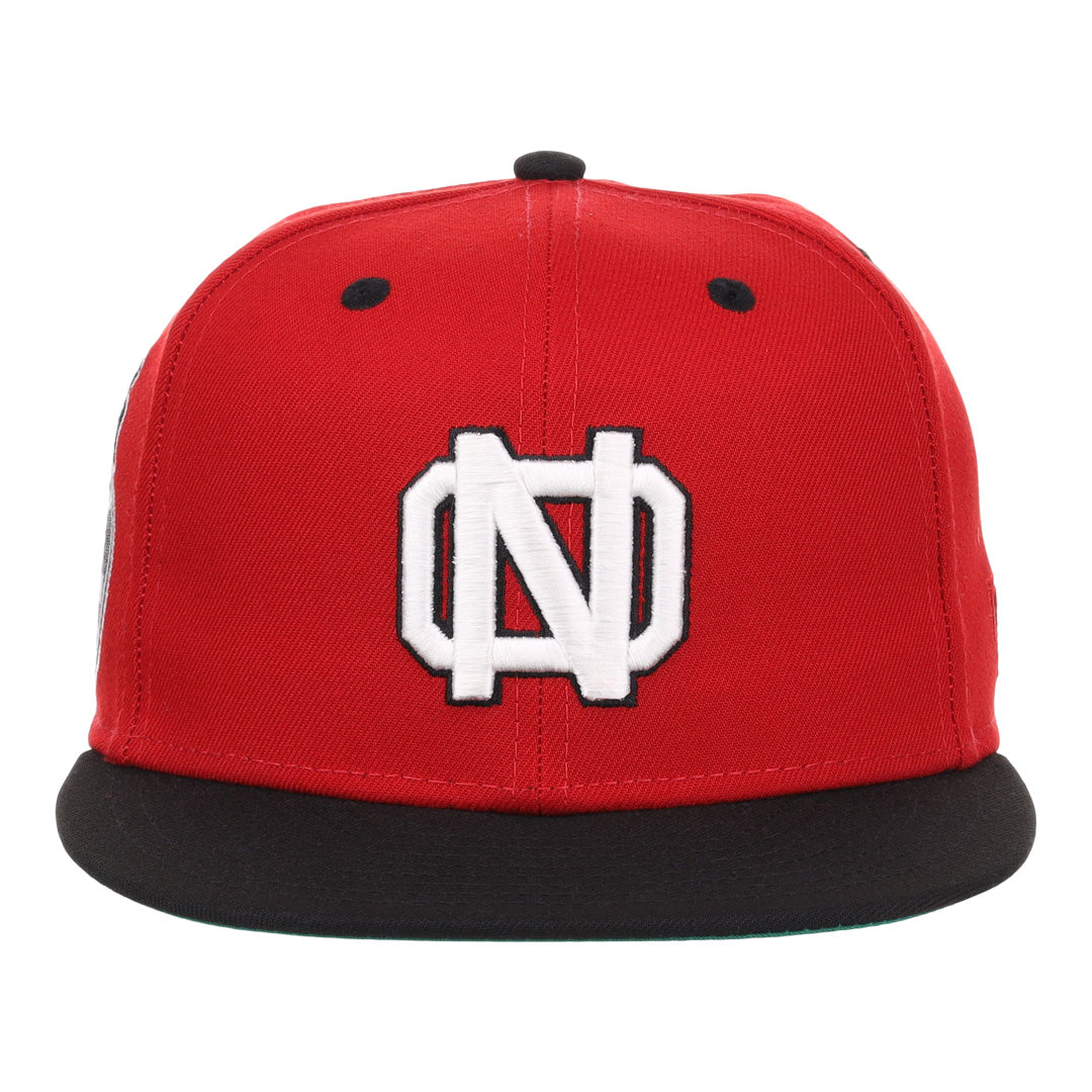
10 hours ago, MJD7 said:
The way the "N" is shaped makes it difficult for an "O" to intersect with it well. These are a couple options that could maybe work (the second feels very UNC-esque):
Of the two, I think I prefer the second option a bit more.-
3
-
-
5 minutes ago, MJD7 said:
What if... the Yankees relocated to New Orleans (and changed their name)?
New Orleans pitched the Yanks to move south in the late 70's, but negotiations broke down before they really began. I wasn't forced to settle on a new name for the team, but I suppose "Cajuns" could work.
I dig the premise of this one, but I'm not really feeling the "NO" monogram. How about something like the Negro League New Orleans Pelicans cap logo, with the "N" centered in the middle of the "O"?
-
1
-
-
I really like the color scheme and sleeve design for Cleveland! However, I think the cap logo would work better if the "C" contrasted with the cap's crown. If you extended the white stroke to separate the wing from the "C," you could make the "C" copper and mimic the wordmark on the navy jersey. I'd also think about putting that logo on one of the alternates so you don't have five different jerseys that all use either the "Cleveland" or "Guardians" wordmark.
I applaud your creativity with the Royals, but I'm not wild about the heavy use of metallic gold, mainly because I don't think that particular shade and powder blue complement each other very well. Also, I think it's redundant to have three powder blue jerseys; maybe make one of them gold?
-
1
-
-
3 hours ago, MJD7 said:
What if... the Mets relocated to New Jersey?
In 1971, with speculation that the Yankees might share Shea with the Mets, Mets chairman M. Donald Grant responded that he’d recommend moving the team to Jersey if this happened. Instead of NYC flag colors, I went with NJ flag colors.
YES! Blue and gold (buff) is exactly what I hoped you'd do for the NJ Mets. That "NJ" monogram is just gorgeous.
For comparison's sake, could we see the home whites sans pins and with piping based on either this jersey or the Mets' 1997 look?-
2
-
-
11 hours ago, MJD7 said:
What if... the Yankees relocated to New Jersey?
Per @coco1997: In 1987, Mr. Steinbrenner met with the New Jersey Sports and Exposition Authority to discuss moving the Yankees to a new complex in the Meadowlands. I added some gold to the Yankees inspired by @raysox' New Jersey design.
Wonderful! The gold trim is an unexpected addition, but I find myself really liking it. The "NJ" monogram looks fantastic, too.
I agree that if this move had happened, they probably would have kept the "New York" name, though.
-
1
-
-
12 hours ago, MJD7 said:
What if… the Rays relocated to Montreal (and changed their name)?
It was largely publicized that the Rays at least considered splitting home games between Montreal & Tampa. I combined the Rays’ fauxback aesthetic with the Expos brand.
I like the idea of basing the revived Expos’ look on the Rays’ fauxbacks to create something new and different.My only nitpick is that the “x” in “expos” looks a little wonky.
-
3
-
-
8 hours ago, MJD7 said:
What if… the (second) Senators relocated to Buffalo (and changed their name)?
Per @maxwasson: MLB told representatives in Buffalo that they would get the Senators franchise if their dome could be built, but it fell through & the team moved to Texas.
I love it! Easily my favorite of your Bisons concepts.-
3
-
-
8 minutes ago, MJD7 said:
What if... the Mets relocated to Montreal (and changed their name)?
This one is a bit too conspiratorial for my tastes, but: Per @coco1997 & @DCarp1231: In 2014, an article alleged that the Wilpons were conspiring to move the team to Montreal so they could use Citi Field's land for mixed-use development.
Looks good (especially how you worked the Mets’ “M” into the road script) but I’d prefer you keep the “Mets” name, since it both predated and outlived the original Expos.-
1
-
-
I just noticed you added fiesta pattern side panels to the road alt. I like that a lot, as it gives that jersey a lot more personality. It definitely works a lot better here than on the Astros' navy alts.
-
1
-
-
2 hours ago, MJD7 said:
Here's an update to the San Antonio Missions (former Marlins): This is much closer to what I was originally envisioning, as I finally found a font that's really close to the Minor League Missions' former font.
Any chance you could add a white stroke around the wordmark and numbers on the road jersey? I feel like the teal bleeds into the gray a bit.-
1
-
-
Purple and orange is definitely more interesting than the boring blue and red from the mockup logo:
I dig the sublimated pins on the road alt, too.
-
1
-
-
20 minutes ago, MJD7 said:
With neither of the LA teams likely to ever take the “Stars” name, I’d say it fits as well in Nashville as anywhere else. Plus, although it’s not the Grays, having a Negro League team name finally make its way into MLB would be pretty cool.
I guess I’m mainly opposed to it because there’s another 60+ year-old MLB team whose identity is based around a star logo.1 hour ago, TrueYankee26 said:
20 minutes ago, MJD7 said:
Hey, if the Nats can still use their script “W” despite it being constantly compared to the Walgreens logo, I don’t see why this logo can’t work. -
4 hours ago, MJD7 said:
What if... the Rays relocate to Nashville (and change their name)?
A Tampa City Council member said that Rays president Brian Auld told him that relocating to Nashville might be a possibility. It seems the team would be the "Stars," which keeps 3/4 letters of the old name.
I personally think it would be a waste to name a Nashville team the “Stars,” but I do love the idea of an expansion team wanting to pay homage to the Negro Leagues.Anyway, I love the concept. I’m a sucker for a good off-white home uniform, and the colors are giving me 2000s Astros vibes.
-
2
-
-
13 hours ago, MJD7 said:
Much like the KC Royals are essentially just royal blue & white, I wanted to focus more-so on purple for the Montreal version, but having more of a co-balance with gold could work, too:
Yeah, I definitely prefer this version! I know you wanted to focus on purple, but remember that St. Louis (particularly around the time the move to Montreal would have happened) distributed brown and orange pretty evenly on their uniforms, so this version feels more consistent with that.-
1
-
-
The Racers set is awesome. Red and gold is always a winning look, and I'm digging the drop shadowed lightning bolt!
-
1
-
-
3 hours ago, MJD7 said:
What if... the Browns relocated to Montreal (and changed their name)?
This is the same premise as my original Browns → Montreal design, but if they decided to beat Kansas City to the punch with "Royals." I went with purple because of its association with the British crown.
Very nice! I think the scripts on the road and home alt might pop better with a white or gold outline, with maybe gold front numbers on the road alt.
Keep up the great work!
-
1
-
-
5 hours ago, MJD7 said:
@DCarp1231 has suggested the Mets variations, I’ll see what I can do. This is gonna have to be the last of the suggestions though, I’d like to be able to finish this series eventually!
Yeah, I'll admit that I actually found these last three a while ago, but I wanted to hold off on posting them until you got caught up on my previous big list of suggestions. As always, thanks for tackling my ideas!
The Nashville O's look great, by the way. That "Nashville" script is gorgeous, and I like the flag stars in the roundel.
-
2
-
-
19 hours ago, MJD7 said:
What if... the Braves relocated to Baltimore?
Per @coco1997: In 1949, Boston Braves owner Lou Perini made a failed bid to move his team to Baltimore before working out a deal with the City of Milwaukee. I wanted to incorporate the Maryland flag a bit more with this iteration.
Outstanding job creating that "Baltimore" script in the style of the Braves' scripts! I'm with @DCarp1231 in that I'm not totally sold on the flag-themed sleeve stripes, but I suppose they give the uniforms a little something extra.
I came across a few more relocations that would fit the premise of this series, two of which happen to involve the Mets. Apologies if any of these have already been suggested:
Jersey City Mets – Once it became clear Shea Stadium would not be ready for the Mets’ inaugural 1962 season, International League President Tommy Richardson offered up Roosevelt Stadium (home of the Triple-A Jersey City Giants, who had great uniforms, by the way) to the Mets. The two teams would have split time at Roosevelt, but with the Giants moving to Jacksonville following the 1961 season, the Mets could have theoretically stayed in Jersey full-time.
Later, in 1971, with speculation that the Yankees could leave NYC if the City refused to fund renovations to Yankee Stadium prior to their lease ending in 1978, City Council president Sanford Garelik proposed the team share Shea Stadium with the Mets as a solution. Mets chairman M. Donald Grant responded that he’d recommend moving the team to Jersey if this happened.
Minneapolis-St. Paul Indians – In 1957, amidst a last place season and a shocking decline in attendance, Indians GM Hank Greenberg was fired when it came to light that he and several stockholders had begun a behind-the-scenes campaign to move the team to Minneapolis-St. Paul.
Montreal Mets - In 2014, the Herald de Paris ran an article suggesting the Wilpons were conspiring to cut the Mets' payroll and destroy fan interest in order to justify moving the team to baseball-starved Montreal so that they could then turn the valuable Citi Field site into a mixed-use development. (Side note: You could probably repurpose the "M" from your Minneapolis Millers concept for this one.)-
2
-
-
4 minutes ago, MJD7 said:
What if... the Browns relocated to Montreal?
Per @coco1997: After Browns owner Philip Ball passed away in 1933, two Montreal business moguls expressed interest in buying and moving the team there. I paired brown with a color the Expos used tangentially on their uniforms in powder blue.
Brown on its own doesn't feel very "Montreal," but paired with sky blue, it works brilliantly. It's also pretty cool that you were able to keep the fleur de-lis logo with this move.-
2
-

 have argued the Braves could drop the Native American imagery and have their name refer to


:format(webp)/cdn.vox-cdn.com/uploads/chorus_image/image/47002458/Rick_Reed_white_hat_April_16__1997_Al_Bello_Allsport.0.0.jpg)
MLB MULTIVERSE
in Concepts
Posted
Much as I like pinstripes on non-white or gray uniforms, these versions feel a bit more "MLB" to me.
Great work creating those scripts in the Guardians' style! I'm curious to see how this set would look with forest green in place of Kelly, similar to how the Guardians pair red with navy blue.
I have to say, it's a nice change of pace to see a concept involving a team moving to Oakland rather than from it.
I was thinking about a potential Indians-to-Minnesota name change, and here are a few ideas I came up with:
Gophers - This name could serve as a nod to both the black baseball club of the early 1900s (the St. Paul Colored Gophers, also called the Twin City Gophers) and the University of Minnesota Golden Gophers.
Lakers - With the Lakers leaving Minneapolis for L.A. following the 1960 season, maybe the Indians could grab that name shortly after their arrival? "Lakers" always made way more sense for a Minnesota team ("Land of 10,000 Lakes") than a Los Angeles one.
(Hero) Twins - You could keep the "Twins" name but have it refer to the "Hero Twins" (or "God Boys") of Native American mythology.
Vikings - Perhaps the relocated Indians, still wanting a name that refers to a group of warrior people, could beat the NFL squad to the punch by a few years? Other names the Vikings considered were "Miners," "Chippewas" and "Voyageurs."