


coco1997
-
Posts
4,872 -
Joined
-
Last visited
-
Days Won
14
Posts posted by coco1997
-
-
1 hour ago, BBTV said:
Isn't Oakland supposed to get a City Connect next season? Awkward.
From reading the tea leaves, I'm betting the rollout of the City Connect program gets stretched out yet another season into 2025. There are ten teams who have yet to unveil theirs (side note, we're getting one fewer team this year than we did the past two seasons, which gave us seven each) so unless Nike plans to go hog-wild next year, I'm predicting we get five in 2024 and the remaining five in 2025, by which point the A's will probably have relocated. This way, Nike avoids the awkwardness of a City of Oakland-inspired City Connect design for a team bound for Sin City.-
 3
3
-
-
24 minutes ago, McCall said:
Like others have mentioned, I think the only change (other than "Las Vegas" on the roads), would be to switch to kelly green. They'll probably keep the same shade of gold, but might simply call it "Vegas Gold".
Yeah, I can see them tweaking the specific shades of the colors (probably to sell more merchandise) but I would bet anything the uniforms stay green and gold. -
I can’t believe anyone would suggest or predict the A’s would change their name or colors upon moving to Vegas. The “Athletics” moniker is almost as old as the game itself and has survived three different cities and counting, and the green & gold is one of the most distinctive color combos in professional sports.
I guess you could argue that the colors are especially relevant to Oakland because of the flag, but then again, the team started using them while they were still in Kansas City.
-
4
-
 1
1
-
-
On 6/15/2023 at 8:06 PM, Paul Lucas said:
I second what the Rabbit said, I’d love to see your Crawfords go sleeveless. Btdubs, I’m really digging the Series. Very creative and well done as always. Great job, Brother!
Thanks, man!
On 6/15/2023 at 6:41 PM, VampyrRabbit said:So does Bucs X Crawfords mean a Nats X Homestead Grays Uniform set?
 On 6/15/2023 at 6:41 PM, VampyrRabbit said:
Would love to see the Pittsburgh Crawfords go sleeveless and with a matching Pittsburgh script for the change, never been a fan of the cursive road script with the odd droop just over halfway through.
Somehow, I knew you'd say that
 . Here you go:
I deliberately used the script for the road jersey to evoke the script from the original Crawfords unis. The sleeveless suggestion was a good one, but I definitely still prefer the script "Pittsburgh." What do you think?
-
1
-
 2
2
-
-
17 hours ago, Coiler said:
Red pinstripes! My favorite
Happy to hear!
Next up are the Pittsburgh Crawfords!
CRAWFORDS HOME:CRAWFORDS ROAD:
CRAWFORDS HOME ALT:
CRAWFORDS ROAD ALT:
Notes:
- I opted against a pinstriped look for the Crawfords to differentiate them more from the Phila Stars.
- The original Crawfords used a "C" on their caps, but when I tried that out it looked awkward, so I just used the Pirates "P."
- Since there's no obvious imagery associated with the term "crawfords," I went with a basic roundel for the sleeve patch, inspired by the Pirates' current alternate logo.
C&C appreciated! I'll have another team up soon.
-
6
-
1
-
-
Been meaning to catch up on this series!
Royals, Orioles & Dodgers - All three look great, no complaints.
Angels - I'd like to see front numbers added to the navy alt for cohesion with the rest of the set, and maybe simplify the wordmark & numbers on the red alt with just a single navy outline.
Marlins - I love the sun rays around the front numbers! Very clever. I also like the idea of the numbers style matching the wordmarks (like you did with the Rockies) but I think they could use a little tweaking. The serifs don't quite match the serifs of the wordmarks.Brewers - Personally, I'd ditch the road grays and make the powder blue set their primary road look. Not sure why Milwaukee didn't just do this when they redesigned a few years ago.
Keep up the nice work!
-
2
-
-
19 hours ago, AstroCree said:
I've noticed the Mets have twice worn their black jerseys outside Friday.
I get why they wore them last night, since it was against the Yankees:
-
1 hour ago, BC985 said:
Bold to assume this will end after City Connect. Nike will just move to some other series of uniforms. I think the long term plan is to have American sports mirror the rest of the world where there are multiple new uniforms available to buy every year.
I would say an MLB version of "Reverse Retro" would be cool, but it feels like some teams have already done that with their City Connects (Mariners, for example). -
On 6/10/2023 at 11:44 PM, JG36 said:
Love the English O alternate, and the lark on ball logo works really well.
Thanks! Hope you continue to follow along.First team of the week is the Philadelphia Stars!
PHILA STARS HOME:PHILA STARS ROAD:
Notes:
- Since the Phillies once had a "P" logo with a star anyway, it made sense to recreate that logo and build the Stars' identity around it.
- Decided to mix things up a bit and go mono blue for the road set as opposed to standard gray.
C&C appreciated! We'll stay in Pennsylvania for the next team.
-
3
-
-
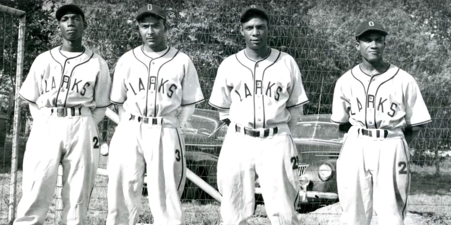
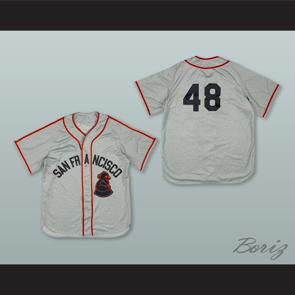
Finishing off the week with the Oakland Larks:
LARKS HOME:LARKS ROAD:
LARKS HOME ALT:
LARKS ROAD ALT:
Notes:
- The Larks were another one-year wonder from 1946, and their dark green & gold identity meshes naturally with the Athletics'.
- An Old English "O" replaces the traditional "A's" cap and jersey logo.
- The sleeve design features a lark perched on a baseball, inspired obviously by the A's alternate logo, but also by the original Orioles primary logo.
C&C appreciated!
Just a small programming note: I've been saving most of the better known NLB teams (such as the Monarchs, Black Crackers and Royal Giants) for the second half of the series, which we're approaching.
-
5
-
 1
1
-
-
32 minutes ago, MJD7 said:
And another black pants team this year. This one does probably make the most sense though.
I want to know who the galaxy brains are at Nike who decided to roll out five consecutive designs with black pants.
 You're right, though, the Pirates are one team for whom black pants actually make sense. I would have been surprised if their pants weren't black.
-
8
-
-
On 6/5/2023 at 9:58 AM, Carolingian Steamroller said:
Very intrigued by the drop shadowed CHI, that's a great aesthetic.
Love the deep blue shade.
Thanks! I love the "CHI" logo, too.Next up are the Cincinnati Tigers!
TIGERS HOME:
TIGERS ROAD:
TIGERS HOME ALT:
TIGERS ROAD ALT:
Notes:
- Cincinnati's Negro League club existed from 1934-37 and boasted an identity very clearly inspired by the Reds, including a wishbone "C" and Tuscan style road wordmark.- In keeping with the actual Tigers' uniforms, I amped up the level of black a bit more than what the Reds currently use.
- The home alt features a script "Tigers" taken from Detroit's current wordmark logo, while the sleeve design includes the 1999-2006 version of Mr. Redlegs with a tiger head.
C&C appreciated! We had back west for the next team.
-
3
-
1
-
 1
1
-
-
Fantastic work all around. I always look forward to updates in this series of any kind.
I love that you took Iowa, which has an unfair reputation of being a "middle of nowhere" state, and turned it into one of your most creative designs in this series. The letter "I" emerging from the corn husks and the kernel patterns are strokes of genius.
-
Good to see you back! I love this new presentation for your concepts and think you should definitely stick with it.
Dodgers - Great work all around. That navy alt blows the team’s City Connect set out of the water.
Padres - More nice work. Perhaps you could make either the home or home alt plain white instead of cream as a way to make the two home options even more different from one another.Giants - Solid set, no complaints here.
D-Backs - Not sure how I feel about the green-dominant look for the road and home alt, but I think this could be balanced out by going with purple socks and under-sleeves. The purple wordmark on the green alt is extremely hard to read, too. I also agree with @VampyrRabbit that it’s a shame you didn’t use the classic “A” logo on at least one of the four jerseys.Rockies - Not really feeling this one, unfortunately. It’s hard to picture the Rox in anything but purple, and the colors you chose are all too muted to work together. I do love that repurposed City Connect logo, though, and I’m wondering if you could work some of that beautiful sky blue into the uniforms themselves.
Regarding having two purple teams in the same division, my personal solution to that was to shift from purple to magenta for the D-Backs, which I did in my Fixing '90s Expansion Teams mini-series. This way, you could have two "purple" teams in the same division without having them both look identical to one another.
Looking forward to the NL Central!
-
On 6/3/2023 at 8:35 PM, Coiler said:
While the colors are obviously pretty Giants-y (whose style I like) , I love the name, which reminds me of an alternate history in-joke. Operation Sealion was the proposed German invasion of England in WWII, which every serious enthusiast knows was unviable because, to be blunt, the British had an navy and the Germans didn't. Thus the sea lion has become a symbol of that community. And since this is baseball alternate history...

I never knew about Operation Sea Lion, so thanks for that. Also curious to hear your thoughts on the Seattle Steelheads.Let's start the week with another Giants team, the Chicago American Giants!
CHICAGO AMERICAN GIANTS HOME:CHICAGO AMERICAN GIANTS ROAD:
CHICAGO AMERICAN GIANTS HOME/ROAD ALT:
Notes:
- Decided to pair dark navy with red rather than sky blue so my design wouldn't look like a total copy of @Carolingian Steamroller's excellent American Giants concept.
- At one point the American Giants used a Tuscan style "CHICAGO" wordmark that was just about identical to the one worn by the White Sox in the early 1930s and late '70s.
- The diagonal "CHI" logo comes from Ebbets Field Flannel's CAG varsity jacket, which, in the time since I put together this concept, seems to have been scrubbed from their website for some reason.
C&C appreciated! Another Central team is up next.
-
1
-
1
-
-
Next up are the San Francisco Sea Lions!
SEA LIONS HOME:SEA LIONS ROAD:
SEA LIONS HOME ALT:
SEA LIONS ROAD ALT:
Notes:
- The Sea Lions shared a similar color scheme to the Giants, so this one wasn't a huge leap.
- I thought about using a Giants-esque "SF" cap logo but decided that going logo-less, like the original Seals caps, would be the bolder move.
- Front numbers are added to balance out the lack of cap logo.
C&C appreciated!
-
6
-
-
2 hours ago, adsarebad said:
No pirates city connect leaks yet?
strange... we saw that Baltimore jersey leak long before they unleashed the horror on us.
And:
-
On 5/27/2023 at 1:54 PM, Coiler said:
Was looking forward to the Stars and they did not disappoint!
Great to hear!
I'm back today with the Seattle Steelheads!
STEELHEADS HOME:STEELHEADS ROAD:
STEELHEADS HOME/ROAD ALT:
Notes:
- The Steelheads only existed for three seasons in the 1940s, but I nevertheless wanted to include them in this series, especially considering the M's have thrown back to them on several occasions.
- It wasn't planned this way, but this is the second team in a row with T-bars. I've been using T-bars for a lot of my Mariners concepts lately, and this wasn't going to be an exception. I especially like how they look on the alt.
- The "Steelheads" wordmark was recreated using Seattle's current typeface, sans the compass, of course.
C&C appreciated! We'll stay out west for the next team.
-
3
-
-
Great work! I agree with @NicDB that the script "L" doesn't really fit the style of the "V" or cap "A." A blackletter "L" would be more appropriate:
Wouldn't have to be this exact one, but something resembling it.
-
I think you're really onto something with the flying ball occupying the negative space inside the "R," and I love the idea of the green latticework forming the stitches of the baseball. However, the shape of the "R" looks a little awkward to me. I know you're trying to do something really different, but I can't help but think the ball would work better inside a Colorado "C."
-
2
-
-
On 5/25/2023 at 1:28 PM, Coiler said:
Conservative design but not a bad one at all.
Thanks!
Finishing up the week with the St. Louis Stars!
ST. LOUIS STARS HOME:ST. LOUIS STARS ROAD:
Notes:
- The Stars' look is strongly inspired by the 1940s Cardinals and makes use of the Browns' gorgeous 1952-53 road script.
- Just like the Cardinals, no alts, and the road is just a gray version of the home set.
- The real Stars uniforms changed colors a bit over the years, so I went with a royal blue and red color scheme to distinguish them from the Detroit Stars.
C&C appreciated! Another "S" team is up next.
-
4
-
-
Anyone post this yet? Haha
-
1
-
1
-
22
-
-
15 hours ago, Anubis2051 said:
Biggest surprises to me:
- The biggest shock of all, I LOVE how this looks for the A's
If the A's were relocating to Portland instead of Vegas, light blue would be a nice addition to their green and gold:
-
9
-
1
-
-
On 5/21/2023 at 5:29 PM, Coiler said:
Looks much better. Love the Classic Brewers look.
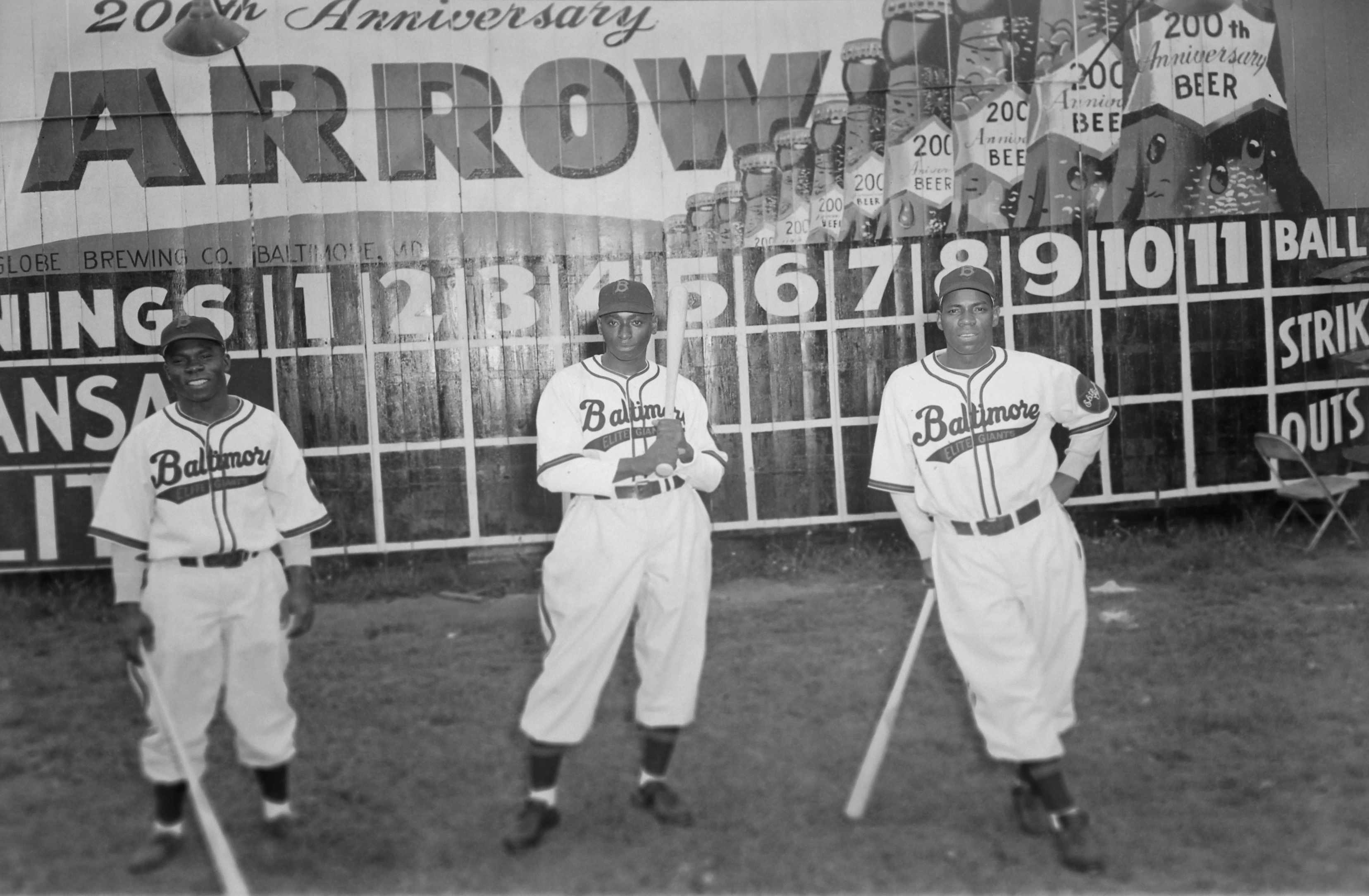
Good to hear. I have plenty of navy teams planned for this project, so putting the Bears in royal blue was probably the right call.Also, I told you there would be more teams in this series called the "Giants," so here's #2!
ELITE GIANTS HOME:ELITE GIANTS ROAD:
ELITE GIANTS HOME ALT:
ELITE GIANTS ROAD ALT:
Notes:
- This one is a fairly straightforward swap of the Orioles' black and orange with black and red. For reference, here's an example of how some of the original Elite Giants uniforms looked, which is not too different from the Orioles'.
- The Maryland flag roundel features "Elite Giants Baseball" in place of "Orioles."
C&C appreciated! One of my favorite designs in this series is on deck.
-
8
-
1
-


:no_upscale()/cdn.vox-cdn.com/uploads/chorus_image/image/67197885/51592514.jpg.0.jpg)
MLB 2023 Uniform/Logo Changes
in Sports Logo News
Posted
The solution to the Cubs' road unis has always been fairly obvious to me. Just bring back these beauties:
Would instantly become a top five road jersey in MLB.