


coco1997
-
Posts
4,927 -
Joined
-
Last visited
-
Days Won
14
Posts posted by coco1997
-
-
On 5/10/2023 at 2:31 PM, tBBP said:
You know the one thing I wish the Rays could/ would do with their current brand to really see them apart, if I/ they know they could get away with it?
Ax out navy; add in orange.
That's about the most sunshiney colorway there is. The problem is that Allegiant Air exists and they already built their visual brand with those same elements:

That's even more of a reason for them to resurrect the manta ray and disambiguate the brand.
Of course, this is just one man's opinion...my two rusted Lincolns.
I feel like this scheme would work better for Miami.
8 hours ago, SpenserRM said:I just want the green back, man.
4 hours ago, tBBP said:Truthfully, so do I...sorta. They'd have to tweak the tints/shades of the green and blue for greater contrast for it to work...but that whole steamline modern-eqsue artistic style plus the aquatic creature was one of the most unique and coolest brands...ever. I still wish they'd have just updated it rather than toss it aside for the derivative milquetoast MS Word-esque identity they have now.
Hunter green and powder/sky blue is the way to go for the Rays.
-
Really nice Rockies concept! Styling the numbers like the wordmarks is a great idea and I'm surprised I never thought of doing that myself!
I like the addition of green to the team's colorway, but personally, I would drop black altogether. You're trying to balance three muted colors as well as use silver as an accent. Losing black would help simplify things for the better.
Also, small nitpick: on the purple alt, the inserts on the wordmarks are silver, but on the numbers they're purple.
-
 1
1
-
-
Very nice! I'd love to see the Jays go in this direction for their City Connect set. I think monochrome blue is probably a given for them.
-
1
-
-
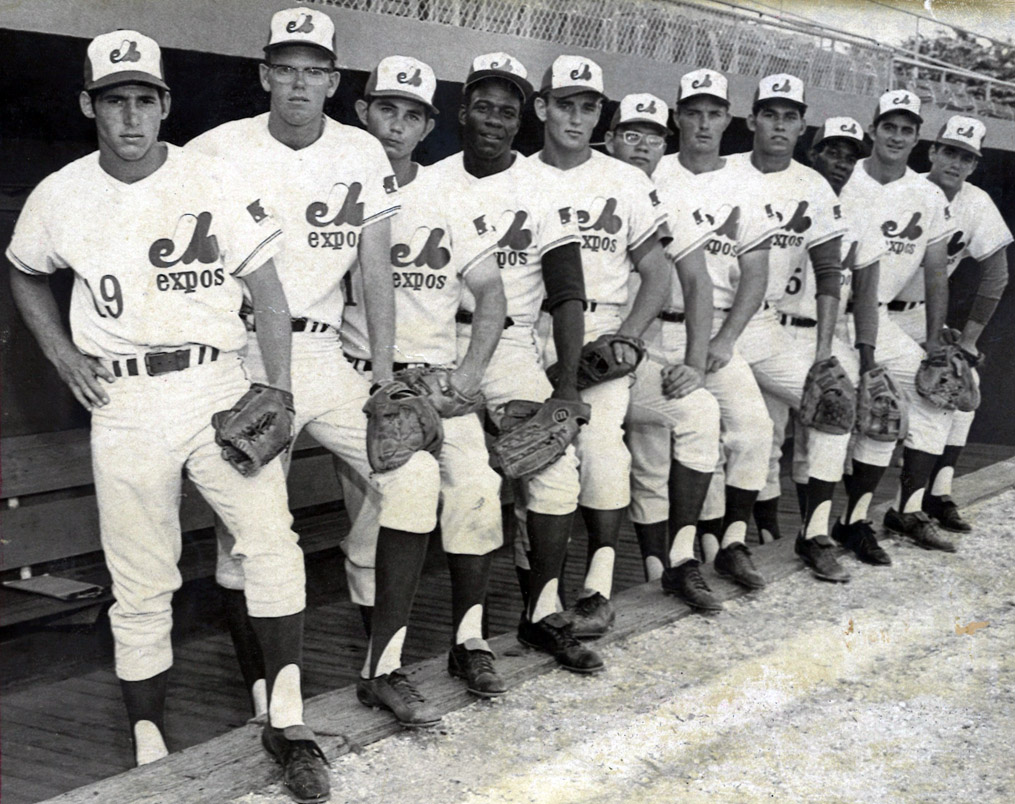
Surprise! To keep a promise I made a while ago to @Discrim, I'm back today with the Expos and Olympic Stadium!
EXPOS:Notes:
- For the Expos, I went all-in on the aesthetics of the 1976 Summer Olympics played in Montreal, with a triple striped design modeled after the uniforms worn by Team Canada that year. I originally considered going just red and white but decided to add a touch of blue to keep the uniform from looking too much like the Blue Jays' Canada Day alts.
- The Olympic logo with lowercase wordmark beneath it are, of course, inspired by those original Expos jerseys.
- The sleeves bear the silhouette of the iconic Montreal Tower which overlooks Olympic Stadium.
- Stencil style numbers are meant to evoke those worn by marathon runners.
C&C appreciated!
-
5
-
 2
2
-
 1
1
-
-
Nice work on both Cleveland teams! I really like the subtle silver trim on the Reds.
For the Guardians, I might go with the block "C" on the navy jersey as opposed to the winged baseball logo. As much as I like the winged ball logo, it might be a little too busy-looking for the front of a jersey.-
1
-
-
20 hours ago, TBGKon said:
Per http://www.uniformlineup.com/#, they wore them 14 out of 29 times in April, mostly on the road. Now that the road grays are eliminated, the light blue jersey is what they wear on the road when the home team chooses to wear black or dark blue uniforms.
The Rays as an organization do pretty much everything right, but matching powder blue jerseys with gray pants is not one of them.-
4
-
-
On 4/30/2023 at 8:45 PM, VampyrRabbit said:
The white pantsed version looks great. The T-Bars and the headspoon are exactly what nike should have went with.
Thanks!
As promised, up today is a full redesign of the Mariners based on the team's City Connect set:
MARINERS HOME:MARINERS ROAD:
MARINERS HOME ALT:
MARINERS ROAD ALT:
Notes:
- The teal/Northwest green used here is a lot brighter than what the Mariners use in real life. I split the difference between Northwest green and the more seafoam-ish shade the team uses on their socials.
- I really love how the T-bars looked on my City Connect tweak, so I kept them for my redesign. T-bars are awesome and at least one team in MLB should rock them in today's game, so why not Seattle?
- As you can see, the road grays are back. Now that the M's have a blue and gold City Connect set, it's redundant to keep the Sunday home off-whites around, and they never should have dropped the grays to begin with.
- I wasn't originally planning to go with beveled wordmarks and numbers but soon realized I needed them to make the silver scripts and numbers really pop against the two alts.
- Huge thanks to @upperV03 for generously permitting me to use his wordmarks and S compass logo for my redesign!
C&C appreciated!
-
5
-
-
So far so good! It's interesting to see a traditional baseball script used for a Rockies concept. The alternate wordmark feels like a glimpse at how the Rockies might have looked as an expansion team in the '70s or '80s.
I think the cap logo could use a little tweaking, as something seems off about the inner mountain running into the opening of the "C." Honestly, I don't think you even need that smaller mountain in the logo.-
1
-
-
1 hour ago, GriffinM6 said:
Feel like that would need black socks to look good. The real answer is going with yellow or white pants.
How about yellow undersleeves and socks instead?-
2
-
-
-
On 4/27/2023 at 8:20 PM, Ark said:
Hey this is a great use of gradients
Thanks!On 4/28/2023 at 9:40 PM, VampyrRabbit said:Updated scripts, perhaps take inspiration from the Rockies City Connects, different shade of purple.
Up today are the Rockies!
ROCKIES HOME:ROCKIES ROAD:
ROCKIES HOME/ROAD ALT:Notes:
- Again, my goal here was not to burn everything down and reinvent the wheel. While I definitely understand feeling that Colorado's current branding has run its course, I also feel that much of it is very much salvageable.
- To me, the fatal flaw of the Rockies' look has always been the totally unnecessary inclusion of black, especially given the team’s original, darker shade of purple. I love the idea of Colorado going all-in on purple and becoming sort of the Reds of the NL West, using a secondary color (in this case, silver) only sparingly, if at all. Ditching black also helps the team look a lot less like a White Sox knockoff. I briefly toyed with a City Connect-inspired color scheme of purple and forest green but realized that probably would only invite further comparisons to the D-Backs.
- Similar to the Devil Rays, I've never liked any road wordmark the team has used, and then I remembered those original '90s road jerseys just had "Rockies" on them. Here, I've used the vertically arched "Rockies" wordmark from the official team magazine, which is VASTLY superior to the style used on their real life jerseys, wouldn't you say?- A headspoon is added to the home jersey for unity with the other two jerseys.
- While I typically use them with most of my concepts anyway, for some reason I feel white cleats would look especially cool on the Rockies in real life.
That's it for the Rockies. C&C appreciated as always!
-
1
-
1
-
 1
1
-
-
Good start to Oklahoma! I'd suggest making the inner stroke on the road jersey's "OKC" white instead of powder blue.
Looking forward to the rest of the set! -
Looking forward to the 89ers!
-
Love pretty much everything about this and wish the M's would switch to it yesterday. This would be right at home with the great "what's old is new again" redesigns of recent years like the 2012 Blue Jays, 2013 Astros and 2020 Padres.
My only criticism is that the navy "S" on the home jersey sleeve gets a bit lost against the Northwest green background/outline, which I think @colinturner95 also alluded to. I'd also love to see the return of the Northwest green cap with navy bill!
-
1
-
-
New Jersey - I was really curious how you'd handle this one, and you totally delivered. The color scheme just works.
Ohio - The nod to the '80s racing striped Indians is fantastic. This is one that might benefit from front numbers, maybe in red?
New Mexico - I love the direction here, but I'm not feeling the solid red cap. Any thought to a gold front panel? The NM flag is gold with the zia in red, so that might be something to consider.
Maine - Love the claw logo. Those shades of blue and red really pop!
Oklahoma - Gorgeous color scheme. The dreamcatcher O? Brilliant.South Carolina - I'd consider lightening the color of the jersey just a touch for better contrast with the wordmark and sleeve stripes. Also, maybe this is too obvious, but did you consider making the "C" in the monogram into a crescent moon?
-
1
-
-
Nice job! I imagine this is probably pretty close to what the Yankees will end up actually doing. They'll stick to their traditional colors, but use them in a way we haven't seen before.
Curious, will you only be tackling teams whose designs we have yet to see, or will you be putting your own spin on City Connects that have already been unveiled?
-
1
-
-
14 hours ago, SpenserRM said:
And now for the San Antonio Monarchs...
The main logo posted above features the cap logo inside of the shape (idk what it's called) that is used by the City of San Antonio, which is inspired by the Spanish.
The cap logo and jersey script are inspired (the cap is just a replica plus a crown) of the 1950-60s San Antonio Missions. The secondary logo on the sleeve is a stylized Monarch that I drew with a baseball bat for a thorax and a crown on its head.
The road uniforms feature the colors of Fiesta, an annual festival in San Antonio to celebrate the Tejano and Hispanic heritage of the region. The block San Antonio is inspired by the original San Antonio baseball teams of the late 19th century.
The alternate road uniforms feature a black jersey with a script San Antonio and fiesta color gradient outline. The cap uses the script M from the Monarchs wordmark, also with the fiesta colors.
The city connect leans even further into the Fiesta colors and symbolism. The fonts used are inspired by the various fonts used for Fiesta graphics, in fiesta colors. It also uses the Spanish name, Monarcas, rather than Monarchs. The primary logo in this case is the Monarch.
The Heritage uniforms are replicas of the 1939 San Antonio Missions uniforms, the Texas League affiliate of the St. Louis Browns.
Great job with San Antonio! The scripts and use of the fiesta colors are really inspired.
I'd love to see the gradient effect applied to the "A" in the "SA" monogram. I might go as far as to suggest dropping silver altogether. I think you could amp up your use of the fiesta colors on the home uniform in a tasteful way, and by removing silver, the design would also look less like the White Sox.
Also, is the body of the butterfly a baseball bat? If so, that's genius.
-
Pirates City Connect leak?
-
2
-
-
1 hour ago, Victormrey said:
What about going back to the original shade of purple?
That works!
-
I like this a lot! I was going to recommend replacing navy with black, but I really like how the navy looks with the new colors.
My one suggestion is to use the Braves' actual number style. Other than that, nice work! -
I actually think the added white outline to the wordmark makes it even more difficult to read. I’d try out @Shumway’s suggestion if either thinning the outline or going with a brighter shade of purple for the letters.
-
1
-
-
On 4/23/2023 at 5:32 PM, mahnkej said:
Looks awesome! This is exactly what I was thinking.
Good to hear!
I'm back today with the Mariners!
Notes:- Seattle's recently-unveiled City Connect set has been somewhat divisive. While most seem to approve of the cap and Pilots-inspired jerseys, the black pants have been met with, shall we say, less enthusiasm. Personally, I've enjoyed Nike's attempts to normalize dark colored pants in baseball; case in point, I'm a big fan of the White Sox, Astros, Rockies and Rangers designs. But here, they just don't work. That being the case, I've gone with traditional white pants this time around.
- Nike's purported "nods" to the Seattle Rainiers and Steelheads didn't even register with me; I doubt any uniform buff is going to look at black pants on a Mariners uni and think, "Now that screams Steelheads." Therefore, my biggest goal in tweaking Seattle's set was to more clearly reference the aforementioned teams, which I tried to do with the addition of thick T-bars (Steelheads) and red sock stripes (Rainiers).
- Red replaces black across the board, serving both as a reference to the Pilots' wheel logo and to distinguish the M's a bit from a certain other blue and gold team.
- In general, I'm not a fan of beveling on baseball uniforms, so I removed it altogether from the wordmarks and numbers.
- As suggested by @Frylock in the MLB 2023 thread, the crossed tridents logo moves to the cap bill, evoking the "scrambled eggs" caps of the Pilots.- I recolored the "PNW" sleeve patch to eliminated black and incorporate red as well as a touch of sky blue.
- Newly-added front numbers help complete the look.
I also mocked up a version with blue pants for those interested:
C&C appreciated! I plan to work up a redesigned Mariners set based on the team's City Connect look, which I should have up soon.
-
4
-
3
-
-
The Cubs turned out nicely! I really like that off-white alt; I've never seen the Cubs "Cuba" script used on a cream-colored design before, but it looks surprisingly great.
In real life I'd prefer to see the Cubs' blue alt tweaked to better resemble their '80s road jerseys; I've been working on an upcoming series where I do just that. But this is your project so do whatever you feel is best!
-
2
-
-
54 minutes ago, MJD7 said:
Thanks! I tend to agree, I think this would be a solid approach if the Mariners were to get a (needed) redesign.
Thank you!
Your feedback of the navy alt is very fair, I'm honestly not as in love with the silver/teal beveling as I thought I'd be. Something like this would probably be better, and would be more cohesive with the rest of the set:
My only issue with it is that there isn't much teal, but I suppose that's okay for this one jersey, since the rest of the set features it a bit more prominently than the team currently does. Thanks again for the feedback!
One solution for the lack of teal on the navy alt would be to add a third teal stripe to the sleeves and collar. Might not be a bad idea to add a third stripe to the other three jerseys, as well.-
1
-


MLB 2023 Uniform/Logo Changes
in Sports Logo News
Posted
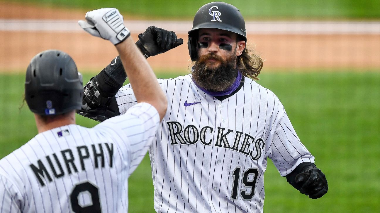
Black pants..