


coco1997
-
Posts
4,927 -
Joined
-
Last visited
-
Days Won
14
Posts posted by coco1997
-
-
-
On 4/18/2023 at 2:36 PM, VampyrRabbit said:
Tampa Bay is great, the sleeve stripes and the gradient are both fantastic.
As for the Marlins, I much prefer the teal and black, the current logos look really good in that colour scheme.
Thanks!
Wrapping up today with the D-Backs:D-BACKS HOME:

D-BACKS ROAD:
D-BACKS HOME ALT:D-BACKS ROAD ALT:
Notes:- A few years back, someone on this forum suggested the D-Backs split the difference between their original purple and current Sedona red and roll with a shade of magenta, so that's what I did here. The color evokes the purple of the early D-Backs, but it's different enough that you'd avoid comparisons with the division rival Rockies.
- I went back and forth on whether to put Arizona in vests for their home look but ultimately decided against it. For my money, only a few teams in MLB have ever truly looked good in vests (Pirates, Reds, A's and maybe Rockies) and sleeveless jerseys feel like one of those fads that's best left in the late '90s-early 2000s.
- No tacky "D-Backs" wordmark on either of the alts, just "Arizona" and the "A" logo.
- One of my big issues with the original D-Backs uniforms was the combination of multiple muted colors, so in addition to magenta replacing purple, copper is replaced with the yellowish off-white from the home uniform.
- Decided to use the rounded numbers from the team's 2007-15- look.
C&C appreciated! No reason to touch the Rockies, unless someone can make a compelling case for it.
-
 5
5
-
 1
1
-
-
Up today are the Rangers!
Notes:
- I really like what Texas did so no major changes, the biggest being swapping the "TX" and numbers on the front of the jersey. Placing the logo on the right breast seems like a case of being different just for the sake of it, but the end result looks awkward.- The new set is allegedly "pitch blue" but looks black to me, so I just went black.
- I added some red to the top of the socks to create some much-needed visual separation from the pants.
- Lastly, red trim is applied to the cap logo.
And here are a few variations I worked up:
First up, for those who aren't big on dark pants with light colored jerseys, here's an inverted version:
Next, I wanted to try a monochrome black look:
And since the Rangers have sadly retired their red alternates this season, a red version:Note: I had to add outlines to the logos and numbers for this one, since the black did not pop enough against the red.
Lastly, I was curious how the set would look in the Rangers' usual colors:C&C appreciated!
-
8
-
1
-
-
2 hours ago, officeglenn said:
Couple of graphics from the mothership:
Also worth noting that it's a very dark navy blue, not black.
Still looks black to me.-
4
-
-
1 minute ago, fortunat1 said:
A bit of a snap judgement on this one, but this Texas set really contributes to my idea that Nike has fumbled nearly all of the pants throughout the CC series.
My personal opinion is that for the most part, light jerseys should have matching pants, while dark jerseys should have light pants. Somehow Nike decided that their navy jerseys warranted matching pants, but couldn't manage to introduce their tan and powder blue jerseys with matching pants. I know that this whole program was meant to push the needle in terms of modern jersey design, but I feel like they went extreme at the wrong times, and showed restraint where they didn't really need to.
Quick fixes would be to give Milwaukee, Boston, and Texas matching pants, and taking away Houston/LA's navy pants. The Cubs' navy pants are alright when they actually have the socks visible, so I'd compromise by allowing them to use either navy pants or solid white pants with their CC top. Just my 2 cents though.
This is proof to me that white/off-white jerseys with darker colored pants can work:-
9
-
-
4 minutes ago, Silent Wind of Doom said:
But I think we can officially say (after the find of the Mariners cap in the colors of those Orioles socks seemed to strongly suggest it) that the sock leak was nothing to do with City Connect.
Why do you say that? The socks are black and red, the same colors as this set, and the Braves socks that leaked at the same time as all the other teams were consistent with the Braves design.-
2
-
-
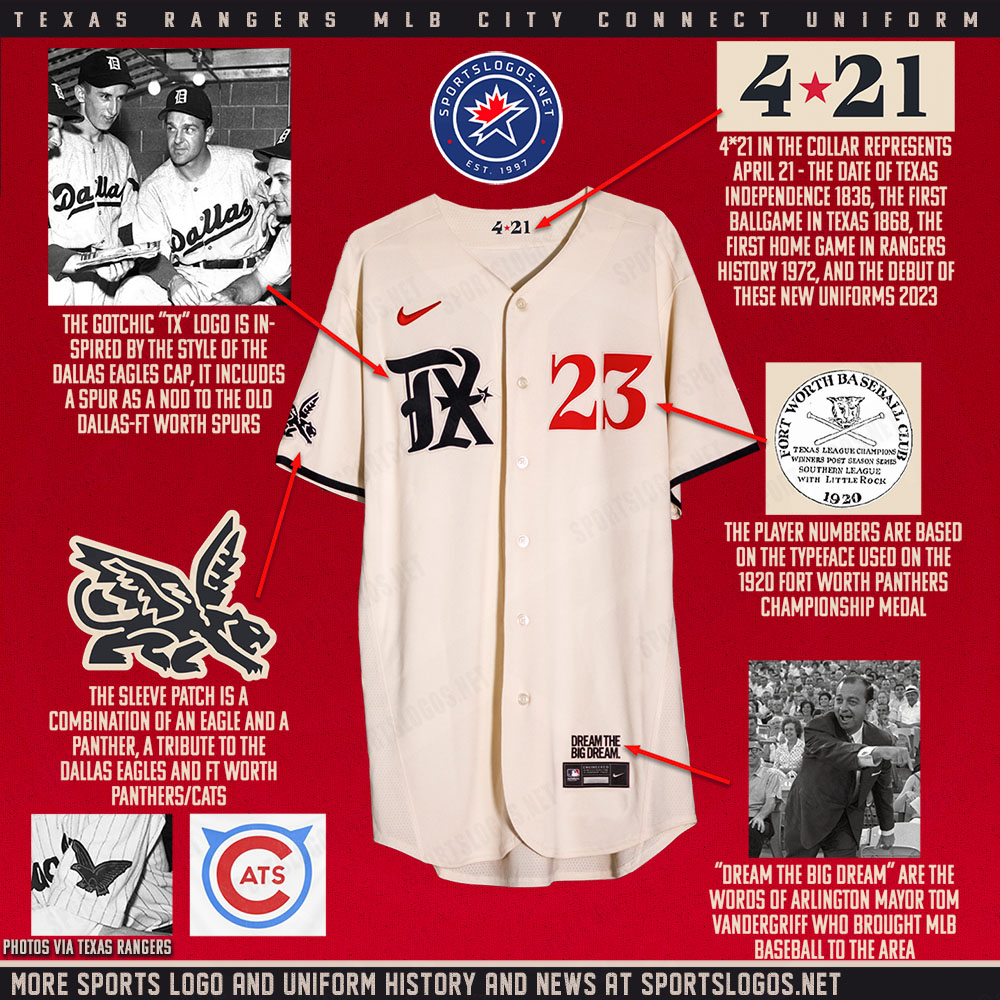
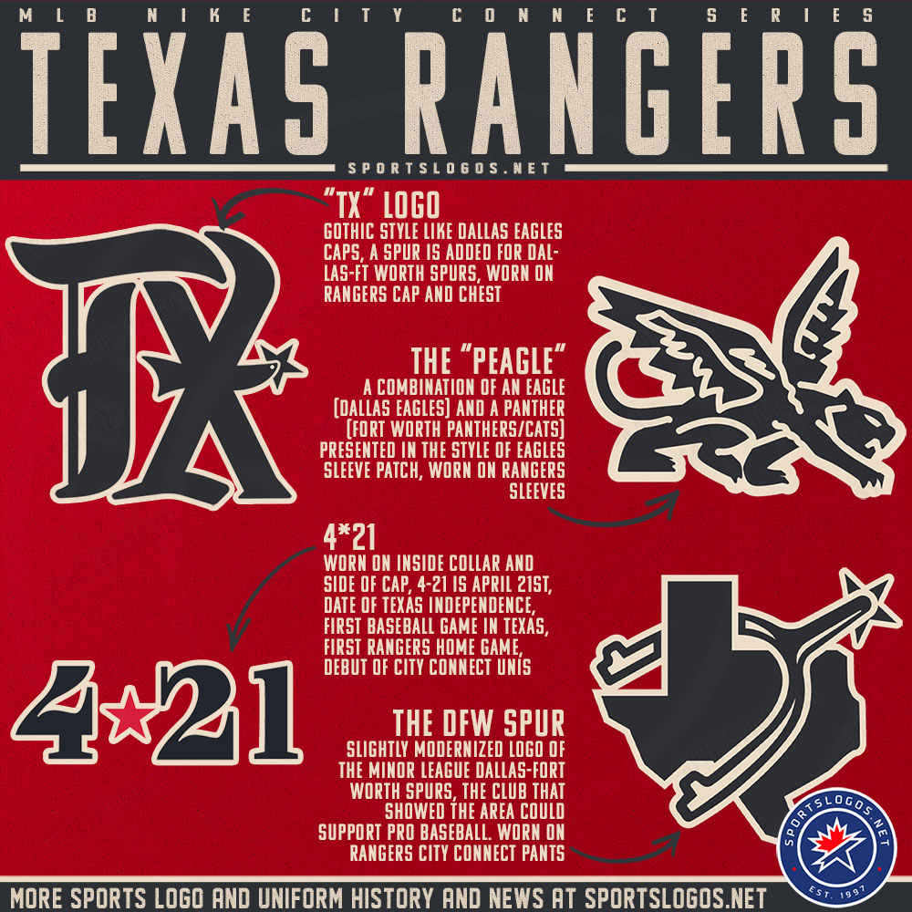
Sneak peek at the Rangers City Connect set:
Was not expecting a cream-colored jersey with black pants.
-
1
-
 1
1
-
-
21 hours ago, johne9109 said:
I like the addition of orange. Gives them some unity with the Dolphins
Agreed!
On 4/15/2023 at 12:57 PM, TheMilkman said:I’d take this over what they currently have any day of the week! So much more life and color! I especially like the pinstripes and sleeve piping you went with! Feels like the Marlins of old.
The only nitpick I have is that the sleeve patch has three variations between four uniforms. I’d just pick one and roll it across the set - or at most have two - one coloway for home/away and a second for alt 1/alt 2
Thanks for the feedback! Very fair point about the number of sleeve patch variations. Here's a tweaked version:MARLINS HOME:
MARLINS ROAD:
MARLINS HOME ALT:
MARLINS ROAD ALT:The same "M" logo now appears on three of the four jerseys, with the flying fish/ST cap logo on the home alt. I also tweaked the color pattern of the sleeve stripes on the road jersey.
-
3
-
-
On second thought, how about adding a touch of orange to the Marlins' teal & black?
MARLINS HOME:MARLINS ROAD:
MARLINS HOME ALT:
MARLINS ROAD ALT:
After all, orange was a big part of Florida's 2003-11 alternate logo, as well as the team's original alternate logo. This makes the uniforms pop a lot better than with silver, IMO.
-
7
-
2
-
-
Man, that Indiana design is great, especially with the added front numbers. The checkered trim gives the jersey a ton of personality. I'm wondering if the "I" on the cap might read better if you went with a white front paneled cap, making the "I" navy to match the wordmark?
Hawaii and Colorado are also awesome. Colorado looks like the basis for a much-needed Rockies identity refresh. Any chance we could see your original version with the mountains inside the "C"?
Texas - It could just be my eyes, but the red and navy piping seems to bleed together. Maybe separating the piping with a white stripe would help that? And I agree with @chestnutz that the cap logo does look like a stylized "I" with horns.Keep up the awesome work! You keep hitting home runs with this series.
-
1
-
-
How about Bond?
-
1
-
-
9 minutes ago, johne9109 said:
Both are used pretty interchangeably now. My son watches Thomas religiously and I hear both quite often. Isle might actually work better on the jersey though
I only remember hearing "Isle" as a kid, but I just Googled it and you're correct.
-
1
-
-
As a big Thomas fan growing up, I LOVE this concept, especially the baseball set. The colors work beautifully together.
One nitpick: The fictional location from the series was the "Isle of Sodor," not "Island."-
1
-
-
Idea for a Braves fauxback:
-
1
-
-
On 4/11/2023 at 8:03 AM, Victormrey said:
I like both iterations the LA teams, but I honestly prefer the original versions! Specially the Robins using the Los Angeles flag colours.
On 4/11/2023 at 7:00 PM, Bomba Tomba said:Yeah, the new black and light blue looks good but the green/yellow/red fits more
2 minutes ago, Coiler said:Love both Robins. I do think the original looks more Los Angeles, if that makes sense.
Thanks!
Wrapping things up today with the Anaheim Rally Monkeys!
RALLY MONKEYS HOME:
RALLY MONKEYS ROAD:RALLY MONKEYS HOME/ROAD ALT:
Notes:
- Like the Dodgers, the Angels don't actually have a mascot, but the Rally Monkey has served as the team's unofficial mascot since 2000, and it really took off during their 2002 World Series run.
- Despite the team's whimsical name, I wanted the design to still be believably Major League-ish.
- My two main inspirations for this design were the 1970s-80s California Angels (arched scripts and thick stripes) and the Rakuten Monkeys of the Chinese Professional Baseball League, which is where I got the "RM" monogram from.
- As a nod to the halo in the Angels' scripts, a small banana underscores the first letter of the scripts.
And that about does it! Thanks for following along. C&C for the Rally Monkeys or any previously posted team is appreciated.
-
4
-
 1
1
-
-
On 4/10/2023 at 4:24 PM, WSU151 said:
I think these would be just fine with out the gradient number on the back of the whites and grays. Would be cool if the batterman were light green and light blue.
Good suggestion regarding the batterman. I'll go back and add the gradient soon. As for the numbers, I'd prefer to keep the gradient, since it makes the team look more distinctive from behind.Up next are the
FloridaMiami Marlins!MARLINS HOME:
MARLINS ROAD:
MARLINS HOME ALT:
MARLINS ROAD ALT:
Notes:
- Someone in the MLB 2023 thread suggested that the Marlins' current wordmarks and numbers might look good with team's original teal and black colors, so that's exactly what I did here. Florida's old scripts and logos were actually my least favorite part of their old identity, while Miami's current scripts and numbers are my favorite part of theirs, so it seemed only natural to combine them.
- There's some debate as to which of the Marlins' early looks is the best, and while I do have a soft spot for their inaugural teal-heavy look, I have to admit that the black front numbers and cap bill help ground the design a bit.
- Miami shockingly never used a regular season teal alt during their teal years, so I've addressed that oversight here with the home alt.
C&C appreciated as always! The D-Backs are next.
-
8
-
2
-
 3
3
-
-
2 minutes ago, raysox said:
There's a few with numbers, they just haven't come up yet! Were you thinking Minnesota?
I'm thinking Florida, Nevada and maybe New York might benefit from them.-
1
-
-
That Minnesota set looks like the Twins and Timberwolves got together and had a beautiful baby.
Ever consider adding front numbers to any of these designs? I feel like a few of them would look more complete with them.
-
4
-
-
1 hour ago, Shumway said:
Not sure if this means anything or not, but the colorful shirts that have popped up in here for the Orioles are currently available for purchase in their team store. It didn't look like it was Nike.
(I'm at the game tonight and took a look)
I think it was determined that those are not related to their City Connect design. Someone a few pages back posted a photo of a Mariners cap in that same style. -
Just now, CLEstones said:
So, you think a gradient is a modern trend and NOT one firmly planted in the 90s?
Not necessarily, but I do think that with the advent of Nike's City Connect program, people might be more willing to accept unconventional design features.
-
2
-
-
With the enormous popularity of the Rays' and Marlins' (and Diamondbacks', until they were sadly retired prior to this season) '90s throwbacks, I was inspired to experiment with tweaking those early uniforms so that they could work in 2023 not just as alternates, but as full-time looks. My theory is that enough time has passed since the early-late '90s that people have nostalgia for those unis that they might not have had, say, ten or twelve years ago.
Let Jon Hamm explain it to you better than I can:
With that said, first up are the Rays!
RAYS HOME:
RAYS ROAD:
RAYS HOME/ROAD ALT:
Notes:
- I'd argue those original Devil Rays uniforms are the best the team ever looked, largely because most of what they've worn in the decades since has been somewhat, shall we say, bland. However, that's not to say those original Devil Rays uniforms were perfect, which I'll get into below.- Since I didn't want to just revert to the team's original identity, I decided to retain the "Rays" moniker, keeping in mind that they've now been called the "Rays" longer than they were ever the Devil Rays. The team's 1998-2000 batting practice jerseys give us an idea of what the team would've looked like had they been called the "Rays" all along.
- The Rays' current throwbacks are really more like "fauxbacks." Since the cap was only seldomly worn between 1998-2000, I've restored the original "TB" cap logo and replaced black throughout the uniforms not with navy but with dark purple from the team's original primary logo.
- I went all-in on the gradient, applying it to the back numbers, socks, sleeves (inspired by this prototype from 1997) and pants. Newly added solid-colored front numbers help offset the "gimmickiness" of the wordmark's gradient.
- For the road, I've never liked any of the "Tampa Bay" wordmarks the Rays have used, and rather than just slap the "Rays" wordmark on every jersey in the rotation (which is exactly what the team did up until about a year or so ago) I used the cap "TB," similar to these '80s-early '90s Giants road jerseys. I also went with more traditional, non-gradient piping.
- The alt is probably my favorite of the set, as the wordmark really pops against the dark purple of the jersey.C&C appreciated! The Marlins or Diamondbacks will be up next.
-
8
-
3
-
-
Improvements all around!
For Nicaragua, I agree with @MJD7 that you probably don't need two shades of blue unless you were to darken the deeper shade significantly. So yeah, I'd see how it looks with navy blue.-
2
-
-
Of the other Tennessee cap options presented, I think the orange cap with powder blue front panel works best. For whatever reason, white front paneled caps don’t look right with pinstriped uniforms, so I think this is the best way to go.
-
This is fantastic work for being your very first baseball concept! I love pretty much everything about this design. If I had to make one suggestion, I would make the inner stripes on the sleeves and pants of the road set white rather than powder blue.
Keep up the good work! I hope you try your hand at some more teams.


/cdn.vox-cdn.com/uploads/chorus_image/image/64993388/158862218.jpg.0.jpg)
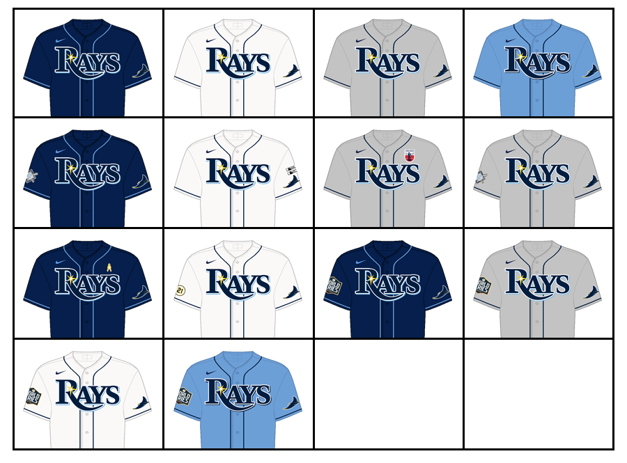
MLB 2023 Uniform/Logo Changes
in Sports Logo News
Posted
See, this City Connect set is why I felt it was the wrong move for Seattle to drop their gray road jersey instead of their Sunday home alts. They now have two separate looks in their rotation that are royal blue and athletic gold, despite the team’s primary colors being Northwest green and navy. Dumb.