


coco1997
-
Posts
4,927 -
Joined
-
Last visited
-
Days Won
14
Posts posted by coco1997
-
-
6 minutes ago, dont care said:
How is a non-team color a good look for them. Much less a monochrome uniform of it.

-
 2
2
-
 1
1
-
-
17 minutes ago, Carolingian Steamroller said:
Horrible idea.
Agreed. Monochrome navy is a great look for the Cubs; never mind the fact that they wear their royal blue alternates with pinstriped pants as it is.
-
 1
1
-
-
On 2/20/2023 at 6:34 PM, johne9109 said:
LOVE IT!
4 hours ago, Victormrey said:What a fun idea! I love the colour scheme for the Parrots
 The sleeve patch looks amazing.
I can't wait to see the other teams!
Just now, GrayJ12 said:I'm all for Indianapolis to change their identity to this.
Another unique idea executed great. The Parrot fits into the Pirate's aesthetic really well. Can't wait for the rest of this!
Thank you for following along!
43 minutes ago, Luigi74 said:One of the Buccos minor league teams should do this.
On 2/20/2023 at 2:59 PM, heavybass said:And I would be up for a Parrot team.
Agreed! I'm always down for a bird (or any animal, for that matter) themed identity.
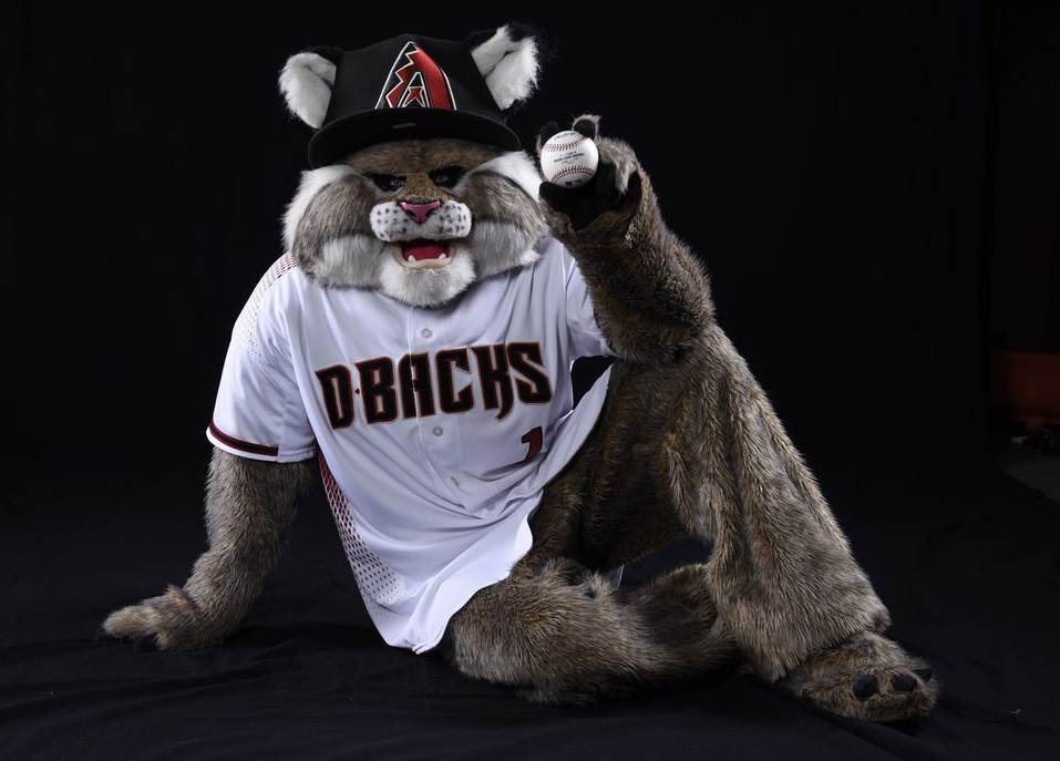
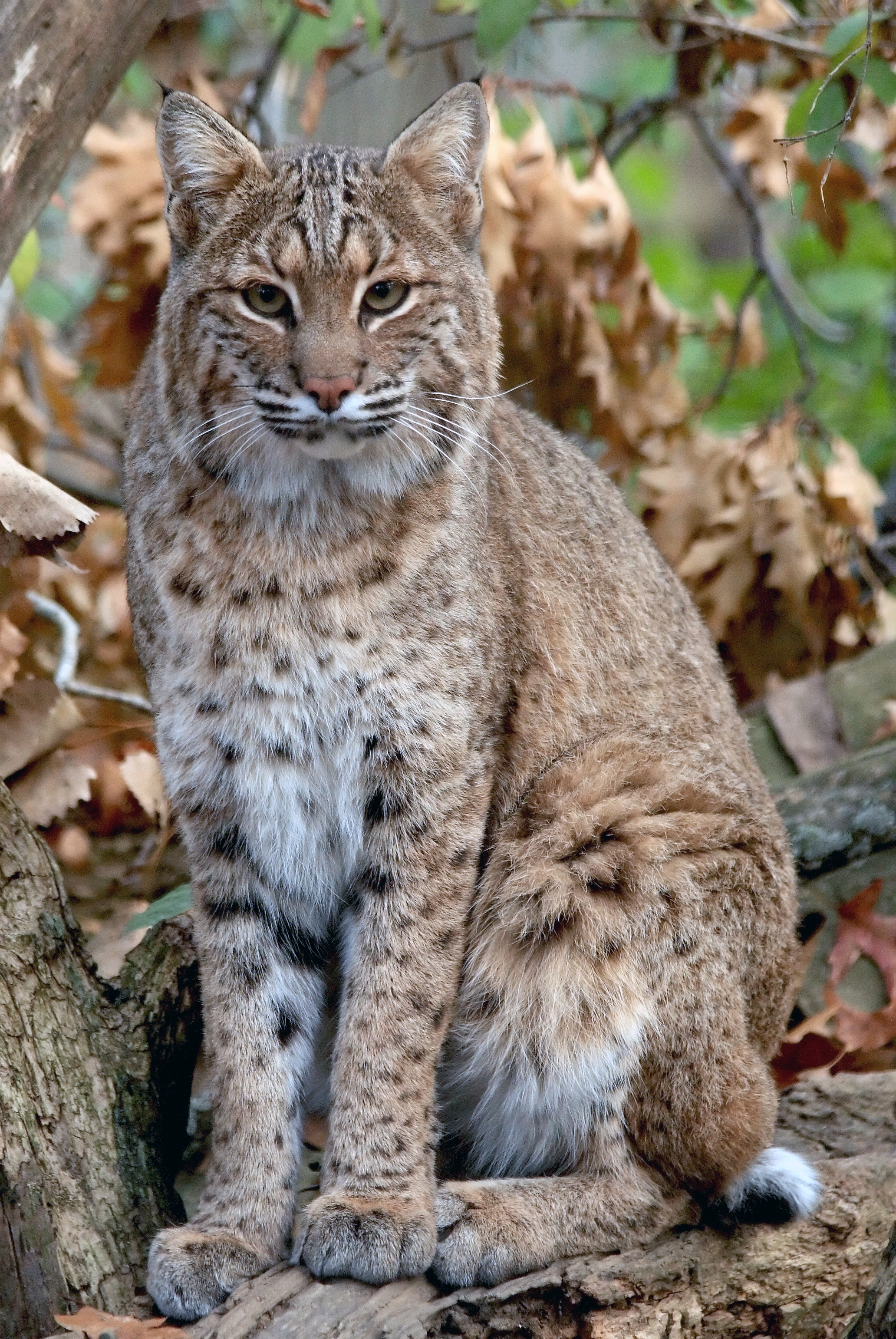
Next up are the Arizona Bobcats!
BOBCATS HOME:BOBCATS ROAD:
BOBCATS HOME/ROAD ALT:Notes:
- The Diamondbacks' mascot Baxter is based on another desert-dwelling creature, the bobcat.
- This one required a slight shift from the D-Backs' current color scheme, with a reddish-brown replacing black.
- While I had wanted to use Arizona's current font for the scripts & numbers, I couldn't find it anywhere online, so I wound up using the team's original typeface, which I found works just as well, if not better.- Inspired by Arizona's City Connect uniforms, I went with a solid sand-colored look for the road set.
C&C appreciated as always!
-
15
-
-
The split-styled "Panama" alt is incredible! Probably my favorite design of any team so far.
-
2
-
1
-
-
Hi all,
I've been working on this project the past few months. A while back I had the idea to rebrand as many MLB team as possible using each team's respective mascot as inspiration.
02. Arizona Bobcats
03. Seattle Moose
08. Houston Orbits
09. Twin City Bears
10. Philly Phanatics
13. Colorado Trikes
14. Texas Mustangs15. Chicago Southpaws
16. Los Angeles Koalas18. Los Angeles Robins
19. Anaheim Rally Monkeys
For those who do me the honor of following along, keep in mind that not all 30 clubs will be represented, as a few teams' mascots are inspired by their team itself (Clark the Cub, Bernie Brewer, Mr. Met, etc.) while some teams are without mascot altogether (Yankees, Dodgers, Angels).
I'm really proud of this series and had a lot of fun working on it. We'll start today with the Pittsburgh Parrots:
PARROTS HOME:PARROTS ROAD:
PARROTS HOME ALT:
PARROTS HOME/ROAD ALT:
Notes:
- Pittsburgh's mascot the past 40+ seasons has been the Pirate Parrot, with parrots often depicted perched on pirates' shoulders
- A lime-like parrot green becomes the team's primary color, with black shifting to more of a trim/tertiary color
- I worked up a "Parrots" wordmark in the MLB Pirates font
- A cartoony rendering of the Pirate Parrot occupies the jerseys' left sleeveFeedback is welcome! I'll have another team up shortly.
-
14
-
5
-
 1
1
-
 2
2
-
-
18 minutes ago, VampyrRabbit said:
Looking back, the Marlins got their colours spot on at the first time of asking. Every other new team was using teal at the time, but with the Marlins, it felt right, the teal, black and silver reflected the name of the titular fish.
I would be all for a Padres/Blue Jays style update for Miami.
I'd love to see the Marlins' original look return but with orange replacing black. Teal and black always felt too "cold" looking for a team playing in a warm climate team like Florida. Teal and orange would create some nice visual synergy with the Dolphins and make for a nice combination of their 1993-2011 and 2012-2018 eras.-
2
-
-
On 2/12/2023 at 6:42 PM, the admiral said:
Were you able to do a high-resolution version of the Camden Yards B?
Sorry, but this is the best I have:
Finishing up the divisions today with the AL Central! A few small tweaks to the Royals: I chose a different "K" for the cap (the previous version looked too awkward) and made the undersleeves royal blue.
GUARDIANS:WHITE SOX:
TWINS:
TIGERS:
ROYALS:
C&C appreciated, and thanks for following along!
-
1
-
2
-
-
The NL East is next:
PHILLIES:
BRAVES:
METS:
MARLINS:
NATIONALS:
-
1
-
-
The sunrise colors-shadows under the "Astros" wordmark are a unique idea and you executed it well. Consider adding front numbers to the home jersey and navy alt because they look a bit naked without them. Nice job!
-
Moving on to the AL West:
ASTROS:MARINERS:
ANGELS:
RANGERS:
ATHLETICS:
-
1
-
-
NL Central:
CARDINALS:BREWERS:
CUBS:
PIRATES:
REDS:
-
1
-
-
The Rays look great. My main suggestion would be to figure out a way to avoid having the same wordmark on every single jersey, which is the same problem I have with the Rays' actual uniforms. Maybe the purple road alt could have the green "tb" cap logo on the breast?
-
Next up is the AL East. One small tweak: I replaced the Orioles "O's" cap logo with the ornate "B" from the sleeve.
YANKEES:BLUE JAYS:
RAYS:
ORIOLES:
RED SOX:
-
3
-
1
-
-
Looks great! I like the contrasting headspoon piping.
-
1
-
1
-
-
On 2/6/2023 at 6:06 PM, Coiler said:
The Marlins uniforms look very Bill Veeck-y, and I mean that in the nicest possible way. Great job.
As a White Sox fan, I'd take that as a compliment no matter how you meant it.

First division up is the NL West:
DODGERS:PADRES:
GIANTS:
D-BACKS:ROCKIES:
-
1
-
2
-
-
3 hours ago, TBGKon said:
More clarity to the Rays uniforms entering 2023.
Now the big question is whether they'll be adding light blue pants to go with the light blue alts.
-
6
-
-
On 1/27/2023 at 2:35 PM, mcrosby said:
The two-fisted slopper is perfect. Where do I purchase?
Thanks! I found a website carrying the design on a T-shirt here.1 hour ago, Coiler said:I return!
Brewers: Eh, looks too Padres-ish to me.Diamondbacks: Looks amazing. For the name on front, the stadium has been nicknamed "The Hangar" because of its looks, so that might work as a non-sponsor name.
Thanks! I'll work on other ideas for the D-Backs jersey.
Wrapping up the series today with the Marlins and Miami Stadium!
Notes:
- Yes, I know the stadium where the Marlins play is Loan Depot Park, but before that it was called Marlins Park, so let's just go with that.- My design makes heavy use of lime green, inspired by the brightly-colored outfield walls at Marlins Park before they were repainted a few seasons ago.
- The horizontal stripes across the front and back of the jersey are based on the work of Venezuelan artist Carlos Cruz-Diez (1923-2019), whose artwork "Chromatic Induction in Double Frequency" adorns the walkways leading into the ballpark.
- Multi-colored parabola-like designs on the sleeves are meant to resemble the infamous home run sculpture formerly in the stadium's outfield.
And that's a wrap on this series! C&C appreciated on the Marlins and any previous teams.
Next, I plan on re-posting the team division by division, for those interested in seeing them presented that way. Stay tuned!
-
5
-
-
The Mariners one is nice. Wouldn't mind if they had a cap for regular season games with just the compass on it. It's a sharp look.
-
1
-
-
A drop shadowed Old English "D" is something I've never seen done before on a Tigers concept. I like it!
-
The black and red looks really nice for Cleveland. I’ve always enjoyed your concepts, so I’m looking forward to what else you’ve got!
-
1 minute ago, Marlins93 said:
Meh, it's basically a Miami Heat City Edition copycat. I understand why people like that look, but it's not for me. A bit too much of a cliche.
That's the thing, though. The Heat wear these colors only occasionally, but to this point have withheld from committing to them full time. If done properly, it's a color scheme the Fish could totally own.
-
3
-
-
5 minutes ago, Marlins93 said:
At this point, just give me teal. Forget the blue.
Give me THIS:
-
1
-
-
30 minutes ago, Marlins93 said:
Why would the Marlins wear powder blue? Makes no sense.
The Marlins should absolutely have a home alternate in that gorgeous shade of blue they use (think these but with front numbers added) but yeah, they are not a powder blue team.-
4
-
-
2 hours ago, VandyDelphia Mike said:
With the ad patch location varying based on handedness, does this mean the Phillies lose their shoulder numbers on the pinstripes and grays?
If the design of a uniform has to be compromised to accommodate ad patches, MLB will have officially lost the plot.
-
1
-


MLB 2023 Uniform/Logo Changes
in Sports Logo News
Posted
Thanks, I didn’t realize that. I guess I must’ve just been picturing spring training games.