


coco1997
-
Posts
4,927 -
Joined
-
Last visited
-
Days Won
14
Posts posted by coco1997
-
-
The segmented sleeve stripes for Australia are a tasteful way to pay homage to the Aboriginal people without being outlandish, and I like that you reverted to their arched wordmark.
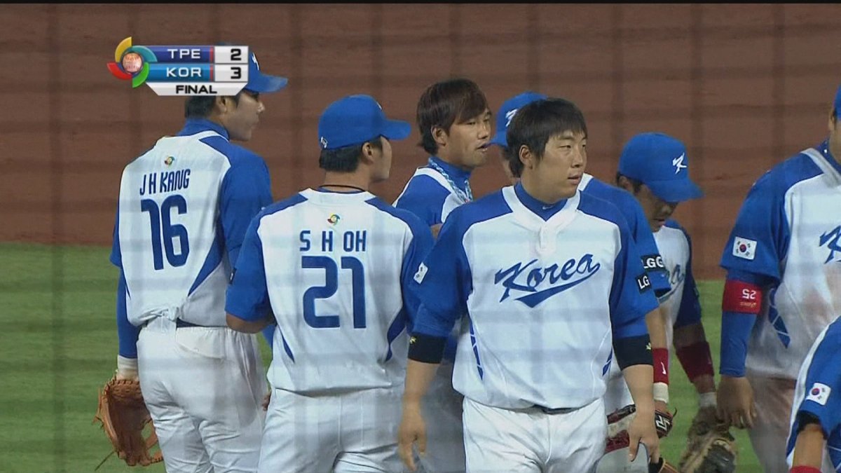
Korea looks gorgeous, especially with that brighter shade of blue. I'm curious how the home and road would look with contrasting raglan style sleeves, keeping the trapezoid pattern for contrast.-
 1
1
-
-
7 hours ago, raysox said:
I think this is interesting, but would love to see your Koala in regular Dodgers colors. I guess what i'm picturing is similar to the CounterClocks logos. I feel like you can still be creative and add more of that deep grey to the concept, kind of like a New York Giants look.

Thanks for the feedback! Just to clarify, are you suggesting the concept be mainly blue with red and dark gray as secondary colors, like this?
6 hours ago, VampyrRabbit said:Is the last team Tampa Bay?
Oh yeah, I forgot the Rays have that goofy kitten mascot. They do, however, also have a stingray mascot, which is why I didn’t think to do them. So the answer is no, I have a different team planned, but they are in the AL. -
On 3/21/2023 at 1:40 PM, TrueYankee26 said:
Looks also like a dinosaur to me
Yeah, I can definitely see that.On 3/22/2023 at 11:27 AM, Megildur said:Your original definitely does have more personality. This is definitely less mascot-based and more Red Sox-based, but I think the hat is a big improvement regardless. Thanks for putting this together!
Thanks, and no problem!
Up today are the Los Angeles Koalas!
KOALAS HOME:
KOALAS ROAD:
KOALAS HOME ALT:
Notes:
- Ok, here's where I sort of stretch the premise of the series a bit. The Dodgers have never had an actual mascot, but in the 1980s, the team's kids fan club was symbolized by a cute Koala cub, which I also used for the sleeve design.- With this being a Dodgers inspired concept, I couldn't not use blue in some capacity, so dark brown is paired with baby blue, in my opinion a very underrated color combo. This also gave me an excuse to finally squeeze in a powder blue road set in this series.
- The thick T-bars and pant stripes (and powder blue base) are inspired by this short-lived Brooklyn Dodgers look from 1944.
C&C appreciated! One more team left, but that's always subject to change.
-
5
-
 2
2
-
-
Nice work on Great Britain! The alt is actually my favorite of the three, but how about adding thick red T-bar-esque sleeve stripes to further mimic the Union Jack, since the flag stripes go both horizontally and vertically? I'm also not totally sold on the sublimated "GB"; I'd probably just make it a white/cream.
For the road jersey, maybe make the middle stripes on the headspoon and sleeves white so they pop a bit more.
Keep up the great work!-
1
-
-
I really like that powder blue Canada jersey!
Of the different Japan road options you presented, I think my preference is the red script trimmed in gold.-
1
-
-
The lighter gray Italia road jersey is an improvement!
Having not paid much attention to the 2017 WBC, I had to go back and look up Japan's uniforms and yeah, that last set was pretty much perfect. The only thing I might have changed would've been to go with a gold cap "J" trimmed in white.
Watching the game last night and seeing the Japan unis up close exposed a lot of little problems I have with them, namely red pinstripes that look blue from a distance and the gold collar trim which seems out of place and maybe a bit over-designed. Looking at your concept, I kind of miss the headspoon, but it would probably clash with the collar & sleeve trim.
Also, I meant to mention that the added front numbers to Brazil and red front numbers on Colombia look great!
-
1
-
-
Israel - Beautiful set! I really love the use of triple striping on the headspoon and sleeves.
Italy - Fantastic job balancing the three colors of blue, red and green. The Cubs style numbers pair really well with this design. For the road jersey, maybe lighten the gray just a tad so the green stroke around the script and numbers is a little more visible.
-
1
-
-
On 3/19/2023 at 6:37 PM, johne9109 said:
This is the biggest departure for the team but it works so well. Great job
Thanks!
On 3/19/2023 at 7:30 PM, Bomba Tomba said:The Trikes look like the main character's team in a kid's movie about baseball
Haha! Well, given the premise of this series, I'll take it.On 3/20/2023 at 12:09 PM, Megildur said:Dang, I never realized until today how much I want the Rockies to go with two shades of purple. I love that. Also, that Mustangs cursive script is awesome and I love their color scheme.
I'm not sure about the Monsters, though, especially when it comes to the blue pants. I'd suggest making the brim of the hat green, the front panel that shade of blue, and keeping the "B" as is, like you have in the Green Monster logo. I would also scrap the number on the front as I really like that the Red Sox don't have one.
Thanks for the feedback! Here are the Green Monsters with your suggested tweaks:I feel like my original version has more personality, but to each his own.
Next up are the Chicago Southpaws!
SOUTHPAWS HOME:SOUTHPAWS ROAD:
SOUTHPAWS HOME ALT:
SOUTHPAWS ROAD ALT:Notes:
- Ask any South Sider what Southpaw is supposed to be, and I doubt you'll get a single convincing answer. He appears to be a furry dragon of some kind, but don't ask me why he's the mascot of a team called the "White Sox."
- I leaned heavily into Southpaw's green color for this one, which would give the Southside Irish a color scheme they'd love rooting for.
- The White Sox have historically only seldomly worn their full team name on their jerseys, so I maintained that tradition here, shortening the name to "Paws" on the 1983-inspired home and road alt.
- Since "Southpaw" also is a term for a lefthander, I reworked the Sox' batterman logo into a lefthanded pitcher.
C&C appreciated! Only a few teams left.
-
7
-
-
That's definitely an improvement!
-
1
-
-
On 3/18/2023 at 5:58 PM, aawagner011 said:
As a Braves fan, I was nervous at the prospect of a City Connect but had more hope when I saw the first leak of the socks and t-shirt. I am more than okay with this design. They pass my test of still looking like the Braves when I turn on the TV. I don’t like how it literally reads “The A” but there are so many City Connect designs that are absolutely horrible, so I consider these a best case scenario. I’ll be curious to see the full uniform with the cap. Expecting a white panel. The sleeves look like they have a hint of the feather but less pronounced compared to the throwbacks.
Looks like this set will fall into the category of City Connect designs that look like they could be a team's regular alternate (a la the White Sox) rather than looking like the uniform of a completely different team.-
2
-
-
Colombia looks good! One nitpick I have is the sleeve stripes are so thin that they bleed together, almost looking purple or brown. Any chance of restoring the thicker stripes, a la their current uniforms?
-
1
-
-
How about something resembling the Brewers' '90s Motre Bame font for Germany? Also, the number font is a little too minor league-ish for my tastes.
Great Britain looks great, though admittedly, just about anything would be an improvement over their actual uniforms, haha. The swoopy "R" alone makes a world of a difference, and royal blue over navy was a great choice. The sleeve stripes are really sharp, as well.-
1
-
-
14 hours ago, Victormrey said:
Lovely job for the Rockies! I think the font works perfectly with the two shades of purple. Also, what's not to love about an all-vest set?!
Thank you!
Up today are Texas Mustangs!MUSTANGS HOME:
MUSTANGS ROAD:
MUSTANGS HOME ALT:
MUSTANGS HOME/ROAD ALT:
Notes:
- The Rangers mascot is a palomino horse with a really dumb name—“Rangers Captain.” Since “Palominos” is too long and unwieldy, I settled on “Mustangs,” which evokes speed, strength and beauty.
- The "Mustangs" script comes from the Billings Mustangs, a minor league team from the 1960s.
- Rust and black replace blue and red, giving the team a bit of a Texas Longhorns look.
- The horse is re-purposed from this Charlotte Knights logo, recolored with a white mane to better resemble a Palomino.
C&C appreciated as always!
-
7
-
1
-
-
10 hours ago, BBTV said:
Make the USA navy and the uniform (other than the hat) would be acceptable. That hat is something else.
Looks better than when they were the American Expos:
I actually love this look, but I'd prefer if the racing stripes had a white stripe separating the red and blue.-
4
-
-
On 3/15/2023 at 12:41 PM, TrueYankee26 said:
Thanks for the info about the blue color and the Green Monsters look really cool
On 3/15/2023 at 2:49 PM, johne9109 said:I like it. It's so Boston yet not Boston that it just works. I understand using Wally's green over the green monster green and agree it works better here. I LOVE the logo!
Thanks!
On 3/16/2023 at 10:05 AM, stumpygremlin said:Why not just "Monsters?"
Not a bad idea! Here's how that would look:Let's finish off the week with the final NL team in the series, the Colorado Trikes!
TRIKES HOME:
TRIKES ROAD:
TRIKES HOME/ROAD ALT:Notes:
- Dinger the Triceratops was chosen as Colorado's mascot due to the prevalence of dinosaur fossils found throughout the region. Shoutout to @Carolingian Steamroller for the name suggestion!
- The split-style font for the script is, appropriately enough, called "Dinger."
- Dinger is often rendered in a much lighter shade of purple than the one the Rockies actually use, so I went with a double purple color scheme for the Trikes, with lavender replacing black.- A smiling Dinger, in the vein of the Orioles' cartoon bird or Mr. Redlegs, appears on the sleeve.
Hope you're happy with how these turned out, @DTConcepts. C&C appreciated!
-
9
-
 2
2
-
-
48 minutes ago, Victormrey said:
Thank you
I've made two version with the white front panel:
Looks great!
-
1
-
-
The red jersey is nice, but I think I actually prefer the black one. Good work!
Could we see a white front paneled cap for Canada, to further the obvious Blue Jays inspiration?-
2
-
-
Been meaning to comment on the last few teams:
Brazil - I think the jerseys would benefit from some front numbers, like this. That aside, fantastic design.
Canada - This isn't a criticism of your concept specifically, but I think the road jersey would work better if you flipped the colors of the script.
China - I think the red jersey might look better with a white stroke around the script rather than a darker red one, but I love everything else about this set!
Colombia - One of my nitpicks about Colombia's real life set is how there's red on the cap but nowhere else on the rest of the uniform. Similarly, while I really like your redesign, I wish the red wasn't relegated to just the sleeves. How about red front numbers outlined in gold on the home and road jerseys? Otherwise, this is a huge upgrade over their current uniforms.
Chinese Taipei, Cuba, the Czech Republic and the DR look perfect as-is. Keep up the great work!-
1
-
-
1 hour ago, MJD7 said:
This shade of pink should be what the Marlins are using.
Bingo! -
Really enjoyed seeing Team Mexico's alternates in action last night:
Too bad they couldn't get matching equipment, because the green and red helmets with baby blue and pink looked awful.
-
11
-
-
On 3/12/2023 at 3:53 PM, TrueYankee26 said:
The only thing I could think of for the Giants comparison in Coiler's post was the off white home jerseys, it is way more Cubs to me
And the blue for the Lions (Royals) look purplish but it works because purple is another color strongly associated with royalty
Thanks! The shade of blue is actually the original shade used by the Royals. Maybe pairing it with so much gold incidentally makes it looks more purple than it actually is.2 hours ago, VampyrRabbit said:The Monarchs tribute uniform looks great.
I like the Bears, the Twins rebrand was great and basing the Bears off that was the right path to take.
Love the Phanatics. I would be interested to see how going full 1980s with the pinstripes and adding racing stripes would work.
Thanks a lot! I'll work up a racing striped version of the Phanatics when I finish the series.Next up are the Boston Green Monsters!
GREEN MONSTERS HOME:GREEN MONSTERS ROAD:
GREEN MONSTERS HOME/ROAD ALT:
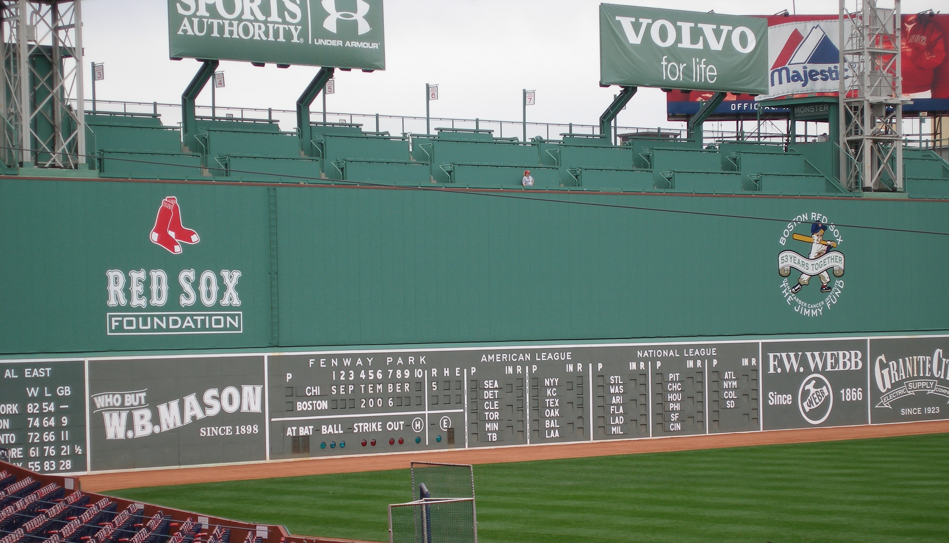
- As @Megildur correctly guessed, the Red Sox become the Green Monsters. The name, of course, refers to both Boston's mascot Wally and the infamous huge left field wall at Fenway Park.
- With Monster green being fairly muted, I chose Wally's more lime shade, which paired better with navy. Early on I briefly considered using green, navy AND red, but it wound up looking too gaudy.
- I tried and tried to figure out a way for the home jersey to say "Green Monsters" but just couldn't make it work. "Boston" is therefore used on both the home and road jerseys, with the Boston "B" on the alt.
- Never in a million years did I think I'd have a reason to use Boston's creepy 1950-59 alternate logo for a concept, but it came in handy here. I modified this logo by adding a big round nose and eye black to help him more closely resemble Wally.
- The green front paneled cap is inspired by these one-and-dones used by the Red Sox in 1974.
- Solid navy pants are a nod to those worn by Wally.
- Front numbers, which Boston has historically NOT used, helped complete the look.
C&C appreciated! I should have the next team up by Friday.
-
5
-
-
The Rays x Expos design is very cool!
-
1
-
-
On 3/12/2023 at 1:12 PM, VampyrRabbit said:
The shades of blue and gold are pretty in your face for the lions, but they look good on the home and the home alt. The white, gray and gold isn't exactly easy on the eye with the road though.
Very fair point. How about a white script, somewhat evoking the Royals' old powder blues?On 3/12/2023 at 1:12 PM, VampyrRabbit said:Any chance of a Monarchs tribute Lions uniform?
How's this?I tried to roll in elements from as many different past Monarchs uniforms as possible, while keeping gold as the connective tissue to the primary uniforms. Also, I'm curious to hear your thoughts on the previous few teams, @VampyrRabbit. Thanks!
-
3
-
-
Personally, I think the red script would be tough to read on a blue background.
-
1
-


/cloudfront-eu-central-1.images.arcpublishing.com/diarioas/O3DPQBCVLV326IDP45I5KXJMGI.jpg)
World Baseball Classic x NIKE 2023 (Venezuela: 30 of 30, Series Complete)
in Concepts
Posted
These look fantastic!
I really love what you did with Mexico, especially the green pinstripes and in general going more green heavy, as opposed to the red dominant look the team used for this year’s WBC.
Would it be possible to use split style numbers to go with the wordmarks? The fact that Mexico‘s jersey numbers didn’t remotely match their wordmark bugged me throughout the entire WBC.