


chcarlson23
-
Posts
2,212 -
Joined
-
Last visited
Posts posted by chcarlson23
-
-
I don’t mind the chrome helmet or the white gloves. It’s a little tacky and flashy, but it is an alternate uniform. The biggest thing is the actual jersey itself. It’s really bland and lame. And the striping mismatching that much is really odd… It looks like something from the bottom of the concept barrel that they decided to go with for some reason…
-
 7
7
-
-
5 hours ago, Roger Clemente said:
And here is that 25th anniversary jersey...

Everything is screenprinted. What's unusual about this one is that all previous special event jerseys were always just screenprinted as as well,, but never sold. They would always make just the 25 or so that the players would wear for the event and raffle them off after that game. Because this is a full blown third jersey for this year (and only this year as the should logo would dictate), they are also selling some in the team shop and while they are the same $135 as the home and aways, they are actually authentics as they are only in sizes 52 to 58, (And youth replica sizes.)
They are somewhat based on the "Fleury" era (techinically from 1998 until 2006, of which Marc-Andre Fleury did play for them from 2000 til 2004. IMO, they're... okay. For a third jersey, they are only scheduled to be worn twice more.
By screenprinted you mean sublimated, correct? Because everything on that jersey is sublimated. Screenprinted would be like a “shirsey” with the textured ink on the jersey.
I feel like that’s actually really common, and becoming more and more common in lower levels of hockey. Unfortunately sublimated hockey jerseys might be the future…
-
1
-
-
Yep. That’s perfect. And maybe add a silver outline im between the burgundy and blue on the numbers just to have consistency.
-
1 minute ago, Kevin W. said:
I'm surprised that they're adding more material given how much discussion they've had about making jerseys lighter by removing material.
It is very interesting… It looks like most logos are all back to tackle twill, where they were fabric at first with Adidas, and now have “heavy” (I mean not really heavy, but heavier than needed I guess) embroidered patterns on most logos.
Before it was small tackle twills pieces on top of different colored jersey fabric, all stitched together. That actually makes the logo lighter, so I’m not exactly sure what their doing here, at least in terms of weight. It’s super cool what they’re putting on the crests though. That’s actually awesome!
-
3
-
-
1 hour ago, -kj said:
Exactly no one calls it 52 there.
(But concurrencies are cool.)Yeah I was going to say something, but I realized it is technically 52. I’ve just never heard of it as 52, that stretch is almost always referred to as only 94...
-
4 hours ago, tBBP said:
Maannn...Allianz Field is just over there. It's location just about splits the difference between downtown Minny and downtown SP, and it is literally right off the US-52 freeway get-off ramp...but it is still just, kinda like, over there. There really ain't much around it (yet)--but it is a really nice venue in itself, however.
Well that whole area is called the Midway for a reason... The old St. Paul Saints stadium was just up Snelling there and it was called Midway Stadium, because it’s halfway between downtown Minneapolis and downtown St. Paul. (Although technically, the Midway neighbor is in St. Paul.)
It’s definitely a little bit of a rougher neighborhood with University Ave right there, but it does feel like it’s getting to be a little bit nicer of a neighborhood. And there’s still some decent restaurants and other shops really close by.
-
2
-
-
Well the matchup should be interesting. I guess it will kinda-sorta be like the 2020 Winter Classic, where Dallas went with the faux leather breezers and gloves, and a style from the 20’s, and Nashville went with a 50’s fauxback. Only this game will be throwing it back to the 30’s and 60’s...
I think it’s a missed opportunity for the game though. The Wild went full out for the St. Paul Saints fauxback look, and the Blues easily could have done a Flyers fauxback, especially since I believe the teams did play each other at one point.
So then blue breezers and faux leather gloves for the Blues?
-
1
-
-
I feel like the Blues could go in a couple different directions here. Based off the striping teaser it looks like the Blues 68’ white (or rather, cream), but my other thought is that this is a yellow sleeved jersey with blue Barberpole stripes similar to the St. Louis Flyers of the 30’s. Someone posted the image of the Flyers sweaters a few pages back, and the one from 31-32 looks like it easily could be the one the Blues are going to base it off of.
The other teaser could be the numbers? The logo? My guess is the front crest will have arched letters over the Blues logo. Either way, the teaser shows that it’ll be made of felt, and have chain-stitching, just like the Wild jerseys.
-
1 hour ago, andrewharrington said:
Why would adidas be forcing teams to add a stripe to the top of their jerseys? This stuff is straight from Twin Cities history books…
Yeah the jersey’s whole layout is basically the top jersey, minus the yellow/cream stripes. I think those extra chest stripes are really what makes the sweater too.
-
1
-
-
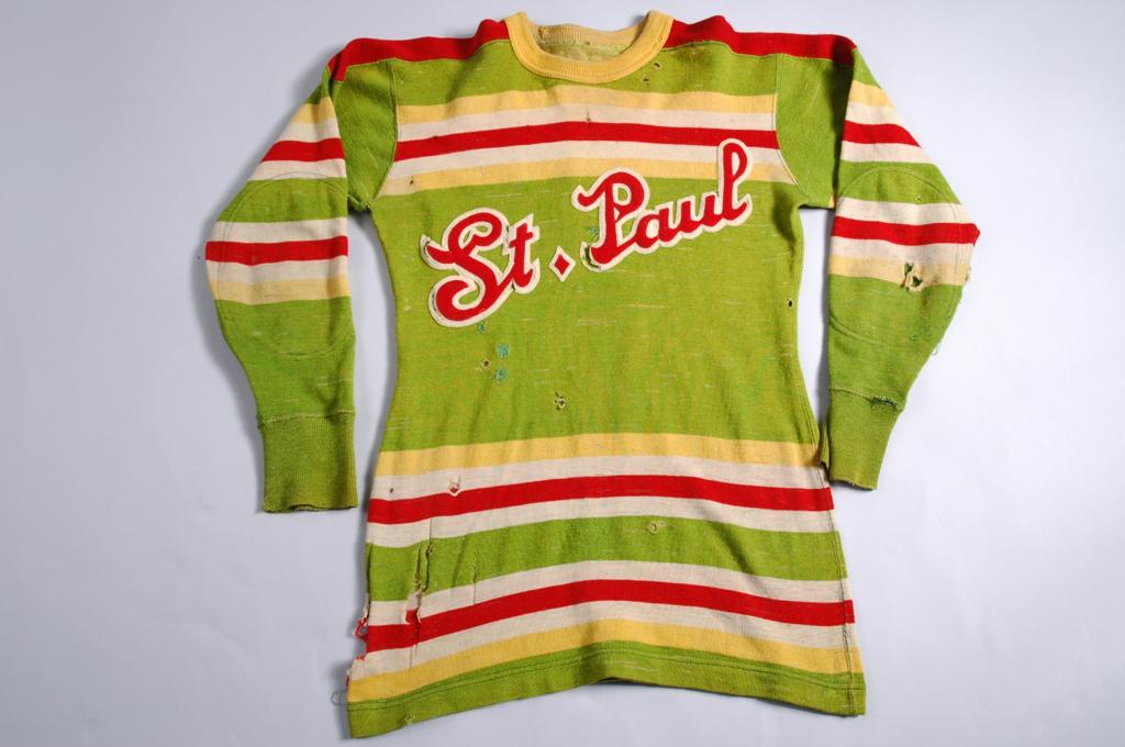
I absolutely love it!! Even the upper chest stripe. That’s directly from the St. Paul Saints in the 30’s. I also love that they included both of the Twin Cities on the jersey. I was just at the unveiling at the Minnesota State Fair, and one of the guys I talked too said they had just an “M” in the early stages, but decided to honor both cities. Part of that came from the Minnie and Paul Twins logo. I think they nailed the whole look. The only weird part is the elbow patches, but even then, that’s a fun quirk. I am very excited to see these in action now!
The other really cool part is that all of the lettering and logos are made of felt, not tackle twill, which is just a great touch.
-
9
-
-
3 hours ago, MinnyHockey said:
The logo depicts a sunset hence the red sky.
The company that made the logo, SME, does say that the scene is a dusk scene on their website, but that leads me to believe that it’s the moon rather than the sun. You can see stars and even shooting stars around the moon during dusk, but it’s just a little harder around the sun.
1 hour ago, ebod39 said:I've always seen it as night and the moon. A dark forest with only the light of the moon to show the way, the ever present north star, even the streaks crossing over the sun/moon feel ominous to me. Night time, where a wild animal stalks.
I also agree. It’s just a little more ominous and dark, which makes it feel like it’s depicting the night time and the moon.
I guess if there was a Wild logo that had the sun, it would be the Reverse Retro logo

-
2
-
-
Having owned many Wild jerseys, I can safely say that they’ve all had the shiny gold effect on the moon. It does look more yellow or more gold depending on the lighting of the photo, but it’s always been the same sparkly gold thread that makes up the crest.
-
6
-
-
I think the teased part of the jersey, from today, will be an upper chest logo, similar to the Rangers WC, with the logo saying either “MN” or “MIN”. The chest logo is probably going to be some kind of script. Either a diagonal mark like the Rangers, similar to many high schools across the state, or a baseball style script, which is also similar to many high school hockey programs, and both the Millers and the Saints.
I also think that the darker cream section from the teaser yesterday, is going to be a sleeve logo. Like the one Dallas had in the last winter classic. My guess is that it’ll have something to do with the State of Hockey moniker, or hopefully patches that have one with “StP” and one with an “M”. I think that would be a really cool way to honor both of the Twin Cities.
-
18 minutes ago, dont care said:
I’m not sure. That material for the wheat is the same as the rest of the jersey and doesn’t appear to be the tackle twill jersey crests are made of. Also if it was a roundel I feel we would be able to see something else like the edge of so lettering or an outline.
Well when the AdiZero system was introduced the crests all had the jersey material as the base for most of the logo. So this could just be the edge of the logo. What is weird tho, is that most logos outer edge was tackle twill, and the inside was the jersey material. So this is definitely a puzzling teaser.
-
4 hours ago, spartacat_12 said:
Back to some actual uniform news for this season, Minnesota has just released a teaser for their upcoming Winter Classic jerseys. Looks like I was wrong when I assumed it would be a green version of their reverse retro:
My best guess for this is that the darker cream section is part of the logo. I guess the other opinion is that it’s the numbers. Considering Michael Russo said that it’s a green jersey, I’m going to say this is part of a chest stripe. Maybe one that would go, Cream-Red-Cream-Red-Cream with the center stripe being the thickest.
-
The Wild’s original numbers looked pretty good with double outlines too. At least on the white sweaters. They probably would have looked pretty good with a single red outline on the original green sweaters.
I do like the Habs with a double outline because it matches the logo. But there are other teams that a single outline looks great. The Knights are a great example of this. The single gold outline is fantastic. It works for some teams, but not for others. It’s definitely better for some teams to have a single outline as SFGiants mentioned, but the jerseys that are above too are great with their double outlines. The Blues especially would be significantly worse if they only had a single outline.
And yeah the Stars suck with a single color number. It’s dumb as heck. The Texas Stars look better because of their outlines.
-
5
-
-
1 hour ago, MinnyHockey said:
According to Michael Russo, the Wild Winter Classic unis will "green jerseys, red shoulders, wheat breezers i think. league and adidas design these jerseys." The jersey will be unveiled on Sept. 4th at the MN State Fair.
Where did you see Russo said this? I can’t find anything about the specifics of the design.
-
4 hours ago, Ridleylash said:
Honestly, I'd be stunned if the Wild weren't pulling out a North Stars fauxback design of some form; it's the obvious choice to go with to cash in on the North Stars love some more like they did with the RR. Nashville and Dallas had a lack of real vintage-y jerseys to choose from given their history, so them going fauxback was logical. Minnesota just has to do a North Stars jersey in either classic colors or modern colors with the current Wild logo and they'll be golden.
As much as I loved the Reverse Retro for the Wild, and the North Stars branding, it honesty feels a little like a lazy way to do a jersey for this Winter Classic. I’m hoping for something a little more original, and something that draws from the rich, hockey history around the State, especially since the Wild are a fairly young franchise. But it definitely would make sense if they used the North Stars branding.
-
3
-
-
On 8/20/2021 at 6:59 PM, logo-maker said:
Hm...
Well I know where I'll be on September 4th... I am so very excited for these! I have no clue what direction they're going with them. I'm hoping for a good mix of St. Paul and Minneapolis hockey history, and even Minnesota in general, so hopefully not just a Millers throwback in green and wheat.
-
The name doesn’t stem from an actual lighthouse, or the area having some kind of nautical connection, it’s definitely more spiritual in nature. This is not meant to be evangelism, just an identification of what the reasoning for the mascot is. Jesus says in Matthew 5:14-16 “You are the light of the world. A city set on a hill cannot be hidden. Nor do people light a lamp and put it under a basket, but on a stand, and it gives light to all in the house. In the same way, let your light shine before others, so that they may see your good works and give glory to your Father who is in heaven.”
So this is why a beacon works so well. It’s a literal light source that illuminates the dark, guiding people to safety. This is what Christians believe, and being a private Christian university, it makes sense that they chose this name. My high school has the same name for the same reason. And we’re not on a lake or anything like that, we’re just in the suburbs.
-
8
-
-
The logo is definitely interesting... It really needs some more work. But I love the new nickname!! My high school has the exact same mascot for the same reasons they chose it.
-
On 7/30/2021 at 9:02 PM, M4One said:
The Howler doesn't really fit with any of the Kachina jerseys. In a few years (if they are still around), the original Howler set can be brought back as a vintage set, which then becomes so popular, it becomes the regular set again.
I’m not sure if any of the Howler jerseys would really make a huge comeback. Maybe for a Shane Doan night if they’re really done after this year, but there’s not a ton of memories for the howling coyote logo. It’s a lot of dismal mismanagement, and terrible attendance, and the greatest hockey player ever, who was not the greatest coach ever.
So even tho everything old will always be new again, I’m not sure the howling coyote will really be pushed to make a comeback. No one is clamoring for looks like the Boston Bruins set with the full-sleeve yokes, or Dallas’s original set. There are just some looks that aren’t anything special, and I think the brick red and white Yotes jersey aren’t that special. Maybe I’m wrong and they’ll make a comeback eventually, but I think it’s doubtful.
-
1
-
-
Are you planning to create schools in the Midwest at all? I’m definitely excited to see schools from Minnesota especially! I was a little let down by a different Moorhead haha
-
18 minutes ago, seasaltvanilla said:
There was relatively little rioting in Robbinsdale and Brookyln Center, certainly not to the extent of Lake Street. As you said those suburbs have always been lower SES, but I don't think you can blame their current conditions on what happened last May, and I disagree with characterizing those areas as still "burned down." I don't think over-exaggerating is the answer to under-selling.
Outstate means someone from Greater Minnesota, ie not the Twin Cities or metro area.
I grew up in White Bear, and currently live in Roseville, but I do spend a lot of time in Minneapolis visiting friends that live there, and I spend a lot of my free time exploring Minneapolis more. I thought you meant I lived out of state. I don’t know if I’ve ever heard of outstate as a term for someone outside of the Twin Cities.
I guess it still feels like there’s left over effects from the rioting all over the city. There’s still scars from it. Maybe I don’t have the best perspective, not actually living in Minneapolis, but I’m not trying to over exaggerate. And the take that there was only a few bad blocks in one city is really selling the extent of what happened short...


2021-2022 NHL Jersey Changes
in Sports Logo News
Posted
It’s too bad he’s not using the hyperlite…