


chcarlson23
-
Posts
2,212 -
Joined
-
Last visited
Posts posted by chcarlson23
-
-
Blue was definitely the right choice for the gear. It looks great with the home sweater. They just need to fix the road jersey to have a little more blue…
-
 9
9
-
-
I guess I’d have to disagree that the Flyers have a clip-art like logo. It definitely has a 70s vibe to it, but it’s a pretty decent logo. And it’s definitely not cheesy…
-
3 hours ago, MEANS said:
The Bears uniforms have never impressed me the way some fan slobber over them.
I do really like the Bears uniforms, however their pants needs to be tweaked. The whites should have a pattern that matches the white jersey stripes, so N-w-O-w-N, and the navy pants should be W-O-W rather than the other way around. The Bears even had that pattern in 1940!
-
4
-
-
14 minutes ago, TalktoChuck said:
As the boards number one hater of the Avs switching away from black, I can say that I have finally gotten used to the blue. The blue numbers help a ton. But like others have said it's a lateral move.
It's along the same lines as the Bruins black socks, and the Blues white numbers. Does it look better? Sure, probably. But it definitely doesn't look right.
I love the Blues white numbers, but the Bruins black socks don’t look good. The gold shoulder yoke makes the whole look super top heavy without gold socks.
If they ditched the gold yoke it would work a little better with the black socks. The Happy Gilmore jerseys look decent with the gold socks, but would have worked with black as well.
The biggest issue about those socks is the color balance. It’s way off without the gold socks. I love that the road socks are updated, but the home’s is awful…
-
3
-
 1
1
-
-
I like the double stripe on the Lions, however I would ditch it on the helmet logo. It would be a great helmet stripe on top of the helmet, but it’s too cluttered along with the logo. I’d have it as the “primary” logo, but not actually on the helmet.
-
The home sweaters look really nice with the added blue breezers, gloves, and helmet. But the breezers and gloves look really out of place on the road uniform that has almost no blue. The striping really just needs to be fixed and it will look a lot better. If you look at the Avs waist down on the road, the blue breezers work well with the socks, which have blue. But it doesn’t match the rest of the sweater. They should have fixed that first, along with changing the numbers.
The classic striping patter would have been enough to fix everything… Even with blue gear and numbers.
-
3
-
-
Well the Wild had their best season in franchise history, and got bounced in 6. And not because the Blues were that much better than the Wild, but because the Wild really just couldn’t play hockey the same way that had all year.
“It’s all about winning”
What a shame, and welcome to Cap hell
-
4 hours ago, Mingjai said:
*80s. The 90s Pens were Robo-pen.
Of course, if being dated is your primary critique, you’re ignoring the 900 lb, straight up 40s gorilla on the ice. The Rangers uniform has arguably as many flaws, it’s just that it’s had 70ish years to become endearing.For the record, I think Rangers–Pens matchup is the best-looking first round matchup.
What flaws do the Rangers have?? At least on the blue sweater… The blue sweater is a fantastic design. Even almost 100 years later.
-
3
-
-
On 4/30/2022 at 7:40 AM, DCarp1231 said:
Most, if not all, NFL teams look better with solid socks* instead of striped socks
*- when not paired with same color pants
To follow this, I hate the sanitary sock look. I’d love to see more stripes on socks, but I’d much rather see the full color all the way down to the cleats. I mean the days of practically needing sanitary socks is over. Those dyes in the socks aren’t gonna kill anyone anymore.
The way NFLers should wear socks these days is a full tube sock essentially, with the stripes on it, if the team has it. Baseball should be like this too, but stir-ups are an option I guess.
Socks can add so much if they’re worn right, and I think having half of the socks be white really takes away from what they could be.
-
6
-
-
So the Blues wore their Winter Classic jerseys again last night, which I think is the third time outside of the WC that they’ve worn it. And the Preds and Bolts have also worn their SS jerseys another time outside of the game, and even the Sabres wore their Heritage Classic jerseys…
Does anyone know if the Wild will wear their WC sweater again? It was way to good to only be worn once
-
29 minutes ago, FiddySicks said:
This is probably sarcasm, but for teams that expect a certain amount of stock every year, I could see where it would cause some issues. Teams kinda supplement their equipment staff’s time to launder these items by having an alternate set to ease some of that burden. Not having the extra jerseys just means they don’t have anything to swap out for, and all of the jerseys have to be laundered way more often, which trust me from experience, can be a bit of a :censored:.Now, you could argue that there are teams like the Yankees and Dodgers who don’t wear alts, but they supplement that by having extra sets of the home/road jersey. If the Rangers only have, say, 40% of their expected jerseys to work with, that could in the very least be a huge headache.
Yeah the supply chain is actually crazy. I work for a hockey store that also carries community lettermen jackets and both have had massive supply chain issues. We recently changed jacket manufacturers to make the time to get the jackets a lot quicker. They’re only supposed to be a few hours away by truck. It was supposed to change the delivery time from 6-8 weeks to 3-4… However since October, letter jackets have take roughly 14-16 weeks to get in. And the manufacturer has nothing really to say to us other than they don’t have the stuff yet…
And it’s the same with our various associations’ apparel orders. Everything is months behind. So it makes a ton of sense that random, very specific colors are really hard to come by especially in the quantity needed by an MLB team. I guess it’ll only be time until various teams start running out of grey and white jerseys too.
-
2
-
-
Just now, Chewbacca said:
I know this will end up being a very random question but I put two of my Montreal Canadiens jerseys together and the much older one that is a CCM has a much brighter red than my Adidas Canadiens jersey. Did Montreal at one point darken their shade of red, or is it a colour error on my older jersey? I just love the brighter red of my old CCM Canadiens jersey over the darker red my Adidas has.
They did, at least according to TruColor, in 1999. Right at the everything darker is tougher phase of sports design.
-
3
-
-
They should have used the red helmets or something. The color balance looks all off. I guess it’s my assumption of the Canes being a red team rather than a red and black team, but this is just weird.
They either need a shoulder yoke or just stick with the red breezers.
-
1
-
-
Yeah that’s a really bad look. The red breezers look much much better. The Hurricanes look better when they’re red dominate over black.
-
1
-
-
9 hours ago, sitboaf said:
You may well be right about the Pens, Islanders and Devils.
I've felt the Devils logo has been outdated for about 20 years now, but they show no signs of alteration, so...
The Pens reverted to the cartoony bird from Robo Penguin in 99, but a lot of people still love that 90s look, so that's why I feel unsure.
Islanders have flirted with change, but never really commit to it. I wonder how soon they will try again.
I mentioned the Leafs because they have had a realistic looking leaf logo for half their existence, and a simplified, geometric leaf for the other half. I much prefer their current logo, and I hope they keep this design for a long time, but there's 5 decades of something else clogging up their history.
The Bruins have had their spoked B for 73 years, and their color scheme for 88 years. All the changes recently have been to third and specialty jerseys, and I don't see the team adopting any of their ugly bear designs as a main look.
Well the Devils logo is an all time classic similar to the Habs logo. It’s not gonna change…
And I guess I was saying that in the changes the Leafs have made are along the same lines that the Bruins have made too. It might be a B on a spoked wheel, but it’s had font changes and stroke changes. Which isn’t as significant as the change from the Ballard Leaf to the current one, but for most people that wasn’t even something they noticed. It’s still just a blue leaf that says Toronto Maple Leafs on it
-
I hate these and love these at the same time. I’m not even fully sure how to explain it. The black with the royal blue accents somehow looks great together. And I usually hate black and blue color schemes, but I like this jersey. And the fact that it’s reversible is fun.
And I hate the fact that this 100+ year old franchise that’s been nearly exclusively royal blue and white, is coming out with a black jersey. But I also love it…

-
1
-
-
On 3/17/2022 at 1:44 PM, sitboaf said:
I was looking through all the NHL team logos, and it seems several teams are "done" with their branding. What I mean is, they will probably never change their main logo (other than small tweaks) ever again. For other teams, it seems like logo and branding changes are inevitable. Maybe I'll think more in depth about other leagues later, but this is how I personally categorize the NHL teams now:
For Sure Forever Done:
Boston Bruins, Chicago Blackhawks, Detroit Red Wings, Edmonton Oilers, Montreal Canadiens, New York Rangers, Philadelphia Flyers, St. Louis Blues.
Wouldn't be surprised by a change, but these may yet last for decades:
Buffalo Sabres, Calgary Flames, Carolina Hurricanes, New Jersey Devils, Minnesota Wild, New York Islanders, Pittsburgh Penguins, San Jose Sharks, Seattle Kraken, Toronto Maple Leafs, Vancouver Canucks, Vegas Golden Knights.
I think these three are for sure never changing again, barring a color change.
And if the Leafs are on the maybe change list so should the B’s. They’ve had some updates fairly recently in their history as well.
-
1 hour ago, pepis21 said:
Uhmm Capitals was first team.
By retro they meant Reverso Retro I guess not regular retro.
Well the Caps can’t put their ad on their road jerseys because of different state laws on sports betting. So the Blue Jackets are the first to have it on all their jerseys…
-
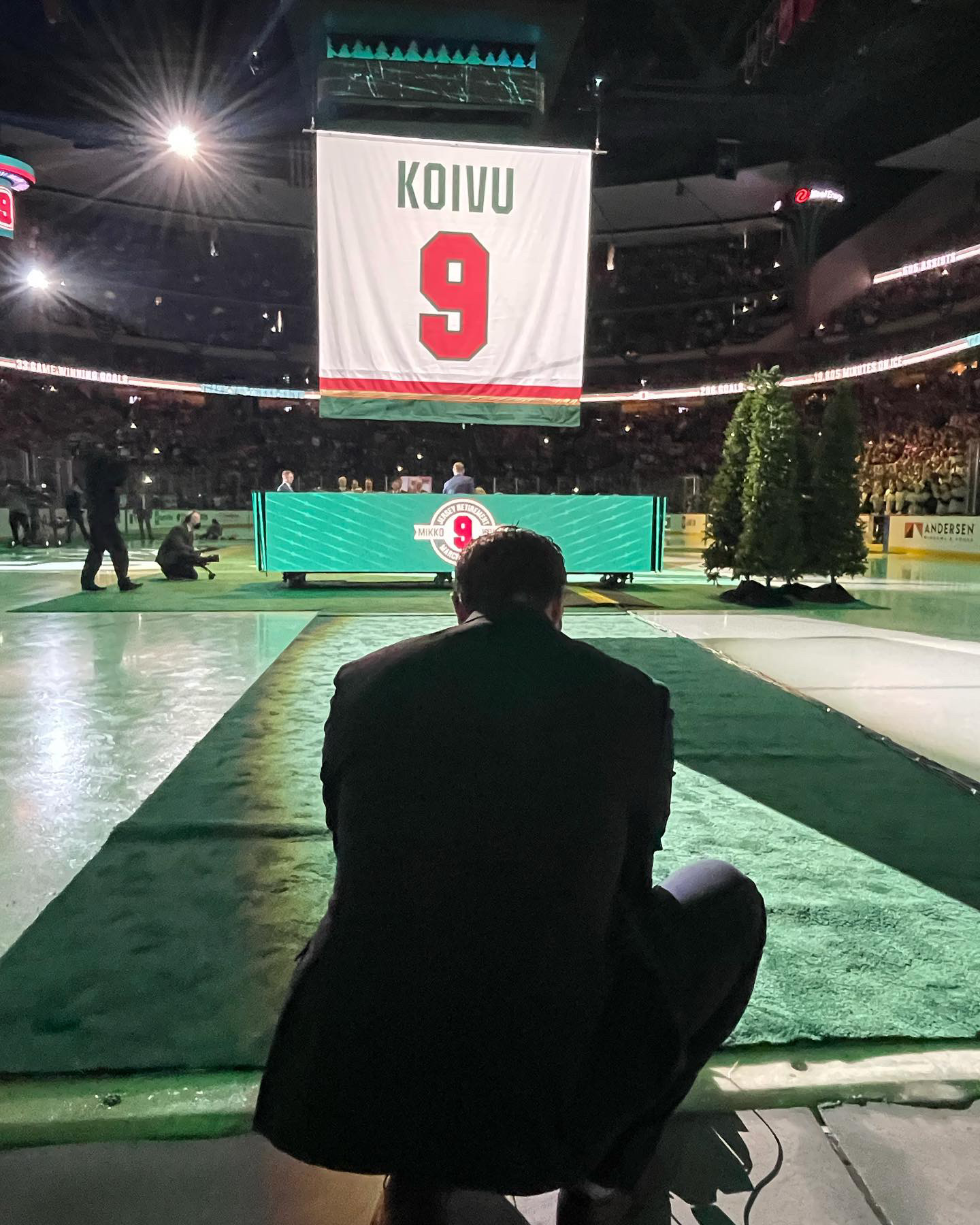
3 hours ago, OnWis97 said:
Since the other banner is for "the fans" (and lame as hell), they should make Koivu's consistent and tailor the other one to it, in my opinion. Actually, I'd rather they get rid of the fans one altogether.
Yeah I was hoping that the Wild Fans banner would have silently been dropped. And with Koivu it was tough, because while he wore both, I feel like the block font is more synonymous with him. Honestly they could have gone with a red banner matching that era too…
-
11 hours ago, spartacat_12 said:
A few turn of the century NHL expansion teams have recently retired their first numbers.

The Blue Jackets went with the appropriate font for Nash instead of the current one, which is a nice touch.
The Koivu one is a bit odd. They used the current road name & number font, but the bottom of the banner has the striping from the old Minny jerseys.
I think the idea with the Koivu banner is that the striping matches both the other banner, and the actual jerseys Koivu wore. I definitely associate the block font with Koivu more, so I’m glad they used it.
-
15 hours ago, habsfan1 said:
So unique and fitting for Canadian Football.
Maybe if they have an alternate, it could be used with that. They just gotta fix the outline.
Someone mentioned earlier that the antlers would look better being light on a dark background and I agree. I think a green helmet with yellow antlers, possibly with a white outline, would look great for the Elk. I could see a white helmet working too, but that doesn’t really feel like Edmonton…
-
4
-
-
So is that just like a fashion jersey Beiber is wearing? Or is that this actual new jersey their going to be unveiling??
I guess I missed something, so I’m confused
-
I still can’t believe they are pushing the triangle-less Penguin… This jersey would look so much better with that extra pop of yellow on the shoulders. It’s lacking currently.
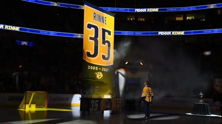
Also this is probably an unpopular opinion, but I think the Preds look a little better than the Lightning tonight. The yellow buckets and socks look really, really good, and even the 3 stars on the side of the helmet works. The Bolts logo on the helmet doesn’t look great, and it feels like something a little different could have been done with the socks. Those feel like they match the Preds jersey better. If there was a normal logo instead of “SMaShViLle” on the front it would be a lot better…
-
1
-
-
Are you trying to abbreviate Minneapolis or the Twin Cities with MNLPS? Because the proper abbreviation for Minneapolis would MPLS, or the airport code for the Twin Cities is MSP.
I would change to one of those on the secondary logos. They look fantastic otherwise!


MLFB Announces 4 teams
in Sports Logo News
Posted
Why do all these small time startup leagues, especially for football, feel the need to name their teams after generic fighting themed verbs? Like Ohio Force? What’s forceful about Ohio? The “THE”?
Arkansas Attack? What does that even mean? I just don’t understand the ideas behind this. I’d rather have a generic animal mascot to a generic verb…