


chcarlson23
-
Posts
2,212 -
Joined
-
Last visited
Posts posted by chcarlson23
-
-
5 hours ago, DTConcepts said:
The wordmark-less Screagle jerseys would like a word.

The white jerseys were a perfect, perfect look. If the blue jerseys had a black cuff and no wordmark, the overall look would've been perfect.
Well I do like the design, in fact I love the reverse retro, but I’m not a huge fan of the color scheme, and the number font is really rough…
-
 2
2
-
-
Honestly the only thing really bringing down the Caps look is the side panels. And maybe the just emptiness on the back of the sleeves. Otherwise it’s a good look for a team, and something that only needs tweaks, not a major overhaul.
IMO, the Caps have never had a perfect, perfect look. The Reverse Retro was pretty darn close, but otherwise each era has had its own flaws in the sweaters and branding. The current look, at least for me, seems to be the most “Capitals” of the bunch.
-
2
-
-
Ahh to be that mediocre
-
The Vikings look is a major downgrade. Those side panels were awful… I would stick with something similar to today or the 90’s.
And the purple throwbacks should have the yellow in the striping to be a true throwback.
-
1
-
-
The Vikings road jersey should have stripes that match the white pants. Not the other way around. The purple-yellow-purple is way better than the purple-white-yellow on the sleeves currently.
If the Vikes dropped the weird serifs and then made that change, they should never change again
-
6
-
-
Out of all of these, the only one I’m unsure of is the Wild shirt. They definitely had that last year, so maybe it’s just actually on sale?? I know Michael Russo mentioned in some athletic article that green for the reverse retro seemed to make sense. I don’t know if that meant he knew it was green, or if that was just a guess on his part.
My guess is that even though that shirt is the same as last year for the Wild, it will be a green version of the 80’s North Stars sweaters.
-
Please take PJ Fleck. I can’t wait for the Gophers to drop the whole row the boat thing and get some better uniforms…
-
1
-
-
The Thrashers were just so close with the pre-edge powder jerseys. They just needed to go away with the contrast stitching and weird armpit areas.
But the edge version was way, way inferior. The side panels were awful, but changing the outline on the main logo was a terrible decision. The white outline looks so much better than the tan.
However, adding a shoulder patch was a great choice.
-
1
-
-
1 hour ago, BBTV said:
With all due respect, you have no idea what it's like to not be a Yankees fan.
Yeah the regular season feels fairly irrelevant if your team folds in the opening round of the postseason… As most Minnesotans would know.
Those down years are so much easier stomach when you can remember celebrating a championship less than 5 years ago. Or even remember one. Out of all my favorite teams, they’ve either never won, or they won before I could remember/was born.
Also at the end of the day it’s entertainment sports. If your team isn’t winning it’s substantially less fun…
-
4
-
-
3 hours ago, Hat Boy said:
Is there any jersey manufacturer who still does a straight hemline? I will personally donate money if they are bidding on the NHL contract.
I’m fairly certain that Nike of all companies, has straight hemlines on their sweaters.
-
12 hours ago, IceCap said:
We're on the same page as a picture of Nike's ridiculous-looking collars!
The U of M men’s hockey collars skip over whatever Nike did with collars. The shoulder yoke pattern just goes right over the collar.
It would be interesting to see if NHL teams would follow suit if they wanted better looking collars that have the same flat feel.
-
 1
1
-
-
57 minutes ago, Ridleylash said:
The Blackhawks have historically done everything they can to quash any attempt at Milwaukee getting an NHL franchise. Add in Minnesota and it's even less likely, relocation or otherwise, since losing Wisconsin means they have only Iowa as an out-of-state market. Hell, both Minnesota and Chicago have a game in Milwaukee this season.
Milwaukee feels far enough away from the Twin Cities that it’s not really a part of the Wild’s market. I’m fairly certain that Bally Sports Wisconsin does play Wild games, but I’m not exactly sure how far that reach is in Wisconsin.
Of all the Wisconsin people I know, (most of whom live west of Eau Claire,) even though they’re Packers fans because of their “Wisconsin Heritage” their also Wild, Twins, Timberwolves, and Loons fans. There’s only a few peopleI know who are Brewers or Bucks fans, and it’s because they’re from the Milwaukee area.
I can understand the Blackhawks pushback on a Milwaukee team, but not really the Wild.
-
2 hours ago, Burkell007 said:
Could MKE maybe get a nhl expansion team? I mean there is a new arena there. it’s kinda baffling they don't already cause I think of them and Minnesota as states that are perfect hockey states.
Maybe the Coyotes can relocate to Milwaukee… They’re already in the central division
-
4 hours ago, WSU151 said:
A change the Wild could benefit from would be to lose the Machine font numbers and go with the number font used for the WC jerseys (which seem a bit more old-school and fit better with the older look).
This would be a fantastic change. Even using the North Stars font would be better than the current font.
-
1
-
-
50 minutes ago, HopewellJones said:
Agreed on the Wild name. I've always liked it.
Would be way different if they were the Minneapolis Wild, in which case I'd look at it like the 90s xTrEmE vibe. But the state moniker along with their whole identity gives me more of a "Minnesota Wildlife/Wilderness" vibe that really works for me.
Well it would be the St. Paul Wild, because the Xcel Energy Center is in St. Paul
 6 hours ago, PlayGloria said:
Is the Wild's current set even a faux back look? They might not be 2000s WILD but I also don't find them to be retro or faux back whatsoever.
I said this earlier and I'll say it again, i think its the wheat/off-white color, not the design, that might give people that impression.
Honestly, I have never dug the name "Wild" but the less they feed into the 2000s vibe, the more I view it as "wilderness" vs tacky. Taming the other elements of the uniform has let the logo shine a bit more. IDK, their branding has grown on me since losing the 00s vibe.
And the Wild had their winter classic which really pushed the 20’s Old Time hockey vibe, but their current branding is definitely more 60’s-80’s style, which is really just the epitome of hockey design.
As someone who appreciates the long history of the game, and is from Minnesota, I’m so happy that this is the direction of the branding they’re going with. The Gaborik-era jerseys were cool, and the numbers were a lot of fun, but the direction they’ve taken over the last couple of years is perfect. They are a blend of modern as well as retro, and it really fits the identity of the team and the state’s hockey culture as a whole. It’s not dumb O6 dress up, it really does fit the market.
Some teams should have a more modern brand, and one that reflects the age of the team, but honestly as long as the sweaters look good, faux-retro is the way to go.
-
2
-
-
3 hours ago, AFirestormToPurify said:
What I'm saying is, teams from the 60s look like teams from the 60s. So do 70s teams. And 80s teams. And a lot of 90s teams. And so on
Except the Wild. The Wild can't look like a Y2K team for some reason, they had to do the faux-retro thing out of nowhere when their original uniforms were perfectly fine
20 years old is not that old (25 lol), up until Vegas, they were the most recent expansion team
Well the faux-retro isn’t out of nowhere… Minnesota has hockey history that predates the NHL. The first hockey tournament held at the St. Paul Winter Carnival was held in 1896. Even before the NHA.
The original look for the Wild was great, but the fauxback look works well too. Minnesota is a historic hockey hotbed, so why shouldn’t their top team look the part too?
-
1
-
-
I would love if CCM was the manufacturer for the jerseys again. Their quick light stuff for the AHL is pretty nice, and I’ve seen some gamers for St. Thomas in Minnesota up close, and they’re also good quality. I do think the collar needs to change a little.
(I guess I also don’t understand what the aversion to something of a traditional collar is… It seems that almost all major manufacturers these days can’t get that part right. Like even if Adidas did the lay flat collar that had a few extra segments on it to make it look like a traditional collar would have been nice. Reebok nailed the collars towards the end there, and so I’m just confused why that had to change so much/end rant)
Nike’s template for the Olympics was pretty nice as well, despite some not great designs. As someone said earlier, with places like the U of M, Michigan, Michigan State, and Ohio State in college hockey, Nike can make traditional looks work. My hope would be that if Nike took over, we wouldn’t have to worry about teams like the Habs or any one else with more traditional looks have to sacrifice something for the sake of Nike being Nike… I guess I would assume it would be more reserved, because teams do like to stick to tradition if it’s there, and only a few teams would get a completely new look.
-
1
-
-
15 hours ago, M4One said:
This jersey would only rank above the flying V. Giant front numbers and a wordmark do not belong in hockey.
Clearly you’ve never watched any college hockey…
-
2
-
-
The Wild logo is at the wrong angle. It’s too flat for what it actually is. The Mothership has wrong angle on their logos if that’s where you got them from.
-
 1
1
-
-
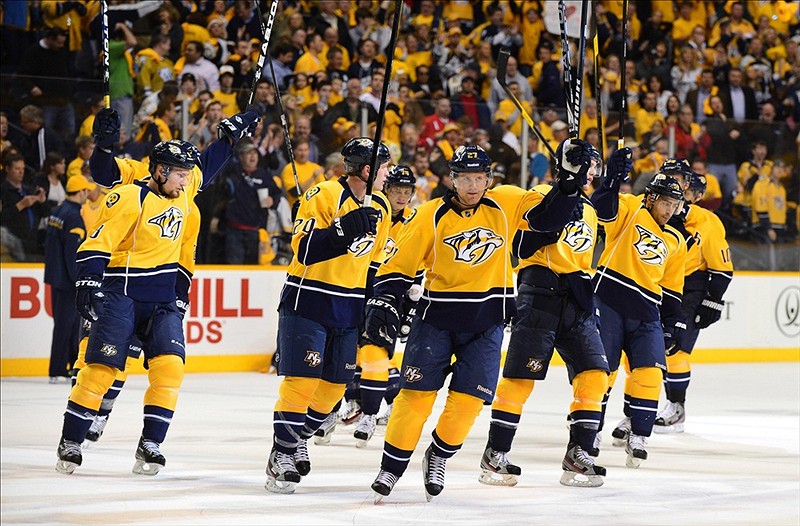
4 hours ago, DTConcepts said:
I think the Predators' switch from a navy/silver to yellow counts here.
They seemed all but ready to ditch the yellow too with the navy, black, and white alternate, alongside the “revealed” (idk the full story on it) matching white version.
I’m so glad they turned it around and emphasized the yellow instead…
-
On 7/8/2022 at 9:14 AM, Sport said:
Shane Wright falling to Seattle at 4 is a real coup for the Kraken. I think that may have the potential to be a franchise-starting moment. Nothing against Cooley, but I feel like the Yotes yoted that big time.
I feel like Wright didn’t have as good of a season this last year, and so I’m not sure how well everything will transition to the NHL for him. I also think the Coyotes made a great pick with Cooley. He’s supposed to be just as electric, and I have a feeling he’s gonna have a great season at the U of M. I don’t think the Coyotes could really go wrong with either player… It’s not like they grabbed a guy projected to go in the 5th round or something
-
14 hours ago, AFirestormToPurify said:
Anyway, I'm done arguing about the Oilers, their jerseys suck and no one here is gonna change my mind lol
I’m curious about why exactly you don’t like the Oilers Gretzky uniforms… I know you have said they are dated, but I’m curious about why else you don’t like them?
I don’t care either way, I just wanted to discuss it haha
-
50 minutes ago, FiddySicks said:
It feels like it’s been coming already for awhile anyway, but the two dumb SoCal schools defecting to the flyover conference definitely feels like college football’s “jumping the shark” moment. Zero interest left in whatever they have going on there.
Hey the Big Ten isn’t exactly the flyover conference. There’s some major and really nice cities like Madison, Chicago, and the Twin Cities… I mean there definitely are some flyover cities otherwise, but still.
And all of this is really interesting to me as a college hockey fan. It really doesn’t change much for any of the conferences, and certainly not for the BIG unless UCLA or USC happens to have a really good club hockey team looking to make the jump up. This huge power and money making move is really only going to shake down to football and basketball. Maybe some of the other lower level sports too, but hockey is kinda just gonna keep rolling.
I personally think it’ll be kinda cool to see the Gophers take on UCLA in football or basketball a little more, but it’s not gonna really matter when I’m watching and following the Gophs in hockey.
It’s crazy how different college hockey is compared to the rest of college sports too. Most guys anyways, are coming back from juniors before playing, and are closer to 21 when they start. And both men’s and women’s hockey, (I believe, I saw this as a stat from the NCAA a few years ago) have the highest graduation rate of any spot in the NCAA at like 98%.
-
On 6/29/2022 at 4:28 PM, spartacat_12 said:
I know the Wild had almost no leverage considering their cap situation, but that still feels like an underwhelming return. Faber is a Minnesota kid and played for the Gophers the last couple years, so I guess they've gotten plenty of looks at him.
As a Wild fan I’m actually pretty happy with what we got for Fiala. There’s no way to totally replace him, so it was gonna be tough with a trade anyways. A first rounder, and an excellent Gopher defensemen is a great return in my opinion. Faber is also a right handed defensemen which is lacking in the Wild’s defensive prospects. It’s also always fun to get a guy who dreamed of playing for your team while growing up.
And as streaky as Fiala is I’m not sure what to expect from him next season anyways. He started the year really steaky and then only found his groove once he was paired with Matt Boldy. If he doesn’t find some chemistry with someone on the Kings, he could end up being a 20 goal scorer this year. Which isn’t terrible, but isn’t quite what the Kings will be looking for from a 7 million dollar man…


2022-2023 NHL Jersey Changes
in Sports Logo News
Posted
Well I would imagine that it would be the Buffalohead, but people probably thought it was so ugly, it looked like a goat. It was an insult. Just like the slug…