


Old School Fool
-
Posts
4,520 -
Joined
-
Last visited
-
Days Won
14
Posts posted by Old School Fool
-
-
23 minutes ago, DCarp1231 said:
I cant wait for the official Broncos colors to get renamed to some goofy
 like-
like-
• Mountain Sunrise Orange
• Rocky Range Blue
• Snow Cap White
Don't forget Elway Silver.
-
 4
4
-
 1
1
-
-
1 hour ago, coco1997 said:
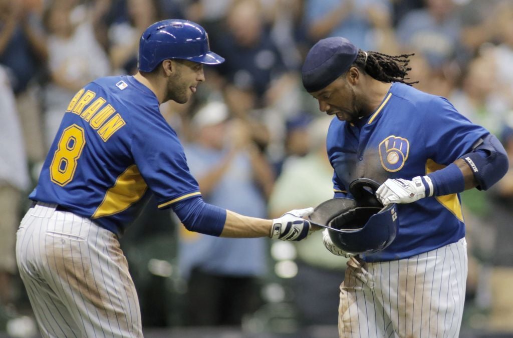
I really dig that Brewers jersey. I wish the Crew had a regular season alternate with the BiG logo on it.I remember when they wore their Batting Practice jerseys in 2014 and 2016 randomly. It was only a handful of times.

-
2
-
-
21 hours ago, fouhy12 said:
Small news, but the Patriots are adding captain's patches to their jerseys starting next year.
I have personally always found them kind of tacky and was glad we didn't have them.
Are there any remaining holdouts in the NFL?
I don't think the Packers have captain patches anymore, almost like Aaron Rodgers took it away from them or something.
-
59 minutes ago, DrunkKidCatholic said:
This has to be the first time I can recall a team just straight up reverting to a previous logo in a long time. Usually there are modifications or something different but if this hat is true then the Jets just straight up went back to the 1997 logo.
You can't do that in the NBA which led us to this weird thing.
-
3
-
 1
1
-
-
3 hours ago, GriffinM6 said:
I feel like it may be some sort of Mandela effect, but I swear I've seen pics on here where the Steelers put the Nike logo inside their sleeve striping rather than above it when they became a Nike team in the late 90s.
It was when Starter made the uniforms in the early 90's and apparently it was only on one sleeve? Most game pictures it's hard to see but it's definitely only on one sleeve, as if it's a quirk to tie in with the helmet or something.
-
9
-
-
Aside from the Seahawks, the 49ers are the only other team I can recall working around the manufacturer logo. When the 49ers wore Montana throwbacks in the mid 2000's. They put the Reebok logo in the stripes and I'm not sure why because the Reebok logo was usually in the position above the sleeve number on all the NFL jerseys at the time. I assume they wanted the logo to bleed into the stripes so that you wouldn't notice it and it looked like a clean design or something.
-
1
-
-
In MLB The Show 24, the Dodgers have an "Alternate 1" listed and it is the blue jersey. It is very curious because it was not there any other year and the video games tend to only include uniforms that are worn in the Regular Season and there are no Spring Training jerseys in the game.
-
If we're hijacking this thread with weird numbers then let's not forget about Ty Montgomery and Cordarelle Patterson wearing 80's numbers at running back as of this decade.
-
3
-
-
I was looking at Vanessa Hudgens Instagram (shut up) and I noticed the co-owner of Cali Water was wearing a Kings jersey with his company as the ad on the front instead of Dialpad. It might just be a random thing but I think it's interesting to point out anyways.
-
4
-
-
1 hour ago, who do you think said:
You people are out of your minds. You think Vince Carter is the reason basketball is played in Canada? This is Canada we're talking about, not Turkmenistan or some previously uncontacted jungle people. It's right next to the United States. Toronto has been a major Great Lakes city since such a concept existed. Plenty of culture spillover. They (briefly) had a team before in the old BAA (NBA forerunner league). Basketball very much existed there before and still would have without Wince Carter being a glorified Ricky Davis.
Also, Raptors game-day entertainment, the oblivious rich kids who still go to NBA games, and broccoli-headed zoomies on social media who've never heard of Alvin Williams or Mo Peterson =/= most of Toronto. People who were old enough in 2005 to have an opinion on the matter despise him, and rightfully so. He set their franchise back years by demanding a trade and then immediately killing his own trade value and never did anything of note while he was there besides throw down some meaningless dunks and jet-lag himself before Game 7 of the Sixers series so he could do his UNC graduation walk.
Cool story. I associate Wince Carter with being a selfish disappointment and a net negative on the game.
This is crap. The Grizzlies moved because they were atrociously run by one of Stern's league office stooges and Vancouver - besides being just a worse market to begin with - was far more sensitive to the Canadian dollar problem (the same one that pushed out the Jets and Nordiques) than Toronto. The original owners were determined to sell the team and nobody local was interested, therefore they moved. Glorified Ricky Davis wouldn't have saved them. The similarly shameful Steve Francis wouldn't have saved them either had he not demanded out before his tenure there even began.
Again, Canada isn't Mars. And some good being "on the map" (whatever that means in this case) did for the Raptors in the decade that passed in between Wince scurrying off to Jersey (in exchange for an old center who just got a kidney transplant and two Mattress Firm delivery guys, because he quit on the franchise and tanked his trade value and his team's leverage, but yeah sure reward that and retire his number!), and them unearthing Kyle Lowry and Valanciunas actually getting good for the first time. They were a piss-poor, borderline radioactive franchise in the interim and I still wouldn't say they're quite "on the map" considering Kawhi Leonard probably never even unpacked his suitcase in the one season he played there before bolting in free agency.
What did Vince Carter do to you, man? Did he
on your doorstep or something?
-
10
-
 1
1
-
-
10 hours ago, who do you think said:
After the garbage he pulled, Toronto retiring Vince Carter's number would be one of the most spineless moves an NBA franchise has ever made. Might as well suggest the Celtics retire Kyrie's number.
I associate the Toronto with Vince Carter more than any other place he played in. I remember as a kid when he came in and it instantly made the Raptors the coolest team in the NBA even though my favorite team is the Lakers. I even sent mail to the Raptors as a kid and they mailed me back a postcard with Dee Brown's autograph on it.
-
4
-
-
-
The Eagles have now had three different wordmarks on the same jersey design. This team really needs to move on at this point. The new font does not work with the current setup at all.
-
20
-
-
4 hours ago, BBTV said:
Laugh all you want, but there is something about 5 that's just... I don't know how to put it, but "static".
It's not necessarily the players that have worn it, it's just the actual shape of the number is not-dynamic. Especially in fonts where the left side descends (like the Eagles, Phillies, Packers, etc.)
I know Mahomes wears 15, but when standing still, it doesn't look like it fits his style. 5 is just a slow-looking number.
Same with almost any number that contains it - 15, 35 (doesn't evoke speed), 45 (maybe a good strong safety or LB number these days) 51, 52, 53, 57, all look "slow", 65, 85 (always felt like a blocking TE number rather than a WR number).
Some combos with 5 look more dynamic. 25, 55, 56, and some others. Again, it's purely the aesthetic of the number, I don't care what great player you post that wore it.
He's right - 5 isn't a receiver number. (of course, IMO 3 shouldn't be allowed, but since it is, it's better than 5.)
It's funny you bring this up cause awhile ago I was watching an old Late Show interview of John Madden from the 80's and he was talking about how numbers should correlate to the kind of player someone is visually, not about any technicalities or whatever. Like if someone is a 74 then they gotta be a big dude. Basically saying you gotta look like a 24 or a 56. It's gotta look right.
I really miss receivers wearing numbers in the 80s, it feels like it's becoming less and less of a thing.
-
5
-
-
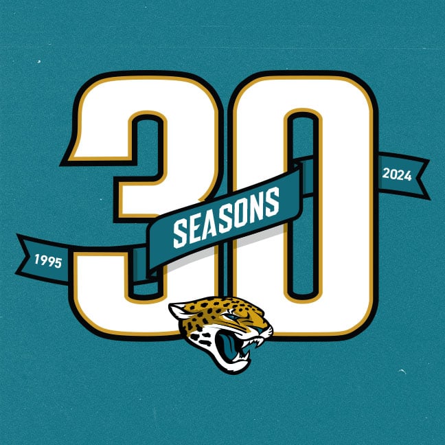
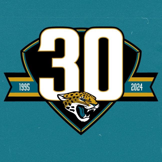
Jaguars are having fans vote for the 30th season logo and two of the choices use gold and the number font from the 90's jersey so one can only wonder....
https://web.witcontests.com/jaguars/sweepstakes/vote/vote-for-the-30th-season-logo-240309
-
2
-
2
-
-
13 hours ago, Survival79 said:
I'll be honest, I don't even really like the the San Diego Clippers logo here, it just doesn't come off like a logo that belongs in the NBA. Without the text it's actually a solid alternate but would be a pretty weak main logo for an NBA team.
The new Los Angeles logo is much better and has a lot of interpretations which makes it pretty cool to me.
-
2
-
1
-
-
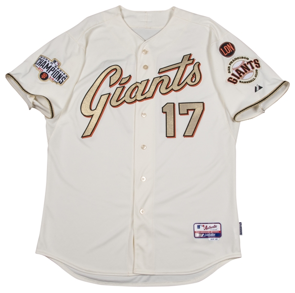
Still the best champion uniform that ever existed.
-
8
-
1
-
 1
1
-
-
11 hours ago, BBTV said:
Yeah I've heard nothing other than they wanted to "test" the '80s greens out for a few seasons before even thinking about making any changes.
I'm still on the lookout for the first 2024 jersey that features that wordmark. I'd be shocked if they pushed it off another year, considering they could do it now.
Test what? They put the uniform out and immediately got an overwhelmingly positive response. They said for years that they want to do kelly green real bad, and they also keep hesitating on it and it's irritating me. Do they want it or not? Make up your mind. The fans want it, the non-Eagles fans want it, but Jeffrey Lurie is too stupid to realize anything.
Regardless of what color green they choose, they need new uniforms real bad like the Broncos do.
-
1
-
-
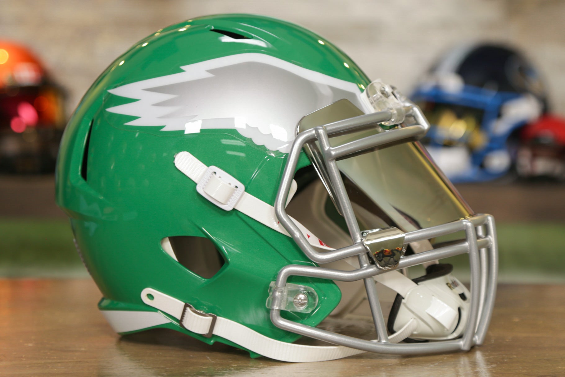
I feel like the Eagles should do a kelly green helmet with a chrome facemask. Something like the picture below but obviously update the wing.
-
3
-
1
-
-
40 minutes ago, BBTV said:
Pretty significantly from the eyes of a uni-conscious person (and a huge upgrade imo), but not to an average fan.
For all intents and purposes, they've had the same "look" since 1996, especially since the helmet, logo, and number font haven't changed.
Fortunately this terrible idea with the stripes only lasted one season:
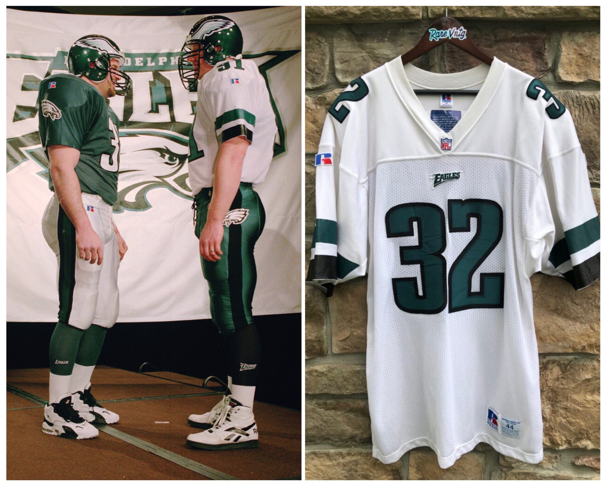
Don't forget the logo on the pants. I actually like the original road uniform. Also check out those socks! NFL teams use to have wordmarks on socks and nobody remembers that!
Also, the original look didn't have the stupid charcoal trim on the numbers and the pants had traditional striping thus making this look way better. They also had green socks. The team eliminated all of these things when they moved to Lincoln Financial Field in 2003 and aside from the shiny fabric the look has sucked ever since.
-
11
-
 1
1
-
-
1 hour ago, GrayJ12 said:
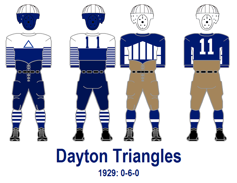
I was looking through GUD the other day and my jaw dropped to the floor when I saw that the Packers didn't have green on their uniforms until 1935. IMO, this might be the most obscure/weird Packers uniforms:
It feels more like something the early-era Eagles would had worn.That was a typical type of pattern for football uniforms in the 1920s/1930s. Bears and Steelers both wore throwbacks of that style in 1994.
The long forgotten Dayton Triangles and Frankford Yellow Jackets (Eagles) took things a step further. When someone tells you football uniforms are too flashy just remember flashy designs were always a thing.
-
2
-
-
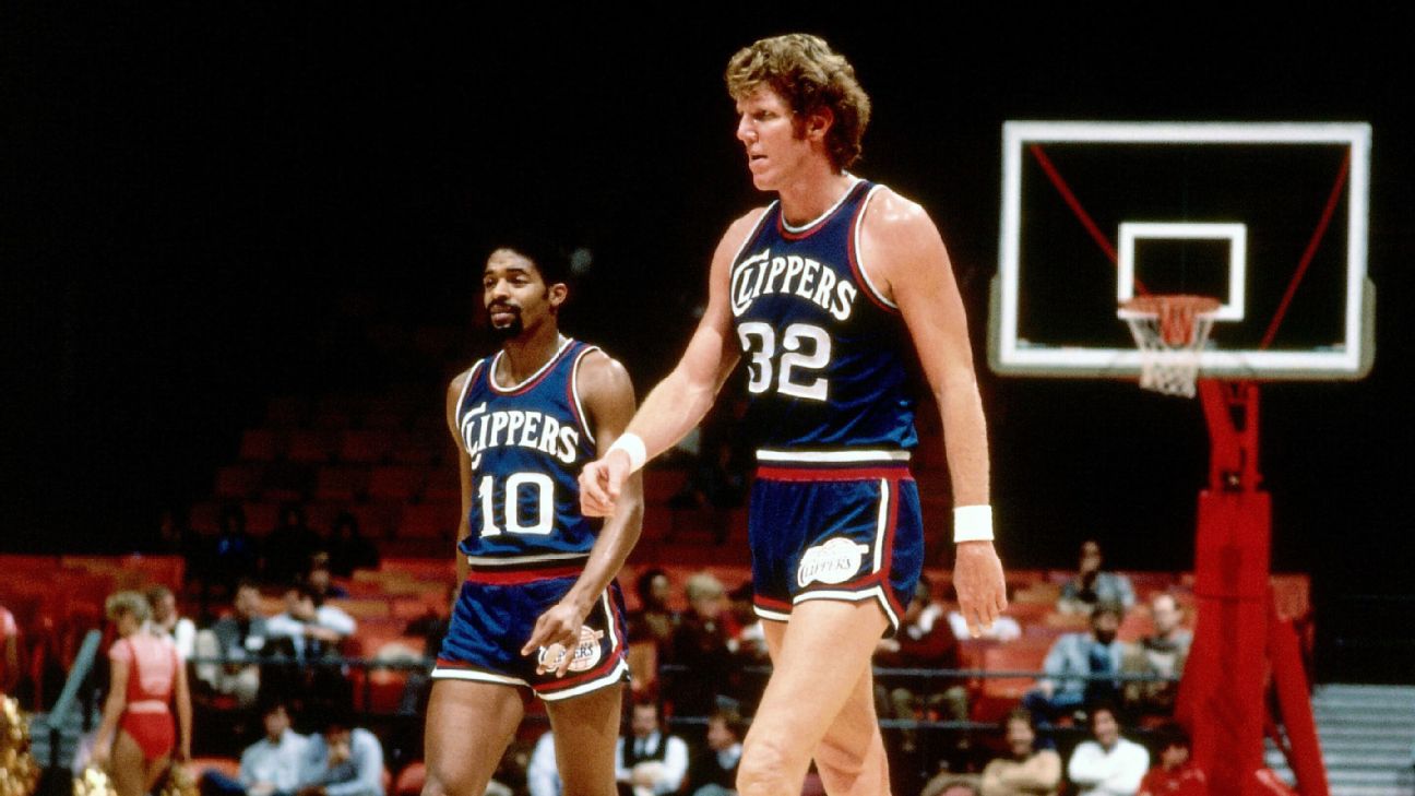
I totally forgot the Clippers wore navy in the early 80's.
-
1
-
-
The Clippers have done something I never thought they would do and that is lean into the team name for imagery. The actual logo has a damn ship in it. It's a miracle. The uniforms are great too.
For being the butt of jokes among NBA fans, they aren't jokes when it comes to their brand, they deserve props for this.
-
6
-
-
Modified classic Clippers wordmark! Thank god!
-
6
-
3
-
 like-
like-


.jpg)


MLB 2024 Uniform/Logo Changes
in Sports Logo News
Posted
It's funny you say this because the uniforms in The Show look way better than they do in real life at this point.