


Old School Fool
-
Posts
4,530 -
Joined
-
Last visited
-
Days Won
14
Posts posted by Old School Fool
-
-
1 hour ago, pepis21 said:
Numbers on shorts are pretty neat idea
Court:

The jersey was dumb but the court is even dumber. This is the most try hard city uniform I have ever seen.
"We're so cool, I swear to god that we are so cool! Please like us! We're so cool!"-
 10
10
-
-
Fans: Let's put emphasis on the Playoffs and Finals again! Put the logos on the court!
Adam Silver: Best I can do is just make you have a Purple and Yellow Lakers floor in November.-
3
-
 1
1
-
-
Normally I would be excited about unveilings and stuff but this In Season Tournament stuff is just really annoying me. I'm sure I will like some of the stuff but it's just so... I don't know, the NBA is evolving in a way that I don't even really recognize anymore from the uniforms, the ads, to various other things. The evolution of Basketball is turning into some weird circus sideshow.
-
5
-
-
5 hours ago, Cujo said:
Sockjacked.
I sure do love sockjacking. What a great word. Nothing suspicious about it at all.
-
1
-
 1
1
-
 7
7
-
-
On 10/27/2023 at 2:49 PM, SantosD_ said:
Nets using seafoam is plausible too, they used accessories in this color last season
-
3
-
 1
1
-
-
5 hours ago, ruttep said:
Sigh. Would have liked to see orange pants in this one. At least it isn't white pants.
Seahawks: Let's pick the Browns for a throwback game, it will look old school enough and fit the old AFC theme! This will be great!
Browns: SOMEONE SAY HALLOWEEN??? BROWN PANTS BABY!!!
If you're the Cleveland Browns then making smart decisions is very hard.
-
5
-
2
-
-
A nice surprise to see the Seahawks breaking the throwbacks out for a second game. Here's hoping the Eagles get a third throwback game in particularly on Christmas in my opinion.
-
Local NBA graphics update over here. Didn't bother posting the Space City Home Network because it's just the AT&T Sportsnet graphics, Spurts and Clippers air some games on local network TV but it uses the Bally Sports graphics.
Here's the Suns on Arizona's Family Sports (Notice it's shaped like the Suns logo):
Wizards on Monumental Sports Network:
And here is the Jazz on KJZZ:
-
1
-
-
NBA on TNT changed the network logo to say TNT Sports for some reason. They've kept variations of this graphics package for way too long at this point and it's starting to annoy me.
-
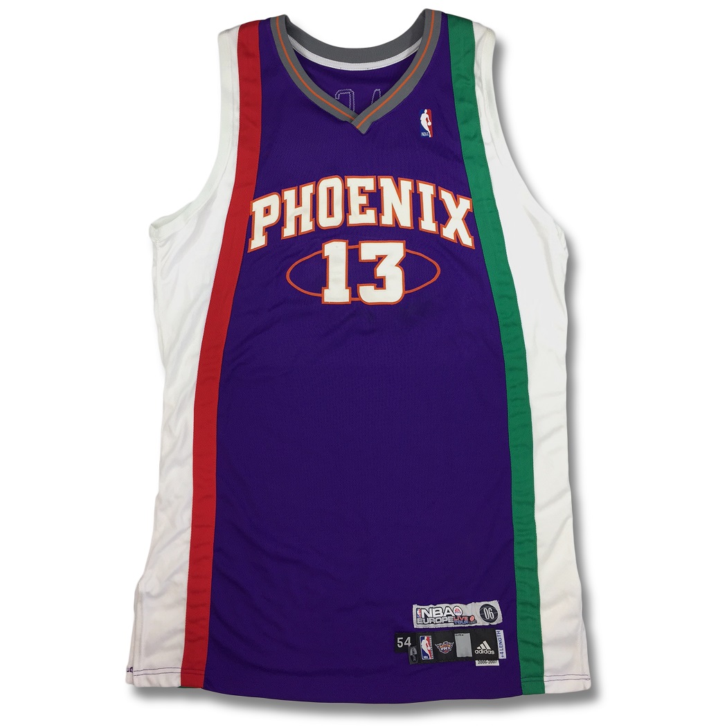
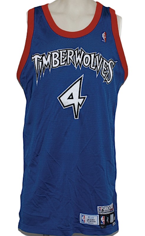
People talk about how weird NBA uniforms are now but I'm remembering that this dates back to 2006 when they had teams playing in Europe for a few years they gave them special uniforms with the countries flag and colors. The photos below are just a few examples of how weird and stupid it got.
-
4
-
2
-
-
I really appreciate that NBC added to the throwback vibe. This should be mandatory for networks in all sports.
-
8
-
3
-
3
-
-
Eagles need to get rid of midnight green as soon as possible. The throwbacks are incredible.
-
6
-
-
Not an entirely accurate Vet Stadium design but still very cool to see nontheless.
-
9
-
-
4 hours ago, throwmesomepics said:
Vegas should wear black that week, I still don't think that the Lions grey set should be used as a home set where the opponent wears white.
I have a fear that the Raiders will wear their white throwbacks against the Lions. They always wear it in primetime but I don't know. I love the uniform but against the Lions it will look real bad. I'm expecting the throwback on Christmas against the Chiefs.
-
1
-
-
8 hours ago, SantosD_ said:
despite the weird drop shadow I really liked it
What the hell is this?!
-
3
-
-
13 hours ago, DCarp1231 said:
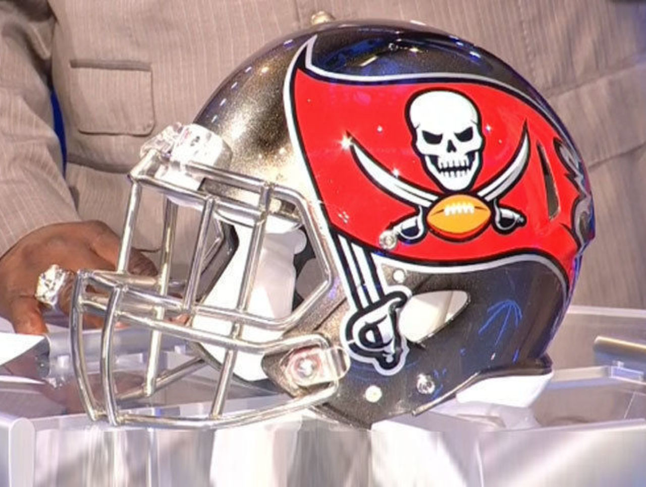
Wasn’t the intention of including pewter for the helmet to mimic a cannonball? If that’s the case, they missed the mark.
Funny you mentioned that because a forgotten element of the Buccaneers 2014 rebrand was that the Helmet had cannonball wear marks as stripes for the helmet. Unfortunately, as with the Jaguars 2-tone helmet, the idea of a spray or gradient effect didn't look how it should have in game. They got rid of it within a season or two.
-
2
-
 1
1
-
 2
2
-
-
2 hours ago, FiddySicks said:
You definitely weren’t in my house after Manning lost to Florida for the fourth time, apparently.
It’s not the colors. The reason I ever became a Bucs fan is because of the similarities to UT. It’s the creepy ass winking pirate, and the fact that it’s in two different shades of orange. When I was a kid, I legit could not make out the logo as a pirate. It just looked like a blob to me. Then one day it hit me what it was, and ngl, it felt somewhat unsettling. It’s like one of those hidden picture tricks where it’s a demon clownface hiding in plain sight in the fluffy bunnies fur or some :censored:.
When I was a little kid, I thought the old Broncos D logo was some weird cartoon character swinging a bat. Yes, I'm serious. When someone can't make out what a logo is you know you screwed up and yet here I am a big fan of the Quebec Nordiques logo because it's so bizarrely stupid.
The problem I had with the Broncos logo probably would have been alleviated if they, you know, didn't "modernize" the logo in 1992 and ruin all definition it use to have.
See this? I know what this is.
And now this? What were they thinking?
-
1
-
2
-
 1
1
-
 1
1
-
-
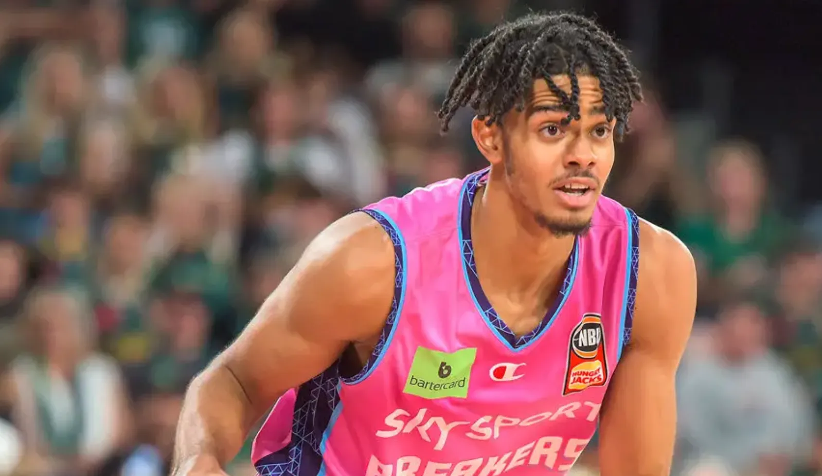
Was watching the Jazz play the New Zealand Breakers and I got a kick out of remembering that NBL teams wear the Hungry Jacks logo on their jerseys. For those who don't know, Hungry Jack's is a variant of Burger King in Australia and New Zealand.
However when I looked closer they had the Burger King logo instead! Did they change it just for the games in America?! That's a cool touch, even if I hate ads on uniforms.
Also yes, highlighter yellow vs. pink is something else. The Breakers uniforms were still better than the Jazz uniforms.
-
2
-
3
-
1
-
-
1 hour ago, ruttep said:
If you're gonna do a 90s theme (which I assume this is), you better wear teal/white/black again.
On another note, the Jaguars only co-existed with that 49ers logo for one year: their inaugural 1995 season. The Niners switched to the inferior updates to their 1994 throwbacks a year later.
The 49ers didn't even play the Jaguars until 1999.
-
2
-
-
The Buccaneers throwbacks.
-
11
-
-
6 hours ago, Digby said:
Possible city leak circulating around Celtics Twitter. I was kinda hoping they'd go for a Vice-esque rotation between various colorways of last year's Bill Russell jerseys... but, this could be acceptable, with a clean old-school wordmark and their underutilized gold trim.
Oh that looks really good.
-
2
-
-
9 hours ago, JELKK said:
This is the best pic I could find, since the TV angle (purposefully?) obstructs it, but the celtics moved Red's signature down to the very bottom of the court, in favor of the TD garden logos being relocated from the baselines.
Why is the jumbotron using the 80's logo? Is it back as an alternate logo now?
-
13 hours ago, oldschoolvikings said:
Buy the way, if you gave me the choice between switching the Cowboys to navy blue and sliver across the board or leaving them with the mismatched color mess they currently are, I'd choose mismatched in a heartbeat. You wouldn't even need to finish the question. Navy and silver is so boring and base-level wrong for the Cowboys. The current white uniform template recolored to navy and silver just might be the most nauseatingly bland uniform I could even conceive of.
The Cowboys obviously do need to streamline their colors, but it isn't in the direction of the boring navy/silver...
Now that is a beautiful uniform.
This also reminds me how much I miss big logos on helmets. The stupid vents on modern day helmets has ruined most helmet decals and now very few teams can enlarge the logo, not only that, decals just look better with no vents and a proper sphere shape. It's so weird.
I'm not saying I hate that we're trying to make safe helmets, I just hate how we can't seem to find some way to bring back the proper shape of a helmet.
-
On 10/5/2023 at 12:52 PM, currymvp2024 said:
Would you like me to call it lemon yellow instead? Alrighty. either way it is NOT the correct shade

You know, I seem to remember possibly the Lakers equipment manager or someone else with the team talking about this change for the Lakers and they said they heard fan complaints and were looking into it.
They haven't done anything about it since despite the constant complaints from us Lakers fans so it's clear to me they either like the banana yellow or Jeanie Buss is colorblind or something.


:format(jpeg)/cdn.vox-cdn.com/uploads/chorus_image/image/37039804/20140808_ads_av1_277.JPG.0.jpg)


/cdn.vox-cdn.com/uploads/chorus_asset/file/11469479/harvey_martin_dallas_cowboys_dl_image_taken_color_slide_73824076.jpg)


2023 - 2024 NBA changes
in Sports Logo News
Posted
It wasn't that long ago man...