


Old School Fool
-
Posts
4,530 -
Joined
-
Last visited
-
Days Won
14
Posts posted by Old School Fool
-
-
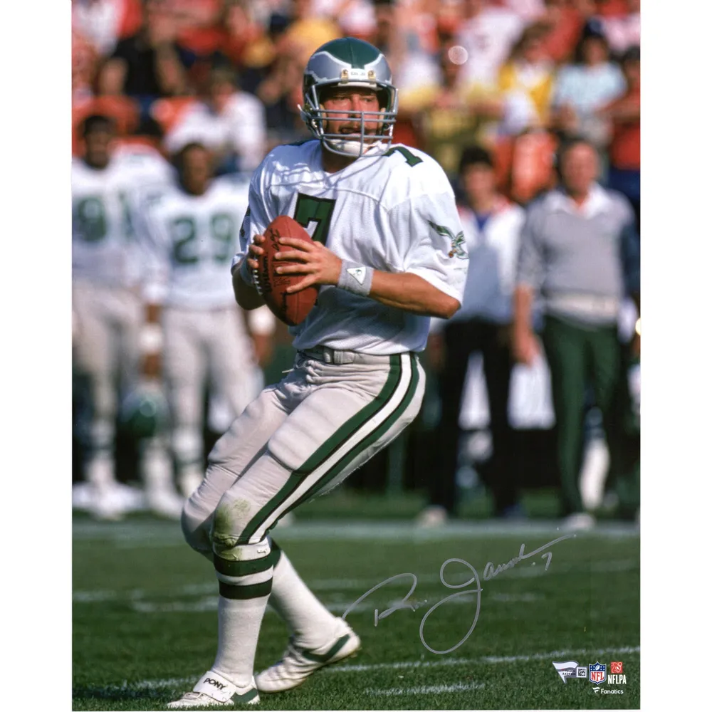
It's funny, I got into football as a kid when the Eagles switched to midnight green in 1996/1997. That's all I know personally and yet I have nostalgia for the 49ers Montana era look, likely because I live in the Bay Area and Montana era stuff was all over. Midnight green Eagles is all I know and yet I still believe kelly green is the superior look.
I remember I played Madden '97 when I was six years old and they had the '83 Eagles in there and I saw the green bird logo and was like "Wow what?" I want to go on record and say the full bird logo sucks as a sports logo. It's just not a logo to put anywhere.
-
Seems to me like the Carmichael era green the Eagles had was definitely darker green but auction photos of game used jerseys show it as brighter. Maybe lighting?

-
This new Suns uniform is better than anything they have worn in the last 24 years.
-
 10
10
-
-
Eagles didn't always have the shiny pants.
-
6
-
 1
1
-
-
Oilers in Vanderbilt Stadium was so bad. They had to use the college's turf design the whole season which is insane. Say what you want but at least the Liberty Bowl allowed them to put Oilers in the endzone and rid it of the college stuff.
Interestingly enough, the Nashville Parthenon was visible from the stadium in a bit of foreshadowing of the Titans name.
-
4
-
-
Anybody remember Titans vs. Oilers in 2009? I seem to remembr CBS even calling them by those names too several times.
-
11
-
 3
3
-
 1
1
-
-
15 hours ago, DCarp1231 said:
In 15-20 years we’re gonna be getting Bengals, Cardinals, Patriots and Vikings Reebok throwbacks
Honestly, it's almost guaranteed the Brady era uniforms will be a throwback for the Patriots in the future. Also, Adidas made those uniforms.
-
2
-
-
As a Raiders fan, I am glad I have another reason to dislike the Broncos.
-
2
-
4
-
-
Nobody told me the Knicks are changing the shade of orange and grey. It sucks.
-
56 minutes ago, SFGiants58 said:
His intro picture looks like Hide the Pain Harold/Internet Historian.
So much pain hidden behind that smile. He's probably gonna implode even more.
He thought he was done with his darkness retreat but he realized the darkness that lurks with the Jets.
-
2
-
 1
1
-
-
3 hours ago, oldschoolvikings said:
I guess I'm interested in uniforms from a visual standpoint, and don't really care about the team's record when wearing it. I can see why the normie fans would get bent out of shape by a team wearing a uniform they played terrible in, but that's not my problem... I'm just here for the fabric. This "but that team was terrible" attitude is what's keeping us from seeing a Steelers batwing uniform.
I don't really understand the "It was a bad team" reason for not having a throwback. A throwback uniform is about evoking nostalgia and making fans remember things no matter what.
Case in point the early 90's Sacramento Kings uniforms came back a few years ago. Those teams weren't very good and never made the playoffs, but there is a nostalgic sentiment about those teams, they may not have played well but fans have good memories and people remember the look.
-
4
-
-
1 hour ago, DCarp1231 said:
Uniform on it's own: Neat!
Uniform for the Colts: Terrible!
Final Verdict: This is doo doo baby!
-
5
-
-
5 hours ago, dont care said:
Yea but did these instances require alternate helmets that would require much more additional storage space than additional jerseys that will take up maybe 2 whole boxes and can be reused for different players. Helmets need to be custom fit and broken in before playing.
I listed 4 examples of there being alternate helmets. Whatever fitting and breaking in that needs to be done can be done. If teams want to then they will.
Also that Falcons throwback is amazing.
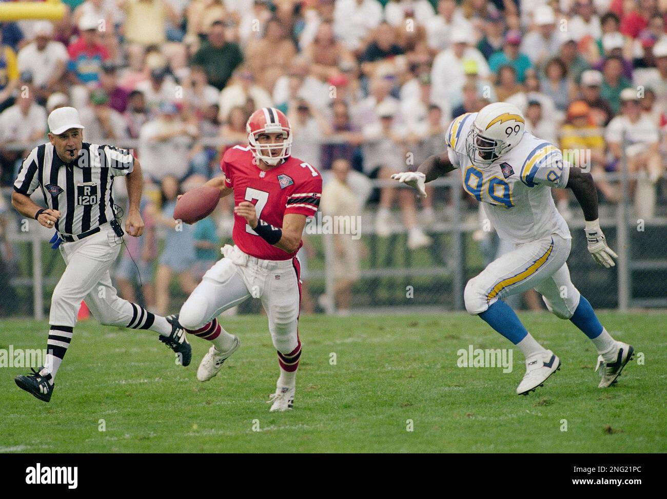
1994:
2009: Note the Bills weird off white helmet color which was a weird issue for teams for awhile.
2010: Colts in white at home
2022: This matchup SUCKS
-
1
-
-
3 minutes ago, BBTV said:
Gonna need citation on the Eagles, since even if I don't watch them, I generally see highlights and I probably would have noticed that. But I don't catch everything. I do remember the Panthers now.
They wore black over white pants in the 2014 Preseason. That was back when Nike screwed up the Eagles jerseys and they could only wear black or white until Week 10.
-
2 minutes ago, BBTV said:
Does that happen often? I can recall maybe once or twice, but I don't pay much attention to preseason.
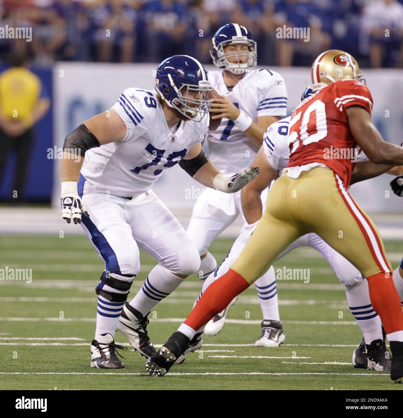
Off the top of my head it happened in the 1994 and 2009 HOF Games. Then there's numerous other games, I remember the Panthers and Eagles have worn alternates in the preseason, last year the Cardinals wore the black helmet for a game, and the Colts wore a throwback I think during the 2011 Preseason.
-
13 minutes ago, BBTV said:
Why would they waste helmets and uniforms on at least 40 players that aren't going to even make the team?
You could ask yourself that for the many times teams have worn throwbacks or alternates in the Preseason. Just because it's seen as a waste doesn't make it an impossibility.
-
If the helmet even happens I'm expecting the Browns to wear the white helmet throwback during the Hall of Fame game.
-
2
-
-
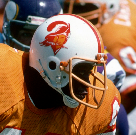
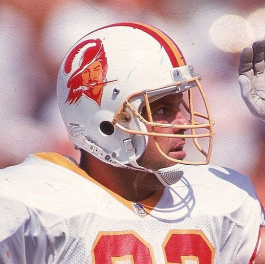
13 hours ago, CrookedThumb said:
As much as I’ve tried to master the Bucs’ uniform/logo history, I was today years’ old when I learned that they actually put that version of the logo on their helmets.It caused me to do some research to verify that they actually used both versions of the logo in the same season(s) (among different marketing mediums), and I just came across this eBay listing for a ticket stub to a 1979 game, where it looks like there’s a THIRD version of the Bucco Bruce logo that’s like a midpoint of the two we already know about.
https://www.ebay.com/itm/235088725858
(Sorry, can’t figure out how to embed an image of it from my phone)
I believe that's the original primary logo. 1976-1991 primary logo had minimal detail, the helmet logo had wonky detailing, then in 1991 they just streamlined the brand and made it a single more detailed logo both ways.
-
1
-
-
On 7/10/2023 at 1:50 PM, neo_prankster said:
The canceled Madden 96 for the PS1 was supposed to feature the Fox graphics package. However, not a fan of how the inverted the colors of the Raiders logo.
And here are the then new ones before they changed the graphics in 1998. We have all of them accounted for now.
They also seemed to realize the Raiders one was weird and fixed it.
-
1
-
-
The Bucco Bruce helmet logo changed in 1991 to the more detailed version.
1976-1991:
1991-1996:
-
6
-
-
17 hours ago, fouhy12 said:
This is so weird to see. Giants have never had their actual logo at midfield as far as I know. At least they went with the better blue/white version of the logo.
The Jets did it in 1998/1999.
However those same years the Giants had a Giants Stadium logo at midfield. It doesn't really count.
-
11 hours ago, tscuzzy said:
Portland, Chicago, Toronto, and Houston are all starting to look wayyyy too similar at a glance with their identical color red/black/white schemes. Because Portland and Chicago have a longer history with red and black, I think its on Toronto and Houston to switch things up. You could even throw Atlanta into this mix.
Who would even confuse the Bulls and Blazers for anybody else? They have some of the most iconic uniforms in the league. You see it and you know.
The only issue is the Rockets uniforms which are quite boring and lack character for a team themed on outer space. You would think they would look cool, obnoxious or have some pop (yellow?) but instead they look boring.
-
2
-
-
Broncos will be one of the dumbest teams in the league if they really have a white helmet with the all orange uniform. It makes no sense, much like the Lions one but in the Lions case the helmet looks cool. This has no chance of looking cool.
-
6
-
-
3 hours ago, Ark said:
He held to that line while he re-signed the EA exclusivity deal for football video games, so he better.EA makes the NFL brand look cheap with how little effort they put into their game these days. Yeah sure, I play the game but it's so far behind the other sports it's laughable. The most watched sport in America doesn't have a really good video game. It's baffling.
-
2
-


/cdn.vox-cdn.com/uploads/chorus_image/image/66679226/334138.jpg.0.jpg)


NFL 2023 Changes
in Sports Logo News
Posted
Not even on Christmas and only TWO games and not THREE.
Who the hell runs these uniform schedules that teams have? They're all so disjointed. The Bucs, Vikings and Eagles all have really beloved throwbacks and they're not maxing out the usage and against bad matchups too because... reasons?