-
Posts
4,539 -
Joined
-
Last visited
-
Days Won
14
Posts posted by Old School Fool
-
-
The jersey numbers saying 23 seem to be a pretty good indicator that this is probably happening. Usually when prototypes or media guides are out showing uniforms, the numbers on the jerseys correspond with the year of the season.
The numbers being used are the Cavaliers old numbers. Why the hell did they pick that? I've never seen a team take a custom number font like that. This leads me to believe this might be BS.

-
 3
3
-
 3
3
-
-
-
I really hope those perforated numbers aren't on every jersey, it will look stupid for teams like the Raiders, Bears and Packers among others.
-
 2
2
-
-
2 hours ago, Cujo said:
With the revised helmet rule (not that it's an issue for Miami), teams will have less of a desire to revert to a full-time throwback logo since they can bust out alternate throwback unis like 4 or 5 times a year now. Fans can now see the unis on-the-field all they want, so teams are less pressured to go full-blown identity change.
CC: Patriots, Bucs and Broncos.
What? NFL teams only have 3 alternate slots per season. Did I miss something?
-
1 hour ago, McCall said:
So the point of the ad placement for the batter is to be on the sleeve that faces the camera. Yet the ads for every pitcher is on their non-pitching sleeve… which faces away from the camera.


-
 6
6
-
-
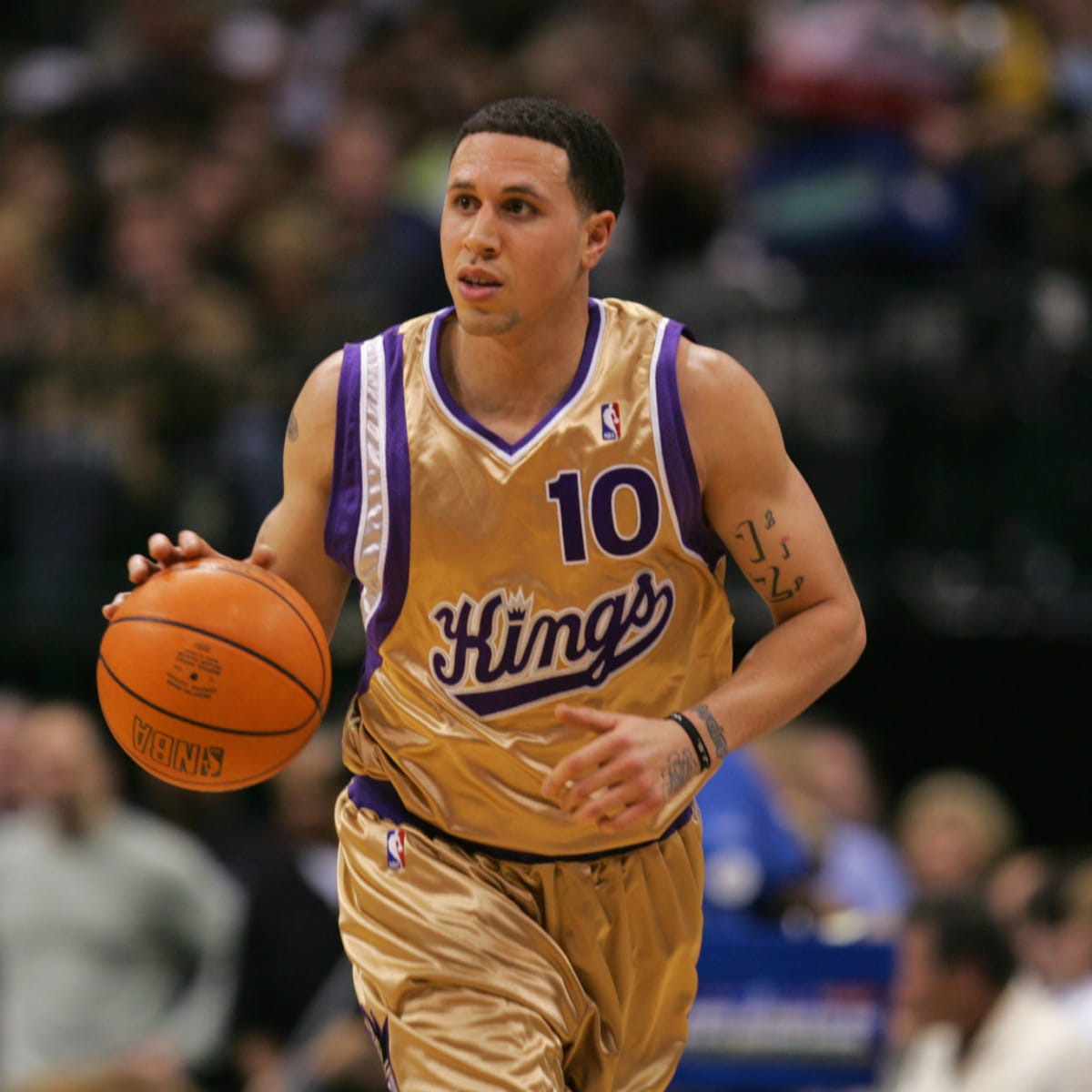
Why the Kings haven't used this more often is beyond me.

They used it on two alternates but when they did it didn't work with the rest of the uniform. Especially the black one, they just threw it on the Home/Away template.


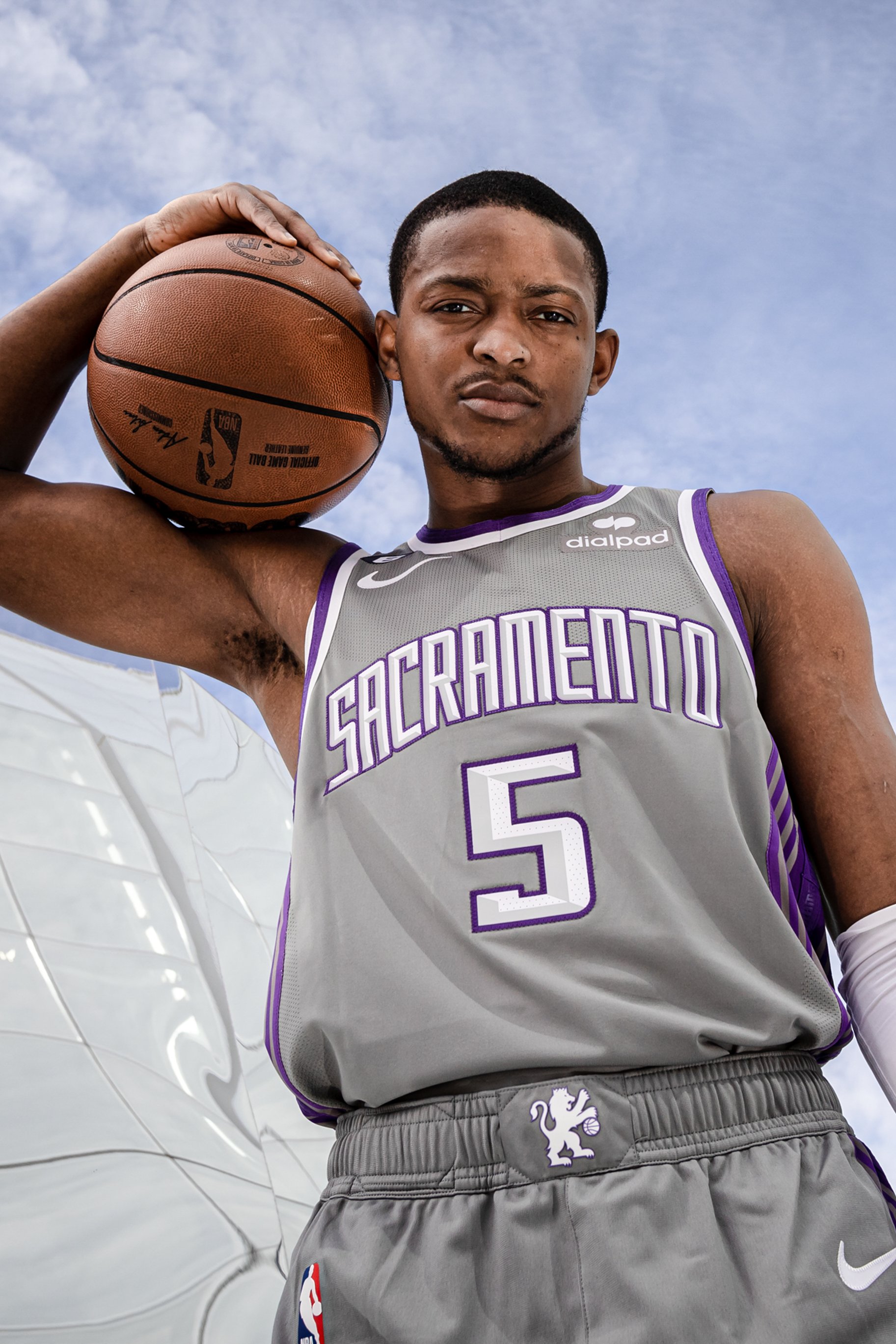
Speaking of Kings alternates, I actually really liked the City uniform this past season, they could build a new uniform set around it.

-
 8
8
-
-
2 hours ago, BBTV said:
Sign me up for a Puddin' Head Jones Phillies jersey. Hell, I'll preorder it RIGHT Fn NOW.
I want a full name jersey or it's not worth it. I want "Puddin' Head" on the back.
-
 1
1
-
-
53 minutes ago, adsarebad said:
Strange coincidence that the latest two City Connect jersey are very "retro"
Even stranger is that these jerseys are available with retired and even dead player name on them!
.
-
.
Now why the hell would you spend $500 on a 2023 jersey that these players never wore or will ever wear in a game??
-
Hank Aaron is dead for Gods sake!
Why would you wear a current jersey with his name, go to Michell and Ness instead and buy the real throwback jersey, that's "only" $300!
Talk about jersey foul! This is common sense foul!
Can't believe Nike actually made them .... + people are stupid enough to buy them.
-
End of rant.
-
The Braves City Connect is a tribute to Hank Aaron so it does make sense why that would exist.
It's the same reason the Lakers had the Black Mamba jerseys with Kobe's dual numbers on it because it was a jersey designed by him and at this point is a tribute.

-
 2
2
-
 1
1
-
-
4 hours ago, dont care said:
Because cars are the first things you think of when you think of Houston, or Texas. Much less stupid looking low riders with stupid looking knee cappers for rims. You don’t see jacksonville making designs after the stupid squatted truck fad that is a thing here. Because it’s just that a fad, and a stupid one that only fits a small portion of the local population and has no relevancy outside of it.
Way to be obnoxious about it. I don't think Houston's urban culture is a fad, it's been around for about 20+ years much like Memphis and Atlanta. If you don't like it then great but to act like it doesn't matter is stupid. What do you think team branding is suppose to be? If you can't pull inspiration from the people you play in front of then what is the point?
If the team wants to embrace something other than the outplayed space theme then I welcome it.
3 hours ago, HOOVER said:Thank you. Being here in KC this weekend, the people are all extremely nice, which is what I expected out of the midwest, but I didn't realize smoking weed was legal here, and it's so ungodly obnoxious smelling everywhere. I suppose that's part of the urban culture, too, but like custom low riders, I don't think that's something you brand a professional sports team after. Be better, Houston.
You just reminded me that the Fresno Grizzlies have a Lowriders alternate uniform.


-
 4
4
-
 2
2
-
 2
2
-
 1
1
-
-
3 minutes ago, batman1211 said:
I may have missed this, but did anyone notice the white Cowboy's helmet on the the Dallas draft table? It looked like the same star and stepping as their silver helmet. It looks good!
Where have you been? They wore it and it sucks.

-
 10
10
-
-
30 minutes ago, pelicanfan said:
i actually dig the red and grey look here. but then again i just desperately want the rockets to look different. if i saw the design of the red and black unis for the first time without the wordmark and logo i’d literally have no clue whose unis those would be. nothing about those unis feel houston-y or rocket-y. i mean i guess the shorts sort of resemble a rocket taking off. but i mean cmon now lol.
i wonder how they’d look if they went for a metallic silver i think the use of metallic silver would look better than dull grey. and no i’m not counting the old yao ming days when the entire jersey itself was shiny
(gonna borrow your edit here)
The 2003 uniforms had a shiny fabric and it's what made the silver work. Nike can still do it too as evidenced by the Celtics and Lakers 1940's throwbacks from the last few years but they won't do it with regular uniforms for some stupid reason. The shiny fabric was great for teams like the Rockets and Nuggets.

-
 5
5
-
 2
2
-
-
2 hours ago, Pigskin12 said:
C'mon, now they're teasing us with green socks with the road whites? We all know this won't happen.
My favorite thing about this image is remembering that the Meadowlands Arena still exists.
-
2 minutes ago, Cujo said:
Again, not a full uniform rehaul like we're talking about Denver doing. The Pats' helmet is unchanged. Colors remain the same. Flying elvis is still around. Lmk when they go back to their 1985 unis/logo full time. (Hint: they won't)
Pat Patriot is pretty much an alternate logo for them at this point though.
-
 1
1
-
-
You want to talk about ill advised rebrands after success, you cannot forget the Houston Rockets in 1995. For some reason they went all in after two straight championships. I have a soft spot for the look but the idea to rebrand was stupid regardless.

The issue with rebranding though is that it's planned in advance so the Rockets ended up winning right after the look was greenlit. Whoops.
"So the request to rebrand Houston happened in 1993, even before the won their first trophy. After the Rockets won their second NBA Championship, Rockets team owner Les Alexander requested the NBA postpone launching the new identity in the fall of 1995. Unfortunately, this was not possible as over $400k of official Rockets merchandise, legal fees and venue transformation costs had been spent and the League was not willing to absorb the team’s expenses."
I know this is the NFL thread but this is relevant to the discussion.
-
-
5 minutes ago, IceCap said:
I'd rather ban Reddit and all Reddit-related discussions then ban a single sort of criticism that you personally find annoying.
Fair point right there. Reddit speculation has never been any good.
-
 2
2
-
-
Team looks like Team is starting to become such an incredibly old and unoriginal take. I feel like this board should start taking measures against it or something. Yeah congratulations, they wear red and have stripes, unbelievable what a concept guys.
Nobody in sports owns anything. This is not copyrighted, trademarked, whatever. It is colors and stripes that date back decades. You're going to see common themes no matter what.
Please stop.
-
 8
8
-
 1
1
-
 1
1
-
-
4 hours ago, FiddySicks said:
It’s basically the original Phoenix Cardinals look with a modern twist.
This is exactly why I like it. They didn't screw around too much, kept it classic while also looking modern. That's about all you can ask for with this team.
-
 2
2
-
 1
1
-
-
Please...

-
 1
1
-
-
4 hours ago, TruColor said:
It’s not metallic, and it’s really not copper.
If everything that’s been described to me is true, then we will be getting a unique color palette in sports.
There’s really not much Black any longer, and Yellow will only be present in the helmet logo (as before).
I brought up the USC facemask. I must be right.
-
5 hours ago, TruColor said:
For the Cardinals, I heard that there is going to be a social media reveal today, and then the players will model them on Thursday.

-
 5
5
-
-
-
Best bet is a chrome facemask, alternate helmet decal on the main helmet.
I was thinking though, what if they had a gray/tan facemask like USC does? It sort of has a desert feel to it...

-
 7
7
-
-
I wish the Twins primary logo was this.

-
 4
4
-
 2
2
-


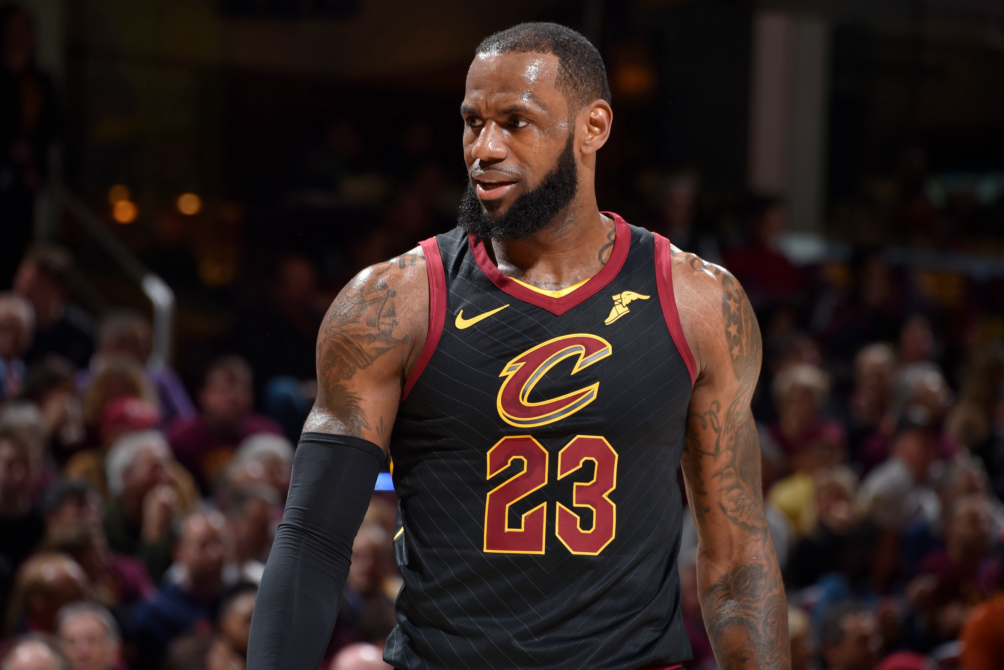














2023 - 2024 NBA changes
in Sports Logo News
Posted
Man, nobody remembers that late 90's Hornets look. I always forget it existed and those teams were unremarkable even if Baron Davis and Eddie Jones were notorious. I personally didn't like the look but it would be interesting to see return as a throwback, maybe I can learn to love it.