


Old School Fool
-
Posts
4,539 -
Joined
-
Last visited
-
Days Won
14
Posts posted by Old School Fool
-
-
Someone mentioned it but I have a strong feeling the Kings are going to get new uniforms and put black in more prominently. It's been an alternate only which has stood out like a sore thumb.
Also for some dumb reason their main court has been black for the last few seasons, I don't know why they do that when their main logo has no black in it, it makes it look weird and not right.

This isn't the only time the Kings have had a dumb decision regarding their court, remember in 2013 they had a 3D logo at center court. I've never seen a team do that before and once you see it you understand why.
-
 4
4
-
 2
2
-
 1
1
-
-
12 hours ago, aawagner011 said:
Padres to wear PCL throwbacks in a few days.
This would appear to confirm that the 4+1 rule does not apply to one off alternates or throwbacks. The Padres have white and tan pins, brown, camo, plus their City Connect.
If this is true, I think this means a club like Atlanta, for example, could wear their true 1974 throwbacks in addition to their regular rotation. My understanding is they just wouldn’t get the full offering of merchandise from suppliers as if it were a permanent uniform and all that comes along with that (Authentic Collection on field and replica jerseys, tees, hoodies, and caps from Nike and New Era, Stance, etc). This tells me the Braves City Connect was essentially a way to milk the throwback money train full time by making it an official uniform.
The Royals are going to wear Kansas City Monarchs throwbacks on September 16 too so one off throwbacks are definitely exempt. -
The helmet at least has to inevitably leak soon right?
-
I don't think I saw this anywhere but this was the logo the Spurs used for their games in Mexico and Austin.
-
3
-
-
On 4/6/2023 at 1:19 PM, DJT said:
Not good. But first city edition for next season has been released.
-
3
-
 1
1
-
-
1 hour ago, BBTV said:
I still, 25 years later, can’t believe that made it to a major league field - both the name and the jersey design.
since their throwback has already been modified to match their current colors, I’d like to see what it would look like if they dropped the Devil and matched the name as well.
I think it’d still give considered a throwback design, but make more sense if it’s to be a full-time alt.
So the old Batting Practice look?
-
7
-
-
22 minutes ago, FiddySicks said:
That ”throwback” annoys me to no end. It’s still got the original black and purple highlights, yet they paired it with the current pants with the navy piping, and made a brand new navy cap with the old logo to clumsily tie it altogether. It’s like, why in the world did they ever bring that throwback out of retirement if they were just gonna half ass it so hard?Finally someone points it out. It's extremely lazy and stupid. Also, Nike changed the front script gradient and it's pretty obvious.
What's weirder is I remember in like 2009 they wore black hats with the Ray on it which was inaccurate. The batting helmet and jersey script was accurate though.
-
5 hours ago, McCall said:
Who's gonna buy a "manager hat"? In baseball, the hat is literally part of the on-field uniform, unlike football, where it's merely sideline attire. The same hat needs to be worn across the board.
One of the best hats.
-
4
-
-
3 hours ago, Crow23 said:
Denver doing something.
Really? No Elway throwback? The Broncos continue to be a joke.
-
7
-
-
4 hours ago, Cujo said:
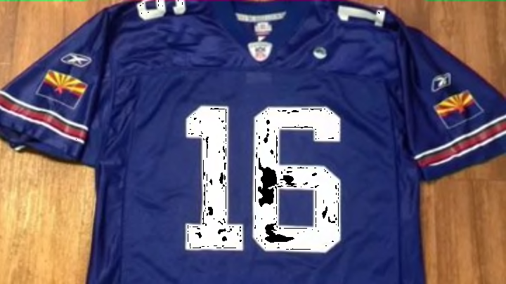
When they were pumping out fashion jerseys from the early 00s, someone checked off on a blue alternate (since I guess the AZ flag is 1/2 blue).
This would've been chaos had the Cards actually tried it.
I remember that, a gold 49ers jersey, a yellow Vikings jersey and a yellow Packers jersey in NFL 2K5.
-
4
-
-
All debuting MLB players will get a patch on their jersey. I've never seen this before in any sport.
-
All this talk about the Cardinals potentially getting rid of history and yet this is the first uniform they ever wore.
Remember when they wore blue and silver? No?
I don't think altering the shades is the worst thing ever, it stays in line with the general idea they've had since forever. We're not talking about the Yankees, we're talking about the Cardinals.
I'm more worried about the actual uniforms then the colors. You can change colors in sports all you want but if the uniform is garbage then it's a true failure and we've seen this with the Utah Jazz.
-
7
-
 3
3
-
-
I seriously doubt the Cardinals get rid of black. They just debuted the black helmet so they will absolutely keep a black jersey to go with it.
-
3
-
-
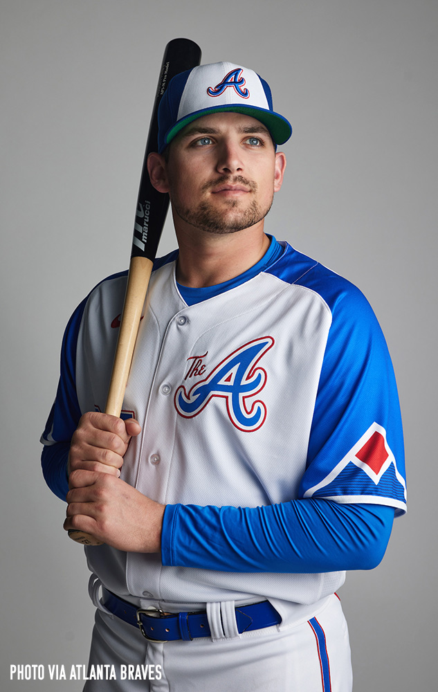
This is really really good. First City Connect of the year and we already have a good one.
-
6
-
-
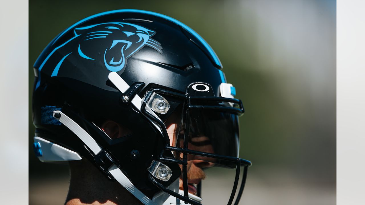
21 hours ago, MJWalker45 said:
Carolina needs to add an outline to the current logo if they are going to make black the primary helmet. Personally, I hope they don't.
I don't think so. The Panther needs to be hiding in the helmet for it to even work. Adding any outline would screw it up. It should be a transparent decal so that it blends completely otherwise it just looks weird and off like the alternate helmet.
How they did it:
How they should do it:
By the way the fact the logo doesn't have white eyes and teeth on the alternate helmet is one of the dumbest things ever.
-
26
-
-
16 hours ago, TruColor said:
I've been hearing a lot of noise lately on this one:
-
3
-
-
For the record here is a clearer version of the original Raiders logo. The one on the main site here is a bad recreation. I think this was a scan from a program or something. The logo used gold but the uniforms used yellow.
-
4
-
-
6 hours ago, BJ Sands said:
And because of the success of its shoes, it had the money to invest in uniforms. I wonder if seeing Jordan wear Reebok uniforms during the Barcelona Olympics compelled them to get more involved with uniforms.
It was Champion that made the Dream Team jerseys.-
2
-
-
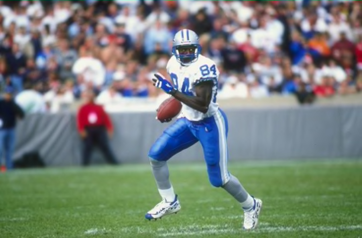
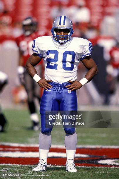
1 hour ago, Froob said:
Do people not like the Lions blue pants on the road? I think that’s their best look. I do hate the all blue look however.
I like this one much better.
-
13
-
 1
1
-
 3
3
-
1
-
-
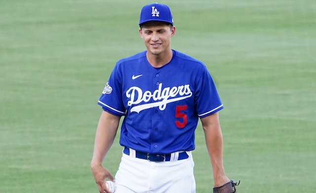
Saw some Dodgers players wearing the regular LA hat with the Spring Training jersey and it really drove the point home that they need to wear the blue for regular season games. It's just too good to never be worn.
-
10
-
1
-
8
-
-
There's this interesting quote about the Lions alternate helmet.
Quote“You maybe have three helmets because you have the (standard silver), then you take the logos off for the throwback, then we’ll have (the new helmet) for the grays,” Wood said. “Then, in 2024, we might have some additional uniforms, alternate, that we can wear with it.”
Sounds to me like this alternate could be their helmet for 2024 or it could easily fit into the uniforms for then.
By the way one of this site's very own dropped some interesting news.
Here comes the long awaited Browns white helmet and Elway throwback??
-
3
-
-
5 hours ago, dont care said:
It also doesn’t have the drop shadow on the inner angles too. That’s clearly just the current logo with some navy recolored in.
You're absolutely right. The 90's logo had that weird shadowing inside the letters and now that I realize this, it's the one thing that bothered me about that logo and I never realized it until now.
-
3
-
-
Milwaukee is like an hour from Chicago. Makes sense to me that Wisconsin would have some Cubs and Sox fans.
-
2
-
-
17 minutes ago, jp1409 said:
This is what they're using on Twitter and Facebook also. Having a turquoise accented main logo while 4/5 of their uniforms are featuring sand instead is absolutely dumb.
I don't think it's the true primary though, their website is still just the regular colors. It seems to be one of those stupid pseudo primary logos that have been happening over the past several years throughout various sports Los Angeles Rams in 2018 and some others.
No teal in sight for Spring Training too.-
2
-
/cdn.vox-cdn.com/uploads/chorus_asset/file/23172427/1237733497.jpg)


/cdn.vox-cdn.com/uploads/chorus_asset/file/11701851/4f7af376eab8eab021000013_480_448.jpg)


NFL 2023 Changes
in Sports Logo News
Posted
It does look nice with the script below the NFL logo though...