


kimball
-
Posts
2,650 -
Joined
-
Last visited
-
Days Won
8
Posts posted by kimball
-
-
2 minutes ago, tscuzzy said:

Absolutely disgusting.
It's just ... soooo ... cluttered.
-
 6
6
-
-
1 hour ago, andregunts said:
Guys please please please, tell me you guys love this

It's actually one of my favorite City designs. I'm not that crazy about the Indy wordmark, but they remind me of the '90s prototypes with the teal/light blue.
-
10
-
-
10 minutes ago, FinsUp1214 said:
Cracker jacks certainly weren’t $0.50 either.
Well, and in 2000 I'm pretty sure they didn't even sell Cracker Jacks at the arena.
-
1
-
-
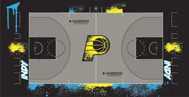
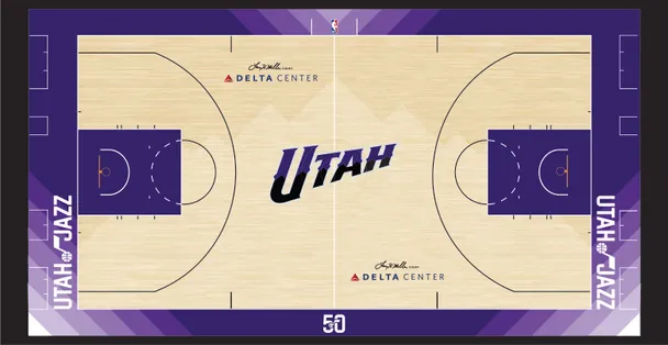
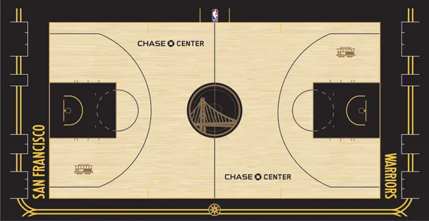
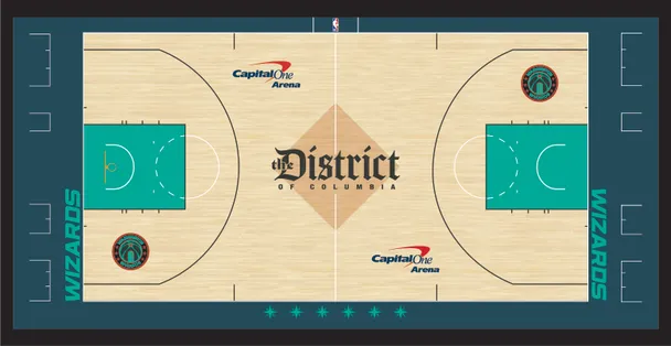
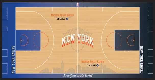
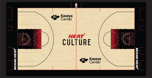
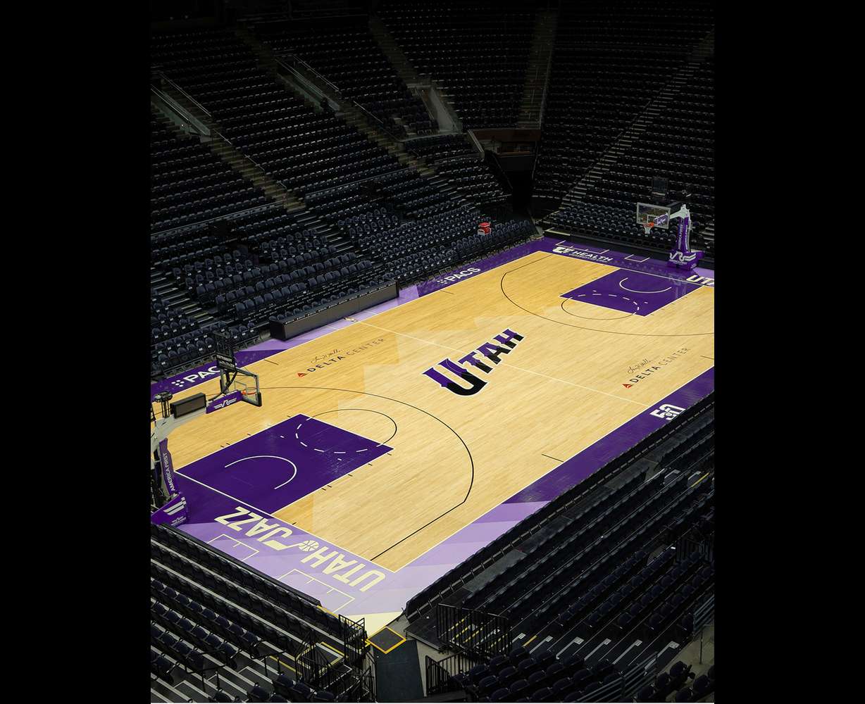
Per UniWatch today, it seems like (almost) everyone has a new court. Here are a few favorites ...
And, these ones can go straight to h*** ...
-
The Jazz's City Court.
-
10
-
 1
1
-
 5
5
-
-
6 hours ago, CaliforniaGlowin said:
The Suns have three new courts: statement, city and tournament. Wood is definitely not an issue. Do they recycle courts somehow?
From the ESPN article it seems most of the courts were bought or repurposed from the WNBA, so it seems so?
-
10 hours ago, spartacat_12 said:
Between this comment, and the Oceans Eleven inspired 'Heist' ad that the league has been running, they really seem to be leaning on the finals in Vegas as a selling feature for this gimmicky tournament. What are they going to do once Nevada inevitably gets their own team and the novelty of the league being there isn't around?
Clearly their logo, jerseys, court and identity will revolve around the runway.
-
Quote
The stripe running down the center of the court is supposed to represent the airport runway in Las Vegas, which will host the semifinals and finals at T-Mobile Arena on Dec. 7 and 9.
This is the DUMBEST reason for a design element I've heard in quite a while.
-
10
-
 4
4
-
 1
1
-
 4
4
-
-
1 hour ago, MauriceMorris13 said:
always wonder why do you care so much about home white and away color. it's not an american thing, considering that in american footbal the home team wear their color jersey. By the way, i know in the Nba has always been like that, but even if they go for achange, why would it be a problem? i mean for me it's even more righteous.
For the same reason why we like home teams playing in color jerseys in football -- tradition.
And, probably OCD.
-
3
-
-
16 minutes ago, Fowler said:
If Charlotte had a strong ownership group with a rock solid ballpark plan, they would be a shoe in.
I don't know anymore? Raleigh seems like a better option. But, outside of that, I'd still rank Nashville ahead of Charlotte if they're only taking one east coast team.
-
1
-
-
5 hours ago, GDAWG said:
Nashville isn't surprising to say the least. It's the best option of all of the expansion cities although I do not know how they are going to have the funds left over for a new MLB Ballpark, the new Titans stadium and any potential renovations made to Bridgestone Arena.
Almost feels like a Minnesota 2.0 stadium situation.
-
15 hours ago, TaylorMade said:Quote
we have six jerseys this year, especially with the in-season tournament
Yikes.
I have a feeling we'll probably see recolorings of currently worn jerseys for the In-Season Tournament like we've seen in the past with the Earned jerseys.
But, then again ... this is Nike. Who knows?
-
1
-
-
On 10/25/2023 at 12:53 AM, pepis21 said:
That OKC was a 75th Remix too.
Huh. I guess there's not much they can draw from, especially since they don't acknowledge the Sonics history, logos and colors.
-
17 hours ago, pepis21 said:
Yes, most. Look at the graphic posted by @SantosD_. Suns and Jazz not had new uniforms in that year.
Exactly my point. They didn't participate in the NBA 75 theming and stuck with a previous City jersey that's why they're on the list with the Pelicans, Grizzlies and Thunder.
Ideally, every team should have had a throwback. I love what the NHL has done with the Reverse Retro sweaters. I am sure the NBA probably would have done something similar (and they still should try it), but I am sure since they didn't want to CTRL + C + CTRL + P they got too creative with the jerseys.
The differing elements may work better on some jerseys than others, but for the most part their ugly and a visual mess. I'm glad my Jazz didn't go along with the program.
-
 1
1
-
-
20 hours ago, CDCLT said:
You look me in the eyes and tell me that this jersey was good. It's only saved from the absolute bottom because of Miami's serial killer set.
Fair. It's not good, but at least the elements are cohesive unlike the NBA 75 jerseys.
-
2 hours ago, pepis21 said:
Oh c'mon, most of 75th Remix uniforms was truly amazing, best batch of City without a doubt.
MOST? We were watching the same games right? The only teams that knocked it out the park that year with their City Jerseys were the Pelicans, Grizzlies, Jazz, Suns and Thunder.
-
1
-
 1
1
-
4
-
-
36 minutes ago, SantosD_ said:
And it worked very well
I'm not sure if that's sarcasm or not ...
-
1
-
-
30 minutes ago, Lights Out said:
I doubt Nike or the NBA would cut down the uniform rotation, but I could see them changing the prompt from city/local-inspired looks to something else.
Which they KINDA tried doing with the NBA's 75th anniversary.
-
Okay, Those Are Cool
- Boston Celtics (It feels like Boston and is just sharp. Maybe a LITTLE too busy with the sides?)
- Charlotte Hornets (I want to rank these lower, but I like the teal and mint combo for some reason?)
- Detroit Pistons (I really like this jersey especially with the tie-in with the Bad Boys and Chuck Daly. I feel like if you added some blue and eliminated the skulls it could be a good base for regular rotation jersey for the Pistons)
- New York Knicks (I want to hate the New York New York design element they have, but I love the simple creativity of it, and the colors are on point).
- Sacramento Kings (I love this jersey, should have been their NBA 75 City Jersey)
Eh, They're Alright, I guess?
- Atlanta Hawks (These are bland, but not offensive).
- Chicago Bulls (I love the idea for this, but I feel like the spacing is off and missing 1 or 2 elements to complete it).
- Cleveland Cavaliers (This trend for designing jerseys after carpet should stop. It'd be lower, but the colors make it work more than it doesn't).
- Golden State Warriors (I like the colors, especially the yellow and Vegas golds, but I feel like the wordmark is just forced a bit too much).
- Indiana Pacers (I don't know why I like these they're VERY much the '90s and remind me of their proposed changes from the '90s as well. The Indy font is not needed).
- Memphis Grizzlies (Meh. And, its sad that a Meh on these jerseys means they're better than most).
- Oklahoma City Thunder (The sublimation is a bit too much, but I love the orange and gold on black. The colors keep it from going lower).
- Phoenix Suns (I want to hate these, but the colors are sharpe and I love the numbers on the jersey).
- Portland Trail Blazers (When are we going to get a completely plaid jersey? It's a matter of time. It's a fun design and tie into team history, it works as a City Jersey).
- Toronto Raptors (Eh).
- As a Jazz fan I love that purple is back. I am just not sold on this design. It just seems like too many elements going on at that the same time. The Utah wordmark just doesn't work.)
Gross, why wear these?
- Brooklyn Nets (Probably be a WTF? if they hadn't already established their M.O. with past jerseys).
- Dallas Mavericks (It's not offensive, yet not needed. And, it's definitely not inspired).
- Houston Rockets (The whole H-Town nickname is gross, I'd almost rather have them lean into Space City or whatever the Astros are doing with their City Connect).
- Los Angeles Lakers (I don't want to burn these, but I hate them. I don't care if the wordmark has history behind it, it's just not a good design).
- Milwaukee Bucks (I want to like these more, but I hate the arch and the fact blue isn't a Bucks' color. So help me if they win the championship in these ... ).
- Minnesota Timberwolves (The wordmark is too small and the water pattern looks more like smoke ... just not good at all).
- Orlando Magic (I hate the whole magician thing they're going for this. Not only does the design feel uninspired, but they look like the Dallas Cowboys).
- Philadelphia 76ers (I get the historic aspects behind the design, but it just doesn't work. The wordmark logo is too small).
WTF? Burn it down, start all over
- Denver Nuggets (I hate this jersey. Hate. It. The altitude is just not needed as a focal point to a jersey! Put it on the waistband or shorts. This is just dumb).
- Los Angeles Clippers (This jersey is depressing. Not only is the wordmark lazy, but the colors are so bland, I can't wait for the backstory on the flowers).
- Miami Heat (Dumb).
- New Orleans Pelicans (I keep looking at these wanting to like something about them, but I can't. The font and colors look like a clipart job. Burn it. Give us Mardi Gras colors).
- San Antonio Spurs (Wait, why are they honoring Taco Bell?)
- Washington Wizards (Too many colors, too many dark colors, too many design elements. Gross).
-
2
-
1
-
1 hour ago, Cujo said:
These are brutalllllll.
So awful, I'm not even concerned about the BFBS.
Yeah, I absolutely hate these.
-
2
-
-
That Nuggets jersey is woof. I'm surprised the NBA approved it with that many numbers.
-
4
-
-
14 hours ago, tBBP said:
Yeaahh when you have to resort to staggering jersey numbers you know you done ran out of ideas. Perhaps it's time to shelve the whole city thing for a season or few...
In a vacuum I don't HATE the jersey (mainly because they're in team colors), but they need to tweak the jersey program.
I don't necessarily mind the Association, Icon, Statement, City, Classic, Earned, etc. names. But, the NBA and Nike need to lean more on history and tradition. Meaning ... no gold/green matchups of the Celtics and Lakers in the Garden, no road teams in white jerseys (it should be either home team in white and road team in a colored jersey or color vs. color) and during the playoffs limit the jerseys to Association, Icon and Statement (no throwbacks, city or earned).
But, I think the rotation rules need to be changed a bit as mentioned above.
- ASSOCIATION: Can (not should, take note of that Nike) be changed every 5 years. Only worn at home (with very rare exceptions).
- ICON: Can (not should, take note of that Nike) be changed every 5 years.
- STATEMENT: Can (not should, take note of that Nike) be changed every 5 years. This used to be three, but it really should be on the same rotation basis as the Association and Icon editions. Statement editions should also fall in line with official team colors, fonts and imagery (meaning no more Lakers in purple/black, Pistons with their current edition or city nicknames (those should be for city editions only).
- CITY: Are changed every 3 years. I think the MLB model here would be great to follow, every year 10 teams get new City Editions. I think slowing the rotation down to every three years will help designers stop reaching for designs, tie-ins to the city or area, and everything we complain about here on the boards. I would argue that colors SHOULD be team colors or at least have some kind of tie-in, but Utah's red rock sunset jerseys were wildly popular (at least here). But, keep the city nickname, airport code jerseys and tribute stuff to just these jerseys. They should be special, but are they really special when they're changed almost every year?
- CLASSIC: I believe the current rule is any anniversary ending with 0 or 5 is eligible for a Classic Edition jersey? Which I have no problem with. I just hate turning into a game with teams wearing throwbacks against current jersey designs, especially on the road. These should be limited to home games more often than not (which I think most are?). I would also love to see the NBA/Nike adopt baseball's throwback practice of dressing up the other team in that era's throwback as well. That'd be fun to see the Lakers in '60s throwbacks against the Knicks, Bulls, Celtics, 76ers, etc. in similar era jerseys, even for one night. Nike could even play around with fauxbacks with the Hornets, Magic, Heat, T'Wolves, Raptors and Grizzlies for '70s or '60s games.
- EARNED: If the NBA slowed the City Edition release every three years, this could become a yearly thing for the previous season's 16 playoff teams. I think you could have some fun with these jerseys. You could either do recolorings of the Icon and Statement Jerseys (like seasons past), do a Reverse Retro-like treatment on throwback jerseys or something uniform among all 16 teams. You could even rotate the themed yearly. I think the NBA Champion should have an Earned Champion jersey that is either trimmed in gold or displays an O'Brien Trophy on the jersey (maybe even stars for the times won?).
- CHRISTMAS: I just want the return of the Christmas jerseys. One off jerseys for the 8-10 teams playing on Christmas is fun and it should be special. Make them special either with the Christmas font like Adidas did or some kind of uniform quirk. I'd love to see an emphasis on MLK Jr. Day and St. Patrick's Day as well.
Anyways, TL; DR ... The NBA needs to slow their roll on the City jerseys, use more team colors and branding and put more detail and purpose into when jerseys are worn.
-
8
-
1
-
2
-
24 minutes ago, Tore said:
Was just about to post it! A tribute to basketball and James Naismith. I am looking forward to seeing more of this. The sidepanels looks like old basketball court floor, yeah?
Is it James Naismith or a tribute to the Boston Garden?
-
2
-
-
3 hours ago, henburg said:
I saw that the Houston Rockets changed their profile picture to this for a couple of days before reverting back to the normal primary logo. It's likely nothing, but does anybody have insight as to what this is?
Pushing the reset button again?


2023 - 2024 NBA changes
in Sports Logo News
Posted
Here is Indiana's court with a game in progress. Ummm ... it's definitely different. Kinda seems feels like a FIBA tourney game or something?