


kimball
-
Posts
2,649 -
Joined
-
Last visited
-
Days Won
8
Posts posted by kimball
-
-
7 minutes ago, currymvp2024 said:
what crap was there besides the sleeved jerseys maybe?i haven’t even mentioned Nike forcing teams like the lakers, warriors and pacers to coincidentally all switch from gold to banana yellow. I guarantee if someone else takes back the rights from nike, these teams will all coincidentally switch back to gold.
I'm not convinced that Adidas wouldn't have pushed jersey design in the same direction Nike has. They pushed it, not just with sleeve design, The precursor to the City Editions were the Pride Jerseys. The NBA has been pushing the direction of jersey design here more than any manufacturer ...

-
 3
3
-
 3
3
-
 1
1
-
-
1 hour ago, pepis21 said:
New warmups via 2k24:
They're not bad. Granted, this is straight from a video game so they'll look **different** IRL. They remind me of a track suit and if that's the standard for all teams, I'm going to die on the "BRING BACK THE TEAM SPECIFIC WARM-UPS" hill.
-
10
-
 5
5
-
 3
3
-
-
4 hours ago, Germanshepherd said:
I love everything about it except the midcourt graphic.
-
5
-
-
1 hour ago, eRay said:
Wolves are putting up a sign inside Target Center confirming the white throwbacks.
HECK YES! I LOVE DOUG WEST!
-
2
-
-
3 hours ago, ChiharuShiba said:
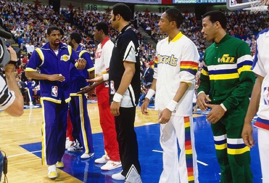
i loved the aba retros during the adidas days and hope the nba circles back to them one day.
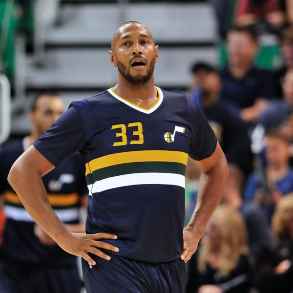
I just want the Jazz to throwback to the Stars JUST ONCE. Doesn't even matter which jersey ...
-
4
-
2
-
-
Huh. Seems like gradient heavy handed courts are the new painted three-point area/two-tone wood/unpainted key court fad. Don't know how I feel about it? I'll wait for final judgement once it hits game action.
-
1
-
-
4 hours ago, BadSeed84 said:
I think teams can only wear throwbacks during an anniversary.
The 76ers anniversaries coming up based on when they celebrated it before.
The 80th season the entire franchise: 2025-2026
65th season of the 76ers - 2027-2028
So they may finally bring out the Iverson's in 2025-2026.
I believe they use the anniversary loosely though ... as in, it was 20 years since this/that happened, let's wear throwbacks.
-
2
-
-
1 hour ago, gosioux76 said:
This is the right response. I dislike dress codes in general. They're a tool for micromanagers and another means of stifling personal identity in favor of homogeneity. What you wear doesn't affect what you do.
Except for football ... and maybe hockey.
-
1
-
-
14 hours ago, the admiral said:
Salt Lake City doesn't touch the Great Salt Lake. Increasingly, water doesn't touch the Great Salt Lake, either.
To be fair, nothing is really touching on the every-shrinking GSL.
-
2 hours ago, 5ss22 said:
I don't love them but I'm excited to see the alternate court.
Are we sure they're getting one?
-
24 minutes ago, Germanshepherd said:
https://x.com/timberwolves/status/1690799548048793600?s=46&t=kT6N7NHJEiLHMRoXB5Naaw
Looks like itd be a better license plate/tourism billboard than a jersey, but still works pretty well.
Also, I guess tweets don’t automatically embed anymore. Thanks Elon.
-
4
-
3
-
 3
3
-
 1
1
-
-
18 hours ago, CardsFan79 said:
Ultimately, my opinion doesn’t matter. I’m a Bulls fan first and foremost. I root for the Jazz as my second team, mostly because Jerry Sloan was my neighbor throughout the 90’s.
Jerry was great. I had a few interactions with him as a kid here in Utah. One, where he called me a "sneaky ass kid" at a sports card show because I brought over 15+ things for him to sign.
-
 2
2
-
-
On 8/4/2023 at 9:32 PM, GDAWG said:
Return of the Holy War between Utah and BYU
As a fellow Utahn ... I'm not sure how excited I am for this?
-
4 hours ago, Old School Fool said:
Can this be an alternate home jersey for the Tigers? It looks very nice. When's the last time they had a jersey saying Tigers anyways?
Only the 1960 season ...
-
1
-
-
22 minutes ago, DustDevil61 said:
I think what’s left of the Pac-12 (whoever may still be on board) will merge with the Mountain West Conference, possibly taking up the Pac [Insert correct number of members here] moniker, or some combination of Pacific-Mountain Conference.I jokingly tweeted #USUToThePac12 when Utah State’s football program was finally looking good. Little did I know that I could very well be right, though certainly not in the way any of us envisioned.
Anyways, Larry Scott is cackling on his yacht somewhere.
I had the same thought about a merge keeping the PAC name, but at this point just kill it and invite WSU and OSU to the Mountain West.
-
1
-
-
2 hours ago, buckeye said:
That's a believe it when you see it type of report
At this point I kinda believe everything ...
-
3 hours ago, henburg said:
The Pelicans just play it way too safe with their brand in general.
I agree. For a city as eccentric as New Orleans their brand plays it REALLY safe. As a lifelong Utah Jazz fan I must admit it'd be interesting to see how the evolution of the team's brand would have gone if they stayed in New Orleans.
-
2
-
-
4 hours ago, MrAstrodome said:
I like the Fiesta colors.. It was always jarring when they had the Fiesta logo on their court and warmups and yet switch to black and silver. The 20-21 and 21-22 City editions were perfect.
I love the fiesta colors, but honestly ... I'd like the colors incorporated in their "Statement Jersey," especially one the style of the black one. Those are sharp. I'd just rather them stick to the black, silver and white for their more traditional look.
-
5
-
-
12 hours ago, ChiharuShiba said:
Wishful thinking here, but I'd like to see the Timberwolves incorporate (or just outright bring back) the Minnesota Muskies look into their City set.
I can see them (possibly) doing a throwback, but their '89-96 sets are basically an incorporation of the Muskies' plain set.
-
1
-
-
5 hours ago, Lights Out said:
The color change (and Lakers-ripoff logo) already happened in San Diego a couple years before the team moved. It had nothing to do with the Olympics, just Sterling having awful taste on top of all his other terrible qualities.
It definitely didn't have anything to do with he Summer Olympics, but 1982 (when they changed to R,W,B) it was supposed to be the year they moved to LA.
-
2 hours ago, FinsUp1214 said:
The Kings’ new set looks like an homage to multiple Kings eras at once, and if that was the intention, I think they did a pretty good job of it. I think I myself wouldn’t have gone with that particular side panel design - I think id have just done something on the shorts and not the jersey - but it still looks fine and works if the blending of eras is indeed what they were going for.
To be honest, I actually don’t mind the higher emphasis on black either. It helps to distance them a little from the purple primary teams in thier own division (Lakers and Suns), and the black uniform especially has some nice shades of the 90’s set. The switch of color hierarchy, at least to me, seems more intentional than “cool” and it’s working better to me than I thought it would.
The third uniform is a really cool idea, but I don’t think it’s executed as well as it could have been. I don’t think it needs “SACRAMENTO” over the “KINGS” word mark, and I think if the checkers on the side panels were black and silver/grey, it could have looked like a much better homage to the 90’s alt. As it is, I think it’s too heavy on the black and purple, and isn’t as balanced in color as it could be.
Your post brought a thought in mind that this might be the start of a trend. I could see teams going this route of honoring multiple eras in future designs. Sure, there's the 75th anniversary uniforms, but there was little cohesion there (not to mention a one year thing for most teams). But, teams like Golden State, the Clippers, Dallas, Houston, Atlanta and Philadelphia could make that work and do well with it.
ADD: I guess you could say it kind of started with Cleveland's recent redesign.
-
2
-
-
4 hours ago, bushy said:
Is it weird that I’ve gotten used to the ads on jerseys ? They look so weird with that blank space now lol
Sadly me too.
-
22 hours ago, Discogod said:
I wish they'd put the NoB under the number, but these are a huge upgrade.
Seconded. NoB under the number would be perfect and a good nod to team history.
-
2
-
-
22 hours ago, FinsUp1214 said:
If the Kings did a purple and grey or black homage to either one of these sets with the new wordmark, I’d be pretty darn thrilled:
They have to also have the names under the number.
-
2
-


/cdn.vox-cdn.com/uploads/chorus_asset/file/19923369/gettyimages_140144142_612x612.jpg)
New Patreon logo
in General Design
Posted
Yesh. I saw the new icon on a tab and figured this happened. Pointless change.