


sky1324
-
Posts
2,410 -
Joined
-
Last visited
-
Days Won
4
Posts posted by sky1324
-
-
13 minutes ago, Cujo said:
And they're official.

This is absolutely gorgeous. These should come back to the NFL full-time. The only change I'd make is putting the numbers on the shoulders so the stripes can shine on the sleeves. (Oh and also give them back to Houston.)
-
 9
9
-
-
6 hours ago, Chawls said:
Can someone please provide a quick recap of the teams who are scheduled to have throwback uniforms for the 2023 season? I’ve legitimately lost track.
New England, Tampa Bay, Atlanta, Dallas, Cleveland, Seattle, Minnesota, NY Giants, NY Jets, Philadelphia, Tennessee are all new throwbacks from either this year or last. You could also include Chicago, Green Bay, Miami, Detroit, and Buffalo if you wanted to.
-
11 hours ago, GDAWG said:
I keep mentioning the Saudi's because of them wanting to invade US sports. Musk is too busy feuding with Mark Zuckerberg and Jeff Bezos isn't likely to be a soccer fan and if he is, it's the European kind.
I don't understand your point. You say they "want to invade US sports" but I can't think of any example of that. I think there was a Saudi-backed group for Vegas in MLS but that's about as far as it goes and they didn't even get a team. I can't say I know every single owner of the Big 5 in America but I'm pretty sure none of them are Saudi.
-
1
-
-
The only way I could ever see MLS doing any kind of pro-rel is a closed system, two-league method with 20 teams or so in each each. This lets MLS keep expanding beyond 30, gives some kind of pro-rel drama in American soccer, and keeps MLS as a "franchise" league with owners paying to be in the closed system of MLS. I don't think that will ever happen but I think it's the most realistic. USL will never have the funds to compete with MLS.
-
1
-
-
22 minutes ago, Pigskin12 said:
They can wear them three times but instead are choosing to wear them only once for a non-primetime game, which is why I feel like all this hype is excessive.
I know. They should be allowed to wear them every game.
-
2
-
-
The Buccaneers should be allowed to wear those jerseys every game. They don't need any other jersey.
-
5
-
-
Brilliant work! A truly impressive accomplishment to have done this for California twice and now Oregon.
-
3 minutes ago, Conrad. said:
We've seen games of 2 of the 3 teams changing already. Obv, the Kings + a team that is barely changing wordmark treatment, not being reflected in the Summer League template.
The 3rd team is only playing in Vegas, so we'll (hypothetically) see the new wordmark soon.The teams that have played so far are the Heat, Lakers, Spurs, Hornets, Warriors, Kings, Grizzlies, 76ers, Thunder, and Jazz. We've already seen the Kings and the Warriors aren't changing. My guess is the 76ers, who, if I'm remembering correctly, adjusted the drop shadow on their red uniforms last season, so my guess is they're applying the same new drop shadow treatment to their white and blue jerseys.
I wouldn't be surprised if the 3rd team is the Mavericks or the Pelicans - the Mavs seem to have been on the verge of a redesign for years and the Pelicans just swapped their global logo, maybe with new jerseys to go alongside?
-
1
-
-
53 minutes ago, sayahh said:
Unsure if also covered/mentioned, but now that MJ is selling/has sold the team, will the Charlotte Hornet keep using the Jumpman logo for all jerseys instead of just on one like the rest of the league?
He's still a minority owner, so I assume we'll still keep the Jumpman logo on every jersey.
-
2
-
-
6 minutes ago, gosioux76 said:
It seems pretty clear the Chicago road race was a fail for NASCAR,
Does it? It's clear not everyone liked it but almost everything I've seen online has been extremely positive. I'm sure attendance was great and I'd bet TV numbers were great as well, even with the rain delay.
The race wasn't the best NASCAR race I've seen but it was pretty good. Wet conditions definitely helped. Definitely a racier track than most (myself included) expected. It was an exciting race without much of the buffoonery that usually goes on at road courses (looking at you, Indy). I'm not going to say it was perfect and I don't really agree with how NASCAR handled the darkness thing, but their hands were tied and by modifying the length during the race instead of just calling it around lap 75 they at least provided teams a way to strategize around that, even if it did kind of screw over several drivers. There wasn't any winning there.
NASCAR got shortchanged by the weather this weekend. Without the rain, fans get to see the concerts, the races, everything would have gone better than it did, but the weather is out of NASCAR's hands. They did everything they could to let the fans see the race and at least they were able to end on a high note.
As for "disregarding their old fanbase" - yes, NASCAR is trying to branch out. But this time, it seems to be working, at least, better than their attempts in the 90s and 2000s. Having been to both LA races, the event itself was a huge success with a pumped and packed crowd, even though the racing in my opinion was pretty boring. Plus, literally two months ago NASCAR was at North freakin' Wilkesboro for a race that was, in my opinion, worse than what Chicago just put on! They're trying to return to Nashville Fairgrounds! Rockingham could make a NWB-style comeback! It's pretty obvious to me at least that NASCAR is trying to reach new markets, but they're also trying to reconnect with their roots to make sure the old fans aren't left behind like they did 20 years ago.
I'm not even a road course fan. I think the Cup Series has too many. I hate that Road America lost its date. I'm from Charlotte, North Carolina, literally the absolute heart of NASCAR. But I love to see NASCAR doing new things. They're bringing attention to themselves in great ways that also bring racing to their fans, new and old. I'm not sure they've struck the right balance yet but I'd rather see them try than stagnate, walling themselves off in the Southeast.
I hope NASCAR continues to branch out. I want to see them try racing in Montreal again. I want to see them in Mexico City. I want to see them overseas, going back to Japan or Australia or trying something in France or Germany. The only problem is that they only have so many weeks to race. I don't want to see them doing all of this in a year. Rotate street courses. Rotate international races. Make sure you hold on to your diehard fanbase.
Great to see Shane van Gisbergen as well. He ran a stellar race, was one of the best drivers all race long, and was rewarded for it. The level of parity is part of what makes NASCAR interesting as a series. I hope this gets even more international stars interested. SVG himself said after one more year in Supercars he may be interested in a full-time Cup Series ride and I welcome him. The sport is better when we have guys like Marcos Ambrose on the track.
Plus, this is badass. If you hate this, then I don't know what to tell you.
-
6
-
-
3 hours ago, VampyrRabbit said:
Would the Twins be renamed the Charlotte Knights upon going down south? I can imagine that the city of Charlotte, desparate to prove itself, would have wanted the team named after the city.
The original Twins -> Carolina proposal would've put them in the Triad, in between Greensboro and Winston-Salem, about an hour and a half away from Charlotte or Raleigh. This was, of course, a bad idea, and after voters rejected the plan, there was a short-lived backup to move to Charlotte that never really got much traction. That to say, nowadays, a Charlotte baseball team would almost certainly be the Knights but back then there's a decent shot the team sticks with at least "Twins".
I am loving the Carolina Twins set! The modern Twins set might be my favorite in the bigs and seeing it in purple and teal is a treat. Keep it up!
-
1
-
 1
1
-
-
I think the Chicago Street Race has the potential to be the coolest race NASCAR has ever put on - I don't have high expectations for the racing itself but NASCAR racing in the heart of the third-biggest city in the country is incredible. They're literally right next to skyscrapers at some points! I'm hoping that this does what the races in LA are doing - exposing NASCAR to a new audience and forging new pathways in new markets. I can't wait for the race.
-
1
-
-
I cannot believe they have "EST 2006" on the sleeves. Forget the fact that words don't belong in sleeve stripes, that's not when the team was established. Unbelievable failure from what should've been an easy slum dunk.
-
13
-
 1
1
-
-
Yes, the lines have been there since the KC-Omaha days, but they were made a lot more prevalent in the 2016 update. I dug back to find press releases from when the logo was announced and it actually doesn't seem to mean anything. I really thought it was for the mountains and I'm actually a little disappointed because I thought that was an excellent way to tie into California's natural landscape while keeping the logo intact.
-
1
-
-
3 hours ago, GDAWG said:
Beyond happy. MJ was never truly interested in winning and the team will be better for it when he's not the head of basketball ops. With him still involved as a minority owner and other NC natives a part of the group I feel the team in safe in Charlotte. Now hopefully the new owners actually invest in the team.
-
1
-
-
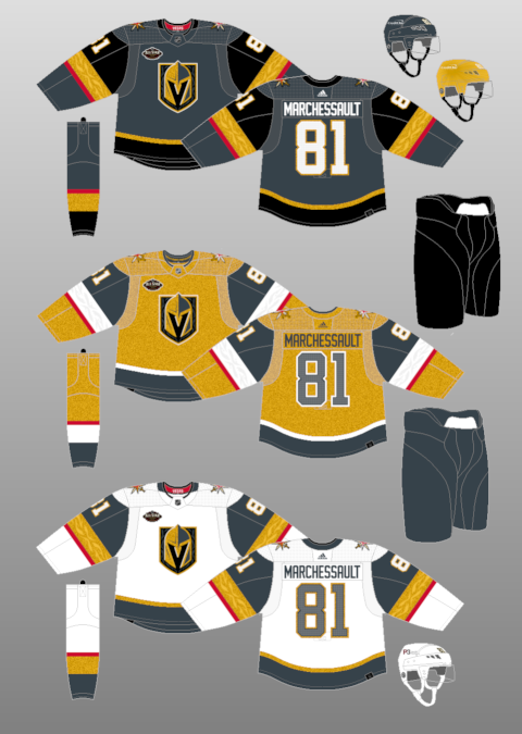
The problem with the Vegas gold alt is that they color-swapped the white jersey instead of the gray one.
They should've swapped the gray jersey instead, there wouldn't be so much white and the numbers would look better (white with gray stroke instead of the opposite).
-
9
-
-
I adore the hen sleeve patch on Delaware. Honestly I'd love to see more sleeve patches in general. The Pennsylvania script is great as well.
-
I think Louisiana is probably still my favorite but I am loving Ohio's logo as well. Just really well-made. I'm a fan of the league logos as well!
-
The double blue take is genius. Nice work as always!
-
For what it's worth, I don't dislike the set with Carolina blue strokes and I think it would work just fine, but agreed that it's a stronger set without it. I actually do really like the logo with the light blue highlights, it adds some nice depth.
-
2
-
-
8 minutes ago, raysox said:
Lol well I will say the comments on North Carolina were frustratingly predictable, to no ones fault. I heard the same thing on twitter from UNC fans.
I've been trying to figure out how to address them for a few days. I feel like i'm receptive to feedback as a whole. That being said, I think I just like the red and black more? I tried a few quick ideas, the Hickory Crawdads comment was a good shout. It was definitely a mistake to tie it to the Hurricanes and Wolfpack in my comments because these all are agnostic from existing pro teams. I can just see North Carolina being those colors. I felt Carolina blue was too tied to one specific team, a popular team no doubt, but I don't want to see this in game and just see a UNC uniform. Hell, it was a mistake having Tennessee orange and blue early on because I feel pretty similar. Hell, I had plans in my original color sheet to have a light blue, but moved away from it.
I'm still going to try and come up with some new ideas. I don't want to just add a stroke to the text and arm stripes because what I feel like is a strong 2 color identity immediately feels like a watered down 3 color identity with a color just to have it. I hope that makes sense, I totally get the feedback everyone had said and really appreciate the time it took to comment.This all makes sense and I don't disagree. My advice would be to avoid "Carolina blue" and use a different shade, like navy or a Panthers blue-esque midtone shade. You mention that Carolina blue is too tied to one team, but to me (a resident from the opposite part of the state) red and black belongs solely to NC State and doesn't feel representative of the state as a whole. Maybe this is my biases coming into the picture but I've always felt that NC is a "blue" state and I feel like it represents the state best.
I think a red and navy scheme with navy replacing black would be a strong, unique palette that ties into the state flag and still stands apart from other teams via color hierarchy. In another direction, literally just changing the base of the jersey from white to powder blue could work - the only other powder blue team you have is Texas so the set remains mostly unique and still true to the state.
I like the set but if you're pivoting, maybe you can include the racing stripes you referenced for Indiana? I know Ohio uses them too but that might be a comfortable direction. (I also wonder if switching Georgia back to black would help the color distribution nationwide.) Beyond that, maybe looking to NASCAR could help? Petty Blue, Intimidator black, there's a wide variety of colorful cars to use as inspiration. Of course, I'm a NASCAR fan and from what I've heard people in the Eastern part of the state really don't care for the association with the sport but there's a reason the association is so strong.
-
4
-
-
The uniforms are good, well-designed, and don't have any major flaws. The logo is great, well-designed, and has no major flaws. The brand, as a whole, is a very nothing brand. There's nothing really unique about it, it doesn't say "Houston", it's more so a "Texas" brand, but that's not a concept I think they should've gone with, because the Cowboys own Texas (and a good chunk of the country), even when the Oilers were in Houston. Trying to get that broad appeal led to a set that, on its face, doesn't have anything wrong with it and is even one of the better sets in the league, but I'd still like to see them go for a more Houston-centric design.
-
1
-
-
I like that a lot more! The neon effect on the sleeve stripes are great. I can imagine either using that neon-ified B on the cap or the winking Orioles (which is great). It feels more Baltimore, it feels more Orioles, to me it's a no contest improvement.
-
1
-
-
7 minutes ago, AndrewMLind said:
This may very well be a case of the fans of the team liking something more than outsiders. The O's hat is fantastic, and most Orioles fans I know agree with that sentiment. I like the City Connect hat because it's new and a unique twist on something they only wore for one season, but I don't like it more than the O's hat or want to see that replace the O's hat, only add to it.
I'm an O's fan myself. Never liked the O's logo. It's redundant on the oriole logo and there's not a cap (well, until the City Connect cap) that actually represents Baltimore. I'd rather leave the nickname abbreviation cap to the A's and have a cap for the city.


The CBL: 16/32 Updates
in Concepts
Posted
The halfway point seems like a good time for me to give my thoughts. For the teams you've updated, I'm only looking at the newest version.
CIN: A good start. Purple and orange is an attractive color scheme and fitting of a city like Cincy. I don't think the logo needs the drop shadow you've given it, however - Just the C plus the "mohawk" for lack a better term. On orange it can be all purple and on the caps it can be all orange. No need for that extra orange stroke, either.
CLE: Solid. Very White Sox, which isn't a bad thing. I'd give the home wordmark a white stroke so that it stands out from the pinstripes a little better, like you've done on the black alternate. I think the stroke on the road could be thicker as well. The Nike logo appears to be a royal blue or purple, almost like it's a leftover from the Cincy set - is this intentional?
BAL: Hmm, not quite feeling this one. You mention that this is an old team, but the touches they have on their jerseys feel very modern. The skyline on the sleeves is one such example. The gold wordmark on the road doesn't fit at all, with the rest of the jersey or the home set. Sticking to red, black, and white (maybe with small gold highlights) would be the way to go in my opinion.
NY: New York looks good! I like the version of the logo you ended up with. I think the "Aces" wordmark is slightly off-center to the right. I also don't like the double orange on the socks - that feels like a holdover from an older version of the team.
KC: The colors you've selected are way too bright. Both the blue and the yellow need to be brought back. This is true of more than a few teams you have - I'd suggest referencing TruColor.net and sampling colors that real teams use. It'll give you that sense of realism. Beyond the colors, the logo needs a little more work. The K and C should actually interlock, not just have the C overlaid on top. Fix those two things and you've got a nice, classy set.
TB: The shade of cyan is obnoxiously bright, especially on the alt. You might be better served dropping it entirely. For the road jersey I'd suggest an all-navy crown instead of the cyan taco you have now (reference the Orioles' road jersey). I think the cyan and pink clash too much on the navy alt - replacing cyan with white would help a lot here in my opinion. The rest is a nice set, I especially like the scripts you're using. They feel very beach-y.
DAL: I love this set. Really nice colors, wordmarks, and the throwback is pure class. I think my only critique would be the logo - snakes don't bend like that. Especially for an older team as well, I think using a D for Dallas would make more sense, but either way the curve of the snake needs a revisit.
BOS: I really only have one problem with this set again, and it's the logo. I'm not feeling the connection from statue of pilgrim -> governor -> Irish color scheme. Maybe a simple roundel (see: Texas Rangers or Oakland Athletics) would do the job?
NO: Good call swapping from NOLA to NO. I think there should be more interaction between the letters here as well - like the O hooks around the stem of the N or something. I'm iffy on having NO at home and "PIRATES" on the road, but it's fine. The alts are great. The socks are.... strange. The striping doesn't match anything else in the set and is angled for some reason? Might be worth redoing. Outside the design, but a New Orleans team starting in 2005 might be the worst timing I can think of besides buying a home in 2007.
MTL: I like using powder blue here. The red is definitely too bright - check TruColor for a more accurate shade. I think the blue and red are blending too much in the piping on the home and road set. Maybe instead it could be red with a white inner stroke? I'm not huge on the powder cap on the road but I don't think red would be better, so maybe it has to stay powder. The Quebec alt is decent but the wordmark gets lost at a distance. Either give some more contrast between the powder and white or instead use a navy stroke to separate the wordmark from the piping.
FLA: This set is different but I like it! It feels like a natural conclusion for the current "Sun Rays" branding that the real-life Tampa Bay uses. I'm not sure why the Florida flag patch changed color between the home and road? I think the version with the navy stripes is better. The powder blue doesn't contrast well enough with gold or white. I also think you might be able to drop the "Fla" from that logo as well. Nice work here!
CHI: Thank goodness you updated the color scheme, because to be honest, the original one was awful. It was way too bright for any team, let alone a historic team from Chicago. This set is much better. It's basically the A's but the A's look great so no notes.
LA: This is a solid set. I like the bear logo and the colors. I'm undecided on the wordmark. It doesn't feel right to be. Maybe a more traditional block set would fit better? I'm also not sure how that gold set would actually look on the field - usually translations of colors like those don't look so great as the main color of a jersey. The Nike logo is also incorrectly colored on this set.
MIN: A really nice set all around. Love the rope striping, love the colors, love the logo. As a matter of personal preference I think I would like it more if the M logo was on at least the road cap. The navy over powder set works surprisingly well. Nice stuff!
HOU: Another great update. The white ball stands out so much more. I like the scheme, it feels very appropriate for Houston. I don't like how the logo is red on a red cap, the H gets lost. Try swapping orange and red for the cap logo. On the flip side, I actually think you should do the opposite for the Texas logo - orange stroke, red fill. I'd also lose the H patch on the right sleeve - it's already on the cap so there's no need for it on the jersey as well.
ARZ: This one's not doing it for me. I'm not a huge fan of the sleeveless jerseys and the color scheme is fine at best. Using both off-white and white on the same jersey is a bold choice that I firmly disagree with. The logo is also lacking in dynamism - the stroke weights are uneven (check where the purple points of the star meet the A) and the triangle used for the empty space in the A should follow the points of the star itself. I think this one needs another pass.
Overall nice work. I'm looking forward to the final 16!