


sky1324
-
Posts
2,415 -
Joined
-
Last visited
-
Days Won
4
Posts posted by sky1324
-
-
I know that there's a reason that NFL teams aren't wearing dazzle fabric. I'm just personally of the opinion that it could be done - that Vegas gold jersey means that there's at least one team that's willing to go for it. If I were in charge of an NFL team that should be wearing shiny pants (Saints, 49ers, Lions) I'd be asking for it. Maybe teams have asked and it's just doable with current materials. But until someone just comes out and says that I'll be wanting dazzle fabrics back.
Oh, also, here's Nike using it, from the Celtics' 75th anniversary jerseys:

So there's some progress on that front.
-
 4
4
-
-
1 minute ago, 8BW14 said:
True, but that’s a different application. It’s used only as trim on those hockey uniforms. Football uniforms are super tight and super stretchy. I think if they could make it super light and stretchy we’d see it on high level football uniforms.
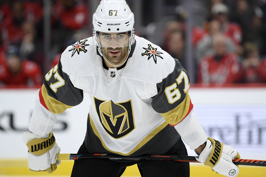
Ok, here's adidas using reflective trim on football uniforms (which, I'll admit, is not dazzle fabric but it's something):
It's also absolutely not just trim on hockey uniforms:
-
1
-
-
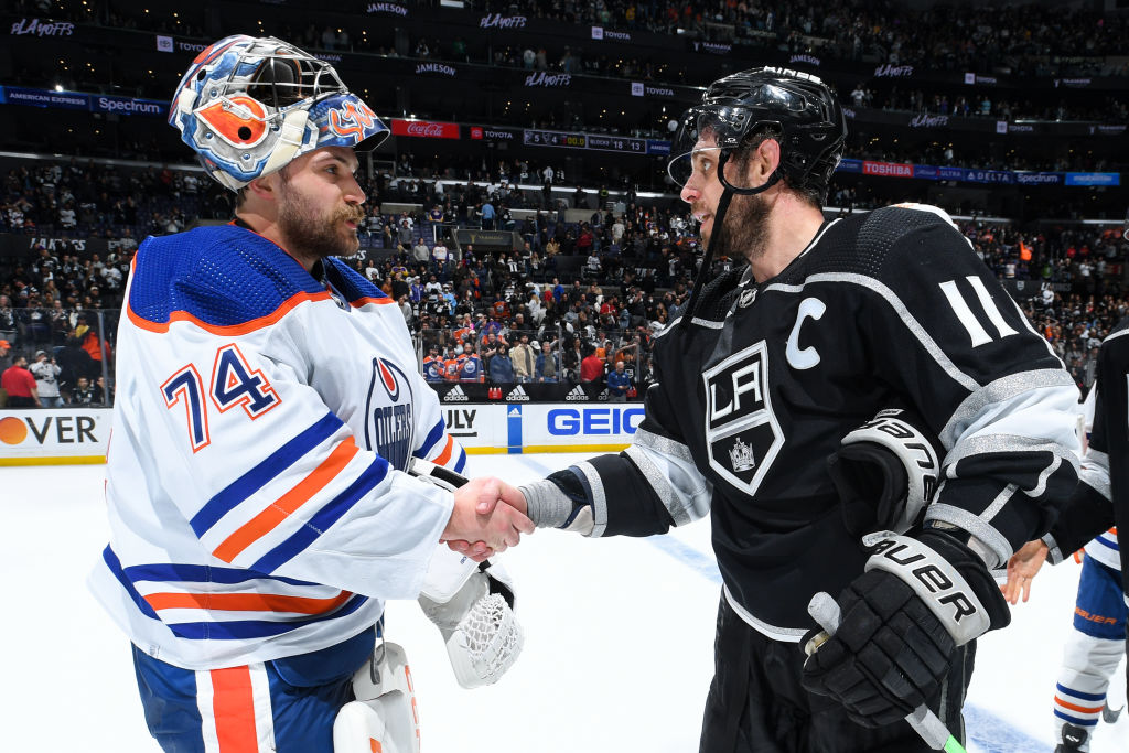
2 hours ago, HOOVER said:
Look, some of the hate for Nike is warranted, but show me another uniform manufacturer, in any sport, that is still using dazzle fabric.
Adidas, in the NHL:
They just started reintroducing it and it looks great. No reason Nike can't do the same.
-
2
-
-
-
5 hours ago, BBTV said:
EDIT:
The members who would like a pronouns field could also simply edit their member title to read "Pronouns they/them" or whatever their preferred ones are. Maybe it doesn't even require a new field.
As the person who that happened to, I do have my pronouns as my member title. People don't read those.
-
16 hours ago, IceCap said:
My main point of contention is that his take "to ignore the Sunbelt would be shortsighted" is kinda tone deaf. The Sunbelt's been the focus for thirty years.
This is why I wanted a pronoun field, btw.
And I apologize, I should've worded by post better. I totally get how it could come across as that so no problem. What I meant was that yeah - Sun Belt teams have been the focus for 30 years but they shouldn't be the only focus. So when expansion comes around (because it will) the NHL should be looking everywhere, including the Sun Belt. Because ignoring the Sun Belt entirely would be a bad idea but ignoring everything but the Sun Belt is also a bad idea.
-
 1
1
-
-
Beyond excited that the Panthers got Young. I think he's the best QB in the draft and he was my choice for number 1 overall. I can't wait to see him in a Panthers uniform and I think he'll be a star in Charlotte.
-
28 minutes ago, Brave-Bird 08 said:
I'm confused. I know it's a fashion jersey with bigger sleeves, but this looks like the stripe is still doing a near-full wrap around of the sleeve, much like the previous iteration.
I'll be fascinated to see how crammed it looks on a player jersey if the stripes do in fact settle below the seams of the sleeve cap, as indicated here. That sounds like there will be more room for TV numbers of a normal size, but the sleeves could look super busy.
The fan replicas have always had the longer sleeves so the stripes wrap around. My guess is they're still trying to make the stripes as long as possible, but the on-field uniform stripes will probably be a lot shorter.
-
4
-
-
I'll wait to see what it looks like on the field but I'm so glad we didn't get Nike-fied. I do hate that officially the shoulder stripes are no longer supposed to go around the whole arm. Frustrating to lose that element because of templates.
-
2
-
-
14 hours ago, who do you think said:
And the Nubobcathornets have been such a smashing success, haven't they. They're a useless footprint franchise in a transplant haven. Road games there for the Celtics might as well be home games, and I'm sure there are several other franchises that can say the same.
NBA teams are far more insulated from any real trouble than NHL teams due to greater central revenues and the league generally not being run by mental midgets, but I wouldn't be shocked if the Hornets are the team most likely to relocate (again) someday. That whole corner of the country is college, college, college, and more college everything. The pros are an afterthought.
The Hornets have actually had attendance that pretty regularly outpaces how "good" the team is. They're regularly ahead of teams like the Suns and Nets and in 2021 and 22, when the team was good (not great) they were in the top half of attendance. The team isn't what it was in the 90s when Charlotte sold out like 300 straight home games or whatever but the fans in Charlotte are still there, the team just hasn't been any good. We have nothing to root for. But even last year when the Hornets were objectively terrible we still outdrew the Suns (a championship contender), the Spurs (the only major league team in their market and an icon), and the Pelicans (the place the original Hornets abandoned the city for).
When it comes to pro vs. college it comes down to what's good. The Hurricanes have been great and as such have been drawing like crazy. Charlotte doesn't have a quality college program to draw fans away so when the Hornets and Panthers are good (or even mediocre), fans show up. Charlotte FC has also been a massive success. The Hornets are not going to move if only because the league wants to avoid that PR disaster again.
All that to say that the NHL would be better served by relocating one of their weak Sun Belt franchises to Quebec City. I think that market (like all Canadian markets) punches way above its weight when it comes to hockey. I also think that keeping Sun Belt teams is a good idea and the idea that the league shouldn't be looking there I think is a little short-sighted.
Also Atlanta does not deserve another team, especially if it's in that proposed suburban nightmare.
-
2
-
 2
2
-
-
That Louisiana set is probably my favorite in the whole show so far. Beautiful work, as always!
-
I think you could start with the London Monarchs logo and evolve it into the Legends crown. I'm not huge on the striping, maybe instead you could put the helmet crown?
-
1
-
-
Big fan of the Charlotte bid, it's easily my favorite brand of the three. I wish the crown had a C instead of an M but that's a minor complaint. Good choice to use teal and purple, especially after the original Hornets' departure that would be a great way to connect to the city.
-
2
-
-
10 minutes ago, JOEYxFRESCO said:
I think they will. The Panthers social media never fails to hype up any and all changes.
My predictions:
Reworked stripes
No more sleeve logos or shoulder numbers
Maybe a new number font???
It's already been confirmed to be just a tweak to the uniform. Adjusted color, truncated stripes, that's it. The biggest surprise would be if they swap their primary jersey to blue like the rumors.
-
4
-
-
Glad to see some updates! Let's see what we have here.
BOS: I actually think my favorite logo here is the compass rose. The new lighthouse logo is good but a little too detailed in my opinion, especially for a helmet. Have you considered putting the B on the helmet instead? The jerseys are great and I love the new wordmark as well.
CIN: Hmm, not really feeling this one. I dig the new wishbone C but the gradients feel extremely tacky to me, like it's not something a professional sports team would do, especially one presumably as traditional as this one. I actually think there's a little too much orange on the helmet as well, at least in comparison to the rest of the set. The rest of the jerseys are really nice, very classy.
SF: Nice work! I really love the monogram and wordmark. What inspired their color scheme? I can get behind a red and darker red but I think it might be even better if you make the maroon brown. The jerseys are nice, I love the shoulder stripe + bear combo but I feel like on the field they'd run into the same issue the IRL Panthers do, where differing jersey templates make the numbers tiny.
For the minor tweaks you made I can't tell the difference without a reference so I'll just say that they all look really nice.
The throwbacks are great! The script "Shamrocks" is especially nice.
Awesome work, as always! I'm very excited to see you wrap this series up.
-
25 minutes ago, officeglenn said:
This is a fair critique, and I appreciate you bringing it to our attention. Looking at the back end, we can add and delete options from that particular profile field. Here's what I'm thinking to change it to, but I'll open it up here for feedback:
- Female
- Male
- Non-binary
- Prefer not to say
Also, would people like to see a "pronouns" field added?
I like those options, personally, and I'm 100% for a pronoun field.
-
6
-
29 minutes ago, Bruhammydude said:
Have there been any alternate helmets confirmed for next year, but without an identity yet? Maybe just the Broncos?
The Broncos and Lions, I believe. Plus the Seahawks, Bucs, and Eagles are bringing back throwback looks.
-
1
-
-
7 minutes ago, NYCdog said:
Somewhere, Panthers fans, Broncos fans, Texans fans, and Lions fans are now all collectively worried about how Nike will dumb down their team branding with their incoming rebrands.
Panthers already said they're not making major changes, so I'm breathing a sigh of relief.
-
1 hour ago, MCM0313 said:
I actually like the gryphon, but I don’t care for the Nikespeak that tries to make it seem like…not a gryphon. Also, how can you have a gryphon without a pea and a tear?
Well... it's not a griffin. A griffin is a combination of specifically an eagle and a lion, the kings of birds and animals, respectively. The Peagle logo the Rangers are using is combination of a panther and an eagle, so they're halfway to a griffin, but not all the way.
-
1
-
-
The biggest problem I have with going directly to what UA made is the mesh pattern on the numbers, which don't need to be there. The single gold stripe on the sleeve is actually a fun touch to me, it's a nod to the flag without it being overbearing like it has been previously. As others have said, below the helmet MD had a solid set but I'm tired of the flag everywhere (especially given that half of the flag has connections to Maryland Confederates) and the script look is just a cleaner set.
-
1
-
-
I actually really like what the Rangers have going. Everything above the pants is pretty nice, the number font and Peagle logo especially. I'm not crazy on the TX interlock but I like it enough. The killer for me is the dark pants, which don't belong in baseball, at all. Jersey-matching cream pants would elevate this set to one of the best City Connects. Even then it's a really good set and I hope we see Texas get what the Dodgers and Rockies got and a set of light pants to replace the dark ones. Cautiously optimistic for the O's!
-
1
-
 1
1
-
-
6 minutes ago, Germanshepherd said:
Here’s the LockerVision report for the Play-In.
Heat vs Hawks is classic. Miami in white vs Atlanta in its standard road blacks.
Lakers in their home golds, but Minnesota is wearing its grey and green city editions that I forgot existed.
Raptors in black at home vs Bulls in white.
Pelicans in red at home vs Thunder in blue.
Atlanta's black jersey is their alternate - their normal colored jersey is red.
-
8
-
-
Spirit was the first name and intended to be the actual name of the team but fans absolutely hated it so the team ran a Name-the-Team Contest and Hornets won. I can't remember all of the other finalists but one of them was Knights, which became the name of the George Shinn-owned then-Charlotte Orioles baseball team.
-
7
-
-
For Tennessee, why not just a solid orange cap? I agree that on white the logo disappears a little (maybe color the white parts powder blue when on white to combat that?) but I don't really like the powder blue on the cap.
-
1
-


Seattle Mariners Brand Refresh
in Concepts
Posted
I love everything about this except the gold NW on the compass. It's distracting and muddies the patch on the white and gray jerseys. Everything else is excellent and would be a great update for the Mariners. Nice work!