


seasaltvanilla
-
Posts
623 -
Joined
-
Last visited
Posts posted by seasaltvanilla
-
-
What about leaning into the double green further and replacing all red with light green?
-
Real snoozer of a logo from Vegas.
-
Stand Up To The Cancer Of Dark Pants In Baseball.
-
 13
13
-
-
Bill Burr City Connect, do it you cowards
-
 1
1
-
-
I'm tired of perforated numbers.
-
1
-
-
Those NOBs are way too small.
-
Apparently those All Star patches and designs are worth an extra $8...almost $50 for a friggin hat

-
 1
1
-
 1
1
-
 1
1
-
 1
1
-
-
Also a fan of the nameplates. Thickening the arm stripes for the shoulder numbers is a good move. Probably should have outlines to match the back numbers (or all single layer numbers). Lateral move with the hemstripe.
Another example further cementing that the people who defended ads are clowns.
-
4
-
-
The easiest way to tell is the new Viking logo doesn't have the shading on the horn.
-
Where did you get the new Twins font?
-
1
-
-
On 6/6/2023 at 11:11 AM, henburg said:
My point being, there is nothing to discuss regarding the aesthetics of corporate advertisements on sports uniforms because nobody on this board actually prefers it to the cleaner alternative.
I agree, but this point is undercut by having sponsorship changes treated as front page news on the mothership. That's tiresome too.
-
Besides being their ugliest logo, switching to the spaghetti skate look would make the Canucks the third Canadian team to use some variation of red, black, and yellow/gold.
-
8
-
-
The crossbar on the A is quite a bit lower on the Baltimore jersey than on the Old Bay font. So not the same but possibly an inspiration.
-
6 hours ago, VampyrRabbit said:
I like the Reds CC except for the black CINCY script and player number. Aren't those two of the things you want the most visable on a Jersey?
Hasn't stopped the Angels with their red on red on red jerseys.
-
5
-
-
1 hour ago, burgundy said:
Commanders isn't generic at all, but that's not the problem. The problem is that its too long and clunky, and has no good shortened version. Other teams with more than two syllable names have shorter nicknames: Patriots have Pats, Buccaneers have Bucs, 49ers have Niners. And then the Commanders have Commies and Ders, which are just terrible.
Yeah that's a fair critique, and a breath of fresh air. Generally when I see people complain about it they almost always use "generic" or "boring," which I think is just recency bias and as previously mentioned, poor branding and uniforms.
-
1
-
-
32s is a worse name than Football Team.
Commanders is no more generic than Cowboys, Eagles, Giants, Jets, Raiders, Bears, or Lions. It's just newer.
-
10
-
-
14 hours ago, who do you think said:
But why couldn't Columbus be "CBS"? To me that's a perfectly intuitive abbreviation for the city. Don't even try to tell me that people would confuse it for the network. I know it's 20 years too late now, I'm just spouting off.
In MLS Columbus uses CLB.
Along similar lines, WSH looks better as an abbreviation than WAS.
-
3
-
-
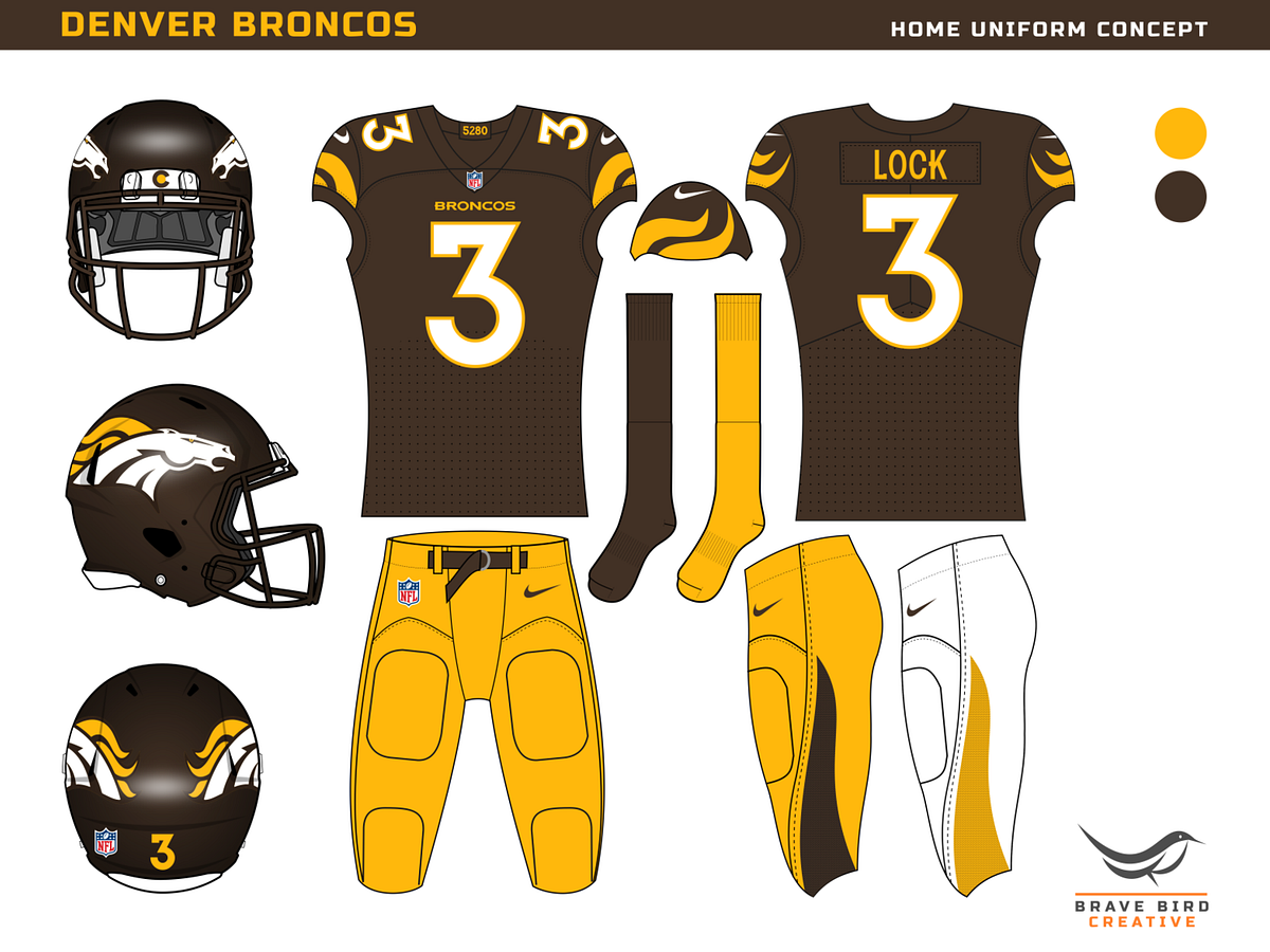
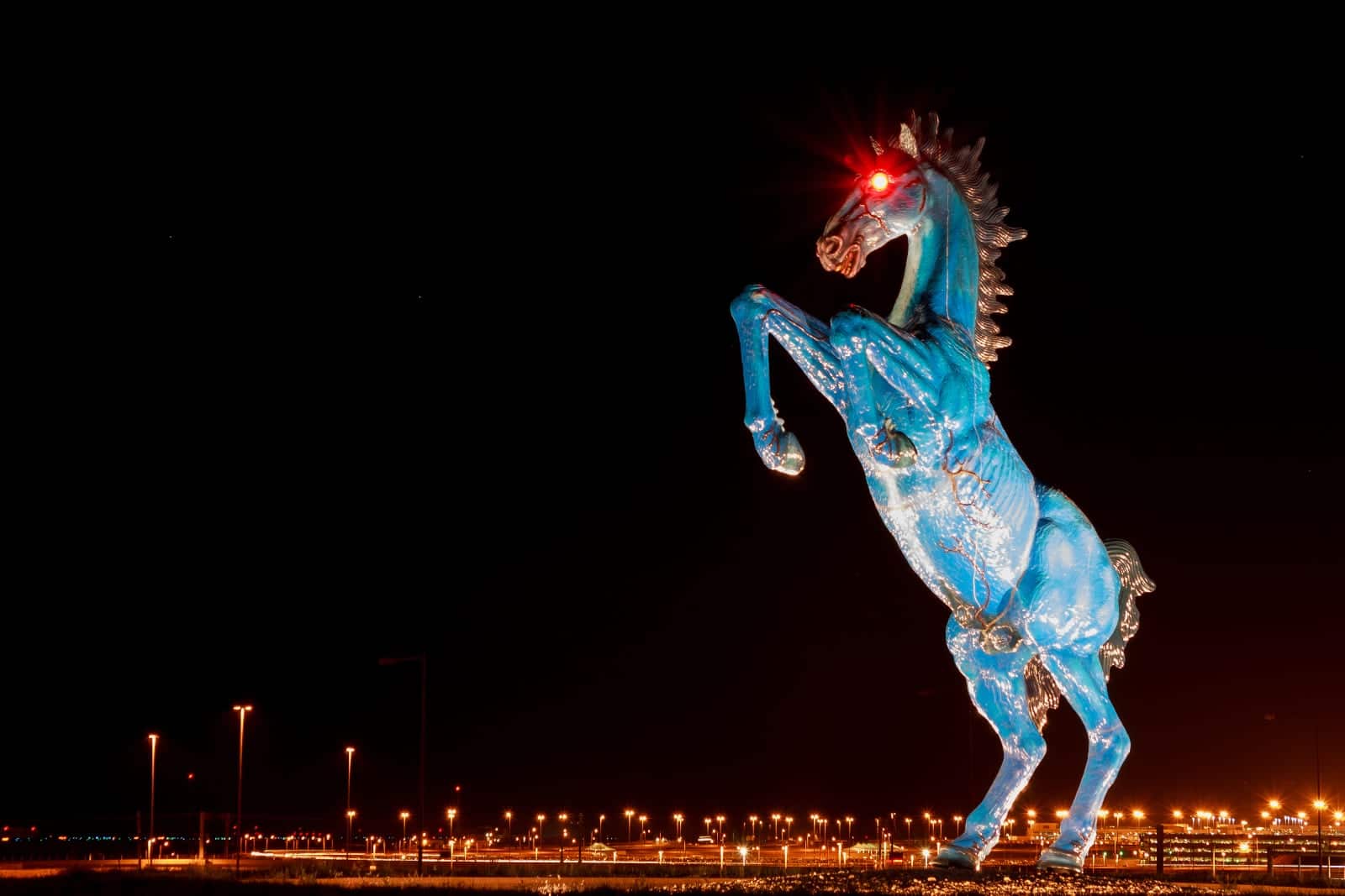
4 hours ago, Brave-Bird 08 said:

Blucifer does not like this
-
 1
1
-
-
What I don't get is why it was so hard to just say the helmet has silver flecks and the facemask is metallic silver instead of dragging it out for two weeks. It's not your fault some of the information was wrong, but it didn't have to be turned into a whole production.
-
 1
1
-
 1
1
-
6
-
1
-
-
I'm glad they erred on the Jaguars end of the spectrum and not the Buccaneers end.
-
5
-
-
-
4
-
3
-
-
They clearly realized that having green and red as your two main colors causes legibility problems, but it's half of the logo so they feel they have to include it. (Also interesting to note how originally the gold of the logo was the main tertiary color, but now it's drifted to the wheat in the outline). I think you can pull off only having red in the logo and going all in on wheat and green (see the Vikings where there's more pink in the logo than purple) but having it be a major part of the white jerseys and a distracting detail to the green jerseys drives me nuts.
-
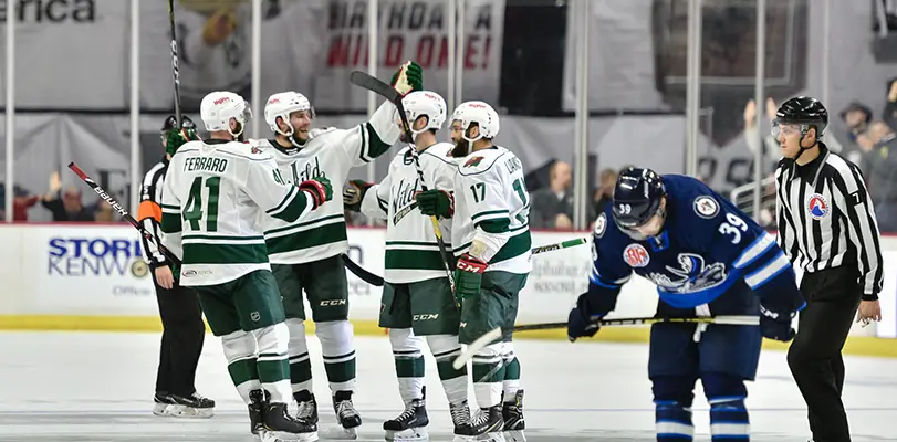
9 hours ago, SCL said:
The red numbers are the defining element that makes the Wild white jersey great.
I agree, I'd much rather the Wild be a green/red team, not a green/wheat team. My issue is the lack of red on the green jersey is highlighted by the excellent green/red balance on the white jerseys. They should be this:
Or something like this concept I made last year:
Your team's secondary color shouldn't look like an afterthought on your own home jersey.
-
1
-
-
And the color hierarchy doesn't match either. Red is the secondary color on the whites but wheat is the secondary color on the greens. It's a big pet peeves of mine. I wouldn't even mind if they went to being a green/wheat team but at least adjust the whites to reflect that, like the Iowa Wild.


2023 - 2024 NBA changes
in Sports Logo News
Posted
In three years these will be the Wolves uniforms that people say "oh, yeah, I forgot about those" about.