seasaltvanilla
-
Posts
623 -
Joined
-
Last visited
Posts posted by seasaltvanilla
-
-
18 minutes ago, Jezus_Ghoti said:
Also there is really not a whole lot stopping him from just describing the uniforms to us in more definitive (or even full) detail, but I will let him decide what he's comfortable doing.
Nobody likes a tease.
-
 2
2
-
-
He's right though in the sense that the Minnie and Paul logo was better. Biggest miss of the set.
-
 14
14
-
-
1 hour ago, MJD7 said:
I love that they’re wearing the white-panel batting helmet with it. Looks beautiful.

Yes.
-
 9
9
-
 10
10
-
-
Ever since their use in the branding for Super Bowl LII I've been a champion of purple/blue as perfect state colors for Minnesota.
-
 7
7
-
-
The Football Team Stockholm Syndrome is weird.
-
 16
16
-
-
Nike can't get blue or green right apparently, how do you expect them to manage stripes. This is very complicated stuff.
-
 2
2
-
 5
5
-
-
As pointed out by many...

Anyone hungry?
-
14 hours ago, DCarp1231 said:
Making “PEPSI” black keeps the color balance in check. It’d look off if 75% was red or blue.
I take your point, but somehow black feels like too much contrast right next to the highly contrasting red and blue. A dark navy (and minor adjustments to the R/B) somehow softens the whole thing enough that it comes together more cohesively, in my opinion.

-
 7
7
-
-
9 hours ago, Ferdinand Cesarano said:
removing managers' and coaches' numbers, this provides grounds for despair.

-
 1
1
-
-
With full context, the Cardinals have been a red/white/black team since before half the league existed, including the aforementioned Chiefs.
So, no, it's not accurate to say the Cardinals don't have the tradition that the Chiefs do.
-
 3
3
-
-
4 hours ago, Durden said:
The Cardinals don't have that tradition
The Cardinals are literally the oldest franchise in the league lol
-
 5
5
-
 1
1
-
-
27 minutes ago, C-Squared said:
The Sabres pride night is literally the next home game

Probably maybe. Don't set your watch by it.
-
 1
1
-
-
I judge companies when they whine about how hard and difficult it is to create sport shirts.
-
 3
3
-
-
22 minutes ago, raysox said:
I really wish Venezuela still rocked maroon as it's primary color. Colombia could use a different font on the front and back (and yellow jerseys). I'm not one to tell someone how to celebrate their nation but if you have a unique color in your catalog, i expect you to blast it!
They at least have burgundy options this WBC, although still paired with the idiotic blue/red helmet. The national teams are known as La Vinotinto, this crap is color by numbers.

They got it right the first time, all the way back in 2006:


-
 4
4
-
-
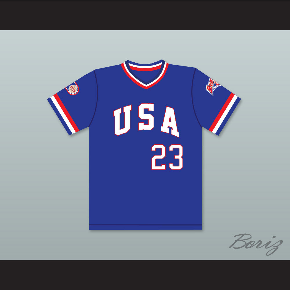
I don't like turning the S into stripes that baseball and hockey do. It looks kitchy, and both sports look better with block serif fonts:


"USA" is already such a powerful and distinct brand, you don't need to add a gimmick.
-
 3
3
-
-
3 hours ago, selgy said:
Well, kind of. Ireland does not love that they're called the "British" Isles.
-
I'm pretty sure the front lettering on the Canadian jerseys is too small for the NOB even.
-
5 hours ago, NYCdog said:
Uniform sponsorship coming soon to Yankees jerseys

-
 6
6
-
 3
3
-
-
I think they should have flipped the stripe colors so blue is the outermost. It would neatly prevent the blending into the navy jersey:

And the loss of the Minnie and Paul logo still stings. Hoping it gets resurrected. The Minnesota state logo with the star is a poor replacement.
-
 3
3
-
-
6 hours ago, adsarebad said:
No other team had that shade of gold.
Then kudos to the rest of MLB for recognizing how incredibly ugly it was.
-
 2
2
-
-
1 hour ago, infernoqueso said:
I see your point, but the victory stripes aren't really a design element, as they are aren't visible on the uniform. I think it is cool to have a little flair that you will only notice if a team wins the stanley cup, or scores a goal.
Highlighting armpits has never looked good in any uniform or sports context.
-
 1
1
-
-
1 hour ago, BBTV said:
Still need a matching white-paneled cap for home.
I feel confident within three years they will add that hat to their rotation. I think the solid navy will continue to be the primary home, but I could see them picking a day to wear the Mauer hats regularly.
-
 3
3
-
-
Highlighting armpits has never looked good in any uniform or sports context.
-
 6
6
-
-
Twins' new whites look great in the sun.


-
 14
14
-
 7
7
-


New England Patriots Jersey Concept
in Concepts
Posted
I like the innovative striping pattern to bracket the sleeve logos, but the template makes it hard to see details since most of the jersey is in shadow.