


seasaltvanilla
-
Posts
623 -
Joined
-
Last visited
Posts posted by seasaltvanilla
-
-
Credit to Adidas for actually making bespoke kits for most teams (even if some of them miss). First time in years it hasn't felt like mailed-in, color-swapped recycled designs.
-
 3
3
-
-
3 hours ago, DG_ThenNowForever said:
The new Austin FC kit reminds me of dazzle ships, which is a naval camouflage:
http://2.bp.blogspot.com/-OaS-q5-O4bs/TpEqYm9wIXI/AAAAAAAAA8Q/IpcYewvCn44/s280/Dazzle%2B10.jpg
Austin is years late and did it worse

If you're going dazzle, go dazzle. Austin just looks like there was a printing error with the scale of the stripes.
-
 5
5
-
-
Funny you mention that, I don't like the USA Hockey wavey S much more than the bacon S. It just looks forced. A Miracle on Ice style block font USA is timeless, in my opinion.
Don't love the color blocking, but at least my Venezuela is back in burgundy.
-
Team USA jerseys are up for sale on mlbshop.com, no one else's yet.
The bacon S, while culturally relevant, needs to go already.
-
4
-
 2
2
-
-
The Flag Code is non-binding however.
It would just be more sensible to place the flag on the left. But that would make New Era mad.
-
I am shocked that Adidas went along with a subdued logo and Three Stripes. Hopefully it doesn't set a dangerous precedent of the club/team branding being more notable than the corporate branding.
-
1
-
2
-
-
I rather like this logo the Mexican Pacific League has been using for the Caribbean Series more than the WBC one.
The half-hearted 3D effect on the Germany hat is somehow more offensively ugly than if they had just done a boring, flat letter like Italy.
Flags should be half the size and on the left, but I know that would be offensive to our corporate overlords.
-
The problem with a wheat away jersey is the helmet mismatch looks awful.
And why the hell have white??
-
1
-
1
-
 1
1
-
-
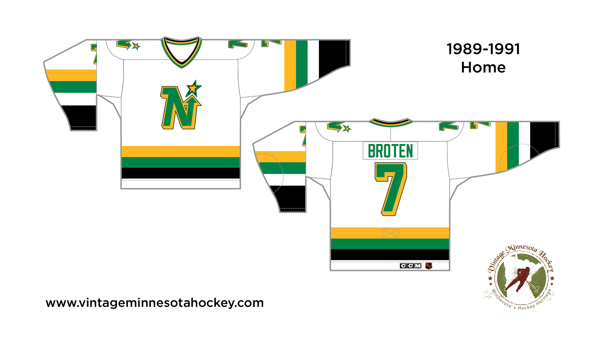
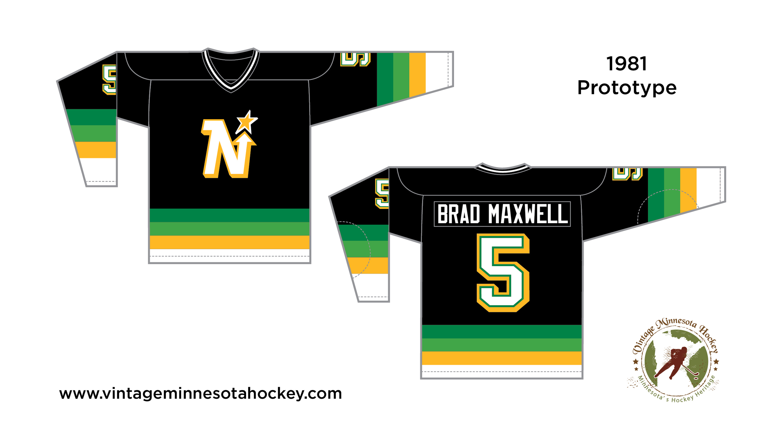
Not a fan personally of black with the North Stars colors, but I think part of the issue is it's used way too thinly in the logo and numbers. Makes it feel like a distracting afterthought versus an intentional part of the design.
This:
Works better than this:
(Fixed the striping to be consistent while I was at it)
And maybe not on a black base, but I've always liked the gradient stripes on this prototype:
Would be an interesting RR3.0:
With the current colors I wish they would have a consistent color hierarchy on the homes. Red is relegated to a barely visible highlight color when it should be the secondary color. The Wild are green/wheat at home and green/red on the road, on different templates to boot. Pick one or the other!
-
7
-
 1
1
-
-
Or maybe not, this is the look on the Venezuelan Baseball Federation's website:
Like the full wordmark, still would prefer a traditional burgundy uniform. Faint hope that these aren't the actual official WBC jerseys.
-
Notable that Venezuela are going back to their traditional (and proper) Vinotinto (burgundy), and with a new font for the cap logo
2017:
As to the US, they got it right in the 1934 Tour of Japan:
-
15
-
3
-
-
2 hours ago, Kevin W. said:
Never gonna happen.
Of course not, gotta feed the beast.
-
1 hour ago, PaleVermilion81 said:
Wait until they hear about the companies that make the jerseys and sports apparel they all wear
Manufacturer's marks should be removed from jerseys along with sponsors, agreed.
-
2
-
1
-
-
The skate is bad, the worst by a wide margin of the various Canuck logos. Green and blue is their best color scheme. Going back to this look full time is a mistake.
-
5
-
-
19 hours ago, oldschoolvikings said:
the classic uniform before the number outlines were nixed
I much prefer plain numbers. Gold outlines bleed into the white and make the numbers look fuzzy. With rare exceptions I think high contrast beats low contrast in sports uniform design.
-
19 hours ago, WSU151 said:
The way the helmet was maroon fading to black was odd…just regular maroon helmets would be nice.
Yeah, the minor changes I would make are having a maroon facemask and cleats and match the sock color to the jersey color. Basically take out all the black.
-
2
-
-
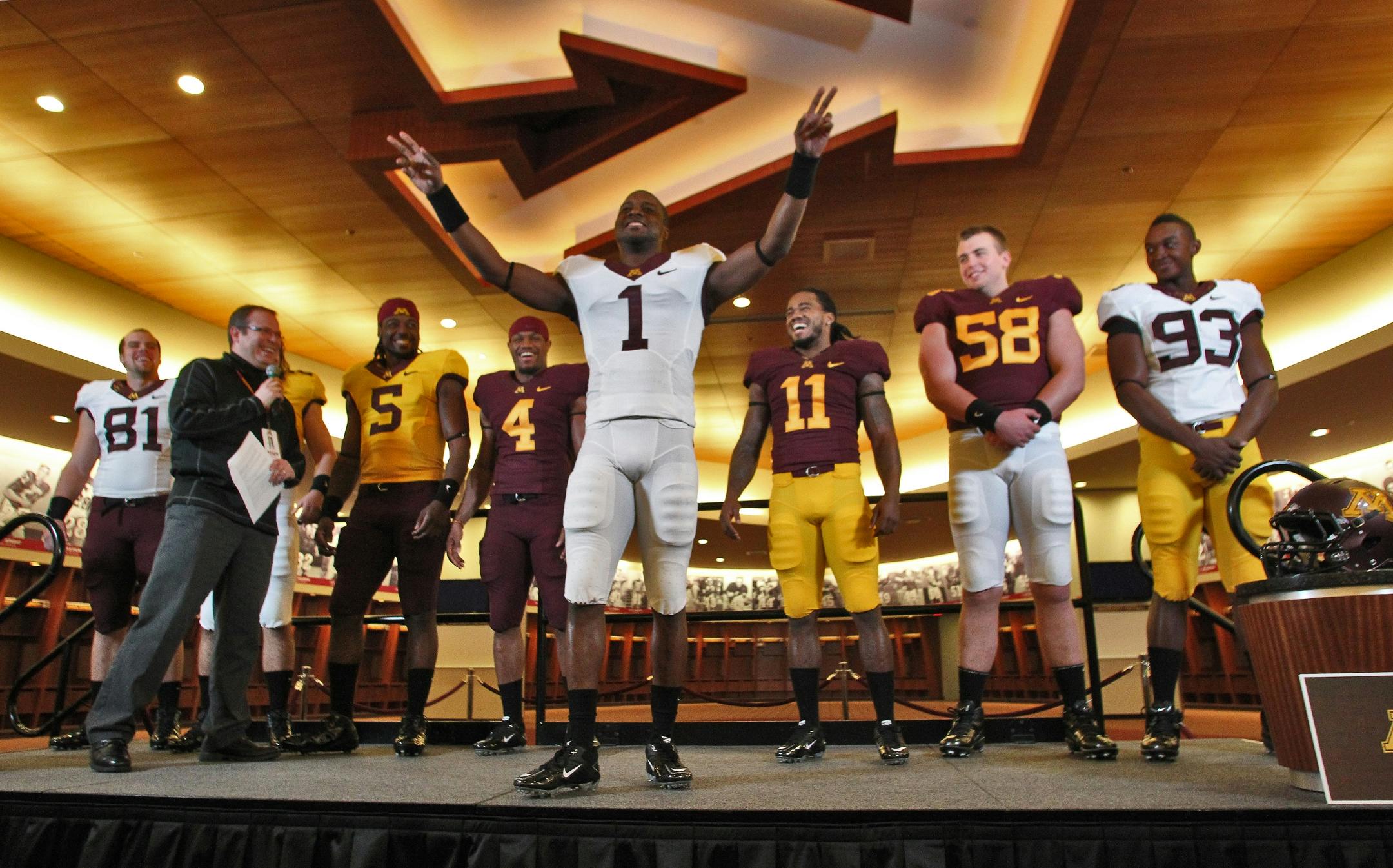
It won't happen because it doesn't stroke PJ Fleck's ego but I would love for the Gophers to go back to this set. Modern classics.
-
29
-
-
I don't mind the font, what bothers me is pairing dark purple with black. It looks okay on a computer screen, but in the fabric it looks very muddled. And yes, I get it, ravens, Gothic. I think they would benefit from more contrast.
-
44 minutes ago, DCarp1231 said:
Go with Tennessee (Music) Titans and have something similar to the Hamilton Tiger Cats of the CFL with the 4 or 5 stripes on the shoulder to mimic guitar strings
What, and clutter up the Swoosh? Where are your priorities at?
-
2
-
 1
1
-
-
23 hours ago, kmccarthy27 said:
Keep in mind the Commanders W is pretty much the same current logo with some lines around it as WFT
Which is a downgrade. I get it's supposed to be a stencil but it looks like origami.
-
7
-
-
The stacked Adidas logo and crest has already outlasted its welcome.
-
6
-
-
On 4/19/2022 at 2:44 PM, seasaltvanilla said:
I don't understand the appeal of the Screagle at all. It's horribly lopisided to the bottom left. I can't tell if the eagle has one or two wings, not in an interestingly abstract or intentional way, but because they just merge into an uninteresting blob in the upper right. The head and talon are rendered to imply three dimensionality, but the wing/body blob is flat. I want to say the perspective of the stars is wrong, but I can't because I'm not sure what the perspective of the eagle is supposed to be. There doesn't seem to be any significance or thought put into the overall silhouette of the logo, it's just what was left over when they put all the parts together. It feels like a napkin draft of a logo.
@mjarvie I got your back
-
 2
2
-
-
I'd lose the full jaguar on the sleeves, it looks silly. Otherwise an ideal look.
-
1
-
-
Vikings wearing white-on-white at home for the first time in franchise history for "whiteout" game including white endzones and midfield logo.
-
2
-

/cdn.vox-cdn.com/uploads/chorus_asset/file/22667441/1323977785.jpg)


Did your high school copy a pro or college team?
in Sports Logo General Discussion
Posted
I was just typing up the same thing. Most high schools aren't trying to pull a fast one, and I'm sure manufacturing is much easier and cheaper if there's only 100-200 designs nationally than if all the thousands of schools had their custom logos.
My high school used the Kansas State wildcat in blue and green, and the Notre Dame fight song with new lyrics.