


seasaltvanilla
-
Posts
632 -
Joined
-
Last visited
Posts posted by seasaltvanilla
-
-
Them leaning into orca imagery as in the concept above would be an interesting direction that doesn't just echo the Space Needle again. Creates an opportunity for a clean secondary mark too.
-
4 hours ago, 8BW14 said:
On the topic of the Cardinals’ uniforms, it should be so simple. All they literally need is a red jersey with white numbers and a white jersey with red numbers and don’t touch the helmet. Add some stripes to the pants, put the flag on the chest if you must and stop right there. Imagine a red/white version of the Raiders.
If they wanna do a little more, I think they should change the logo’s beak to copper because that’s really closer to the color of a cardinal’s beak and add a pair of copper pants as a sort of fauxback old-timey alternate look. Pardon the shameless plug, but this the last concept I put together for Arizona with the general idea of what I’d like to see:

Looking back, the sun ray stripes pointing directly to the players junk is an unfortunate mistake, but you get the idea. I could also take or leave the yoke.
Sunburst pattern to the yoke and then it shows up on both jerseys, doesn't highlight the crotch, and isn't overdesigned garbage.
-
I hope it doesn't take the Revs another 20 years to ditch the white roundel part of their badge on the kits.
-
 3
3
-
-
I feel like there could have been a way for them to tie the three stars of the DC flag in with the rank insignia of a three-star lieutenant general, the highest rank G. Washington held while alive. They even have the shoulders empty and everything. C'mon people, synergize!
-
1
-
-
Flag of DC, based on George Washington's coat of arms
-
3
-
-
To get away from the uniforms for a second (sigh of relief) this is just a terrible, uninspired roundel. The only interesting part is the quadrant with the stars, and that just makes me think of Tennessee, not DC.
-
17
-
-
Hail to the Redscares

-
24
-
-
Personally glad they didn't go with Redtails. Staying away from marginalized groups of people, even if done in a positive light, seems like a good idea in the modern world of sports branding, and particularly for this franchise.
Also seems a bit silly to ding Commanders for being generic in a league of Titans, Lions, Bears, Giants, Jets, Panthers, Eagles, Falcons, Cowboys, Rams, Cardinals, etc. The NFL is not exactly overflowing with unique, topical names. Missed opportunity for something better, sure, but not the worst by any stretch.
-
6
-
-
27 minutes ago, burgundy said:
I'm guessing this is the photo they used:
That's the Smithsonian Arts and Industries Building, with the Smithsonian Castle in front.
-
1
-
-
Really think the stencil W is worse than the W they have now.
-
13
-
-
22 minutes ago, DCarp1231 said:
Considering what we’ve seen so far, it makes more sense than the Vikings black facemask.
Speaking of Minnesota, the Gophers make it work
100% look better with matching maroon facemasks. Same with Vikings and purple masks.
-
9
-
-
Also a more desaturated blue ^
-
-
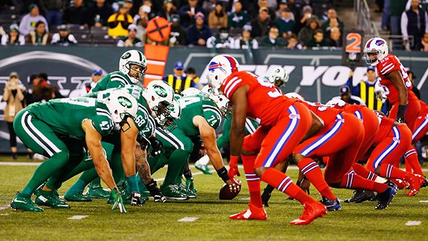
The other New York game also looked very good, at least in terms of apparel.
-
2
-
-
Blues should have yellow numbers. And never, ever have red on the uniform.
-
6
-
-
-
12
-
-
What's strange though is the buffalo head is different from the original.
-
I see you Jags-Titans and raise you the Colorblind Bowl:
-
10
-
-
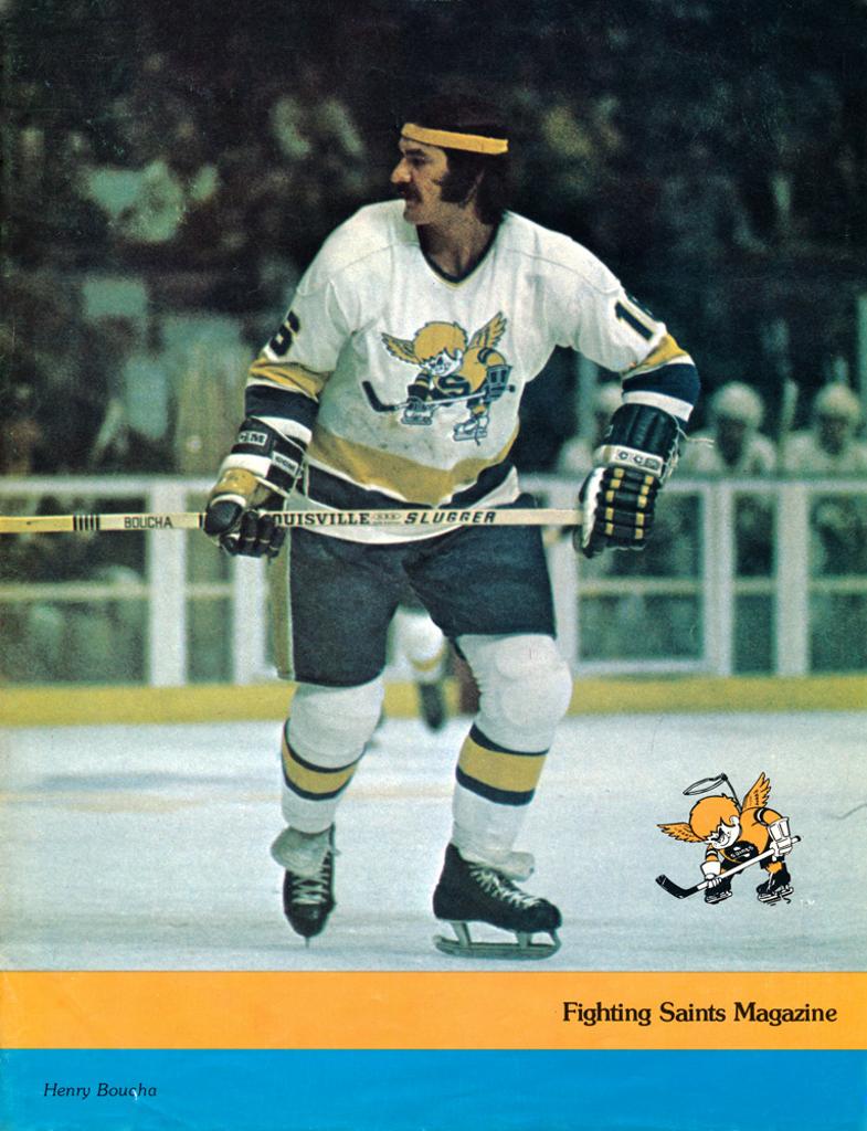
That's essentially what Minnesota did with the Winter Classic jerseys. Personally I'd be a big fan if they busted out a Minnesota Fighting Saints RR:
-
6
-
-
The gifs are worse. Bring back the Denver talk.
-
12
-
-
Annual reminder that the CCSLC version of the Wild logo is tilted. Compare header logo to the profile and bottom logo. Worse that it's the official organization doing it. For a site as nitpicky as this one I'm surprised this continues to be unfixed.
-
1
-
-
Correct. The Adidas redesign is worse. Bring back the original striping, I can take or leave the green alternate by @Morgan33
-
4 hours ago, QCS said:
It's always funny to me when a soccer club outside of the States/Canada upgrades their crest by improving it in like every way and the fans are livid because it doesn't include a poorly drawn lion/bird/crown/whatever that's been there since like 1890. Such a different world compared to how the US does it.
Sighs in Barcelona
-
4
-
-
Re: legibility of long scripts
I saw someone suggest this on here once (with the Dodgers) and it's stuck with me since:
Why not stack the different words? (Old template because it was easily available)
-
12
-


MLS Kits 2022
in Sports Logo News
Posted
Don't blame anyone who's disappointed but I'm surprised how much I like it. Numbers and letters should definitely be light blue though. If Vancouver can do it so can MN.