


Gothamite
-
Posts
36,227 -
Joined
-
Last visited
-
Days Won
277
Posts posted by Gothamite
-
-
21 hours ago, Digby said:
Could they have the best of both worlds, e.g. fund a stadium renovation by subleasing or selling part of the parking lot to create the SoCal's next generic high-end outdoor mall?
No. Parking lots are far too lucrative for anyone to deliberately get rid of one. Especially in LA.
-
So "Los Angeles Angels" can stay.
I worked in Long Beach a couple times in the 1990s, and traffic on the 710 was worse than anything I saw going out to Orange County. I know that was a long time ago, but LA traffic doesn't tend to get better over time. Any current residents have an option on the 710?
-
 1
1
-
-
This doesn’t look bad in the classic colors:
although I do wish the last outline around the M was white, not blue. Blue is too Seattle Mariners.
-
4
-
-
That. Is. Awesome.
-
3
-
-
I should love the Nebraska-steak logo. But I don’t.
I guess I just don’t find most of these identities charming anymore. They’re ad agency-tested, focus group-approved, the whimsy forced and soulless.
These changes used to show that the game wasn’t taking itself too seriously. But now they show exactly the opposite - attention seeking (and the merchandising) is too big a business for the teams to ignore.
-
1
-
-
In fairness, the initial post in that chain specifically mentioned the majors.
But I think this one is stupid even by minor-league standards.
-
I know I’ve been advocating more teams to adopt brown, but this isn’t what I had in mind.
Love that state logo, though. Clever.
-
Terrible logo, though. Won't miss that one.
-
1
-
-
21 minutes ago, CaliforniaGlowin said:
Guess their not changing it to the Pizza Rats

They never were.
-
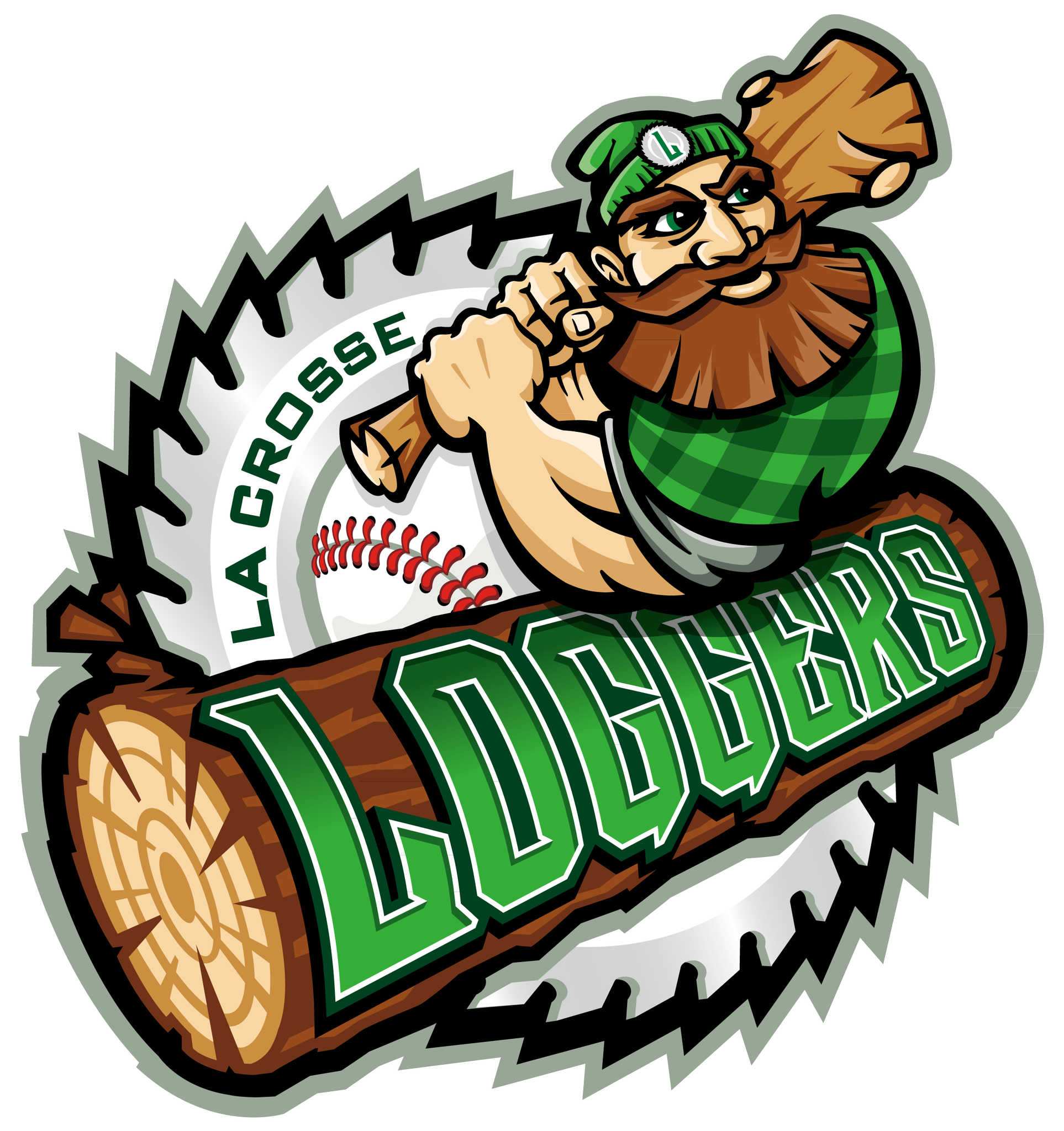
The LaCrosse (WI) Loggers have a “refreshed” logo.
Shame about the 90s extreme perspective.
Here’s what they’re calling their “icon” logo, which I guess means a cap logo.
that one might not be so bad, if the two elements looked like they were part of the same design. Here’s an example where adding perspective would have helped.
-
18 hours ago, SFGiants58 said:

I dunno - I think you're right with the wordmarks, but those cap logos look off. It looks in the screengrab as though the orange letters might have a white outline. Or, failing that, are thicker than yours.
-
1
-
-
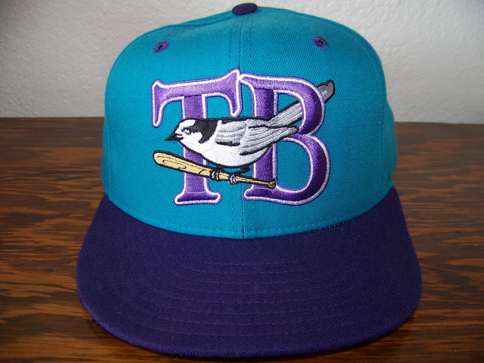
14 minutes ago, Big Yellow Flag said:
If nothing else, the new Whiskey Jacks logo is better than the old Whiskey Jacks logo
I’m not sure I’d go that far. At least the old bird is well-rendered.
-
38 minutes ago, Big Yellow Flag said:
if I knew where Wheat City is
It’s Brandon, Manitoba, right? Home of the Wheat Kings?

I remember the last team named Whiskey Jacks; they were Canadian as well.
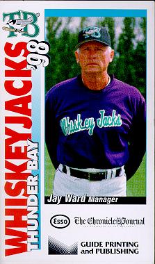
Holy
 , the 90s.
-
9 hours ago, Brian in Boston said:


Why are the stick’s motion lines outside the two outlines?
-
2
-
-
2 minutes ago, WideRight said:
McMahon believes (maybe right, maybe wrong) that many NFL fans are also conservatives, Trump supporters, etc. and that they will be attracted to a league that takes a stand, that plays on nostalgia for a "traditional" brand of football and that plays up the jingoistic "Patriotic" card.
And last time he believed that many NFL fans thought the NFL was the “No Fun League” and they would be attracted to a league with fewer rules, bigger hits, and less regulation over player behavior.
He was laughably, demonstrably, wrong last time. And given all his bizarre choices this time there’s no reason to believe his guesses are any closer to the mark now.
-
1
-
-
6 hours ago, guest23 said:
I'm sure vince is not worried one bit now that he has access to that sweet saudi cash...I'm really starting to question wwe's true motivations and think that mcmahon and his ilk only align themselves with patriotism and pro USA stances when they stand to profit off it. Maybe we are all getting played for fools here?
That is usually the case.
-
1
-
-
3 hours ago, tubby34 said:
Right now, the name XFL is going to get viewers. AFL and AAFL and FFL and UFL and all that didn't bring eyes. The XFL is going to get that wrestling fan and football fan.
That’s what we heard last time.
-
2
-
-
18 minutes ago, O.C.D said:
NFL is hard to watch for various reasons. Having a 2nd option is good.
I think we’re about to learn (again) that Americans aren’t crazy about pro football so much as they are crazy about the NFL.
-
3
-
-
On 10/9/2018 at 9:25 AM, Dante_X said:
Shawinigan Bruins throwback in action

I like that logo a lot more than the Bruins’ version. Stripping away some of the black and limiting it to the B makes the letter stand out so much better.
-
1
-
-
25 minutes ago, Sabres7200 said:
If you look at the top 25 teams from last year, Brandiose is responsible for 7 of the identities. I don't like a lot of their recent work, but they know what they're doing.
Nobody says they don’t know what they’re doing. That’s not the problem.
The problem is that what they’re doing is potentially corrosive and bad for the sport, putting short-term merchandise sales ahead of everything else. Brandiose didn’t invent this sugar-rush junk food model, but they do seem to have perfected it.
-
11
-
-
17 hours ago, Ferdinand Cesarano said:
Also, I understand that the current Chicago Fire team is paying homage to the fire department; indeed there is even a television show called Chicago Fire about that department. Still, the main referent of the phrase "Chicago fire" in the English language is the 1871 conflagration.
To you, maybe. Sitting in Queens.
But not to people in Chicago in their everyday lives. Which is really all that matters.
I had problems with a lot of the early MLS identities. But this one is a success story; after Nike tried to push the truly terrible "Rhythm" name on them, the club responded with an identity that's almost hyper-local. Something that speaks directly to Chicagoans in their own words. Even if people like us outside of Chicago don't quite get it.
-
5
-
-
25 minutes ago, Ferdinand Cesarano said:
Imagine the New Orleans Hurricanes, the Las Vegas Snipers, the Florida Sinkholes. All of those are awful; yet none of them is any worse than the Chicago Fire (if you remove the FD reference)
Yes, but you can't remove the FD reference. Not when we're talking about the soccer team.
-
On 11/20/2018 at 1:51 PM, Ferdinand Cesarano said:
Once I was in a chat with someone from England who was somewhat interested in American sports. He was fascinated/appalled by the existence of names such as the Chicago Fire and the San Jose Earthquakes, mentioning that he couldn't imagine that anyone would go for the English equivalent, the London Plague.
FWIW, "Chicago Fire" is the local colloquial name for the Chicago Fire Department. That's what the name refers to, not Mrs. O'Leary's cow.
Which is why their logos have always been modern fire department-themed, not in any way 1870s period.


-
3
-
-
2 hours ago, SportsLogos.Net News said:
El Paso Chihuahuas introduce new alternate logos
November 16, 2018 - 23:42 PM

In many ways, the arrival of the El Paso Chihuahuas in 2014 signaled the full arrival of the era of the wacky minor league logo. They weren’t the first, but they became the poster team, the mascot everyone pointed to […]
Do we really need “EP” twice in that logo?
Besides, looping them together to read “PEPE” over and over again is a very bad look.
-
1
-


 , the 90s.
Angels tell Anaheim they're opting out of their lease on Angel Stadium
in Sports In General
Posted
That guy thinks Miller Park is a terrible ballpark?!
I like the cut of his jib.")